Indie game storeFree gamesFun gamesHorror games
Game developmentAssetsComics
SalesBundles
Jobs
TagsGame Engines

Game Art - @the artists, what did you use, what did you learn, what inspired you?

A topic by Aprilkind created Aug 06, 2019 Views: 1,424 Replies: 42
Viewing posts 1 to 19
Submitted(+1)

Hello everyone,

GMTK gamejam 2019 was my first gamejam as artist and will definitely not be the last! :)

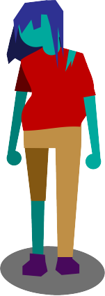
I usually work as fashion designer so there were many first times for me whilest creating the art. I made the illustrations with illustrator and my first walkcycle ever with duik bassel and adobe after effects.

So I am preeetty curious about what all of the other artists learned during this jam, what you guys used and if you have some tutorials that helped you getting into animation, game art and stuff like that.

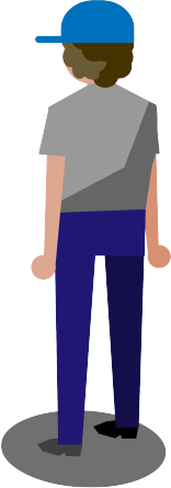
I myself had serious troubles with creating a walk cycle that does not go kinda vertically but direct to the front. Also exporting my opening in a size that fits good to unity was a trouble - it ended up rather pixelated anyway. ;)

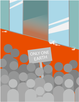
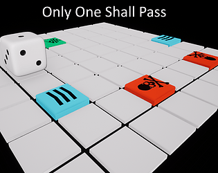
And I am looking for feedback as well! So here is our jam  - art by me and design/programming by my brother - topic is only one earth with only one way usage items - so you have to survive while avoid drowning in your own plastic waste in the same time. ;)

https://itch.io/jam/gmtk-2019/rate/462623

Submitted
Deleted 3 years ago
Submitted (1 edit)

I like the fact that we can hear your sister screaming XD Personally I have no clue about audio - my brother is a musician as well so he did all of the music stuff. :)

(+1)

We agree. Sound is also a very important part of a video game, from the background music that sets the mood, to sfx that serve the gameplay as feedback to the player,

Thanks for sharing a little bit of your workflow! We think that is more common to see information and tools to come with some nice visual placeholders at the very least, that it is to find something about creating sounds (not just downloading them from a site)

Also, if someone is interested in sound effects for an 8-bit style game, we've found that https://www.bfxr.net/ is a pretty helpful tool

Submitted
Deleted 3 years ago

For game art in general, Riot games released a series of videos on their Youtube channel that explain the different areas.

And for animation, we think every animator would agree that "the animator's survival kit" is THE BOOK. As it explains the basics that pretty much every animation follow.

Now, specifically for games, we are big fans of the YT channel "New Frame Plus". Dan really loves animation, and you can notice from his videos, he explains in detail every aspect of the animations and why they do or don't work well.

Also, https://80.lv/ and https://polycount.com/ very good sources of information and feedback regarding everything in the world of art for games.

Submitted

Aaah sooo many nice sources, I definitely will check out all of them. The animator's survival kit was already recommended to me by a friend. You mentioned the book - I just saw they have an app for Ipad - do you know this as well? If yes - what would you recommend? :)

We haven't tried the ebook but its safe to assume they got the same information (at least text-wise). Ebook says that it includes a wide variety of videos to exemplify the concepts given and other material; so it sounds like a really nice purchase.  In the end, its just a matter of what you feel more convenient; the important part is to keep practicing and watch a looot of animation in different formats: movies, video games,  ads, etc.

Another good resource is the book "The illusion of life", written by two of the animators known as Disney's Nine Old Men, who defined the twelve basic principles of animation.

Submitted

I've worked with a friend of mine called Lorenzo Tombesi, here is his Instagram, where he posts his art!

https://www.instagram.com/loti_art/?hl=it

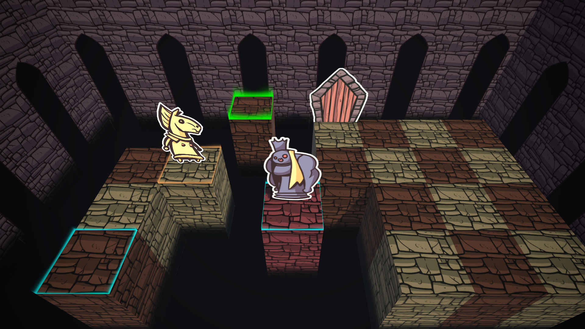
AND here is our game! It's a puzzle game inspired by chess, where you control the knight only! It's not chess althought!

https://itch.io/jam/gmtk-2019/rate/462613

The art is of course completely done by my friend!


Submitted (1 edit)

My art is bare minimum. I used Modo. Since I did the game alone and I have not art skills (yet) I had to use something simplistic. 

https://itch.io/jam/gmtk-2019/rate/462667

I did most of the stuff either by hand (using Procreate) or Illustrator. Drawing by hand just makes me... kinda happy. 
Also Maya scares me :S

https://itch.io/jam/gmtk-2019/rate/460811

Submitted

I love the simple design and the proportions. :)

(+1)

Thanks! I'd love to grow the game further as I was thinking it would be super cool if you can move like a ball and bounce off the walls and what not :D

Submitted(+2)

I would love to see that!  Mansharkball go! :D

Best. Superhero. Name. EVER

Submitted(+1)

Great art! Congrats!

(+1)

Thank you so much! I'd love to build this world up and make it more and more interesting :)

Submitted

Wow, those are all lovely in terms of art as well as design! Kudos! <3

@Rismosh That's some catchy music, love it ! :)

@LordMysterio Gotta love those black & white shapes, you managed to give them character :)

For this project I made everything myself. Tiles, sprites & animations with Clip Studio Paint (note: pixel art for a jam game = never again D:   ) , music and sound effects were me humming in my mic in Windows Recorder.

You can test my entry here and have a laugh: https://itch.io/jam/gmtk-2019/rate/461861  ;)

Submitted(+1)

I looooove pixel art and wanted to make some, but oh my! I think it is waaaay more difficult than regular vector graphics or just painting something nice. I have the feeling that every pixel counts and every pixel needs to sit perfectly.

Submitted(+1)

Yeah, proper pixel art isn't as trivial to make as it might seem. Pedro Medeiros made like a bazillion free guides on specific techniques and objects, maybe check that out if you want to give it another shot: https://www.patreon.com/saint11 <3 <3 <3

Submitted

Hey thanks for the resources, always good to learn from the talented <3

Submitted

What took me the most time was actually the animations. You can usually save time with selection and transformation tools to modify the moving parts between frames. With pixel art, you have to redraw those, pixel by pixel. And I used flat color, I gave up doing pretty pixel art with shadowing and tones XD

Submitted (1 edit) (+1)

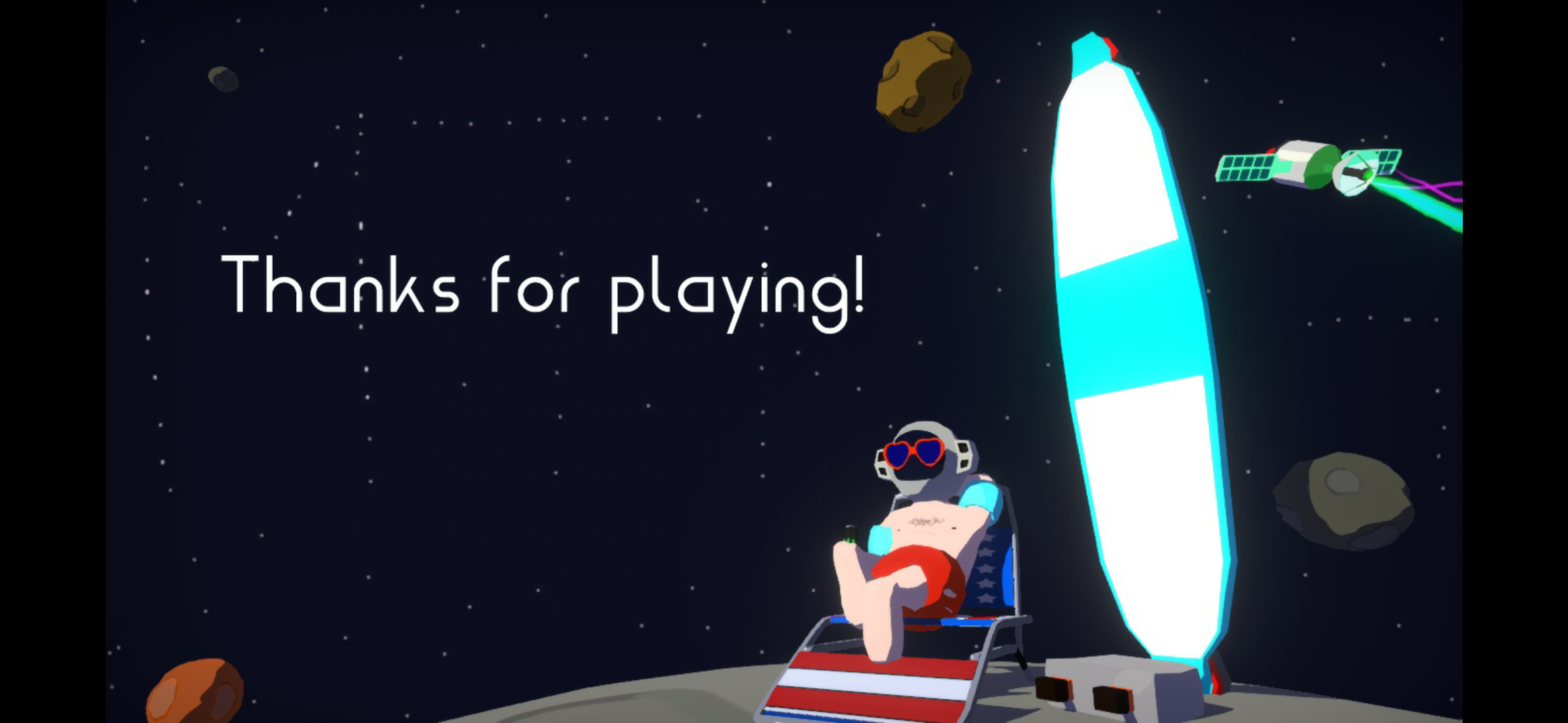
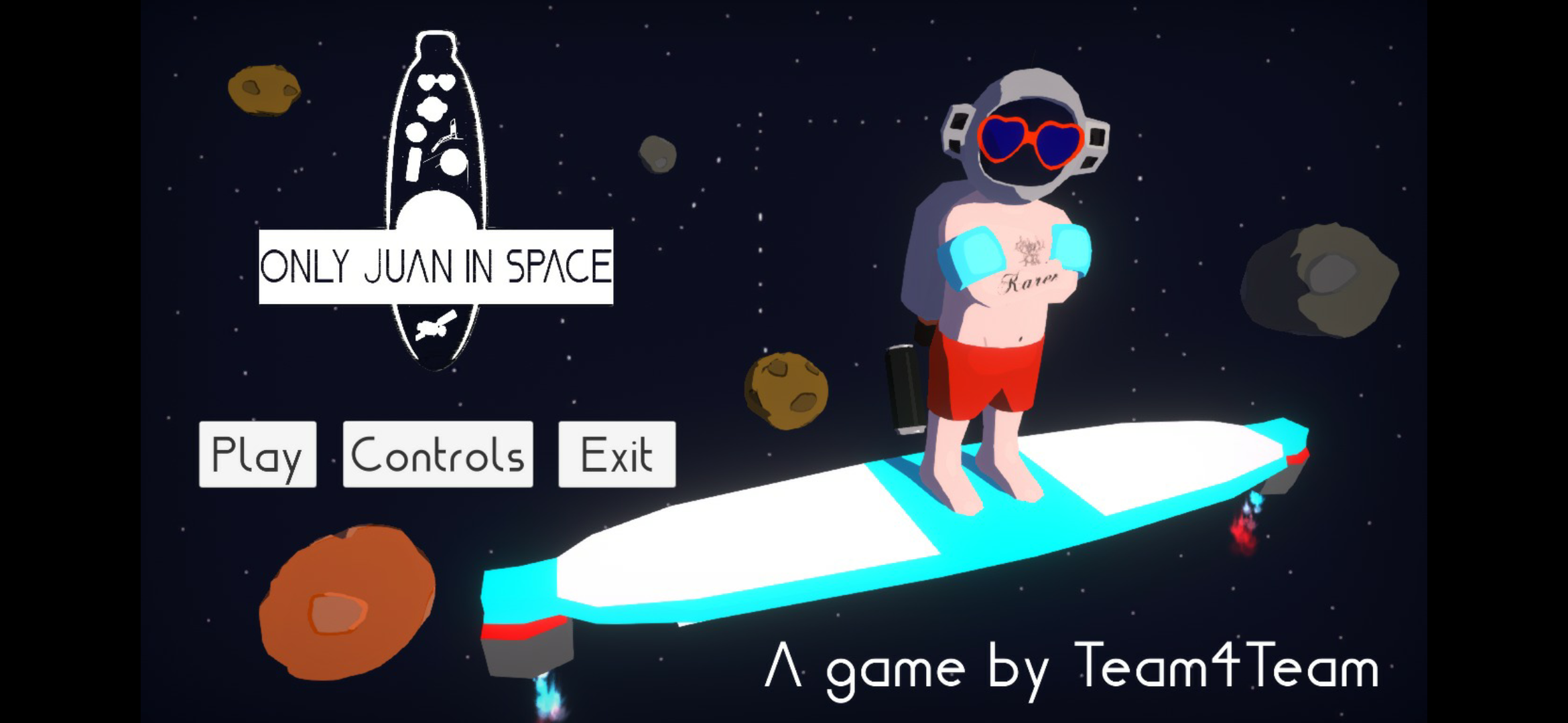
This is my first jam as an artist, i was a bit scared because it's not my usual role, but I think it turned out well!  As I'm not good at drawing, I thought it'd be better to use 3d models and a good toon shader (which I did myself).  I got inspired by games like Zelda the wind waker because it looks amazing. But honestly to do the character I thought of my father who's also called Juan. Also we wanted the character to look cool, we came up with the idea: a surfer astronaut.  This is how it turned out looking:

https://itch.io/jam/gmtk-2019/rate/462969


Submitted

This looks nice! I like the space surfer idea (I guess everyone would love to surfe in space ;) ! 

Can you explain to the game art noob that I am what programs you used? How long did it take you to create the art?

Submitted(+1)

of course!!  It would be cool if I could say I used many professional programs, but the truth is that I only needed two, blender and Photoshop.  I only used photoshop for some textures when needed as many models are vertex painted. 

I coded the shader for unity by hand, but based on previous work on blender, basically I traduded a shader done with blender shader editor to code for unity. I used this video as tutorial for making the shader in blender (in blender yoj don't need coding and it's very intuitive)  


Submitted

Waaah thanks! This is so informative and helpful! :D

Submitted

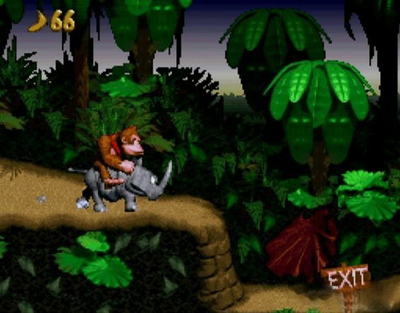
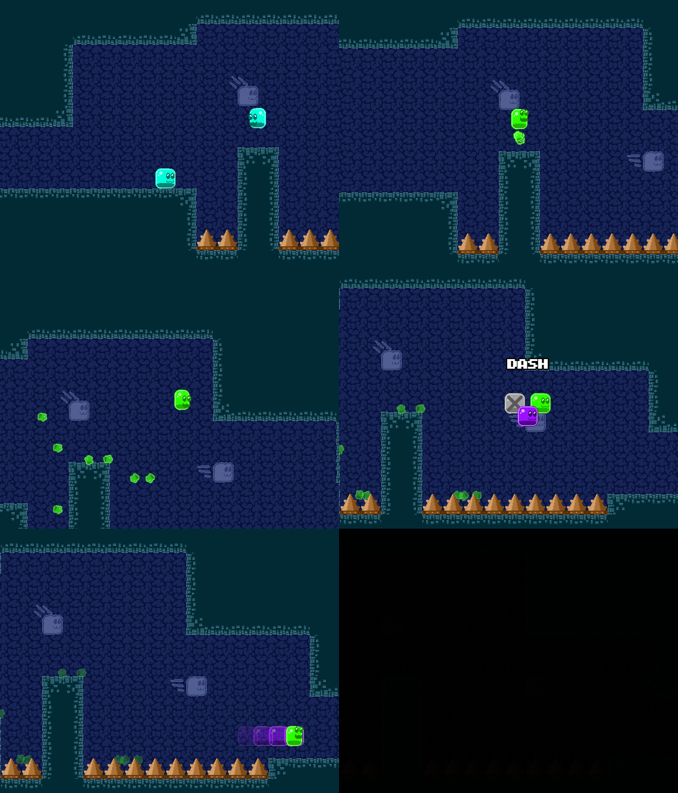
Hi April! We usually make 2D games, the one time we made a 3D game was really too much for us, so this time we decided to create a 2D game using pre rendered 3D graphics, inspired by Donkey Kong Country and other games from this era.

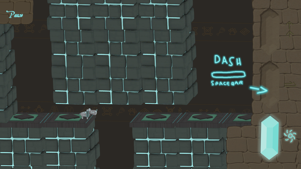
Another inspiration was Prince of Persia for DOS, mainly because of the camera angle and "chamber like" style.

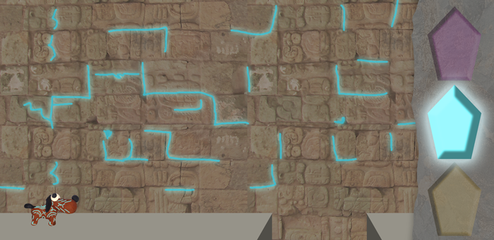
We mixed both art styles and applyed to the game theme: A mystic Atlantis like puzzle platformer where you need to switch your only one power crystal to use your 3 abilities.

So here are the examples:


And here is the outcome:


here is the link if you want to play it!

https://itch.io/jam/gmtk-2019/rate/462457

Submitted

Love the donkey kong take on game art! I guess this is a really nice compromise when it comes to 2D/3D game art (and like I said in the cute character thread, I think your dog is really cute :D).

Could you explain which programs you used and how your workflow looked whilst creating the art?  This would be awesome. :)

Submitted

Thanks! :)

After the brainstorm session, the 3D artist started modeling the dog using 3DS max. He used previous images from other games that we made as references for the 3D model.


At the same time I drew fast concept arts using photoshop just to explain to everyone on the team what the game should feel and play, with UI and player sizes, some colors and effects.


The final thing before implementing the arts onto the game was to create the textures to put on the 3D model. That was done by the 3D artist using Affinity, who also placed the camera on the 3D space to render the character in all animation frames (run, jump, idle and dash) and the platforms.

We used Unity2018 to create the project, so we imported the assets and edited the final bits in there. Unfortunately we didn't had time to add the chatacter's final animations until the deadline, but we have a newer version (Android included) ready to be posted as soon as the rating period ends.

If you have any more questions, please feel free to ask! Thanks for being interested!

Submitted

Thank you for being so informative! Getting a glimpse at all the different workflows and possibilities is really interesting and broadens my horizon so much! :)

Submitted

You're welcome, I hope to see you growing, keep going!

Submitted

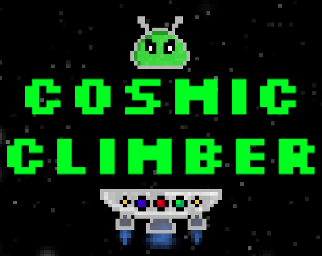
I'm not really an artist (primarily a game designer) but I have to do everything myself. And while I tried drawing vector graphics, and got decent results, I stick to pixel art as it gives similar results in shorter time. It was especially important during this game jam, as not only I've been working alone, I ended up having to finish my game in less than a day. Which is also why I decided to make player character a slime - slimes and swords are two things that I drew so many times that I could probably do it again with my eyes closed. I use gimp, mostly drawing one pixel at a time, occasionally helping myself with some filters (lately I've been using RGB noise a lot).
An interesting problem that I encountered while working on sprites for my game was the fact that I drew them with black outlines. And since it takes place in space, the background was mostly black too. Not wanting to redraw the sprites without outlines, I changed their color to light gray, which turned out surprisingly well.
You can check it out if you want to: https://itch.io/jam/gmtk-2019/rate/462343

Submitted

Yeah I figured out that working on background and character art simultaneously makes quite sense - or at least setting yourself a colour code for everything and see how it machtes/contrasts before you start making the actual art. :)

I build both my background and character and items next to each other and always put them on the background to see if the contrast was enough and if the colours matched!

Submitted

I also really struggle with walk cycles, so I just made a character who didn't need one haha! For real though, the art in your game was super charming so I think you did a great job! I used a combination of Pixel Edit and the built in sprite editor in Game Maker Studio 2! Worked out really well and was a ton of fun.

https://itch.io/jam/gmtk-2019/rate/462672#post-867118

Submitted

This is quite a good idea! Just get rid of all those annoying limbs! Blobs ftw (yours are especially cute)! ;D

Did you use the draw while animate part of game maker studio 2? I think this feature is soooo cooool but I find it so hard to use!

Submitted

I did for one part actually! There are enemies that are poisoned in my game and to make their "Poison Aura" I used that feature! It came out nicely! Makes me really want to experiment with it and see what kind of art styles come from it!

Submitted (1 edit)

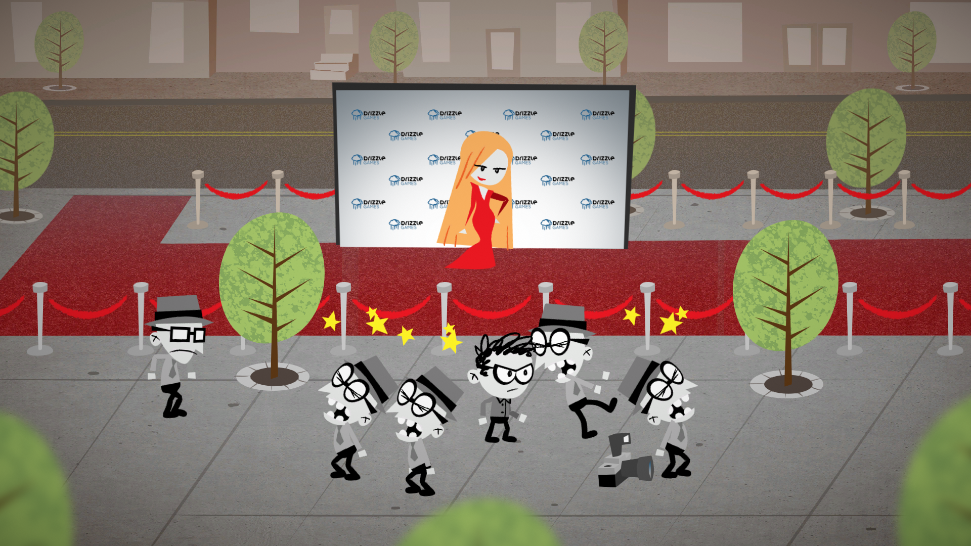
For our game, the premise was that a bunch of paparazzi would be fighting over one camera, which is pretty goofy. So I figured a goofy art style was necessary, so I took inspiration from some classic 90s TV shows, particularly Dexter's Lab and Powerpuff Girls.

Used Unity's skeletal animation system. All art made in Photoshop


https://drizzlegames.itch.io/paparazzi-panic

Submitted

If you like the look of 90s cartoons like those, you should look into the 50s UPA cartoons that inspired that style.

Submitted

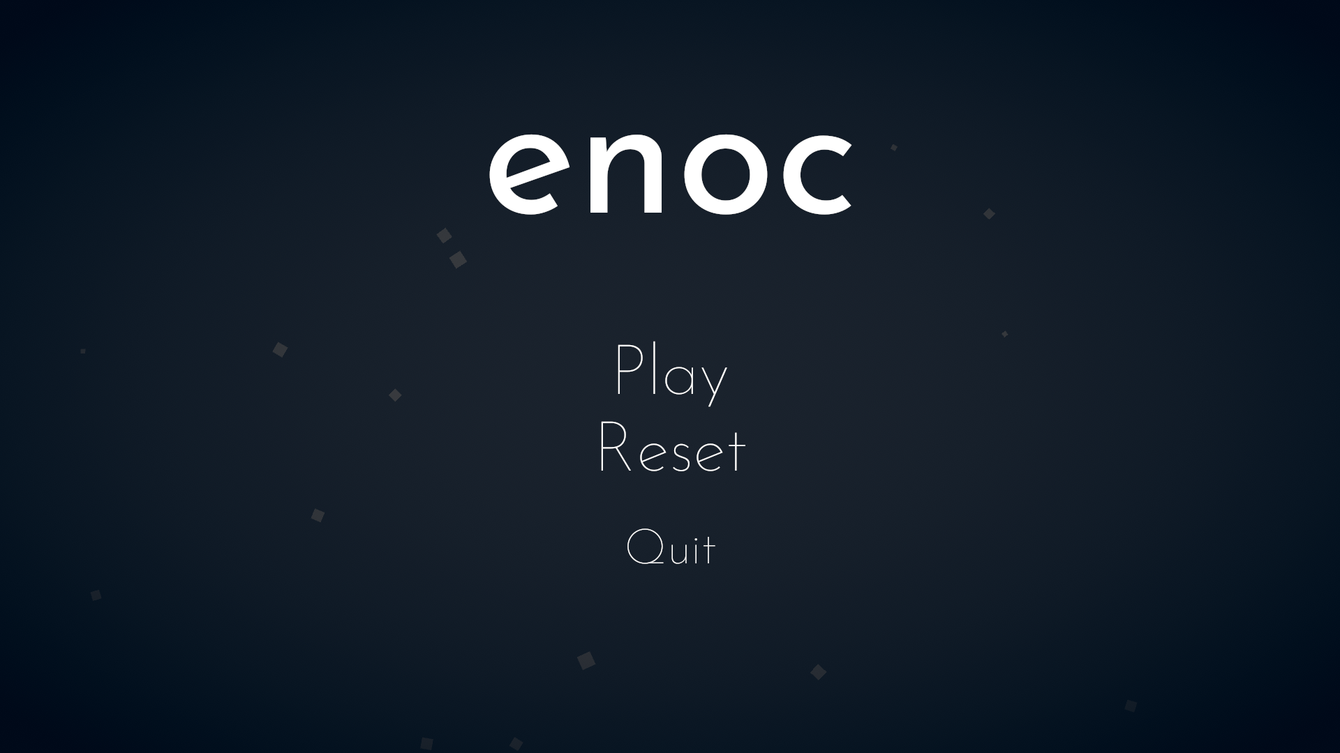
Hey there! My game isn't particularly stunning but I achieved what I set out to do, namely make a minimalistic  theme with complementary colors. I learned more about creating art in-engine, as I'm more of a traditional artist, mostly drawing with realistic motives. My current studies in design where valuable as well. One aspect I'm proud of that I'm completly new to are the sound effects in enoc, all created in my bedroom with things I had lying around and some editing in Audacity.


Submitted(+1)

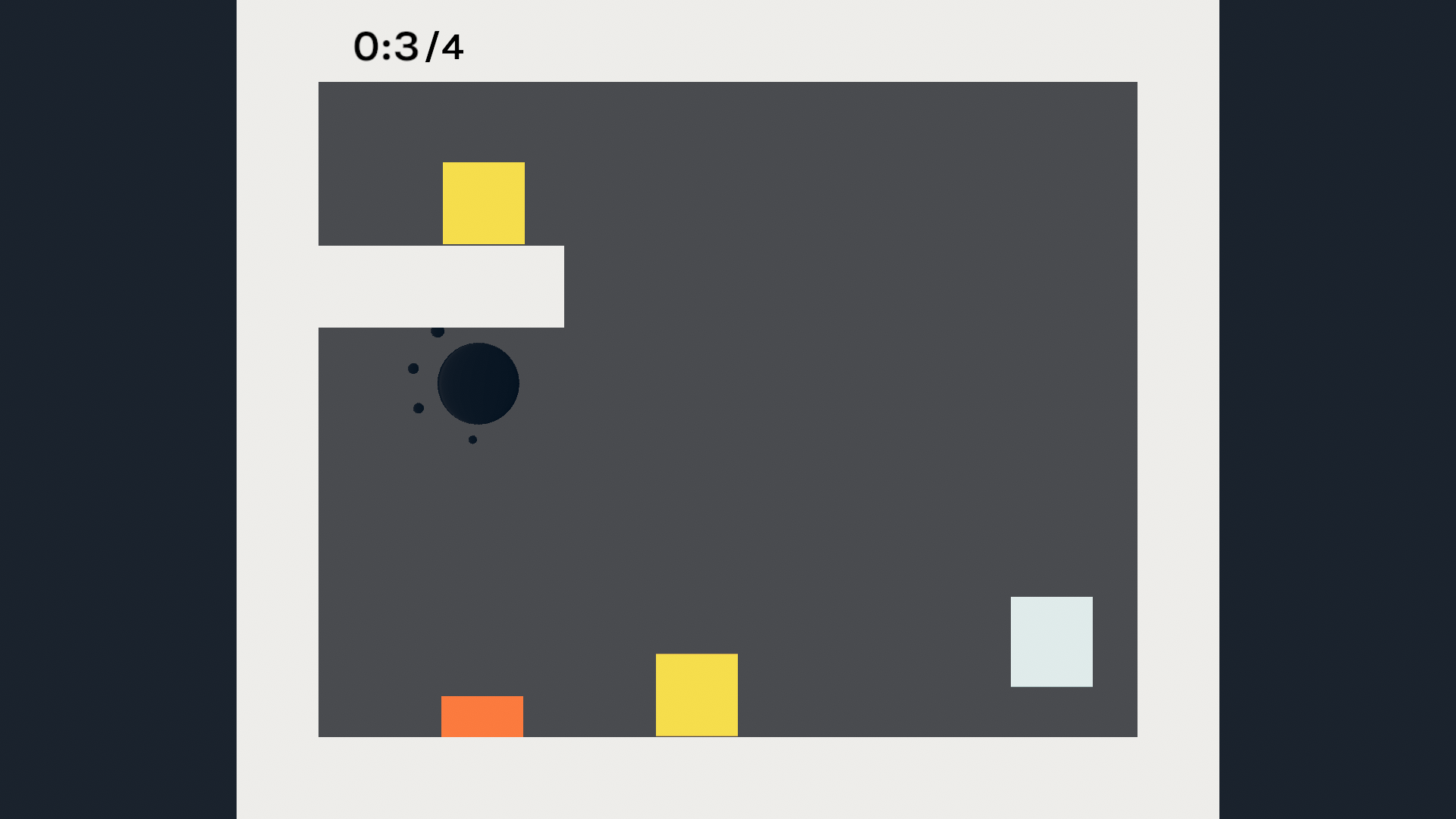
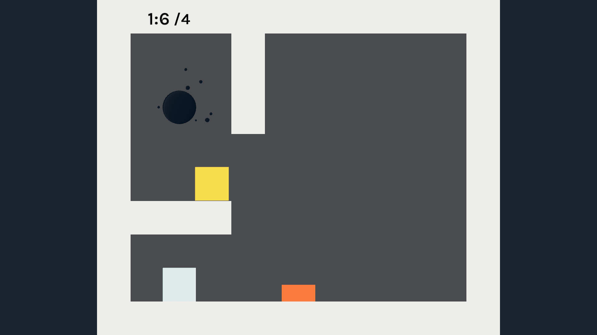
I experimented with some kind of glitch art that has many objects ingame appear as constantly shifting masses or shapes, somewhat inspired by Lucah Born of a Dream and Skelly Selest. Not hand drawn as in Lucah though, instead all art in the game was made from a single sprite (at different sizes and rotations):


That sprite was then used either as building blocks or by using it as a brush in Gimp. The end result looks like this:

The resulting aesthetic was justified ingame by some story bits, explaining that your player character is near dead in a coma. What you see is vague visual information that is feed directly into your brain by your mech computer.

I also made all the vfx and projectiles with this technique.

In previous projects I used a similar effect to create darkness effects, since the engine I'm working with doesn't support true lighting, I find that lead to some interesting visuals and it was great fun to go all out with this for the jam.

In many ways it was easier to create the art this way, since I could just brush down effects and shapes quite quickly. I'm normally work with more conventional pixel art, so not having to care about all the details was quite liberating. I think that freed up a lot of time to be put into gameplay, game feel and additional features.

On the other hand, to keep up the effect, I needed to make multiple frames for all objects, even in situations where they are totally still. That created some additional work overall. I wanted a lot of poses for the player mech, (since the game is all about executing many different actions with a single button). It still only had 8 frames overall I think, but I would have had to draw each one 6 times at least to create glitch animations aren't visibly repeating. Eventually I switched to a skeletal animation for the mech, where limbs and head constantly follow an invisible sketch and animate independently from the actual pose.


The whole thing was quite the learning experience. I like the style a lot and I want to try mixing it more into my regular pixel art for future projects.


Submitted

Awesome work! Hurts the eyes a lil' bit but the concept is great! :)

I'm a game artist by trade, and a fairly seasoned gamejammer. The thing I was most proud of in this jam though was the shader I wrote (in UE4, it's all node based) to simulate a CRT monitor in game. 


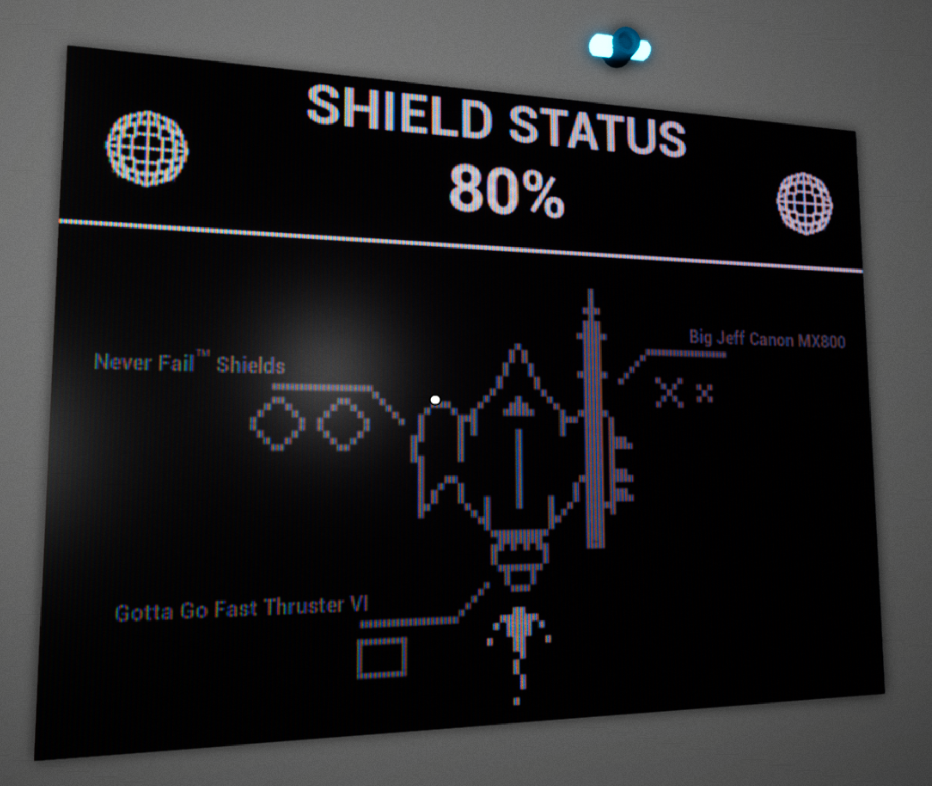
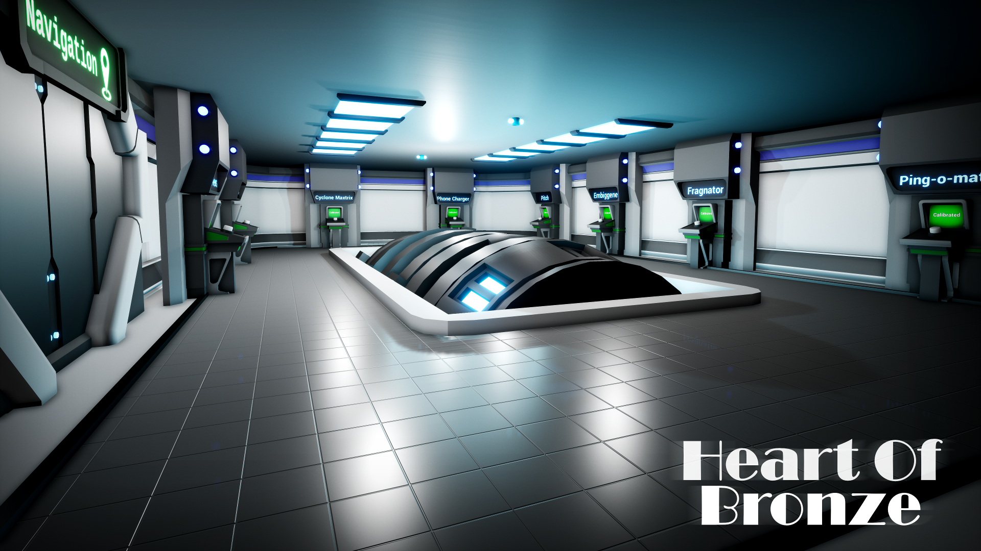
It looks a lot nicer in game with the scanlines. To create the effect I actually split all 3 channels and masked them through a a fake CRT style RGB pixel set up. It added a lot to our images in game and gave them an older school feel. There was a lot of other 3D stuff we had included as well, but it's not particularly wild. I actually avoided as many textures as I could in order to focus on other things. The only textures I included were 2 normal maps used to break up the floors in places.


I have a fair amount of 3D experience, if anyone has any questions or wants any tips on 3D work (specifically the sort of stufff I do for jams) then feel free to message me!

Submitted

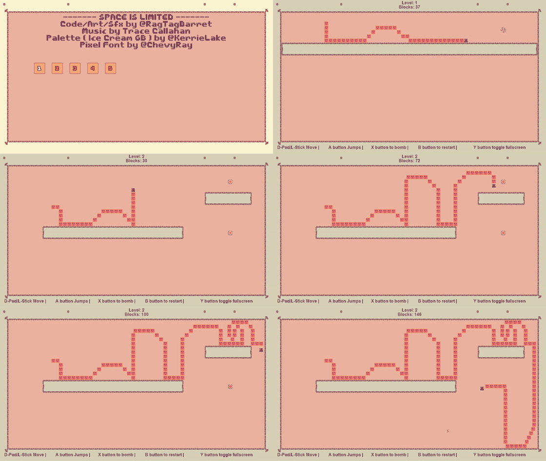
So I'm not an artist so I used a lowspec color palette. This one specifically https://lospec.com/palette-list/ice-cream-gb

you can check it out here if you like https://itch.io/jam/gmtk-2019/rate/461128


Submitted

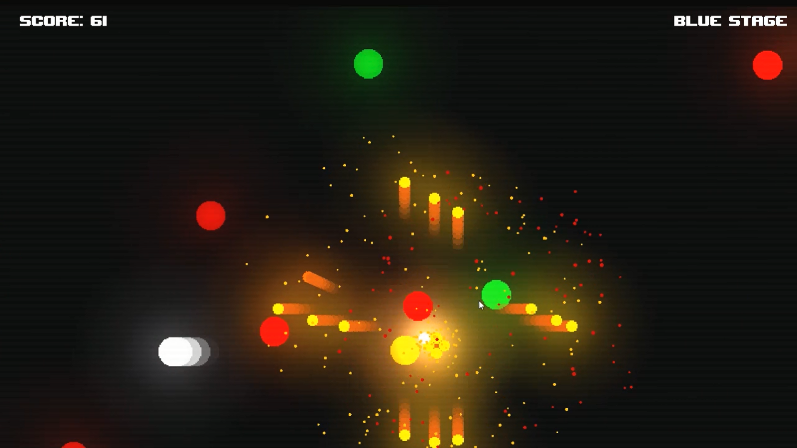
I went for a minimalist retro artstyle however not sure how well I fulfilled that. 

My game is called One Shot In The Chamber, a wave based survival game where you must fight off hordes of enemies with the catch being, you have only one bullet. Fortunately, the bullet is magic and you can summon it back to you or teleport to it. Using this unique ability, you must survive as long as possible in the chamber. Here is a screenshot of the game and the link to the game page: https://mark-auman.itch.io/one-shot-in-the-chamber

Submitted

I used Adobe Illustrator to create vector-based graphics for It’s Rude To Point. The art style of the game’s UI was heavily inspired by Kahoot! and the Jackbox Party Pack, though the general aesthetic of objects (solid colors with minimal shading & thick black outlines) was inspired by WarioWare.

If you’d like to see the art in action, you can check out our game here:

https://itch.io/jam/gmtk-2019/rate/461113