Not bad. I like how you have to manage your money to get through the levels. That's unique. I got through to level 4. I'm not sure if there are other enemies than the saw blades. But some other enemies would be neat. In terms of current design critiques, the platforms shouldn't crush the player, in my opinion. I think they should be no collision on the bottom so you can jump through like with similar games of this style.
Play game
Lorenzo's Looting's itch.io pageResults
| Criteria | Rank | Score* | Raw Score |
| Originality | #1203 | 3.486 | 3.486 |
| Overall | #1409 | 3.257 | 3.257 |
| Fun | #1503 | 3.071 | 3.071 |
| Presentation | #1590 | 3.214 | 3.214 |
Ranked from 70 ratings. Score is adjusted from raw score by the median number of ratings per game in the jam.
How does your game fit the theme?
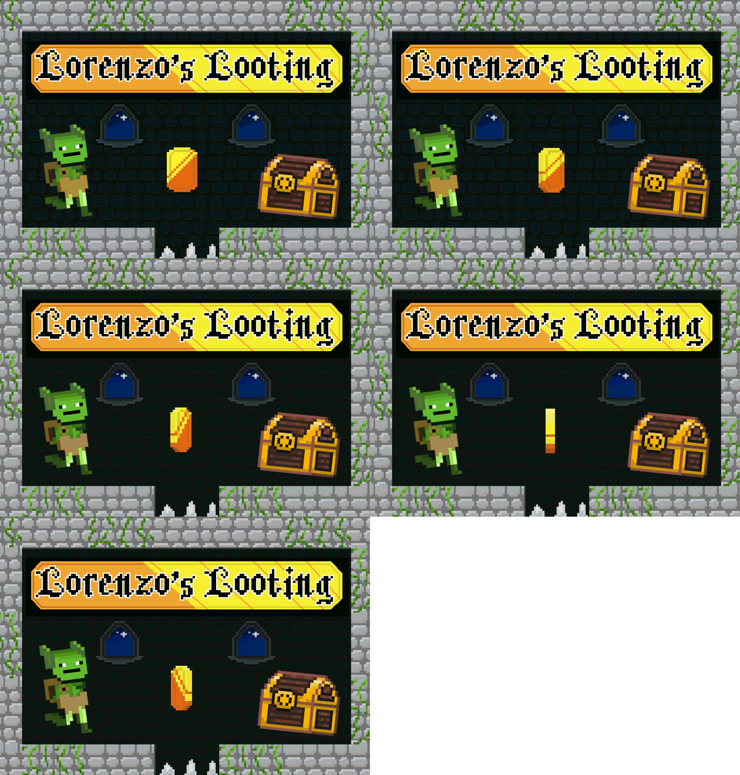
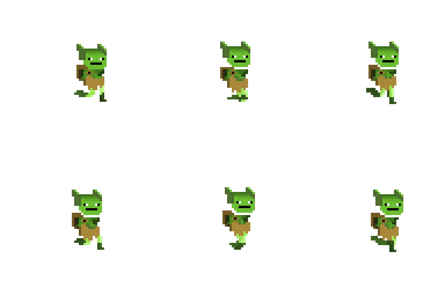
Lorenzo (the goblin) joins together with his precious shiny objects, but with one catch: he gets heavier. Each coin drastically decreases his movement speed and increases his gravity, so the player has to strategically join together with the coins at certain parts.
Did your team create the vast majority of the art during the 48 hours?
We created the vast majority of the art during the game jam
Did your team create the vast majority of the music during the 48 hours?
We created the vast majority of the music during the game jam
Comments
I had a lot of fun with this! The levels were nicely designed in a way to make you think about how much you should be carrying to clear obstacles, and there was a good balance between wanting to carry more and making the hazards harder vs being lighter and making more runs.
There was a bit of confusion on my part that I expected the ATMs to be linked, as in I could withdraw from a different one than I deposited. Maybe something less electronic would make it more immediately clear?
Great job!
Great and original concept. You really nailed it with those pixel graphics :)
This is a really really cool concept! One of the first I've played where being greedy can actually get you stuck, which is very fitting.
My main feedback is the fact that the levels have a lot of jumps that look like they could be done if my timing was just a little bit better, so I ended up trying the same wrong solution over and over before I realized the real one. But in 48hrs you managed to make some really pretty art and music on top of an awesome game, so bravo!
I like the concept of linking coins to weight, really unique! The music is also really nice, great job!
The art style feels very retro! Reminds me of my childhood. The character sprite in particular is pretty nice. I had a bit of trouble with the ATM triggers in the beginning.
I think the concept is pretty neat, there's more room to explore!
Good job on creating a game!! Congrats on submitting.
Cute, and I like the idea! The hitboxes for the ATMs seemed a bit finicky. I'd be interested to see what other variations you could make on the mechanic, the early levels seemed to mostly be about depositing most of the coins and then ferrying them to the end one by one (or two by two if you're feeling spicy).
I was stuck for a bit in the beginning but then got to know the concept of depositing and was able to clear the game. Nice concept and art overall. Could use a bit of smooth movement, however a solid entry :)
Hey! Nice game, I like the charm of it, I think is fine that the ATMS are not connected, is impressive that have a level select screen. I think that the hitboxes on the saws are a little to unforgiving, good job.
Great idea! I really like the game! But its a bit anoying you have to restart the entire level once you die. else to that this is an awsome game ^v^
Awesome idea! I think a tutorial would help a lot with this game. Maybe even just write the controls in the game description.
Loves:
- Level select stage in a games jam? Excellent attention to detail.
- Interesting and unique puzzle design. I like the general concept.
- Nice looking retro style.
Nitpicks:
- Prologue font is really hard to read!
- Is that UGUI? It's mostly obsolete now, replaced by a much better visual Canvas system. Make the switch, you won't regret it.
- Controls aren't presented on screen anywhere. Had to look up how to access doors!
- Doesn't cope well with different resolutions.
- Don't really understand the gameplay at first. Needs a bit more in-game onboarding. Please don't make me read instructions external to the game, I might just quit and move on to the next game.
- Why don't ATMs transfer coins? I thought that would be an interesting mechanic. Maybe if that's important the visual metaphore should be something else, perhaps a sack, vault or chest?
- Hitboxes are way too sensitive, and levels are way too hard! No matter how good the puzzle design is, if you can't easily perform the solution it ruins the game.
Oh yikes, thanks for bringing those nitpicks up to my attention. A lot of the problems you had I addressed in previous comments, but yeah I do agree we could've made this a lot better. The main two reasons why most of those nitpicks you had aren't implemented are because of 2 things: lack of time to implement and/or lack of programming experience (we're still fairly new at this). I do really appreciate your feedback though, and I hope to improve on those aspects in the future! Thanks for playtesting!
I didn't mean any of the nitpicks to be insulting. Was just hoping you'd take them as lessons for the future. I totally understand the pressures of a games jam limits what you can do. I think you can be proud of your creation, lots of teams tried hard and didn't submit anything. Lots more probably wanted to try but never got started. Just submitting a game is a fabulous achievement in itself.
nice puzzles and nice mechanic, however it would be cool if there was more interesting music/
Good entry! This could easily be expanded into a full game.




Leave a comment
Log in with itch.io to leave a comment.