Play game
JAILBREAKER (GMTK Jam 2024)'s itch.io pageResults
| Criteria | Rank | Score* | Raw Score |
| Enjoyment | #1273 | 3.432 | 3.432 |
| Style | #2301 | 3.324 | 3.324 |
| Overall | #2307 | 3.225 | 3.225 |
| Creativity | #3736 | 2.919 | 2.919 |
Ranked from 37 ratings. Score is adjusted from raw score by the median number of ratings per game in the jam.
How does your game fit the theme?
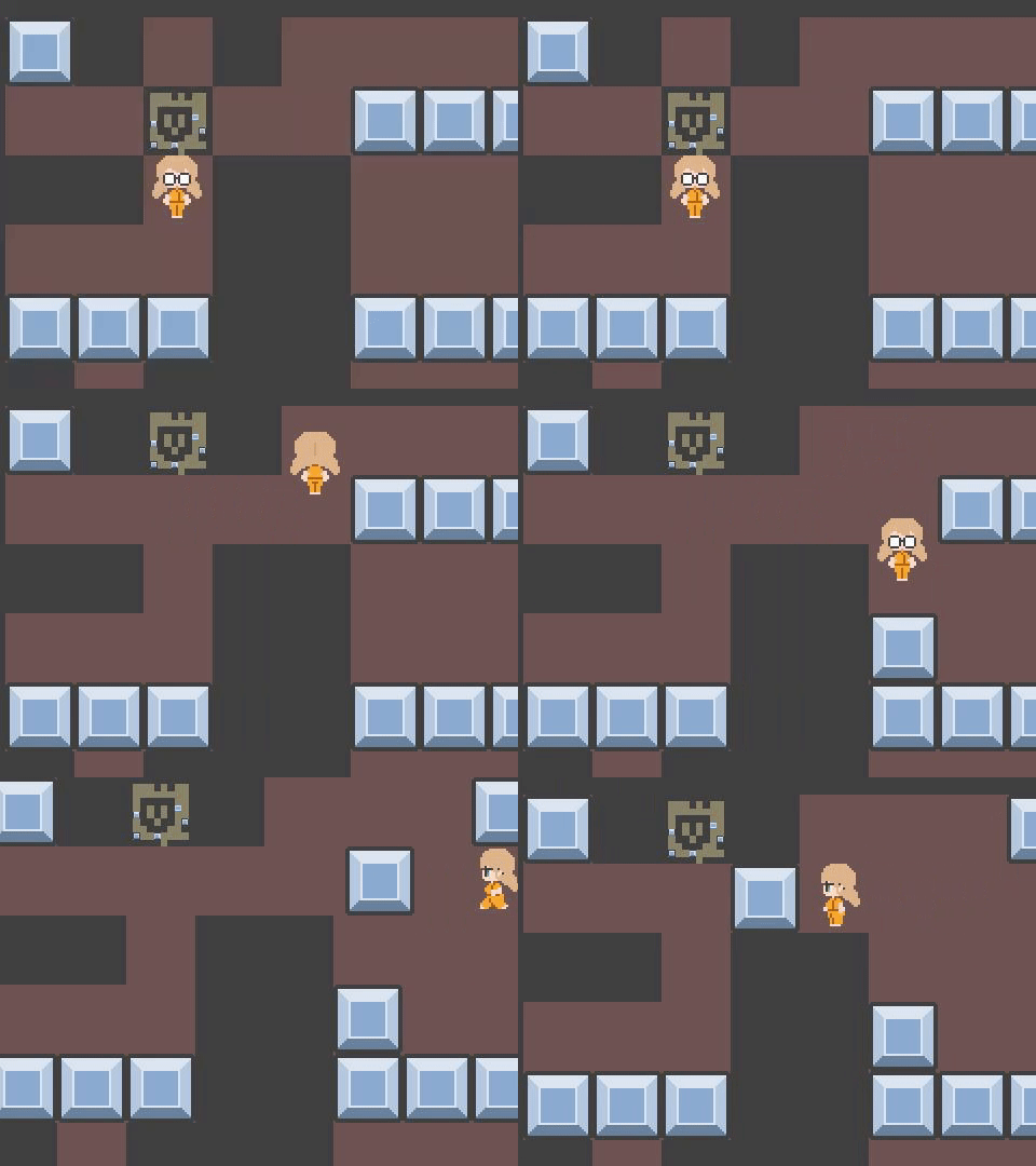
Each level shrinks down to the size of a tile in the next level, She's trained long enough to punch even bigger crates, etx
Development Time
48 hours
(Optional) Please credit all assets you've used
See description for full credits
Leave a comment
Log in with itch.io to leave a comment.


Comments
Good old sokoban! don’t let that prisoner escape, she’ll mess everything she touches haha
nice work!
i had sprites of her all covered in blood drawn before i saw the no gore rule, or she have been using those fists on human guards
Good stuff! The screen shake gets a bit too exhausting after a while.
I love a good sokoban game. This game had great levels too. I find it very impressive the challenge you managed to get with your puzzles. I made a puzzle game this year and that was the thing that I found the most challenging
in some levels i added extra pressure switches just because i liked hitting boxes into corners
Very epic music and nice puzzle design.
Nice puzzle game. I liked the added challenge with different block sizes! Art style was nice and the idea was creative.
A fun little game, though the screen shake can be a bit much ^^;
In the future, crimes will be punished with endless sokoban puzzles! :) Jokes aside, great work, especially with the 48 hrs limit. Just felt that it could use a little more polish.
be more specific please, finishing touches are what i always fail at because i cant think of how to polish
I've seen that you've done a bunch of cool effects already, I was mainly referring to the overall consistency of the presentation. Things like the solid color tiles clashing with the more detailed player sprite , wall break, and squares you are pushing. Also while I love the button effects on the UI, I don't like that it takes up 30% of the screen space by itself.
ah, originally i was gonna put a character portrait there, but my drawing skills left me high and dry, i couldve just gone with a square for the resolution but it didnt feel right
Mrs. Screenshake escapes prison.
miss punched walls until she was strong enough to escape
If you suck at sokoban - you can kick blocks.
Art is cool!
Fun little sokoban, had to retry some times the room with all the buttons on the side x)
that was actually a scaled down version of a puzzle i made in my game kate's test, though the trick in that was that you could accidentally leave the room and reset it if you werent careful about handling the boxes at the bottom first
Oh i see, hence the need for all the buttons around
the one in kates test was a more complicated version of a puzzle with statues and vents from resident evil 1 (the original, not the remake)
that releases gas into the room when you hit a switch
Interesting little Sokoban game. Got kind of tough at times, but the puzzles remained fun. Great stuff!
I already wrote my thoughts on this game in a review before the jam ended (and I kind of forget what I wrote so you'll have to check that yourself haha). Great game!
"The gimmick is simple-- one of the first things you'd thing of when you'd hear "Built to Scale." Despite that, the game is really fun and some of the levels required a surprising amount of head-scratching to get through. If it was a little more polished and perhaps had an original OST, this surely would've been a 5 star game."
someone else said that they didn't get how it fit the theme at all and ranked it 2/5
Nice concept and music! i love the puzzle games great work owo
The puzzles are fun! Stumped me a few times. Excellent job!
Great music and even better puzzles. The puzzles have more than one solusion, witch i found great when other games try to go more for the one solusion path. The using levels mechanick reminded me of Patricks parabox.
it wouldve been nice if i couldve imitated parabox, but it wouldve added a level of complexity to coding that i couldnt have finished like remembering where abox was in the previous level so you could go between them
the transition going back in wouldve been hard enough
that would be a really hard think to do with this deathline, i understand
Great level design, very chalenging! great intro also!
the push effect is a bit over the top 😅
it just didn't feel like she was punching hard enough when i toned it down
Great block sliding puzzle. The smash effects felt over the top but well put together. It reminded me of aqua energiser from the old miniclip days.
really cool level design. It would be cool if you could interact with the previous level block in a different way
i didnt wanna rip off patricks parabox but also i cant even start to figure out how to re-enter them, like, first id need to code so the level actually saves the position of everything, then make a reverse level transition somehow, and it was too much for me
i'd have felt bad if i ended up doing patricks parabox, but also the complexity of having rooms remember where you left the previous level box wouldve been too hard