Play game
Spirit Guardians's itch.io pageResults
| Criteria | Rank | Score* | Raw Score |
| Presentation | #208 | 4.293 | 4.293 |
| Overall | #582 | 3.649 | 3.649 |
| Creativity | #1050 | 3.500 | 3.500 |
| Enjoyment | #1318 | 3.155 | 3.155 |
Ranked from 58 ratings. Score is adjusted from raw score by the median number of ratings per game in the jam.
How does your game fit the theme?
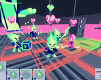
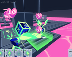
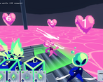
Rolling and selecting special dice for the player's in-game units is a core part of the gameplay loop
Did your team create the vast majority of the art during the 48 hours?
Yes
We created the vast majority of the art during the game jam
Did your team create the vast majority of the music during the 48 hours?
No
We used pre-existing audio
Leave a comment
Log in with itch.io to leave a comment.


Comments
I found it a little difficult to understand which units to assign the dice to. It wasn't really clear which unit was which to me - maybe if selecting the unit on the top snapped the camera that might have helped. I feel like there is a creative game here, but I struggled with the UI.
Bro how did you have time to make all this? Fr this is sick! I think the only thing I’d want is a bit more animation, which is really just a time thing, so kudos for making such a complex style of game with really nice visuals in such short time!
I had a lot of fun with this one! I liked the customisation of your players in a turn-based strategy combat game. I think the UI and gameplay was a little weird/glitchy and hard to keep track of your actions, but the game was quite forgiving so it wasn't a dramatic problem.
Really cool concept! I Really liked the artstyle and the graphics in general! Great game, well done!
This game looks soooo cool, it felt like an early aughts adventure cartoon. The game play is super well fleshed out and very impressive for the time constraint of development. I think the only feedback i have is sometimes it can get hard to tell which character im controlling. I think you should expand this game, i feel like it has so much to offer.
Those was loads of fun! The game looks absolutely fantastic. The theme was worked well into the game, it was fun to see the dice bounce off the old dice that were left behind. Good job! -Kaylee
The camera is a bit weird and the dice don't despawn I think.
Nice characters.
Just great. The only thing I didn't understand is why one of my soldiers turns opponents into allies, but I got a ton of fun. A very beautiful game.
Man I love the color scheme and the lovely design of the characters! Really nice job! This game is so ambitious, I am surprised your team has managed to pull it off in such a short time, taking into account the huge amount of work needed for such a complex game.
Really impressive presentation and art! Outstanding work!
I really love the visuals of this game!
The controls are a little finicky, but once I got used to the characters it was a clever game. I like the visuals a lot.
Really impressive work for a jam game! I was surprised to see someone pull off an Xcom-like in 48 hours! I really enjoyed my time with it and the art style is charming. I found it difficult to differentiate my characters (and their abilities) at a glance. I also found the level a bit long as I'd spend a couple turns just moving down hallways to get towards enemies. Lastly, it frustrated me not seeing what the enemies actions were, but I understand only so many things can get included in such a short time period.
Overall I really enjoyed this game! I'm a big fan of Xcom and I think you pulled off the tactical combat with dice rolls really well. Nice work :)
Fun game, but I was a bit confused about which character did what. Maybe different color schemes for different characters?
I liked the idea of this game, but I think there were some small adjustments that could be made (of course, what is already here is VERY impressive for just 48h).
I think full camera control would help a lot in the navigation... sometimes I could not click on the grid because the cards would stay in front of it (mostly on the narrow corridor that "comes towards" the camera angle).
Also, I think an indication of the Attack Phase would be nice. It seemed to me that I always had to move twice or thrice in order to get to the Attack Phase, when it would probably be better to allow attacks at any moment (costing your Movement Phase). And an indication on the cards that you did everything you could with the unit would be nice.
In any case, the presentation is fantastic and I can see a lot of potential on this idea! I think it might be worthy to clean it up post jam :)
Great aesthetics, only grief in presentation is that there could be better feedback for attack etc.
I did play it blind, without reading page first and I was able to get hang of it pretty fast. Character types could vary more visually, now I did not notice different classes until I noticed that some can't attack as far.
I didn't expect to see a fire emblem style game here. I really like the aesthetic of this game a lot and it was fun to play. I do think it has some shortcomings though. It was definitely a bit confusing to tell what's going on at times. I wasn't really sure why I couldn't attack with some characters despite having a red attack range for them. And it was a bit difficult to see, even when I finally figured out that you could switch to an above view. I wish there was a way to roam around freely without having to spam click the tiles to look around. but these issues weren't too big of a deal. It was a unique experience that fit the theme well and I really enjoyed playing. Great job!
Extremely impressive for a 48 hour jam
Good job
Great art style, nice music and sound effects, and it's really well balanced for a 48h game. I feel that the learning curve was steep, and with some small animations and some small text with a name above each character, the game would greatly improve. But overall, it was a really unique game :)