

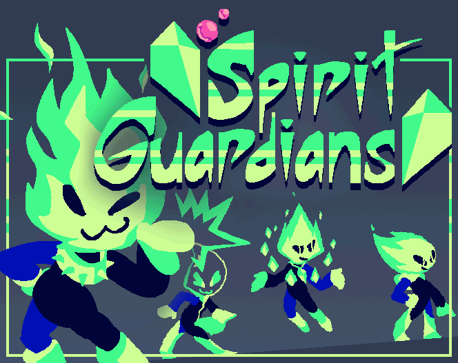


Play game
Spirit Guardians's itch.io pageResults
| Criteria | Rank | Score* | Raw Score |
| Presentation | #208 | 4.293 | 4.293 |
| Overall | #582 | 3.649 | 3.649 |
| Creativity | #1050 | 3.500 | 3.500 |
| Enjoyment | #1318 | 3.155 | 3.155 |
Ranked from 58 ratings. Score is adjusted from raw score by the median number of ratings per game in the jam.
How does your game fit the theme?
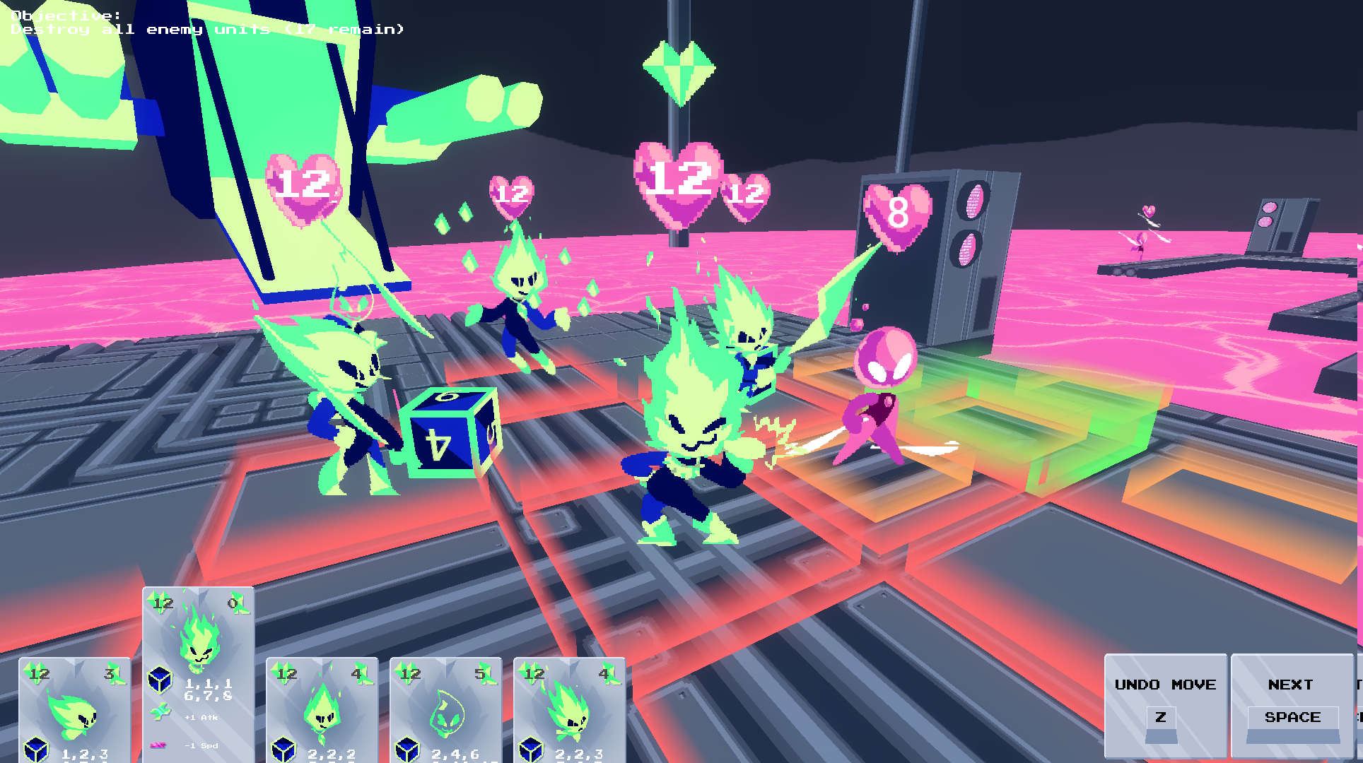
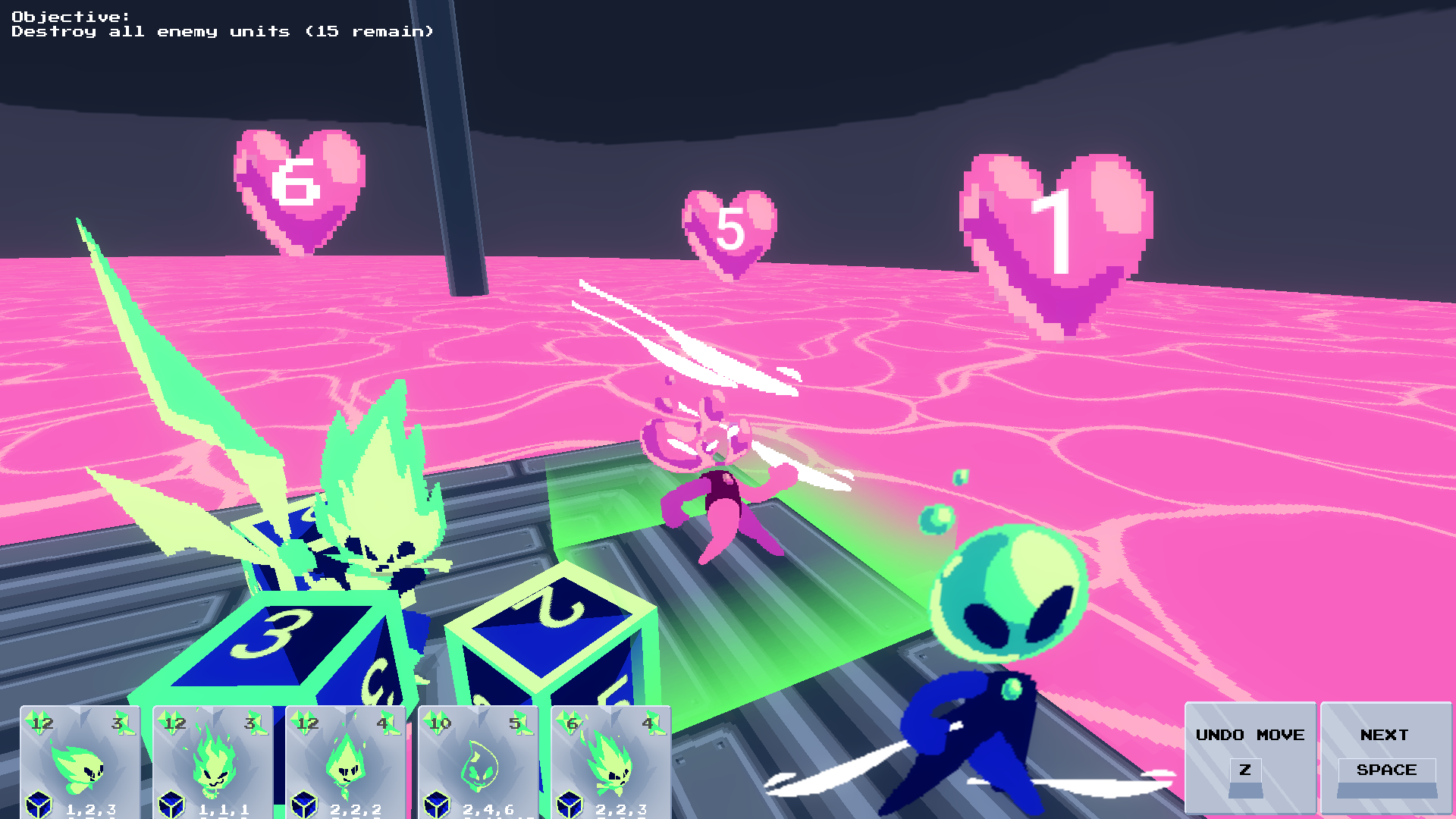
Rolling and selecting special dice for the player's in-game units is a core part of the gameplay loop
Did your team create the vast majority of the art during the 48 hours?
Yes
We created the vast majority of the art during the game jam
Did your team create the vast majority of the music during the 48 hours?
No
We used pre-existing audio
Leave a comment
Log in with itch.io to leave a comment.
Comments
The art style drew me in and I never looked back. Very fun, very big, very cool for a 48 hour game. Juice on health loss would be a cool addition and some text maybe when hovering over your guy telling you what they do since I was confused about the healer in particular for a long while. Thanks for this experience and good luck. 15/15 This deserves one of the top 100 for sure.
Quite impressive for the jam! Visuals are nice and very unique. Definitely could use some better clarity on your characters and what they do, but overall great work!
That's a really good entry ! The game was a bit hard to understand at first, but it was quite enjoyable once I learned everything =) !
Controls are nice and responsive, visuals are awesomely polished for a 50h jam and you game fits perfectly the theme (which makes is a bit frustrating at times, I must admit, but that's the main concern I have with that theme, so it's not your fault ^^). I love that you took the time to add some backstory elements with the little spaceship at the beginning of the level : we are not dropped randomly in a map, but we came with that ship, it brings some context and that's really cool !
Here are some little "quick wins" that, I think, could have improved your game with not a lot of time spent on it :
- I have a lot of trouble to remember which spirit is which. I know they all have a different shape, but I would have loved a little icon in their cards and above them so I can know who has which role (like a "+" for the healer, a sword for the swordmaster, a hammer for the brawler...). When I wanted to give some modifiers to my spirits, I always wondered "mmmmh which one is my healer again ?"
- How does the "range" bonus work ? I attacked and my dice did the right number, but I didn't notice anything different ?
- I feel like the gameplay could have been more fluid : instead of "clicking to move" => "space to confirm" => "clicking to attack", you could just remove the "space confirmation" and go to the attack phase.
- The healing range of the healer could be green instead or red, I always try to attack with him before remembering that he's the healer xD
But these are just some "nitpicks" to give you something to improve on, overall that's a neat little game, congratulations =) !
Thank you for the compliments and insights :)
You make a lot of good points with your tips. My teammate actually had the same ideas for the icons but I didn't think it was necessary- definitely an oversight on my part because I got them confused sometimes too.
Range bonus is kinda hard to notice because the attack range isn't directly displayed anywhere and each unit starts with a different one. Psionic and Swordsman had 1, brawler and healer (i think) had 2 and spear had 3. The +1 and -1 range modifies those values, its easiest to notice when you give psionic or swordsman the -1 range card because then they have 0 range and can't attack at all (a bit of an oversight once again).
I didn't make the attack phase automatically begin after moving because I wanted to allow the player to continue moving if they misclick or something and didn't use up their full move speed, but in hindsight that was totally unnecessary because of the 'undo move' button.
Finally I was planning on making the healers thing green but I just kept forgetting and never ended up actually doing it.
Once again thank you for the detailed feedback, I really appreciate it :)
This is awesome! I'd love to see it turned into a full game
Took a little getting used to, with quite a steep learning curve, but on the other side of that wall is a really rich and well-constructed game. One of the most visually striking I've seen in the jam so far. I really, really like this!
Like the board setup, be nice in future versions to have more fluid mouse movement across the screen instead of left clicking. Great idea that just needs time to flush out the graphics and story I think.
Extremely impressive presentation for 48 hours, it looks very cool!
The gameplay feels quite traditional, like an older tactics game with part of the formula exposed.
It feels very robust. From my play session there was no jank in the interactions at all.
The art is incredible!! The game itself has quite a learning curve but its impressive that you managed to make it in 48 hours! Nice
The art is incredible !
It's amazing how many complex systems and how much great art you have been able to make in such a short time. I enjoyed the visuals and there seems to be the makings of a fun strategy game there. The barrier of entry is pretty high with so much information to digest up front and I don't think I have really gotten in to the loop yet. Still pretty great achievement putting all this together.
I love the art and aesthetic for this!
The visuals are great! Loved the palette and that there was enough contrast to not sacrifice readability. It took me a second to get the mechanic, but once I did, I had a nice time!
The visuals were great, both vibrant and care enough to distinguish units easily. The music was a good volume by default, which is always nice. The random +/- effect you are assigning out each turn did feel a little unnecessary but not to the point of being a problem. It was a fun time overall.
Feel free to check out the game I made with a group for this jam too https://itch.io/jam/gmtk-jam-2022/rate/1618446
really interesting take on the theme! i had to play and read through the instructions a couple times to understand it, but i dont think thats a bad thing. the character designs were immaculate, and the color really helped the visuals pop. selecting which dice to give to each team member adds so much dept to the game. maybe im reading too much into it, but the situation the cast are thrown into almost feels like its a roll of the dice for them. anyway, thoroughly enjoyed this, and great game!!
Looked great, sounded great. The instructions on the game page are... well, there's a lot of that, but kudos for explaining everything with screenshots :)
The gameplay was cool and I liked the idea, but I'll be honest - most of the time I was just clicking randomly on those stats and then having fun on the tactical grid (nice autocomplete option!).
The instructions on the page are actually the revised, shortened version. If I had a few more hours I would've for sure added an in-game tutorial. I'm very glad I decided to add the autocomplete last minute :)