Play game
Slash the Dice | GMTK 2022's itch.io pageResults
| Criteria | Rank | Score* | Raw Score |
| Presentation | #48 | 4.567 | 4.567 |
| Overall | #540 | 3.678 | 3.678 |
| Enjoyment | #1409 | 3.117 | 3.117 |
| Creativity | #1445 | 3.350 | 3.350 |
Ranked from 60 ratings. Score is adjusted from raw score by the median number of ratings per game in the jam.
How does your game fit the theme?
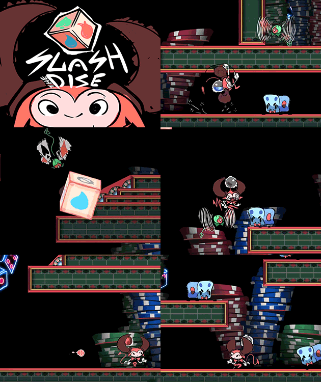
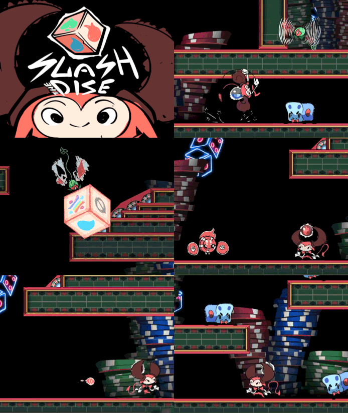
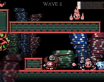
It's a Hack'n'Slash game with a dice that randomly gives your weapon an elemental power, elements may cause more damage to one enemy but may heal the other, it also have several types of dice with different chances for elements from balanced to chaotic.
Did your team create the vast majority of the art during the 48 hours?
Yes
We created the vast majority of the art during the game jam
Did your team create the vast majority of the music during the 48 hours?
No
We used pre-existing audio
Leave a comment
Log in with itch.io to leave a comment.



Comments
Certainly the most visually impressive game i've played of the jam. Excellent animation. The character controller feels good, the combat is pretty good and punchy. The only issue I ran into is that I wasn't entirely sure how the systems worked. Some die rolls, I would kill enemies with ease, other I could do no damage. So I would essentially be stuck if I rolled a fire weapon until I hit enough enemies for no damage to trigger a reroll. At least I think that is how it worked?
Thanks for playing and thanks for the feedback.
No, you won't get stuck if you get an element that heals the enemy. You see, the effect subsides when you attack, then in the current version, you can just beat the air ot other enemies to get rid of the unnecessary effect. In the future, we plan to allow the player to instantly reset the current element.
The presentation is just excellent, awesome character designs and fluid animations. Sadly, I couldn't get too much into it since the game was running at about half the speed of the GIFs on my machine. That amount of sluggishness to the controls really hurts a game like this. It sounds like other people aren't having this issue, which is great. My PC can certainly handle it, so I'm not too sure what the issue is.
Yep, that shouldn't happen! Don't mind if I contact you in the future for trying to understand that issue for the after-jam development?
Thanks for trying anyways! <3
Yeah, hit me up if you want to make sure that issue is resolved.
if you're playing this and like controllers, use JoyToKey (its free) and made this super fun
Thanks! Will add controller support in future versions!
First off, the art is freaking amazing! The animations are nice and fluid, too! However, i think that that the time between you pressing the mouse and the player attacking is too long for a game like this. Id recommend shortening the animation do that the response time is shorter. I also feel like you should add a background, like a casino or something, since the place youre fighting in just kinda feels empty. Besides that, Great job on this game! :D
Thanks for the feedback and for playing.
In addition to the environment, we had to draw a lot more, we simply did not have time to make the environment more lively and interesting.
Awesome job! Gameplay was fun and fairly polished. Great job!
Thank you!
The game looks amazing! The game play is fun but the flying enemies were a bit difficult to kill. Good job!
Thanks!
easily 5 star presentation
the art is amazing, and the sound effects are too
a different music could've been chosen, but it's not a big deal
as for the gameplay, i think the enemies are too hard by default.
it feels quite tedious to chase after them and get punished for doing so, especially with how slow the attack is.
other than that,
amazing work!
Thank you so much!
I loved the art in the game!
Although the enemies do need some tweaking as the people below have mentioned, they were fun to play around. Having the flyer always try to go higher and the fireball enemy always try to run away from you is a bit tedious when trying to clear out a level thought, maybe having them only adjust to you on a delay, have their "run-away" be a bit slower or just general player mobility improvements would help a lot.
I also wished there were a bit more chaotic effects for the dice like a range buff or something not damage related to create more variety in dies as I ended up relying on the x2 all die after getting frustrated at having to wait/attack air when having the element that heals the enemy.
In spite of that feedback, a very cute and enjoyable game!
Thank you so much for playing and thanks for the feedback!
Yes, we are going to tweak the enemies more in the future and add new effects to the dice.
I have to agree with the commenters - this is some fantastic artwork. The controls were also really well done for WASD/mouse on a 2D plane. I wasn't sure that the rolling did much for me, but the visuals and action made it so it really didn't matter - nicely put together!
Thanks for playing!
You should have read the game page or the tutorial from the game menu to understand the impact of the dice.
This game gives off an amazing first impression. The art and animations are all wonderful and it got me really excited to play this game. However, the gameplay felt a bit short. The enemies were all a bit hard to hit, especially the flies, since it's not possible to attack vertically. I like the idea of the dice, and it feels right because of the setting, but I did not feel like the dice did anything or gave me an advantage. There probably was just not enough time to make the visual component for all these buffs. Maybe I sound a bit too critical, but I really want to like this game, because it truly looks phenominal.
No prob, thank you for the feedback, will make sure to mind it on after-jam development.
I think this is one of the most memorable games I have played so far. The concept is cool but may benefit from a faster gameplay (faster rolls?). The presentation is amazing, very lovingly crafted. good job!
Thank you 😳
We will make gameplay faster in the release version!
I realy like the art style and the difficulty
Thanks!
I adore the art style! Moving around felt a bit slow but other than that pretty solid game!
Thank you!
A very interesting game. The sort of rock-paper-scissors aspect of it is quite engaging, and the RNG part wasn't too obstructive, which was a problem I saw a lot of games face this jam. I didn't really like how the combat felt personally. The attack animation felt like it locked me in a little too much (especially when used in the air), and I found it harder than I would have wanted to avoid getting hit while attacking (especially with the flying enemies). I think I would have liked it a lot more if that was balanced differently. One nice-to-have which I understand not being here would be more enemy variety within the elements, but I get why that wasn't there. It was a nice game all around, though. Good job.
Thank you for playing, noted your feedback!
The Cuphead-like atmosphere is really well done!
I may need a new pair of glasses, but having a black spear over a black background made me miss more than one hit 😅 I think there’s also a little bit of improvement that can be made to the transition between the movement and attack positions.
Hey, thank you for that comparison 😳
Yeah, we messed up a bit with this "black on black" thing, haha. We are planning to continue the game after the Jam, so will try to do all the needed improvements.
Thanks for playing and for the feedback!
Nice work on this! As others have said, the art and animations are wonderful and impressive! I liked the variety of enemies and the weakness/strength system (I used something similar in my game). It did seem like it took a while for normal attacks to do enough damage to enemies, so I wonder if speeding up the dice roll (even when not killing enemies) would make battle more dynamic?
Nicely done :)
Thank you. Also will check your game!
Awesome Game, Awesome Graphics. 4/5/5
Thank you!
Fun game, although the hitbox for the spear seems a little on the small side, and the flying enemies are pretty hard to hit anyway. Liked the idea of the elemental effects, though I wish there was a way to speed up the charging, maybe by defeating certain enemies or having pickups.
Fat 5 stars for Presentation!
Thanks for playing, noted!
Definitely a very interesting base with some incredible art direction especially for a jam game, but even otherwise. Some decent setup fort combat mechanics and a interesting way to mix it up in terms of damage.
Though I will say that the dice honestly felt a little more "bad" than good most of the time. Not just with the actual bad rolls which were interesting but mixed it up a bit, but more just, I didn't really run into a lot of situations where it was "needed" more so I could do it if I wanted the slightly increased damage sometimes. Which honestly I didn't super need. Though that might've just been since I wasn't clear on the actual damage?
Could be helpful to get the damage across more by having some sort of visual indicator of health possibly? Could help with that issue, though I'm not sure. It probably would be a little hard to fit in with the art too so maybe not.
One other thing I would say is it did feel a little.. slow I guess with the attacks. Mostly I think because there were a few trailing frames at the end that made trying to avoid attacks while attacking quite difficult, which to be fair. It fits some game styles so it may be intended to may attacking more dangerous, though for me it more just felt punishing, since there's not a very quick movement option for avoiding damage. Ex. a dash or a dodge etc. that would allow you to get out of the way at the end of those couple frames or so.
As well I would say the map layout, was a little hard, I'm not sure if it's just me being used to games having ledge grab like this, but I could not for the life of me reach some fo the jumps. I'm not sure if there's something I was missing with it, or just if they're slightly too tall, but I figured I would point it out.
To finish off I'd say at the moment, it doesn't really feel like the enemies scale too much with the waves, at least compared to the start. Or possibly they're just quite strong at the start, not sure. Either way though it ends up with the early waves, taking quite a bit to get used to to manage to get farther. Which I mean could fit, it's just a little hard early on.
Along with that there's not too much feedback on your "progress" throughout. Since really you just move around, kill enemies, repeat (and heck you have to hunt them, which is a little weird) and not much else. I mean obviously you get more dice, but there's no score or anything equivalent to give some clear "progression".
Overall though an interesting base for a platformer hack and slash that I'd be interested to see where else it goes. Especially when it comes to the art, but also with some more polished combat and mechanics.
Thank you so much for the detailed feedback!
In fact, the damage increases as much as four times compared to a normal attack. You can kill a deck of cards (a green enemy) with a single hit, for example. And yes, there was a flying text in the plans to give feedback to the player about the damage, but we didn't have time.
We were well aware during development that dash in some form is simply necessary for maneuverability, but we also did not have time to make it.
I think you're right, the initial wave of enemies is really too complicated and not much different from the others, and it feels like you're fighting the same wave. We will fix this in the future.
I agree, the gameplay flow is repetitive, we essentially gave the player an arena with enemies in which he can try different dice, there are thirteen of them in total.
Thanks again for the whole article! We will return to all comments when we finalize the game.
This was an interesting one. I enjoyed the combat but I wish the animations were a little quicker. Outside of that I would suggest giving the spear some more contrast against the background (it's hard to gauge my range if I can't see the weapon) and maybe increasing the frequency of the dice rolling. That aside, I had fun with this. The combat still felt pretty punchy and the animations were solid. Nice work!
Thanks a lot for the feedback, we will definitely work on this in the future.