Play game
studio apart(ment)'s itch.io pageResults
| Criteria | Rank | Score* | Raw Score |
| Aesthetic Flair (Graphics & Sound Presentation) | #26 | 4.154 | 4.154 |
| Relevance (Creative Expression of Theme) | #40 | 3.885 | 3.885 |
| Overall | #43 | 3.625 | 3.625 |
| Technical Excellence (Design & Engineering) | #62 | 3.346 | 3.346 |
| Immersion (Gameplay & Storytelling Engagement) | #75 | 3.115 | 3.115 |
Ranked from 26 ratings. Score is adjusted from raw score by the median number of ratings per game in the jam.
Made by One or Two People
yes this was made by just me / us
All Original Content
yes everything was made during the jam
Leave a comment
Log in with itch.io to leave a comment.


Comments
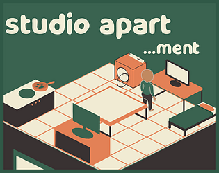
I really like this concept, would have loved different animations for the different tasks. The sound was well done also, and the overall style was very crisp. I could see with a few more tasks this getting very hectic!
Wow, nice and simple game. I really liked the sound effects and music. Also the art and animations are cute, though it would be cool to polish the player a little bit more (waving while sleeping lol). I also think you should get rid of 4h and 3h black tasks, the waiting is boring but otherwise very well done!
Interesting idea, liked the graphics a lot. I found interactions were difficult - I'd click on things and they didnt' always respond. I think with some fine-tuning this could be pretty fun!
I really like the art style as it feels so fresh. Also interesting take on the theme. One thing I would consider chaning/adding is to cancel current action. Can happen that you have clicked on wrong option and there is no way for you to cancel it. But I understand that, it can be part of the challenge. Also if you' d manage to add specific animations for each activity (but again I understand that the time constrains are hard, it is still good as it is now). Overall great job done
The gameplay reminds me of Devils and the Details on Jackbox. Good artstyle!
This game looks just lovely, the gameplay is straightforward and easy to understand, and the sound effects were just the icing on the cake.
I thought it will be a simple game but I was wrong haha. I didn't manage to fulfil all the tasks on time. I am more organised on second gameplay though.
I like the art, music and sound effects. Good job!
pretty cool game! beautiful art, the music is a banger, and no technical issues at all!
the system may seem simple at first, but organizing yourself to be closer to an object than another one & not doing the long tasks when you might get a white on before you finish is a real strategy you can use!
sound effects are funny and cute, the video game one is very awesome :D (pew pew)
oh and lastly, funny references to other games, so that's an extra point there :)
Nice! Solid little game.
I was not expecting this to be as hard as it was :0 The gameplay is really adicting too! But the best thing by far is the artwork and color pallete, super gorgeous :) Anyways great job on this one :)
Amazing presentation, and logo/branding design. Felt a bit RNG sometimes, but thats fine. Really good job for 72hrs though!
Nice game. I would really wanted such steak and eggs auto-cooker
Nice concept, a real-life simulator. i love the animation
The minimalistic style achieved here is something worth celebrating: It's incredibly polished! I love the palette and the sharp text elements.
When animating things like the text dropping and bouncing, along with the scene transitions, it might be worth adding some squash and stretch to objects to sell the motion, as well as some easing in and out to make the tweens look a bit more natural.
The gameplay of optimizing free and locked tasks lends itself to a pretty enticing meta-game, but Day 2 seems exceptionally more difficult to pull off when compared to 1. I'm curious to know how the tasks are chosen for a given day, as sometimes it felt like my day was riddled with locked tasks with high time requirements.
Regardless, this is great work! The sound effects in particular were very charming.
thank you for your feedback! about the task system: yes it's bad. it's supposed to go through all the tasks in a random order repeatedly but i probably screwed up the code somewhere. my goal was to make some tasks more/less common but, alas, i ran out of time. the only main difference between levels is
maybe this is something ill change in a post jam version, who knows. hope that clears things up
This game is really cool and has a really nice flat colour artstyle which I find quite visually pleasing, and I found the sound effects are, well... interesting. I just find that there is a lot of waiting around in this game, and that tends to diminish the fun, perhaps if there was some way to speed up the timer, or something like that the game would feel more engaging.
Good game! I love having some more smooth graphics from time to time! The room could've benefit from being a little bigger and also I would've made from of the things unlock only on day 2 or day 3 that way the player gets something new instead of always doing the same thing. Apart from that, really good job! It was fun to play
What a good little game! Lovely art and music, nicely polished, and really resonates with the tiny apartment life XD
The art and audio are wonderful!
I love the artstyle and the UI so clean and lovely colors!
This is really good, however I would've made the difficulty curve more gentle