Play Marty Tram
Marty Tram's itch.io pageResults
| Criteria | Rank | Score* | Raw Score |
| Art Direction | #13 | 4.282 | 4.282 |
| Innovation | #20 | 3.821 | 3.821 |
| Overall | #34 | 3.738 | 3.738 |
| Game Design | #56 | 3.641 | 3.641 |
| Fun | #58 | 3.564 | 3.564 |
| Theme | #171 | 3.385 | 3.385 |
Ranked from 39 ratings. Score is adjusted from raw score by the median number of ratings per game in the jam.
Leave a comment
Log in with itch.io to leave a comment.


Comments
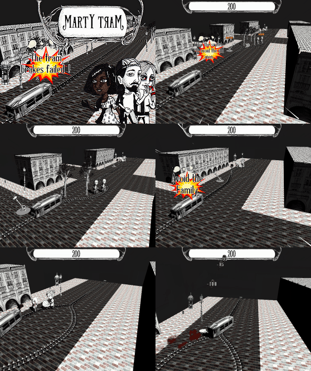
This was a very interesting and surprisingly dark game. the art style i loved and was similar to liek dont starve and really helped portray the dark nature of the game. was a really interesting concept and a lot of fun well done
Thank you for your feedback! 'Don't Starve' is indeed a source of inspiration for this project (i love their ArtWork).
Very nice! Reminded me of Ethics classes all over again. When playing on a slower computer though the game is very choppy.... which is usually to be expected but it is always nice if you can lower the graphics....
Thank you for your feedback. We take note :).
Oh. My. God. This was AWESOME. I bust out laughing when the guy says "WHY ME" haha. The art style reminds me of darkest dungeon for some reason. Actually I get a lot of darkest dungeon vibes from it - probably due to the unavoidable deaths. Really great job on this.
Edit: one suggestion, I would have preferred to have the option to use the left/right arrows to change the direction.
Thank you for your feedback. I'm glad you enjoyed it :).
I like the games concept a lot along with the art in it. I find the concept super funny and removes you immediately away from the dark part of what's actually going on. I found the trains sound pretty intrusive. The turning of the camera was a little jarring at first but I got used to it pretty quick. I think the only thing that I think could be approved on is making it more clear who's who, the old people are easy but its starts to get difficult to deciphers who's what.
Thank you for your feedback. :)
Now that's natural selection! :P Original idea, the art style goes well with this kind of dark but humorous atmosphere.
One little thing I didn't find obvious though is which characters have more value than others so maybe you could have a way to let the players know in level 1. (Unless I didn't see it)
Other than that I had enough time to make decisions which is pretty nice, I had fun!
Thank you for your feedback. Yeah, we'll still search a better way to make it more obvious. Thanks :)
The murderers feel a little random for me, I can't figure out who is who and the scene shaking like it does feels a little unpleasant. However good concept and art and I can see that there is some serious work behind this. Maybe add some wanted posters or something for murderers in a future update.
Thanks for the feedback. The shaking is supposed to be soft, I think it's perhaps a performance issue (I don't work on it at all).
The sounds are great, Very cool concept. Well done!
Thank you :)
Love the art style and sound effects. I found it a little hard at first to understand how the switch works, but after the first couple of levels, I got the hang of it. My only suggestion would be to make the switch stand out a bit more, at times it could be hard to see/control. Overall though, great job!
Thank you for your feedback. We will look at it.
This game is really amazing! I love the art direction, the attention to detail, and just really fun. The addition of brain eating people and zombies was a nice twist (although I kept losing when first introduced, and the level eventually skipped itself after dying so much. I went back and turns out to win I had to pick a path with more people because the track was shorter, but I wasn't to know that).
Any way great great dude! Such a cool mechanic!
Thanks a lot for your feedback. :)
This city has terrible public transit - doesn't help pedestrians like to hang out on the tracks though. Simple mechanic but interesting and had my attention until the end.
Glad you enjoyed it ! Thanks or your kind words. :)
Enjoyed the style. Sound effects fit the game. Don't like killing people though =)
Thank you. But you also spare a lot of lives ;).
very nice take on the classic morality problem :D
Thank you ! :)
The stylistic approach to the art, sound and classic moral problem was really nice!
I feel like clicking the track switch on the screen could be fiddley and took away time from making my decision, maybe having the switch as UI would help that, so its right there in front of you. This could just be my bad coordination.
Thank you for your feedback. We will work on it ! :)
Don't know if I should laugh or report you to the authorities lol! Fun and funny game. It made me laugh. Great presentation. Love the art, sound and camera.
Thanks your for your feedback ! Glad you enjoyed it :)
Surprisingly enjoyable game given the subject matter! It definitely made laugh and I really liked the presentation. great job!
Thanks you for your kind words ! :)
Now that's what I call a take on the trolley problem. Visuals are really nice. I wasn't expecting the brain eaters and zombies, that was cool the way it changed the problem from save the most lives to maybe take out a killer cause that'll actually save more lives. I felt like the extra paths weren't really necessary, I guess that comes down to me not being bothered to experiment but there was always a better option (even if it wasn't clear the first time) and those best options lead me down the path. I guess for maximum points you could kill more people now to later kill less people.
Anyways, really nice looking game, nice simple gameplay and an interesting idea. Nice work :)
Thank you so much for the feed back ! I'm glad you enjoyed it !
wow, the game looks great. The movement/animations/alerts felt really cool. the sound effects are awesome.
*I liked the idea a lot so I might have gone too far below*
Far-end clipping felt like a pro and con: it made the current decision matter more but also losing the level because of that felt unfair.
the mouse can be changed to some other icon or making a popup when it hovers over the switch might be great. but it felt fine after the first level.
SCORING/DEATH METER
the math model of scoring felt hard. I felt it can be toned down to 10's to make it look easier or maybe a comparative model like
a child is twice important than a person
old person is half important than a person
a zombie/killer might add to score or nullify the deaths of those on that track
hinting to make it easy
a moving meter that shows the better decision just seconds after you move on a track but not the entire solution so increase or decrease the weight of following decision.
the end:D:D
Thank you very much for this complete feedback. Indeed, the balancing need to be refine. In the first place, we would like to see forward for the choice's implication but the people were not quite visible. It's a good axe of improvement.
Pretty funny game. I like the hit effects and I notice the direction of the track changes with each attempt. Nice use of colours too
Thanks you very much for the feedback. :)
Looks very nice, i didn't expect to make choices between people XD
Thanks for the feedback! Yeah....i understand XD