Play game
A Long Night's Work's itch.io pageResults
| Criteria | Rank | Score* | Raw Score |
| Fun Factor | #15 | 3.682 | 3.682 |
| Overall | #19 | 3.727 | 3.727 |
| Audio (Does not apply for Physical Games) | #19 | 3.545 | 3.545 |
| Visuals | #27 | 3.864 | 3.864 |
| Originality | #48 | 3.091 | 3.091 |
Ranked from 22 ratings. Score is adjusted from raw score by the median number of ratings per game in the jam.
Is your game a video game or a physical game?
Video Game
Was your game made solo or in a team?
Solo
Did you use any third party assets, if yes what assets did you use?
A bunch of stuff (base models, soundfx, font, sprites) are free assets from kenney.nl, title font from google fonts
Did you use choose from one of the optional secondary themes?
A little bit of Build It, Then Use It
Does your game contain 18+ content (Nudity, Gore, Language)?
No
Leave a comment
Log in with itch.io to leave a comment.


Comments
I love how you pick up the enemy's resources to make yourself survive longer. I was already enjoying the game, but when I turned on audio it was top tier. Nice Game.
Thanks. Using the enemies resources to survive was the foundational idea I had when I decided to participate. The very first thing I thought about. I'm glad people are liking the music. I find myself listening to it again and again and it was fun to come up with.
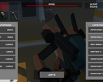
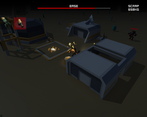
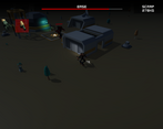
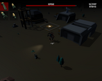
visual design was really good, but the camera could use some work; I found that enemies could attack you from far off screen, which made defending the base pretty difficult. I noticed it was also possible to lose the mech behind a building, and because of the tank controls, it wasn't always easy to get out. I would recommend pulling the camera out a bit, and angling it down more.
Love the visual design!
I love tank controls. And I love this type of game - dawn breaks and survived the night
Challenging, but fun to survive and get the upgrades - the radar is worth getting early on!
It would help to see the either the player character or the direction indicator through buildings as sometimes when the mech obscured I wasn't sure which way I was facing.
Overall great as a jam game, nicely done.
Really well made game, loved the music too! Excellent job!
The dynamic music, fitting UI and low poly aesthetic certainly make this game very inviting.
This game wasn't for me. Maybe the issue is I'm too easily frustrated, but it felt like a lot of small things added up. The issues listed by PixelMetalWolf are the start of it, but what frustrated me the most was the aiming. The aiming was more to point the face than aim the gun, as based on the weapon's position on the mech, the bullets would fly to the side of the crosshair instead of towards the center by what felt like a lot. I had to put in a lot of effort just to aim the gun correctly, and due to the enemies unfair range & aim advantage, I would get demolished easily. I'm fine with the mech's low health, but resources are so tight that it feels like there is a developer intended win strat that I'm not privy to.
The music was excellent, and I really liked the look of the mechs & environment. I enjoyed it aesthetically, but couldn't get into the gameplay. I hope this doesn't come off as too harsh.
The developer is totally cool with the feedback. I set it as a survival game, it was supposed to be challenging in a "I'm frustrated and never have enough resources/health/time" kind of way. Your feedback is all valid, and the game doesn't have to be for everyone. Glad you enjoyed the the aesthetic and the music.
Managed to have a lot of depth despite the initial simplicity! I especially liked the way the rock music cut in when the wave started.
The perspective made some waves much harder than they needed to be with the whole getting shot from offscreen thing, and not being able to see through or move through buildings made movement very tricky at times.
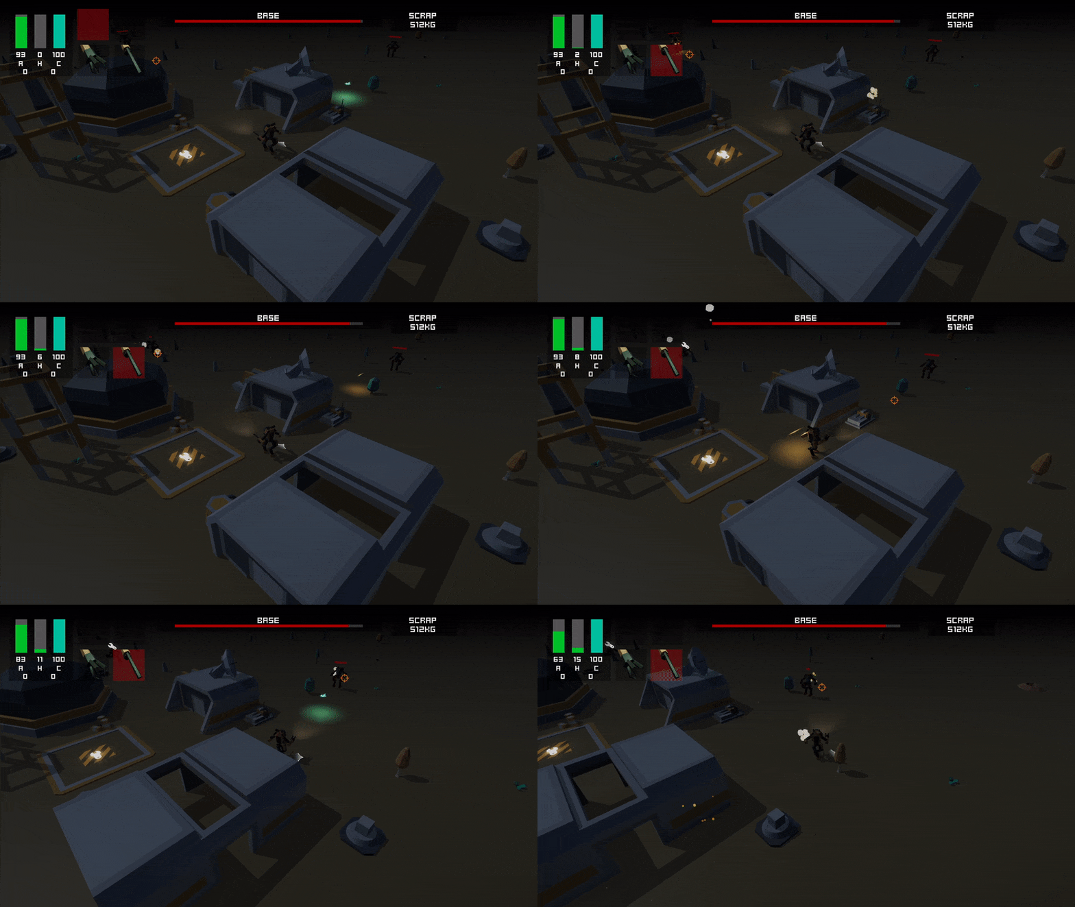
The basic gameplay loop works very well. I liked how little health the mech had, and how this forced me to use the buildings I was supposed to be protecting as cover, and how this provided more choices in the upgrade menu in terms of when to repair the base vs everything else. I was never very happy with the cost to reward ratio, but that might just be my preference or frustration with getting shot so much. I tried to offset this by buying another weapon, but I couldn't figure out how to fire more than 1 weapon at a time which to me is a missed opportunity.
Very solid entry.
There is no multi weapon fire. It was on the list from the very beginning (and it would look cool), but the balance was such that as you can win with a single gun, multiple weapons would have made it too easy. I also had to work the AI to stop them from firing all their weapons at once, which absolutely annihilated the player during development. And I never quite worked out how to handle the UX of selecting what weapon(s) to fire. Solvable problems though. I think I could tune weapons easily enough.
I get people's frustrations with firing off screen and the low reward, but that (and having to use your base to take some hits etc) was all completely intentional. It's about surviving by the skin of your teeth, not smashing through at the end with all the goodies. Making players question: do I fix things now, I try another round and make more money.
I appreciate the feedback, positive and negative.
Very cool. Top entry I've looked at so far. I really like the clean art style and the lighting.
Thanks, that's big praise to be considered the top entry. Glad you enjoyed
This is a really great game!
I really enjoy the process of enhancing my Mech.
Thanks, I'm glad you enjoyed it.
Great Game!!!! I like very Much.
Conratulations...
Thanks, I'm glad you enjoyed!
It's definitely possible to beat the game. The autocannon is my weapon of choice
I love the little waddling feet. It was fun unlocking and playing with all the different weapons, and I like the heat sink system. I think you could speed up the start by dropping more metal then, but overall really fun!
Fun seeing we used the same asset pack too hehe.
I survived 18 waves! Great work!
Hah, the waddling feet. I screwed up the rotation point and by the time I realised, I didn't want to go through the pain of fixing up the model, so making the leg movement look vague okay was such a pain. That was the best animation I could pull off.
I think 18 is more than I ever did. I only started counting toward the very end, it was one of the last things I added into the game.
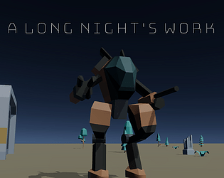
I like those very Mech Warrior inspired designs :D
and the dynamic music to alternate between attack waves and prepping at the base is also a nice detail.
Gameplay has some solid stuff, as well as some issues :
I like the fact that it's mouse aiming to have great precision, however i feel the angle you put your camera at doesn't really help, i think this could be improved if you put it a bit higher up and pointing a bit more down to get a better idea of the 360 area around your mech.
Also the enemies do seem to have quite an unfair advantage in that they fire imediately from offscreen and can take potshots at you and the base before you can really see them.
But on the solid side with the mouse aiming i'll add the neat arrow indicating your mech's front since you made the walking tank like and thanks to this it works well and avoinds confusion to as where you're facing ^^
Overall despite the small issues it's a cool game and i think with a few fixes it has some solid bases already in place, so good job to you :)
Thanks! One of the first games I ever played in depth was Mech Warrior 3050 on the Megadrive (Sega genesis). Mechs has always meant mech warrior to me.
The camera was something I debated about a lot. I actual had the ability to orbit the camera originally, but I think it complicated things and you could end up disorientating yourself. The unfair advantage was (as I send in my comment below) quite intentional, though it could probably use some tuning. I always started in my mind to have that isometric viewpoint but maybe the angle isn't right. I also originally had the camera further back, but I felt like the closeness and unfairness was a 'good' frustration. I'm happy to get the feedback though, it's worth experimenting with.
The arrow and also the spot light on the ground showing your body facing position are some of my favourite little touches.
Haha yeah it's an awesome game to take inspiration from i gotta admit (cause i kinda did too for my entry XD) even though i like both very Mechwarrior grounded designs, and crazy anime ones ^^
I agree that an orbiting cam could be a bit confusing so you made the right choice by having it fixed but like i said to me it's the angle rotation it has that to me felt a bit hard to judge depth when enemies are in the distance.
But like i said that's the only real issue on the gamefeel, the rest is fine, and yep the spotlight with the arrow indicator is really the best detail that helps tremendously :)
Great game, I liked the music. I'd suggest preventing enemies from firing until they're visible on the screen as it's a bit hard to fight back when you can't see them. Other that that a nice well rounded effort.
Thanks! I debated to myself about firing off screen, but I really liked the 'shocking' effect. I wanted it to make things feel slightly overwhelming to add to the tension. It might be a little too far off screen though! Glad people are liking the music, it was a lot of fun to come up with.
Love the music, the controls are clunk for the movement (the firing is great and rotation of the torso... i would limit the amount of rotation so that it is not a full 360 degrees, and keep like MW2 has it for something like the timberwolf). It is fun to play, did you make the mech assets yourself?
I'm not sure limiting the rotation wouldn't be too frustrating (too unforgiving), especially with mouse aiming. I thought about it, but as the waves increase it's move or die. I couldn't find my gamepad to test out that style of input. I will have to experiment! Yes I made the mech asset myself, hence the dodgy walk animation :p
I'm glad you found it fun!