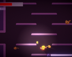
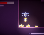
I loved the animations and general feel of this game! Particles at the feet and when you hit things it feels like it has weight, for instance.
Play game
Neon Blackout's itch.io pageResults
| Criteria | Rank | Score* | Raw Score |
| Sensory | #25 | 3.438 | 3.438 |
| Overall | #33 | 3.047 | 3.047 |
| Execution | #35 | 2.938 | 2.938 |
| Enjoyment | #41 | 2.875 | 2.875 |
| Metroidvania | #43 | 2.938 | 2.938 |
Ranked from 16 ratings. Score is adjusted from raw score by the median number of ratings per game in the jam.
Engine
Unity
Team/Developer
CrazyCow75, PigeonBubbleBee
External assets
SFX from mixkit.co, Font is Vermin Vibes 1989 by Chequered Ink
Prizes eligibility
LearnIndie, PlusMusic (Only best overall soundtrack)
Comments
I really like the UI work and the art, especially the interact prompt and the card designs, they were both very cool looking. The attacks felt really solid and weighty, and the platforming was overall pretty tight. I also liked the enemies and their overall design and the amount of enemies you throw at the player at once is at times pretty crazy. I think more environmental art would have went a long way here in making the style hold together better but also in making navigating the levels a bit easier as landmarks would help in remembering paths and whatnot. I also agree that generally the card mechanic could have been better explained although I'm pretty sure I figured it out. The soundtrack was overall solid, I think they loop a bit too soon though.
Very solid and good entry! Attack feels very nice, animation, sound and the push effect is well designed indeed. Character management with 3 passives to choose is realy cool and it can be seen you made a lot of work here. You can feel the increase in your own power, when you upgrade those cards. Great entry, well done!
Fantastic soundtrack! Embodying a little Jedi in such a simple and retro style was an absolute treat. Well done!
Really good hit effects and enemy sprites! I also like the song a lot :) Here's a recording of when I tried it at timestamp 1:33:41
This game is fun, the special effects look quite interesting, I especially liked the animation of damage to enemies. However, a sufficient number of bugs, as well as some flaws, are also present. In any case, the game turned out to be fascinating.
Very nice! I really like the artwork and general style; the enemy designs especially stands out as super well done to me. And the lighting really adds to the game's vibe!
I think that this would really benefit from a bit more direction. Even just something on the game page would be nice. I really had no clue what the things I was collecting were doing, and I couldn't really tell from the inventory screen what I had equipped or what some of the things there even were, despite the nice little descriptions. I know it can sometimes be annoying, but designing some simple little bits to tutorialize might not be a bad idea if you're up for it.
That said, not understanding everything didn't stop me from having fun and enjoying the art and music! Great work!
Very cool visual style. Certainly lives up to it's name.
The impact and game-feel of the attack is very satisfying.
The movement is a bit sluggish. Here's a rundown of what I gleaned. Sorry if I'm off-base with any of it, and it's just my own skittishness.
- Holding left/right doesn't persist between rooms.
It's a small thing but it did bother me. - There's quite a big windup on starting to move. Maybe it's a nice flourish for the character revving up, but it felt a little awkward, especially in a game where you need good reaction time. It's not super annoying, but it's just enough to throw you off in the heat of gameplay.
- You direction isn't locked during a dash.
- I think the game queues up dash, and given the somewhat sluggish response, I would sometimes double dash when I didn't intend too, mainly when fighting the final Boss.
- Assuming I'm right about the queuing, the game locks your direction when attacking so you can strafe, but I don't think it lets dash over-write your direction if it's queued up, meaning I sometimes dashed in the wrong direction.
The enemies were good, and it was fun to work around their interlocking attack behaviours, but given I couldn't find a value for those collectable blue cards, I spent most of the game just dodging them.
Actually, I have no clue what those gold capsules did either.
Really enjoyed the final Boss. (Thanks for that Checkpoint in the upper room; it made retrying not too much of a hassle.) Though, I can't tell if I beat it yet or not. It seems to explode for a few frames then the game restarts. So either I beat it, and that's just what the game does, or it has a death attack that keeps wiping me out. XD
I've got some gameplay to upload. Just know I did get a little turned around. That was partly because there weren't a lot unique things around to orient me (maybe add some Neon Signs if that doesn't muddy up the clean art-style too much) but also I was stopping and starting a lot between records so that probably contributed.
EDIT: Going up - MM21 - Neon Blackout 1/5
Hi! thank you so much for the in depth review! sorry for the unituitive mechanics. For the windup, the acceleration should be instant, but it might be a bug. You're right about the dash buffering, but unfortunately, we didn't have much time to tweak the timing of the dash.
The cards upgrade your cards, and equipping those will give you bonus effects. When you open your inventory, you should see your unlocked cards with their rarity, which starts at "RUINED." picking up a card will add one to that cards count, and collecting enough will upgrade your effect (e.g. the muscle card gives you +1 damage but collecting three blue cards dropped by the goblins will give you +2 instead).
The gold capsules are collectable items, which can be traded in to an NPC for bonus money/a new card.
For the boss, I think I know what you're talking about. The boss (if it was the first one you faced) has an attack when reaching a low amount of health where it will slam into the ground. You can dodge it if you look at its mouth and dash when it turns red (requires good reaction time, but we probably should've added more telegraphing). Defeating that boss will drop a weapon that lets you explore the second area.
For the neon signs, we wanted to add those but didn't have time (we also wanted to add lots of other things to the environment to help guide the player)
Again thank you for the long review!
The soundtrack sounded really good, movement needs a bit more polish, a some instructions on what to do would be nice... also I've noticed a bug in the home screen, if your not in full screen mode, when pressing 'play' it presses 'quit instead'.
Nice little game. My favorite part was the soundtrack, it really sets the mood. I also noticed a variety of enemies, which is not something you always see in MVM submissions. Like it has been pointed out, the font is a bit hard to read. Movement was a bit floaty, but that's just my preference. Enjoyed my stay.
Loved the main character! The controls felt pretty good and it was fun to explore different ways good job!
Nice character and weapon animations! I like the upbeat soundtrack. Maybe there could be more of an explanation for the abilities? I would also agree with the comment about the font being a bit difficult to read.
nice workkk, the fonts are a bit difficult to read but loved the enemy variation


Leave a comment
Log in with itch.io to leave a comment.