Play game
HORIZON's itch.io pageResults
| Criteria | Rank | Score* | Raw Score |
| Rhythm | #6 | 4.235 | 4.235 |
| Overall | #17 | 3.765 | 3.765 |
| Fun | #22 | 3.588 | 3.588 |
| Creativity | #23 | 3.765 | 3.765 |
| Sound | #29 | 3.706 | 3.706 |
| Visuals | #43 | 3.235 | 3.235 |
Ranked from 17 ratings. Score is adjusted from raw score by the median number of ratings per game in the jam.
Did you use the theme? If yes, what is your ___ in "every ___"?
Every 2 or 4 beats (depending on the difficulty) the direction you hit notes in changes
What was your team size?
5
Leave a comment
Log in with itch.io to leave a comment.


Comments
A tough challenge for sure!
the speed of the game is quite something, but if you're fast enough, it's quite something!
Excellent implementation of the leaderboards and scoring system (though I wish I was able to get higher than D :c ). Slider moving up and down paired with the notes slowly fading in makes the appearance of new notes excellently smooth.
Criticism-wise, I'd definitely add a level or two on the lower side of the difficulty, because the game feels genuinely overwhelming for some with limited reflex :/ Another thing is the lack of punishment for pressing a note when it's not needed - I could land decent scores by just mashing all the keys as fast as I physically could - there is no safeguard against this kind of cheating. Still, very solid entry, was it not for the low amount of tracks, I could've mistaken it for a fully released game, with how smooth and polished the core gameplay loop is!
This game it actually pretty pretty good! I like the mechanic even though is hard to get use to it, but when you do it's really fun! I would have at least a mode with less notes but overall really nice game! Nice job!!
Nice! I like the music and the beat. the problem is 6 keys are much harder than 4 keys I guess, I need to do some calculations in my mind to realize which finger should I use haha. then I just gave up and press every key when there is a key at any time. This works somehow, but still, 6 keys are harder to read lol.
Love that you make people do the tutorial first before jumping into the game. Visuals and scene transitions are smooth as butter. The gameplay is on point. I can't play it because I'm doo doo butter at rhythm games, but it feels tight enough to be on point. Also you implemented a leaderboard too??!! Y'all are crazy. Solid submission for this jam!
cool! :)
I only wish it was a little bit easer. (I'm founding out this jam how bad I'm at rhythm games hahah ;p)
Yea I went from bad to decent in this genre in name of testing I feel you .
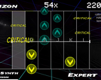
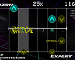
This is a really really cool concept for a game and I see you put a lot of thought and work into it, but I sadly just can't play it, the visual clarity is kinda lacking, especially in higher difficulties. I tried hard to read the notes that were coming, but I just couldn't. Just the overwhelming amount of notes on the screen by itself was very disorientating, even if the notes that were in the different direction were grayed out a bit. I think maybe the notes that were at the bottom and top rows don't need the arrows, I think that that just makes it a bit more confusing. Also the controls felt natural to me, because that's how it's done in most 6k mania games, I didn't think it was confusing like others said :P
But, still, even with the screen clutter, it was a very enjoyable experience, and I love the idea, good job! :)
Agreed - the readability situation for notes that don’t need to be hit yet needs to be improved, especially for notes that sit on the very top/bottom of the field. Options I’ve considered but didn’t get to implement were greyscaling irrelevant notes and adjustable options for the game’s equivalent to Approach Rate (currently you get 2 “scans” of lookahead, with less visibility for notes in the 2nd “scan”).
Thanks for the feedback!
Really cool idea! I think that since the game is really visual (yellow and blue arrows have a strong meaning), there should be a visual cue of the beat or more lines to indicate the beats in the bar.
Nice entry, well done!
Very nice game. The only complaint I have is that the keys are separated for both hands and I'm unable to play like that lol, I kept pressing G or H. Solution would be to either visually separate the keys for left and right hand or add an option to have them all inline on the keyboard, without separation.
Other than that, everything is great, good game.
Yea, even i faced that for a bit before starting pressing all keys and put your fingers on the buttons , and the dead time before a round really starts really helps on that
Agreed to the idea of separating the left/right sides of the field - this would visibly separate lanes in a way that doesn’t resort to making lanes different colors the same way other rhythm games would, which we didn’t do due to the reliance on note color for showing hit direction.
Thanks for the feedback!
I suck at this game - I wish there was more difference between disabled and enabled notes because I just get so confused. Also I wish the buttons were closer together.
a well-polished game with the original mechanic of up and down arrows! the leaderboards are a nice touch :)
I initially found the controls to be quite difficult to use and I kept having the notion to press on the keys between F and J. After the second time playing the same level I started to get used to the controls and found the game to be more enjoyable. I don't know if it was intentional but it's quite clever using the 'home keys' (F and J) as most keyboards have notches on those keys.
I would probably start the first level with maybe only four collumns (D,F, and ,J,K) to get new players used to the controls. I noticed I would hesitate a lot when I saw any of the markers at the very top or very bottom since I couldn't quite figure out what the right timing should be since the icons indicated a direction (up or down) but I wasn't sure if it made a difference.
Including the highscores was great for adding re-playability and made me want to try to improve my score.
I'm going to start this review with a fact: I suck at this game. I made it onto the leaderboard of dark synth at the basic level, a moment I will cherish forever; I am sure that as rating picks up on the jam I will be pushed right to the bottom - if I wasn't there already. As such, I had more to say about the things that I struggled with, but do know that I tried multiple times and the game itself is very good.
My main struggles were with the control system. I tried both control schemes offered, and they had their own pros and cons. For example, the SDFJKL option was really good for hitting sets of two adjacent notes. However, for more wild note patterns it became confusing which key to press. On the contrary, the QWEIOP system felt more natural with wild notes, but due to the large gap adjacent notes down the middle were confusing to hit. However, as I said I am not skilled at all with this game, and for all I know this could be a very common control scheme that works perfectly well in the hands of more talented players.
I think my brain was sort of leaning towards either an ASDFGH or ASDGHJ control scheme - having all the keys next to each other would make it easier to deal with notes very far apart as you wouldn't have to think about the gap in key locations and for one reason or another my brain kept offsetting my fingers so that I ended up pressing A when I actually wanted to press S. I guess I'm just too used to game controls being aligned right at the edge of the keyboard...
Moving onto the gameplay... showing the next set of notes was appreciated, as it gave me time to prepare my next move. However, as soon as things got more complex I got overwhelmed trying to separate what notes I'd need to hit now and which ones would become important later. Although you lowered the opacity of such notes, the bright colours meant that I could hardly take my eyes off them. That said, it's currently 11PM - roughly the same time I took a hit to both Icicle Fall and Rainbow Wind Chime - so maybe my lack of concentration at this hour did not help with that; I might try again at an earlier time to see if it changes anything.
On the other hand, this game was greatly polished. It had a good selection of songs to play of various difficulty and the UI was well made to not distract you from the main rhythmic focus. Very good work overall, and I suspect that most of the problems I had were simply skill issues.
" either an ASDFGH or ASDGHJ control scheme - having all the keys next to each other would make it easier to deal with notes very far apart as you wouldn't have to think about the gap in key locations"
Won't work since we have 4 really good fingers (since thumb reaching which fingers level is kinda weird feeling) this would eliminate the combo moves we could perform if we try the game one handed.
If we choose to play two handed the index fingers of both hands would rub against each other and would cause annoyance and missing of tiles by sometimes since the one of fingers could touch and make the other miss , this would be annoying.
SDFJKL is better for this since most keyboards have small notches that can be used for locating the keys in hurry. Hopefully this comment helps you to understand the design decision
Honestly, we chose the SDFJKL scheme because it’s a common 6-button scheme that works well, doesn’t require a numpad, and on many keyboards has nubs on the F and J keys. A scheme like ASDFGH was not considered though because of the way it would put both of your hands on the same side of the keyboard (uncomfortable, in my opinion). Rebindable controls would go a long way though…
Thanks for the wall of feedback!
really hard game but at the end its fun
one thing that made this too hard was the keys, i think the arrows/w,s,a,d would be easier and make the game better.
the only think that was a little too hard was the keys, all of the other things in the game was amazing
great job
That was SUCH a unique concept! Loved the idea and most of the execution. Would have loved to see a few more pixels on the arrows. They are pretty low-rez. Also nice touch with the online leaderboard. Really makes me want to git gud.
Seriously why is there always a danganronpa character profile pic person in every server related to game making or pc games .. and now even itch ..
I really like the series but, this is a mystery to me .
Unfortunately the notes themselves were pretty low-res to begin with and not having any other options to fall back to at the time, so I had to choose between keeping them blurry to keep things consistent with the rest of the game (no pixelation, aside from the pixel fonts) or pixelate them but make them stick out. I would definitely go for smoother, high-res notes given the chance.
Thanks for the feedback!