The grapple physics in this are pretty fun but I couldn't find as many places in the level to use it at max speed to get that feeling. I also think it would be more fun if the grapple hook moved to its point a lot faster so I could do a bunch of quick mid-air grapples.
Play game
Carlo's Trip in the Underworld's itch.io pageResults
| Criteria | Rank | Score* | Raw Score |
| Theme/Limitation | #19 | 3.815 | 3.815 |
| Overall | #71 | 3.163 | 3.163 |
| Fun/Design | #72 | 3.259 | 3.259 |
| Technical Implementation | #73 | 3.000 | 3.000 |
| Music/Sound | #86 | 2.889 | 2.889 |
| Graphics/Animation | #107 | 2.852 | 2.852 |
Ranked from 27 ratings. Score is adjusted from raw score by the median number of ratings per game in the jam.
How does your game implement the focus, Multi-Use?
The game includes a multi-use tool and the mechanics revolve around the choice on how to use the tool
Team Size
Completeness
What tools did your team use to construct the game?
Unity, Paint.net, Chiptone
Which art and audio did you / your team NOT create?
Music and some sfx
Which art & audio did you / your team create BEFORE the jam started?
None
Which diversifiers did you use, if any?
We don't need pixels
Comments
Really good game. One of the more interesting platformers in the jam. I'm not sure buttons were taking me to the right levels, though.
The difficulty was a bit high for me. I couldn't beat all of the levels.
A couple changes I think would improve the feel of the game:
- Touching a wall prevents you from pulling in the grappling hook. Maybe make it slide the player along the wall instead of just stopping.
- When you walk/jump/fall with the grappling hook in the air, the hook moves with you making it difficult to aim shots while jumping. I think the hook should maintain its own trajectory even when your trajectory changes.
Lots of good work here. The swing was really nice and nice implimentation of the theme. It really lacked juice on the moevment. It all felt a bit flat and that is where I would focus my attention. It was challenging and a good experience other than that. Good job
really cool use of the theme! and it reminded me a lot of a game called grapple dog. the level design is great and it was nice figuring out the best path to beat the level! :D
Nice game, I liked the mechanic!
I do believe that the difficulty was a bit high, at least for me. I think it was because of the combination of the grappling left/right and up/down + the need to time the jumps - I found that not so easy, even in the tutorials.
I think there's a lot of potential with such mechanic, and one thing I learned in the previous jam is that what might be easier for me, could be much harder for others (especially if I play my game all the time when I build it, and just get good at it eventually, and others obviously play it for the first time in the jam). So, if you intended for the difficulty to be this high that's alright by me, but if you didn't I think its important to keep this point in mind.
Good job overall :)
The game was a little bit difficult for me, but I am really bat at skill games so there is that. Nevertheless, I liked the visuals and the grapple implementations was really good. Congrats!
This was a good game! I had fun with it. The difficulty early on was a little high, but great use of theme. The grappling tool was fun to swing around with. It was a bit tough to control the swing because it was pretty quick without much control of how far you were going to jump. I enjoyed the music/sfx. They definitely felt retro and fitting of the environment . Very well done!
This is a nice use of the focus. I found the platforming a little frustrating (it wasn't clear if some gaps could be jumped or not, and it needs some coyote time), but I managed to finish all of the levels. I like that there are multiple paths to solve a level. I would prefer it if missing a shot with the hook didn't waste the shot, and also if you could still shoot when you have one shot left instead of just dying. Swinging on the hook felt good though, and it was nice to be able to zoom out and plan a path. Good work!
I liked the idea of the grappling hook i like the art the sfx and the music and unique approach to the theme , one complaint is jumping sometimes you can somewhat you can double jump some times I cant get over anything , but thats fine , I gave you a solid rating 5/5 for everything the game is fun to play and thats enough for me!
I loved the game a lot! And I liked the fact that we can swing around using the grappling hook and laser enemies AND destroy crates. It was a very fun idea and a very fun game to play, though I thought that the controls were a bit unrsponsive. Hope to see it on full release!
Cool game with a lot of potential, but my main issue is that the character's movement feels really sluggish. Also did you forget to add colliders to the metal crates because on tutorial 2 I watched on fall through the ground lol.
Thank you for your feedback! Could you elaborate more on what you found sluggish? Was it related to the character speed or more to the swinging movement or something else?
The crates have colliders but for some reason some of them randomly fall off the world lol. This didn't happen in the editor and only after exporting the game, so i didn't have time to correct it after the upload. I should have probably done more tests on the target platform lol.
Nice implementation of the focus. Reminds me a little bit of the hookshot from Link to the Past (my favorite item in that game).
The swinging mechanic works well. Unfortunately, the controls are not always as responsive as they could be, and I had many falls that I thought should be avoidable.
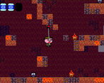
The character sprite seems somewhat blurry; I wonder if you imported it with the wrong resolution.
The music is cool at the beginning, but gets repetitive pretty quickly.
Here's a bug: A couple of times, I fell into the lava but didn't die.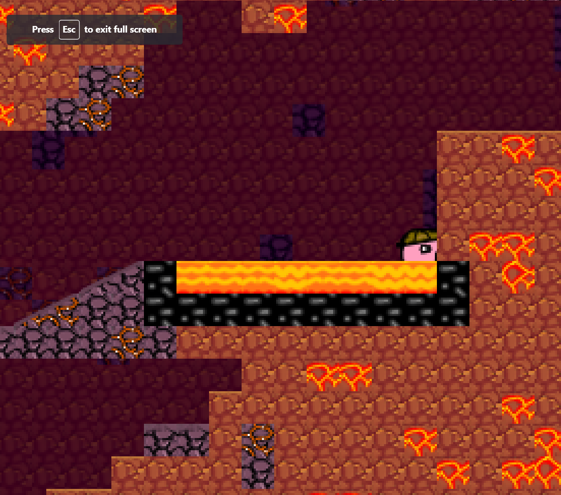
Thank you for your feedback and for reporting to me the lava bug. I'd like to implement a jump buffer so that even if you are a bit off the edge of a tile you can still jump, so maybe this will help avoiding frustrating falls. I think that the sprite's blurriness it's because the camera is really zoomed in but the resolution of everything is 16x16 pixels, so pixels are quite visible.
Lots of fun! its got potential for sure. only thing I came across that seemed a bit off is dying on using the last grapple? Maybe this was done by accident but it feels off to die when I have one hook shot left over. BUT very good I enjoyed the game! :)
The game has promise, but needs a lot of work. the dichotomy between the walking speed and the jump is almost too much. it feels like the character is constantly slogging through mud. the range of the grapple also isn't clear until you try and fail, so some guide showing just how long it is would be nice. lastly it feels like I kept running into the side of blocks instead of swinging onto the platform I needed to reach.


Leave a comment
Log in with itch.io to leave a comment.