Indie game storeFree gamesFun gamesHorror games
Game developmentAssetsComics
SalesBundles
Jobs
TagsGame Engines

CatPrisbrey

46
Posts
108
Followers
10
Following
A member registered Apr 18, 2022 · View creator page →

Creator of

Recent community posts

(1 edit)

I think that's fair for sure. Even if this were something more generic too its be handy on my end. I already use your village generator this way, but if it were adjusted it'd be evnn more handy. Like, rather than similar shaped/sizes of homes, along curving roads-- having a few key/large buildings, that smaller buildings or props procedutally arrange around, and perhaps not on curves or a circle but on more square grid based rows?

Somewhat emulating a town square w/Town Hall buildings, or a school/gym/library that then smaller buildings, trees, parking or parks would arrange around. University campuses tend to imitate small urban layouts already. Like mini neighborhoods

All your generators are amazing and I've used them for inspiration of several game layouts. Which brought another idea to mind. Sorry to play the idea guy right now, but a 'facility generator' would be handy. Something that produces layouts of schools, universities, military bases, airports, hospitals, etc.

Examples of things it's shuffle would be parking, maintenance area, supplies area, administrative/public facing areas, scattered buildings, commissary/cafeteria, field grassy areas, fenced areas, etc.

The games areas I've worked on lately have needs for complete facility areas and your generators immediately came to mind.

Glad you dig it!

I check back here pretty regularly hoping to see more details on the 1.4 roadmap. Fill us in on how things are going when you get a chance! :)

I've been using your app for a while now and was inspired to make one similar for character design. Thanks for all the inspiration!
Character Idea Generator

(1 edit)

Thanks, Controls were posted on the itch game page, and the current objective is on a label above where to go all the time. (The big "OBJECTIVE: REPAIR SATTELITE" label)

Thanks for playing! Agreed on the oxygen meter, i probably could have turned it off in the pre-crisis scene. I consider the pre-crisis scene to be the tutorial area. It gives you about 500 seconds to figure out controls and get to the satellite. Once you're there, it refills to 100% after the crisis once the true level starts to give you a full chance of survival back to the ship. I hoped that was enough tutorial time for folks, while also keeping them from meandering around too long and testing the limits of the level's bounding box. But also... easy to stop it from ticking pre-crisis.

Curious and funny. Made me nostalgic for old point and clicks

Really a unique take on the theme. Well done, funny, interesting, unexpected. The music, art and play style were very cohesive and had a lot of charm.

Surprisingly entertaining! I really enjoyed it. Great music and audio too!

Interesting game to play, felt very original and loved the audio.

Some tutorial or explanation would have been VERY helpful. At the start of a new mechanic it's good to handhold the first use of it. I wandered around throwing watermelon at nothing for a long time before realizing there were animals to be fed. It wasn't clear to even be on the lookout for it.

Something as simple as once the watermelon / pineapple, etc is picked up the first time, the camera is forced to look at a creature pop up, Maybe even show a label for a moment like "It looks hungry"

As simple as that and you'd be golden. Level two was very pretty, i'd almost say lead with that one too rather than the library. Much more engaging environment to be in.

This game was a blast! It thought i wasn't going to win there for a minute (that last level with the BIG black hole is really great). I've played a bunch of submissions this week and this one was at the top for fun value. Great backgrounds, appropriate audio, on theme. I think the only thing it was missing was a powerup! Rapid fire, a AoE missile/bomb, or a stead stream laser or something.

Really great work though, very fun!

Thanks! I used MaterialMaker to create all the textures (fun fact, almost all are only 128x128 pixels haha, UV scaling for the win), and the shaders are mostly simple clamped noise, moving over time with emission.


Worked real well for making a space sky for very cheap and keeping file size small on all models.

Haha yeah, the gyro and thrusters are best done it short bursts, and then pause to gauge your new velocities. The draining Oxygen adds a sense of urgency but the trick is to stay calm and make careful moves. Our game can be quite boring and short if you just remain chill.

I'll still check your game out still during the jam. Everybody deserves a chance to have their game voted and played.

The challenge is purposely the the Newtonian style controls. It's unforgivingly accurate when in space you can't over-do rotation or acceleration. Otherwise the game would be quite boring and quick.

I'll check out/rate your game for sure

Short but well done! I didn't realize it was a reflex based game at first and got my butt kicked the first time. Wish i were longer but what was there was top quality.

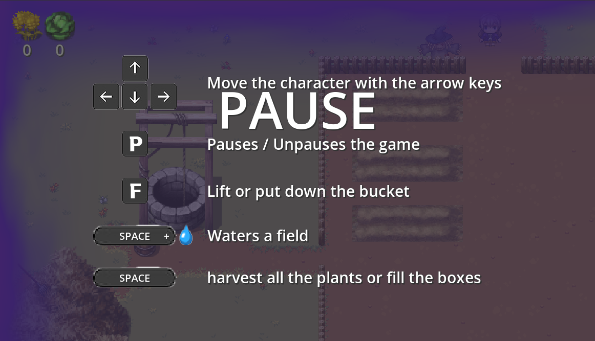
 I tried P, as well as left the game up for the whole time i was typing the replay, taking the screenshot, etc. It didn't go away unfortunately. Could just be Firefox, it can be wacky i've found. I'll try on another.

Hmm, having an issue making it unplayable? The game loads, but immediately shows the pause menu, and doesn't let me leave it? I hear music, the screen scales if i change the size, but it's just none of the keys shown, or mouse clicks or ESC or anything are responsive. Playing on Pop_OS Linux, in FireFox, 1080x1920 resolution. Music sounds nice though :)


Mixed feelings about this one. I loved the look of it and the feel. Great models, great textures with the hand painted look which went well with the music. Great looking shaders on the item picked up, etc. Visually great all around, and immediate world-building that worked! But then the other aspects didn't hold up,:
Animations with no blending, the jump action out of sync with the animation for it. The entire level restarting at each death rather than checkpoints before obstacles. Obstacles you can't beat without losing to them first because they didn't seem like obstacles in the first place (looking at you sinking bridge! what a bait and switch!)

It just felt aesthetic and mood were great but the programming didn't match it in quality. Lot of potential here though! Whoever is doing the art, and world building, you're stuff is on point! :)

This game jam had folks asking about cinemas too. Maybe i should do a few move videos... ugh (i'm no youtuber. I like helping folks out, but one video always ends up being 3 more. Takes away from dev and hobby time, haha).

Great ambience and mood, great music and sound, properly difficult, great mechanics that make sense. Just... phenomenal all around!

 Haha, agreed. I really wanted to add a controls page on the pause screen but just ran out of time.

Controls are posted on the game description page on itch though. Not much to it though. Rotate using the arrow keys, spacebar goes forward, tab changes camera.

All the cutscenes are literally just using the built in animation player. I made a few animations for the player to repair things in place, duck and cover, looks surprised etc. But really all the movement around and everything else was just the animation player cueing various actions to take place in order.

Blend trees can be tricky to learn at first but once you get used to them you find they speed up your work and you have to spend a lot less time managing animations. ESPECIALLY if you commit to root motion and using AnimationStateMachine Nodes. it's like cheating haha, animation driven movement can end up saving you so much programming time. I have some videos and templates on that sort of stuff if that's handy to you (here on itch, and they link to youtube)

The baked lighting though! I think for your game itt would have been killer. Like throw some windows on  that house, and a dark skybox, then bake the lighting, and add a reflection probe too! WOW it can make a game look amazing fast. Especially int he case where you're a first person ghost and so dynamic shadows don't matter so much. It'd be really great. Let you add more ambient dramatic lamps or something, push the look of the candles, etc, all while saving on performance but turning off dynamic light.

As for music, i think just some a light, spacious, gentle, high piano part. Something just noodling some nodes lightly would be all you'd need to get the ambience of a sad, lonely home.

Very cool, this was my first introduction to Jolt physics in real gameplay. Thanks for making this!

I enjoyed this, very cool. I ran into a few small visual issues ( i think at some point i must have thrown off the female's rotation, she kept sitting facing the wall, etc). But overall i enjoyed it. I think some light background music could have been nice, and I bet you could have added more dramatic lighting that was baked to up the look with little performance cost. This was very cool even still. You got yourself a follow! Looking forward to checking out your other projects (and future ones!)

Cute! Had a lot of waiting around though (for the repairs, and for the black hole to swallow me) but still a cute game.

Fun to play! Enjoyed it a lot. I see in the comments i wasn't the only one who couldn't figure out why the special attack 'wasn't working'. I think more visual or audio feedback to the player could have guided us better to hold it down.

Both of us are also musicians so we lucked out there. She recorded all the cello and piano and I mixed and produced it. She made it easy though! Talented musician for sure!

(1 edit)

Controls are the whole challenge! :) The code is entirely physics based, and movement in space is unforgiving. It's Newtonian inspired where if you give it too much gas or lose angular control you will stay in motion until acted upon again.

(1 edit)

The controls are Newtonian which gives it a good challenge. If you start rotating or moving, you don't slow down or stop until acted upon by another force.  Getting used to them is mostly slowing down, and planning carefully how much forward or rotation force to apply without over doing it.

(1 edit)

Thanks so much! We're glad you enjoyed it! ( i see from playing through your game, we VOID them brought us both similar ideas!)

Thank you! Graphics-wise it was checks and balances. Keeping textures small and models basic gave us the liberty to crank up some exaggerated lighting and shadow effects.

And no brake, thruster only goes forward! Gotta plan those moves! Thanks for playing!

Really a horrible way to go

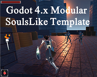
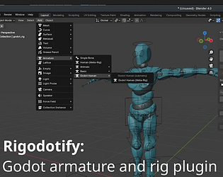
I've already written a root motion controller for soul's likes already. I use my own Blender plugin Rigodotify for rigging, which creates a miximo/unity/Godot compatible skeleton from a Rigify base. And it includes root bone. So I'm good actually.

I used to use the mixable animations, but I don't like how they're commonly found everywhere, so I try to just make my own now.

It's funny how fast we can progress in game dev. I'm already upset with this template. It's still too complicated and long winded...

I may rebuild it again here soon. Honestly using root motion solves a LOT of the complexity.

Handy for packing what data you want, and where. Some engines support the channel splitting controls better than others, so mileage may vary!

Love it. That sounds great! Skill systems and inventory systems can be very intimidating when folks are first starting off. I know I enjoy a good tutorial on them, so if you're making a template for Diablo-like games, I'll look forward to checking it out!