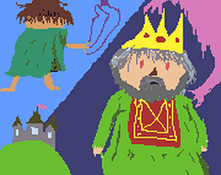
I really like the look and feel of the game. Everything is smooth and works properly. The controls are responsive, and the animations look cool. The sword swing is a little slow and there's no indicator for when you get hit other than your health going down (the boss had a slight animation but was a bit hard to discern); and, the game is very short, but there's clearly a good game here.
MoonPanda134
Creator of
Recent community posts
I liked this game, but there wasn't any clear direction. I originally thought you couldn't go over the sand dunes because of how steep they were. I like the clear progression system. I would've liked a run/sprint button and the mouse controlling the camera would stop if you went too far one way. All of the interactable items lit up when you could use them, but your mouse had to be directly on them instead of just looking at it. I also didn't notice either of the themes besides the sand hills you jump over.
I liked the concept of the puppet master hand (I also liked the movement of the hand). There was no response when picking things up, and when you dropped them, you might also pick something else up at the same time. There was also no sound or progression. I liked the movement of the little puppets though.
The movement and shooting were smooth and responsive. The potential of having to dodge a bunch of bullets flying at you while attacking is also really fun. The sounds were really mumbled/hard to hear, and the range of the gun isn't as far as the enemies (at least that's what it seemed like). I liked that you made the enemies and bullets different colors to differentiate. I would've liked to have seen more of the theme implemented.
The game was simple to control, and I liked the style/layout. I don't understand the use of a timer and laps and scoring. The game was also very unforgiving, sending you back to the beginning when you crash. The theme only played while the double coins was active, but it isn't active for very long; so, you don't get to hear much of the song.
I really enjoyed this game. I liked the movement, gunplay, and everything felt smooth. My problems with the game: you can fall off the edge, no health indicator, spawn indicators for zombies are too small, zombies are too fast, zombies blend in too well, and there weren't any sounds. Weirdly, the music fits really well. (Also, I like the background)
This game was a neat platformer game. I think you should've given a bit more space between the start of the level and movement of the camera. You could also jump as soon as your character 'reached' the next platform instead of when they landed on it. Effectively you could just hold up and you'd stay at the top of the screen for the most part. There was no reason to jump to other platforms, so with a few obstacles and more time to react this could've been even more fun.
The art style was surprising, because I wasn't expecting a horror game based on the story (good surprise). The movement animations lagged behind actual movement; the projectiles fall behind you, and there isn't any progression (nothing happens at the end). With some sounds, an ending, working projectiles, and smoother animations you have yourself a fun little horror game.
The game was fun to play and there was progression. The art was good, but the animations sometimes played wrong (for jumping it would use the moving animation). The camera moved a little too fast to follow the character when moving slowly, and the collision boxes were wonky and all over the place. Also, you take 3 hearts of damage at times instead of one (not sure if intended).
The sounds, music, and environment are all good. The movement was fairly smooth, but I would've liked to be able to change how far I could jump. At the beginning of the game, you should've put an arrow pointing right, because I just had to guess there was something further. I also kept getting stuck on the walls, and the platforms weren't very precise in respect to how they looked.
The game fits the concept perfectly. The movement of the character was smooth and reactive, though you probably didn't need to add a jump. There doesn't seem to be a way to lose and some of the objects were spawning off of the map. My only big issue with the game is that objects don't interact with the player.
I liked the music and the movement felt fairly smooth. The art probably needed different colors. It was hard to differentiate between the floor and background, also where the platforms began. You don't have any indicator of taking damage from enemies, and I would have liked to have been able to aim my shots. (I also jumped at an angle towards a platform and flew through the map)
Neat little game. I liked the art style of the character as well as the animations. How you used the music was also unique. The character movement also felt smooth even when going up steep slopes. The bad: there was a bit of a cut at the beginning of each loop in the background music, and the lyrics could overlap. The view also doesn't show where you are going when you jump of each little 'section' and there's no text tutorial explaining that the green boxes do anything.


