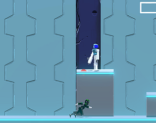
Thanks for the feedback! Some of the animations (mainly the attack anims) were rushed for the demo, I do like the 3-hit combo so I won't be removing it but I'll definitely be going back to them to polish it up. A few other anon's mentioned the jittering as well, it will be a priority to get that fixed up. I haven't thought about implementing a smooth camera but I guess it is common in 2D games for a reason. I'll test it out to see if I like it.
Narwaffles
Creator of
Recent community posts
Thanks for the feedback. I have no idea what exactly could be causing the character popping out. One other anon mentioned this as well, but I can't seem to replicate the issue, I'll definitely do a deeper dive into the issue since I do, do some weird shenanigan's at the start of the game to initialize everything, obviously something happening there doesn't work on every system. I might go study up on color theory, the colors on her were picked arbitrarily at the start (I thought it looked ok-ish) so I'm not shocked to hear that it doesn't agree with a lot of people. I do intend to use the mouse to aim some future abilities which is why I defaulted to the mouse, I don't know if I'll get that far for next DD, but I'll add keyboard only bindings regardless. I agree in that it's probably a good idea to have as a temporary solution until I add rebinding. I'm glad you like the models, I never worked on humanoid models before so making them for this game was my first time. They were the first thing I worked on (I know it's stupid but I felt pretty strongly about making a "character" first) I ended up spending 2 weeks on the main character model lmao.
Thanks for the feedback. I definitely plan to go back and polish up the animations, most of them were kind of hastily put together to have something for this demo. I'm happy you enjoyed the boss fight, about half of the development time so far was spent on the boss/cutscenes. Glad you see the MGR inspiration in the cutscenes
Thanks for checking out my game. The thought process behind dash costing HP is that the "HP" isn't actually hp. I called it that for simplicity in this version but it is supposed to be an F-zero style shield/energy bar. You die when taking a hit after reaching 0 shield. There is also a plan for you to be able to recover "HP" when hitting enemies and using the dash and any future abilities will cost this resource. I definitely want to try making this system work but I'm not dead set on it. I'm going to do a trail hopefully ready by next DD and see if it works or not. The deadzones were actually added in last minute so there wasn't much testing going around there. I'll definitely look into improving that. Admittedly the megaman inspiration is very loose, it was what got me started on this game but I don't want to strictly be a "megaman" inspired game. I'll probably just drop that note since I do seem to be deviating quite far from those game already.
Pretty cool game. I played for about an hour and a half and I had fun. I appreciate that the tutorial wasn't a text dump, and I'm sure I would be completely lost without it. But the tutorial text hidden behind fog of war was annoying, I would need a unit right on top of it to be able to read it since it would go dark without one, but then the units would cover bits of the tutorial (same goes for buildings) , or I would be able to partially read the tutorial text and would need to send units to make it readable. Maybe make the whole thing appear when you reveal a bit of it. I only got as far as the first section of the campaign, but seeing the borders grow when I beat the last section felt very demotivating (Might just be a me thing to be honest since I hate roguelikes/roguelites so disregard this bit if you feel strongly about it). I'm assuming the maps are procedurally generated for infinite gameplay? I built a few buildings but have no idea what the stat increases do, maybe a tooltip or something might be helpful. An auto exploring unit might help as well, exploring felt really tedious especially with all the tree's & lakes that can spawn and the relatively low health of the starting units (On further playthroughs I see that the units you start with also appear to be random so I guess its just the units I got weren't great for it?). There's a mention of game speed in the web version so I downloaded the standalone but I can't seem to find such a setting in game. I like variety of units but I feel a lack of cohesion in them, maybe if the tiles they spawn on and their spawning circles matched the theme of the units or something the game world would feel a lot more alive. I feel like a lot of my gripes come from a lack of understanding of the in-depth gameplay elements. Something like a hand built campaign mode that can teach the players about the intricate mechanics bit by bit would help a lot. Individually the sprites, textures, look great but some of them don't mix well together or feel really out of place if you lets say started with skeletons and then you got a car or something next. I know I mostly just complained but I did have fun, and that's the most important thing. The game itself is fun, if there was a way to introduce players to maybe some strategy and understanding of more mechanics I could have fun for a whole lot longer. Keep up the good work, hope to see you next DD as well.
Thank you for playing, glad you had fun. Spamming dash shouldn't be faster than holding it down, I'll test it out but I'm fairly certain that's not the case. How dashing currently works is that it increases your max speed and slowly decreases the max speed back down to the default value when you let go, and acceleration is set to some arbitrarily high value so you always move at max speed. The final cutscene is supposed to be a quick time event, so I'll change up the required button press to prevent that kind of thing from happening. Thank you for the feedback
Thank you for playing! That seems to be a common issue, its supposed to be a quick time event but using the attack button seems to be a mistake since people are clicking it a lot anyways. I'll switch up the required button press and maybe make it a combo of buttons you need to press instead. Thanks for the feedback.
Pretty cool demo, I like the little details like the smoke from the train. I wish there was a reset button so that I can clear the whole track at once. A way to rotate the tracks would be nice as well. It did feel intuitive. Also is creative mode broken? That section didn't seem to work for me, it was just an empty space where I couldn't place tracks. The toy-like aesthetic is great and the little bit of physics when you throw the pieces are a neat little touch as well. Great work so far, can't wait to see it next DD.
I see what you did there by only requiring one hand to play. Maybe add mouse support as well? Left click horizontal, right click vertical or something? I understand how to play but I guess the dopamine hit is supposed to come from the scenes you get and not the gameplay itself? It just doesn't feel very rewarding in it's current state. The sounds for hitting the wall being louder than hitting the enemies feels odd as well. I do like how there is an animation for enemies to transition from being hit to their next spawn location instead of disappearing and reappearing.
I agree in that it feels very non-intuitive. But it definitely feels like a very deep puzzle/simulation game. I knew what yellow did since I read the tutorial but I had no idea what the ability name for yellow meant, I find out its the correct term but I had no idea what it meant until I googled it. Maybe its a me issue but I never heard the word "Graze" be used to refer to eating grass used before. Placing an animal on the same square as another when it dies of starvation places both grass and the animal, if you then have yellow eat that grass tile you can have two animals on the same tile. Not sure if this is a bug or not, feels like it could be either.
Having an indication of what will happen when you do CW/counter CW rotation would be very beneficial. I found it pretty fun to play, each move requiring a pretty good amount of thought. Excited to see how it looks next DD.
Thank you for the feedback & bug reports. At least for this demo the ability never killing you was intentional. I never want the ability drain to kill you but maybe for next DD I'll change it up as to not trivialize the enemies. I'll either change the dash hitbox size or prevent usage once HP is at 0. The idea was that you're rewarded with infinite ability use by playing risky (at 0 hp, you'll die in 1 hit). But it seems that it wasn't well balanced.
Thanks for playing. Glad you enjoyed it. Fixing the physics is a top priority, getting it consistent is definitely something I'll try to fix asap. Someone else also mentioned being able to interrupt playmode by drawing so I'll definitely add that in as well, seems like a good idea, I never even considered it before. There are hotkeys for the UI unless you're talking about the menu, although the hotkeys for the drawmode UI isn't exactly the most well conveyed. I'll see if can make it move obvious without interrupting gameplay. Thanks for the feedback I really appreciate it, I hope to see you next DD. :)
Thanks for playing the game, I'm glad you found it fun. I'll look into adding some better speed modifiers so that the ball goes overall faster for a better runtime. Currently it's just a slapped together speed increase that changes the speed of the entire game so it can cause some issues. Physics is almost deterministic but there's still a few kinks, which I thought was good enough. Thanks for letting me know its still noticeable, I'll focus on making it deterministic (probably some bug from old code, gonna take forever to find it). When you talk about the button design do you mean the buttons on the cube/puzzle or the UI buttons? If you're talking about the buttons on the cube, is it too bright? or is it the colors that are distracting? or the image itself?
Not a huge fan of rage platformers but had fun with this. Visually game looks great, I had alot of issues with some background objects looking like foreground obstacles and vise versa. Maybe make the distinction a lot more clear. (A big issue I had with this is the lava wall at the end of the lava area, thought it was an impassable wall and spent a few minutes being an idiot going back and forth around the area) Mario level is I'm guessing just for the demo, way too hard for me, had to cheat to get pass that one :(. Curved walls are really neat definitely adds to that mysticism feel you get with Castlevania style games. No metroidvania gameplay is present so not sure if you just plan to add that eventually or something, but just gonna mention it. In terms of rage platformer mechanics I think you should make safe area's a lot more clear. The laser area was quite frustrating for me since I didn't know if where I was, was safe or not. Not a fun section because of that. The firey balls section with the elevator? rift energy thing. not sure what to call it. But it was disorienting, kind of just moved forwards, I had no idea where I was going. Might be cool as a side/hub space for that zone but the entire section being that was just kind of weird. Clearly you have a visually interesting game, keep up the good work. Can't wait to see how the game progresses next DD.
How going through the same options can lead to the different results is definitely one of this game's biggest strength. I love it alot, gives it a lot of replayability and JoJo is always fun to be with. Although since they can be pretty unexpected I would appreciate it if any of the "scares" or schizo scenes (idk what to call them) wouldn't immediately go back to the title screen / crash. I'm the type of player who skips past any scenes I've already seen/read and I fly past those scenes and it can be difficult to get back to them especially when the conditions for activating them aren't obvious (Maybe a gallery feature with any changed lines also present). Love the new car scene in Act 1, and all the rendered cutscenes in both acts. Adding those images to help visualize some things (like the 7070 tattoo) is a very nice addition. The interactivity in Act 2 is short but quite fun, and I can't express how much I appreciate that there is NO jumpscares. I hate them since I'm pretty jumpy and I can just enjoy the game without worry. Can't wait to see how much more is done for next DD.
I think im just bad but I got demolished in Arcade mode. Had the AI get like 18 scr or something crazy in a turn and wiped me tf out. I think the shields mean if you take that card you take 1 dmg? Alot of the mechanics weren't super intuitive and reading them each time isn't exactly fun todo. its cool that the card layout if different for what I assume is each character, and by sheer dumb luck I made it past 1 enemy so I saw the shop which I think is pretty cool. Making the AI dumber might make it more accessible to idiots like myself. Otherwise I think its a neat idea, presentation is nice (I really like the coin flip at the start of each match, it having a shadow really make it look cool). Maybe a more visual tutorial and highlighting activatable abilities and separating passive abilities and color coding text (Like dmg, healing, and other effects) might make it easier for people to understand. Since most players aren't going to be reading most of the text unless they're really invested into the game.
Love the atmosphere, the music is nice and the art (the ones that i'm assuming are not placeholders) look great, its really good and I love it. Although the art on the main page looks really weird almost like its AI generated with touch ups but the cutoff on the left should be fixed, i'm sure it can look great but it just looks really low quality with a cut like that right now. Played it with mouse and keyboard, and the controls were not intuitive, assuming the main focus is on controller, but I eventually figured it out (Saw that you list them in your game page but didn't know until I started writing this). It would be neat if the piano notes played when shooting synced to the music or had some more depth to them. Playing the same 3 notes over and over got repetitive fast, and annoying to listen to especially when it would clash with the bgm. I like that the levels are (I assume to be) procedurally generated. But with how the levels & enemies are it devolved into kiting all the enemies and running around the map pretty quick. I did not enjoy this style of gameplay but that's just me (I think vampire survivors is kind of like that so if that's what you're going for you got it), especially since you can't see the whole map. Corners and walls were difficult to predict which made it more difficult to maneuver around with hordes of enemies chasing you. Enemy hp increased too fast and they become too tanky which would be fine if not for the above mentioned map issues. Upgrades you do have are cool, but I didn't really get far enough to play around with them all. With how great the art that you do have looks I think you're on track to a very pretty game, with some gameplay fixes I'm sure it will be a lot of fun. There's alot going for this game and I'm excited to see what you'll bring next DD.
Changes since last dd are mainly visual. Current goal is to get the game to not look like shovelware. Any and all feedback is appreciated.
Changes Include:
- Added ball and line color customization, (In Gameplay menu)
- Updated backgrounds in Sectors 1, 2 and 3.
- Sector 1 has a new background.
- Sector 2 has interactive pyramids, ground texture, and background.
- Sector 3 has moving cars and a blimp. Cars also have an event attached, activate by pressing "k". This will be changed to be caused by random chance in the future. (Takes a few seconds to activate, pay attention to right side of the road)
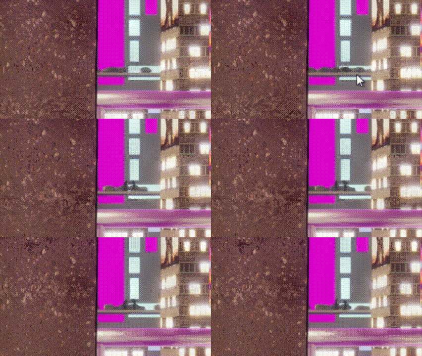
- Lock buttons now have a texture.
- Activating the speedpad now has a sound effect and visual effect.
- Cycled levels. Levels for Sector 2~4 are different than in Demo 4.
- Updated lighting.
Jumpscare at the *click* scared the shit out of me. For the "sit back and don't click" part it would be nice if you could pause/skip forward or something. I had to stop for external reasons and had to rewatch the whole thing again. Would be a nice qol improvement. The VA for that part works pretty well but the VA at the scene before that sounds really weird. Probably because the VA is a bit mono-tone so it works well for narration. Also all the small SFX are really nice and I really appreciate it, really makes it feel more immersive.
Thanks for playing the game. I went ahead and watched the whole video, thanks so much for doing this, stuff like this really helps out. Also I was really excited to see that the solutions you came up with for some of the levels were completely different from the ones I intended. Things like the rotation in the space sector not rotating 90 degrees as well as the cross on the tool cycle popping up incorrectly are bugs. The levels in the space sector are unfinished and just there to show off the mechanic, and I don't think the 3rd level is solvable but thanks for trying it out. Watching yours and others playing the game it's apparent that I need to expand the tutorial a bit more, and make the mechanics of the game more clear in the beginning. As well as a much more in depth explanation of the tools since more than half of the tools went unnoticed in your playthrough. There's definitely still some work needed on the physics and I'll be sure to keep your comments in mind as I try to polish it.
Game seemed to work fine on my system. Chatting worked, moving and jumping worked. If this is actually connecting to another server and not running some localhost thing this is pretty cool and I'd love to try it out with people other than myself, seems like it would be fun.
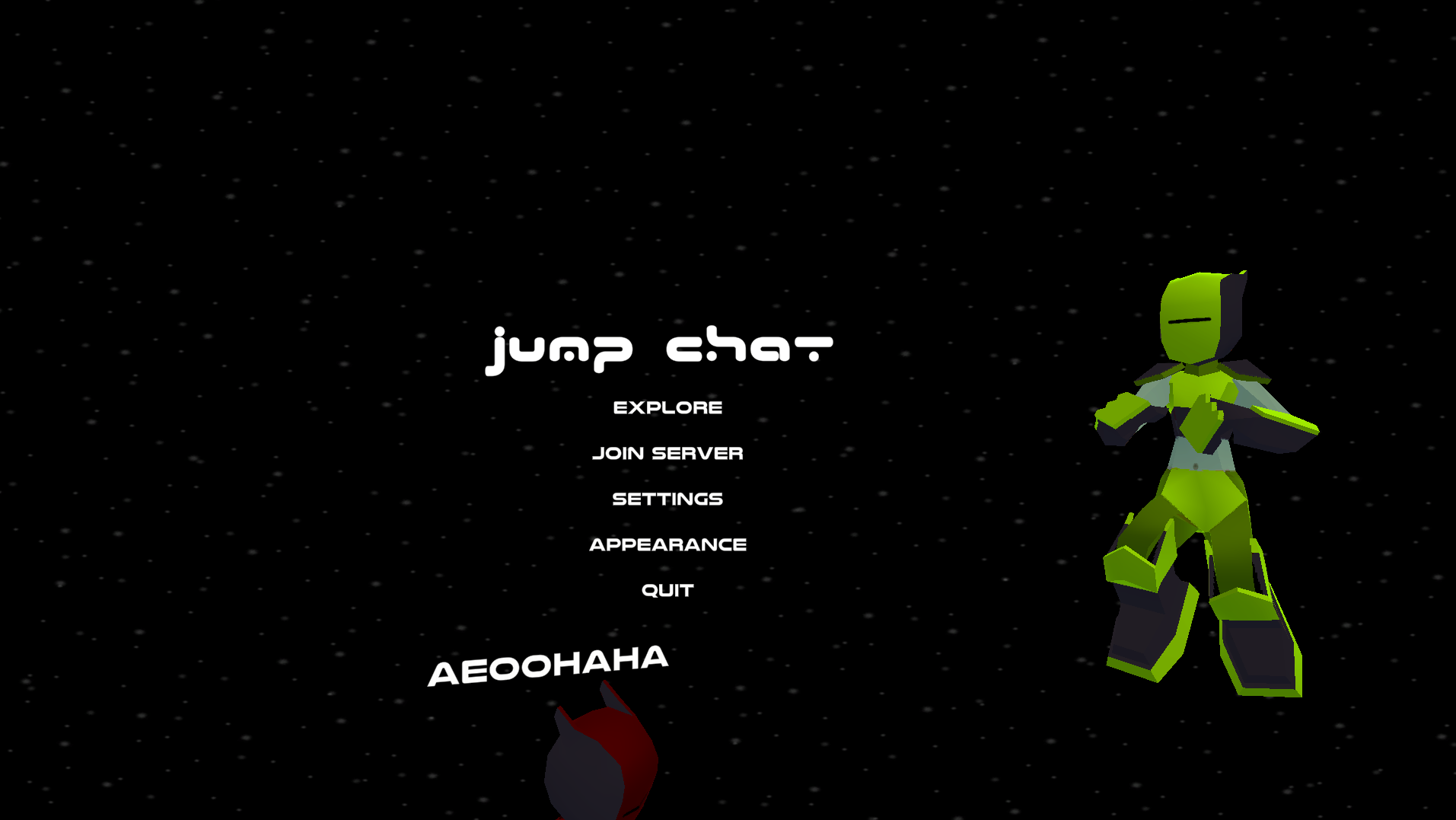
Found a bug where other characters won't despawn when you disconnect and they instead just fall.
Pressing revert&return in the appearance menu only reverts the color of your character, things like your name, sfx choice stay the same. Not sure if being able to wall jump upto 3 times is intended or not since your jump distance is so limited but its there and its cool.
Same as alot of other feedback, love the magaman zero vibes. A shame the slash doesnt have a sound effect to it yet but I love the swing combo animation and the swirling dash slash. The dash itself is alot of fun to use especially if you combine it with a jump, I wish you could dash off of walls like in some of the Zero games. Spikes were difficult to see in some locations (mainly the outside spikes after the indoors section) making it difficult to traverse, and had to play super carefully as to make sure there are no spikes below the screen. Checkpoint system is appreciated. Killed the boss at the end but it would get stuck in its death animation (not sure if that was a bug or its just not finished yet). Also you should try to make it more clear that the arms can't be hit, and when the boss is invulnerable since that was confusing when I first encountered it. I mainly mentioned off the negatives and such but like others have mentioned, this game has great potential is already a lot of fun to play. Make sure to keep us updated if you continue with this game.
First and foremost I want to say that I really enjoyed this short mystery. Played it over a span of 2 days in two sessions, gave me real nice Umineko vibes with the compressed real life image backgrounds and focus on being a *pure* mystery. Without hopefully delving too much into spoilers for others that might read this comment, the solution and presentation of it felt (at least to me) similar to Umineko, in that I thought of the correct solution early on but was then tricked into believing something else for the majority of the story until the end. Very well done and I love the lighthearted nature of the story, kept it from getting too tense and the few situations that are tense were much more tense because of the contrast. Assuming there isn't some secret ending I missed and the ending I got the real one there are a few things that I think are left unanswered but perhaps those are intentional or that Im too small brained to put two and two together. I also love that you added in a programming socks joke fellow /g/amer. Flame's first run in was a bit too fast, I didn't even notice it, just thought my screen blinked or something so maybe make it a little slower. There also a few typos but I suppose those are bound to happen with something like this. There's a few small things but overall I enjoyed it quite a lot, keep up the good work
What's new in this demo:
- 3 new tools to make drawing easier.
- Line tool. (Draws a straight line)
- Move tool. (Moves a drawn line)
- Edit tool. (Edits the points in a line)
- A new transportation mechanic. (Basically teleports the ball from one point to another)
- 3 new levels (I intend to keep new levels low until the release)
- Button rebinding (In the controls tab of the settings menu)
- Your current tools chosen are kept in between levels (If you locked the cube it will stay locked. Tool selected will also stay the same)
- Lots of behind the scene fixes.
As always thank you so much for trying out my demo. Any and all feedback is appreciated but I would like it if you could pay particular attention to the ease of drawing out your solutions. As that has been where a majority of the time spent went.
This game is very clearly early in its development so don't take any of what I say too negatively, I'm just mentioning everything I noticed while playing the game.
I'm not sure if it's just on my system but I could only get the demo level to run and the main level wouldn't run at all (Game didn't crash but just gave a blue screen until I switched levels). The interact key made the player character run and would only stop running if I pressed the loadout or radar menu keys. Jumping also moved at run speed regardless if I was running or not. I suggest working on the menu because I was very confused and took me a while to figure it out. I still don't know how the loadout and radar menu works (Although I assume most of it is still WIP) this includes the main menu for example the game and system buttons on the top, where you can move to system with the right arrow but can't move to the game button with the left (you have to press the down arrow). I also don't think the bgm should stop when you open up the Radar and loadout menu. The mini radar on the top right would switch between being opaque to transparent when I transition between menus (not sure what the exact cause is). And spamming the loadout and radar menus caused it to break. Like you mention in the readme the default controls are very poor, although the only real problem is the camera control, everything else isn't that bad. Not sure where you plan to go with the game but the visual and 3d environment so far look pretty cool, and I really like the aesthetics of the menu. You clearly have something pretty cool here and I can't wait to see more of it in the next DD.
Pretty cool game. The idea of playing a traditional bullet hell game with friends is pretty exciting. The bullet particles both from the player and enemies are pretty cool, I quickly tested the multiplayer with two instances of the game and seems pretty good. The UI seems ok for now, nothing felt out of the ordinary or in the way if that's what you were asking. Both the special and dash abilities have delays on them which is kinda annoying for a game like this. The special ability also feels really lacking, I don't exactly have the largest amount of bullet hell experience but I feel like it should do more than just remove some bullets around you, and the powerup it gives you after also feels lackluster. I had to use it multiple times before I noticed it gave you a powerup at all, so I think you should make it more obvious somehow. I can't wait to see how this project goes forward and I think many of my bullet hell friends would love to try this out. Keep up the great work! For the multiplayer aspect would the game in its current state just connect with others, or would you have to setup something like hamachi to play with friends?
There was its 'X'. But it's only mentioned on the itch page and never in the game, nor is there anyway to change the controls in game. Its something I need to add into the tutorial or somehow let the player know, but all the buttons on the top left have a key assigned to them. For the line I don't want a line appearing off the cube so I'm thinking of adding a point before the first one gets added where the edge of the cube and the path you took from off the cube to the first detected point on the cube intersect. The only issue is I haven't figured out how to determine the position of the edge of the cube especially since you can now draw while the cube is rotated but nothing a few google searches and banging your head against a keyboard can't solve


