Feels good that all the components I expect are there, but feels a little slow and awkward. Also feels bad not to have the “class” ability unlocked out the gate, I chose the bow and had to wait until the level up to use the color spray arrows.
SoulReviews
Creator of
Recent community posts
Levels are good mechanically for the most part. Could use a little more signposting of where key items are. Baked lightmaps with sprites is an interesting aesthetic choice but kind of uncanny since the characters don’t seem like they have shadows, although I think I saw something for the dog? Was disappointed that I couldn’t carry my shotgun to the next level.
Seems to be too heavy on the RNG currently, 3 enemy encounters will wreck you depending on the sigil spawn. I have no idea where you’re going with it, but dying to RNG does not feel good
I’m pivoting to making a roguelite, so I appreciate the RNG callout.
I dig the movement, but I think you’ve gotta be old to understand that style of controls
Probably. I think games like Fight Knight and Grimrock make the case for discrete movement being mechanically relevant, but it probably should be the core of the experience if that’s the case.
Also - the game started in a reddish-field with fence around. I died and respawned in the snow area, opened the door and read the ending, confused. Started the game again - and only then did I read the intro message, so that was broken.
I created the reddish field with the intention of that being the new demo level, but didn’t fix the death callback to send you to the start of it.
why can’t i move freely? feels very restrictive.
It was a bad decision on my part frankly. The idea was something like Legends of Grimrock or the classic Megaten games, where dungeons are tile-based, but what I missed is that those games are in DUNGEONS and not large open areas or the movement restrictions are mechanically relevant.
Moving forwards, I’m going to scrap the exploration entirely and just focus on making combat a roguelike experience.
The arms race continues! Cool puzzle game! There was a lot of unique situations and it was nice to see all those different approaches. One big improvement was if there was a way to “mark” a meeple, like a safe square in minesweeper, so you don’t go insane tracking everything at once.
Also, I really liked these cute little illustration more then the main game art. Make of that what you will:
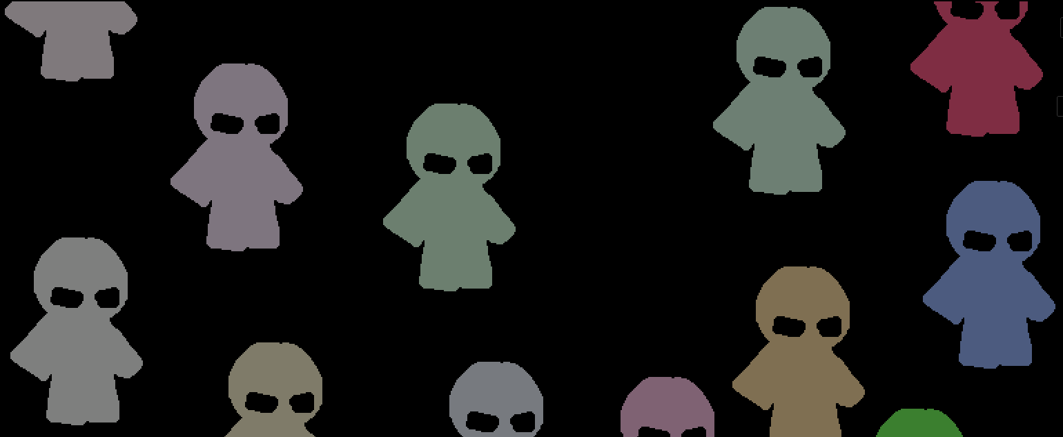
Creatures are mostly drawn from references of medieval mythologies, at least as far as I could find in terms of sources.
Wow, I thought they were mostly Youkai-inspired, I gotta hit the books on engravings again.
Great job, lost of cute pictures and animations. The reference image being in the corner and dimmed kind of made it difficult though. Might be better if it was in a symmetrical spot at the same color.
I feel like you offered me a gimmick platformer, and did a bait-and-switch giving me a fantastic one with tight controls and just-right levels.
I noticed it looks like you’re suffering from particle load lag when they first pop up on screen. This wasn’t solved AFAIK for web build in 4.0, but two solutions were provided by a dev here: https://forum.godotengine.org/t/handling-particle-shader-compilation-lag-in-godot-4-web-compatibility-renderer/36170/2
Okay, fess up, you saw Balatro’s perspective shader on it’s cards and couldn’t help yourself right? 🤨
Jokes aside, it an interesting build system thinking about what ‘core’ items to grab and how those are placed. Seems like “abberiated” items hurt you here because you run into the situation were someone misplaces a core item turn 1, like I did with the casino and it’s a huge feel bad. Also, small touch I liked was how the basic enemy “sprays” instead of shooting dead-on predictably.
Some UX stuff:
- Some ‘not enough cash’ messages should be minimally short. the longer delay you have, the more frustration there is.
- I’d a box around the “Star” signs and just make them always show up as zones in the box so that info is always visible to the player, maybe have an item “shine” if it’s conditions are met.
- This might help you illustrated some better-looking items: https://www.youtube.com/watch?v=D1pXyO0MKFg
Bunch of ux problems:
- If your too close, it’s hard to see the repair bar
- When you drag an oxygen tank to an empty space, it doesn’t “snap” you have to actually press F again(and I think it glitched for me and just ran out even though I put in oxygen)
- The camera for the docking is kind of confusing
- The game never tells you you can use the scroll bar to switch items
- You can’t hold-click the wrench, you have to tap it multiple times.
All that being said, fun game for the most part. I liked how you can open a shortcut to the oxygen tanks. Could also use a map which is harder then the other UX impv. I talked about, but still probably worth it.
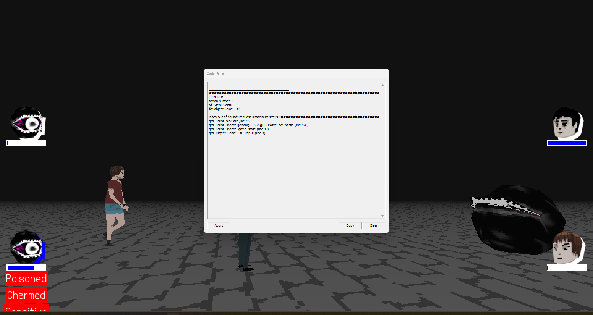
I think I broke it by stacking too many status effects:
___________________________________________
############################################################################################
ERROR in
action number 1
of  Step Event0
for object Game_Ctl:

index out of bounds request 0 maximum size is 0############################################################################################
gml_Script_pick_arr (line 45)
gml_Script_update@anon@11534@GS_Battle_scr_battle (line 476)
gml_Script_update_game_state (line 97)
gml_Object_Game_Ctl_Step_0 (line 3)
 Very impressive you got it this start of maturity! I mainly took to enemy avoidance, but the overworld movement made dodging around kind of fun.
Fantastic and really interesting concept to be the guy spawning the monsters, really brings me back to playing Dungeonland. I figured out the exploit pretty quickly on my second run to just spawn the biters right next to the player. This concept still has legs, just seems like you’ll have to experiment a lot with KABOOM’s AI and the player spawning resource. Really makes me want to see a full release.
I got to then end!
- The empty input also crashes the game(just pressing enter at the prompt)
- If you’re going to make a text terminal your main features, please, tab completion.
- knowing to omit the backslashes for the dates is kind of correct, but also awkward, since in the worst-case you try 6 different options.
- I didn’t know you had to press ‘enter’ at the menu for a second, might want to prompt for that.
All that being said, I like haunted terminals and this had about the right level of stylization, so it was cool!
Pretty cool! It was fun to figure out how to launch and fly, but I got bamboozled by “Maintain heading 340” after the takeoff because the flight instructions say “Maintain Runway heading” and I didn’t realize that’s only for TAKEOFF not in-flight.
The oddity was a bit underwhelming, but I see a lot of potential here!
Ahhh it’s so close. The concept is great and I love the idea, but it’s ergonomic death by a thousand cuts! Please forgive me for this list I have many thoughts:
- scale of things feels like half the size it should be. Makes it hard to accurately pickup/drop things(I even catch the feeder miss dropping some things in the heart!). I’d double the size of pickups and triple the size of drop-zones like turrets and the heart
- I did not realize the ‘sacrificial dagger’ is not the same as the dagger you start with and assumed it was useless to craft. I’d probably change that to something different then the ironic main sacrificial dagger to avoid confusion
- Having no way to heal the heart makes a challenge, but’s also very frustrating. For a jam game, I would’ve had it heal at the end of each day to full.
- One of things I’ve done in past jam games is just thrown up a quick-n-dirty graphic in the pause screen for instructions. If you find yourself in this situation, you can literally just put what you put on the itch page in the pause screen.
- Slowing down during building is nice, but I would completely STOP the game process after a set period so the player can scroll through the menus to access things
- Sometimes the menu appears out of bounds and I can’t see what I’m selecting
- If the craft menu had icons of what you’re about to craft, that’d help
- If the craft menu had q,e shortcuts to switch categories, that’d also help
- Some audio/visual queue that the heart was starving would be a good edition.
Hope any of this is useful, again, I wouldn’t have this many thoughts if there wasn’t something to this!
Very nice writeup.
For lightning, did you use Light2D nodes and just the flashlight to apply to all the canvas layers? Also, do you have any ideas for shadow casting, like with the desks or objects that aren’t world bound? I actually didn’t notice their absences until I thought to look for it when thinking about how you did you light.
Ahhhhh, grenade jumping/hit boosting is the besttttttt feeling. I never opened any of those level doors after I figured out how little HP you lose from doing it.
- It’d be a good idea to add some more playground elements to the level hub like maybe an infinite grenade dispenser and npcs that respawn which you can practice your timing on. Nightmare of Decay had a shooting gallery with inf. bullets at it’s start and that made all the limited ammo feel fair
- The delay for opening menus/restarting is kind of aggravating, especially if you’re aiming for the perfect run. A hot-key to restart on death is essential IMO. The Golden heart is a very cool concept though and I think was a pleasant surprise at the level end.
- I’d like if the enemies had some indication of whether or not they had a key or some way to figure that out without trial and error. People who go for score won’t care as much, but it feels really unfair to the first time player.
Most skillful game of the jam I’ve played so far. Have to stop myself from playing it lol.


