Ended the season with 3993 for my first attempt - nice idle game! As others have echoed, if this were to be polished further, would love the increased confidence of what will happen with a preview placement - sometimes I thought the run below would attach instead of the run above where my placement was, but otherwise a nice contained experience that was easy to understand.
Patrick W. Crawford
Creator of
Recent community posts
Thanks for playing, that’s a pretty good score!
The bridge is definitely the buggiest - added hours before the deadline, we really wanted this min-size obstacle to complement the other max-size obstacles already in. But with the time we had, we had to relied on the physics “just working” to get it to work. Collision meshes and handling could definitely be improved, thanks for bearing with it 😅
Very fun mechanic! Style fits together nicely, whimsical and all. Took me a moment to figure out the placement and the way that worked - I think if you animated the placement of a first one for the player to jump on, with a little “right click” icon directly over when the action occurred, it would have been a buttery smooth onboarding. Minor detractor though, nice work!
Thanks for playing! For sure, I feel I’m still somehow getting used to the controls, but also certainly an area for tweaking. I guess that’s one of the challenges of game dev, tuning one param means affecting other parameters (e.g. if we make the character speed up/slow down faster, then we’d also need to tune distances between obstacles lest it get too easy). Also helps to fix lil bugs and near-impossible to surpass sections too. Actually that gives me the idea that maybe we could have enforced the first couple sections to be the easier flat ones to let you ease into the gameplay, hmm.
Appreciate the feedback!
Very fun, charming, and relaxing title! Made it to the end, I only discovered the charm interactions about halfway through which made for a good acceleration, but then had to stick it out. Would have been fun to layer in some mechanics of some charms doing more than just an additive on the rate, was a bit of just waiting to unlock each next tier, but hey that’s also part of idle gaming and for a 4-day jam this is incredibly polished (far better than my own entry, that’s for sure!)
Managed to just live with a 43K score, fun twist by having a carried through survival health mechanic (I guess that’s kind of similar to the original in a way, but worked very well here). Pseudo 3D aesthetic was very nice - my only nit is that the platforming aspect and timing was a bit tough to judge, found myself always triggering a little early which, especially for the last event, would make it rather stressful since I’d have to go through them all again just to get back and try that one again. I guess that’s by design though, Crunkle is not forgiving! Nice work.
Minor other edit: having in-game controls always helped a lot, though I was able to mostly correctly guess the intended control to use.
You’ve nicely carried through the aesthetic through all the rounds and continues to hold together, I just love the way the character idles and runs and everything. My main gripe if anything is more to do with my gripe with the original game around button mashing - most awkward in hurdles where you need to button smash but also risk losing velocity as you pause to try and use the jump command. Though maybe arrow keys. But I won’t fault for that, nice work replicating the original’s UI work.
Thanks for playing! The third is definitely the least polished, and unlike the others, you inherently just have to fail a few times before you get it right.
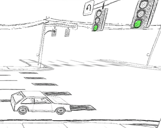
Given your score of 814, what actually happened for you is you discovered the little easter egg: turning the wheel all the way lets you make a U-turn instead of just a left turn. And though the U-turn is in a way harder to get without fouling, it ends up giving far fewer points because you’re closer to the correct lane (which is in part how the score is calculated). In hindsight, I could have added some visual text or indicator that helped clarify that you found something hidden.
Thanks for playing and providing the feedback! Glad you appreciated the quick restarting and option for keyboard only navigation, agreed it helps a lot to not get stuck in menus :)
It’s interesting you mention the camera position. I had a tough time deciding on the right balance there. I wanted to make sure that the light turned red only once you arrived at the intersection so that no matter how faster you got there, you would still need to come to a complete stop. That means there’s two area triggers, one for getting “near” the intersection, and another for actually entering the intersection. I didn’t want players to see they were coming up to red and basically slow to a stop too soon before they reached the first trigger. But I also get what you’re saying around giving a little more room to the right, could help.
Very nice implementation while keeping true to the original, I really liked the motif of walking to the events as a sort of menu. Your itch page is, as always, on point so well done there. Also clever way to make us as the player feel good for your not having time to finish an event, giving a gold was a nice touch - as was rewarding the player for completing all events, I should have thought to do something even basic like you had! Nice work
Fun idea to twist things around. The controls felt a little funny, like shift to leave a game was a bit unexpected. I also feel a little more UI leading at the end of a round could help a lot, it was a bit jarring to just suddenly be popped to the end (and for those that you restart if you lose, that it’s an instant restart with no setup first). Still, nice work getting a variety of events in place.
Nice implementation of the theme, definitely hit that arcade-y feel. Many of the events felt a little samey since it was just trying to quickly see which button to press, but the disc toss and archery added some nice variety. The Javelin throw was a fun idea too with the balloon popping. Swimming is a easy gold, seems like there should have some different tuning. I do however appreciate that this wasn’t a button mashing game, my wrists can only take so much! Also a fun idea to have circuits unlocked as you go.
Edit: one nit though was that it felt a bit out of the experience that only some of the menu navigation worked through key presses, had to do some mouse clicks. Especially between each round, just being able to press enter would have helped it feel snappy to get to the next round within one game.
Thanks! Building on prior work has helped a ton for sure. Pretty everything for this round was made the final weekend of, I actually thought I wouldn’t have much to submit. But having many reusable parts actually meant things kind of fell together nicely. I do try to orient myself to the judging criteria, but after this round (if I somehow make it) all bets are off :D
Definitely a fun and totally different take on the source material! I’ll admit it feels a bit of a particularly loose interpretation, I get more “endless runner re-envisioned” vibes than track and field, but I appreciate the description going into how each event was imagined.
I need to come back and try again to get to the end. I just can’t tell what I’m doing wrong at the window. Without getting enough feedback to know what’s off (I hear the window breaking, so am I going too high? too low? too fast maybe?? Or am I running into something after?!), makes it a bit extra frustrating that I have to keep going through the 20-some seconds of all the other stops to just try and fail again 😬 I appreciate the little mid-game helper graphics, just in that one case it’s not quite enough for me at least!
Not to defend on behalf of the author, but just felt like chiming in that actually I really liked how some challenges actually are impossible.. until you the the right stack of rings. Forces you to think about that and not just the events in isolation.
In my case I never had too much trouble with the mountain, but I ran into sprint once when it was impossible to keep up, and then quickly it was the high jump that had me out to dry. One ring (walk on walks) suddenly changed all that, which also gave it that spark of actually discovering something.
Absolutely top marks.
tbh I was considering not actually entering this round, because I didn’t have any history with the game and I’m not the biggest fan of button mashing arcades (I was sweating just thinking about developing my own game let alone playing everyone else’s game).
Well, with no rub against anyone else’s entry (my own no different), I’m kind of expecting your entry the be the only one that I actually really had fun playing. Early rounds were unsuspecting, but as I started to see those rings to unlock and how the stacks multiply each other, I was having a blast given how ridiculous the modifiers got. Let me tell you, once I got “run on walks” paired with “5x run but no jump” along with the not being slowed down by obstacles, everything was a breeze but in the “I earned this and really gratifying” sort of way.
Verrrry minor UX thing, it took me a bit of UI hunting to finally see where my coin balance was, there’s a lot of things competing for equal attention in the shop page. But, quickly learned.

Very solid entry for sure! Polished all around, with a good credits, settings section, and nice little widget interactions in the menu selection.
Only nits from me are that the UI felt a bit slow to navigate, slightly worsened by forcing me to go back to the main menu each time instead of the event selection or even a “quick retry” button. I also feel it’s slightly polluting that we’re asked to enter our top score every time and it doesn’t remove old top scores, that list is going to get very long very quick heh :D
Thanks for playing! Glad you enjoyed the aesthetic. Pretty much the whole game was made in the last 48h and the left turn one was very last, so definitely not as refined. I also realize now I meant to drop the “qualifying” score from 200 to 175 whoops so yeah, it’s not the easiest for sure.
Re: sound, I totally agree - I decided to bet on a higher score via adding in that last left turn event.
Wow really well done, well polished, and tbh brilliant idea to basically force us to do an entire “run” all together. You also had really nicely implemented tutorials, not just slapped into an intro panel like some devs (*coughs at self). And I definitely lost some points when hurdles turned into flappy bird cuz I just started laughing ha, in fact all of these had very fun clever twists on the baseline events.
You also get a bonus star from me because “foul” counts as a pun. Though you could have written “fowl” too ;)
Very minor nit that on my 2x density monitor, the corners get slightly clipped (I assume anyhow) both in static and full screen, not so much that it gets in the way. it’s honestly the only thing to comment on as the rest is totally set!
Though it feels a bit more like a puzzle platformer with a timer than a track and field-remake, I can appreciate the direction you took building on your core telekinesis mechanic. I’ll admit I did find them a bit hard, tried each level but did not manage to pass all of them. Also, a little more in-game text instructions for what to do in each round would help as I had to experiment a bit. Having the overworld map was a fun idea!


