Oh wow yeah I'm dumb, I straight up forgot to add the option to leave. Thank you for letting me know.
Briggs
Creator of
Recent community posts
Hi, everyone. I'm working on a year-old project text fishing game. My goal is to finish a few sections I started but abandoned back then- namely finishing my "fishdex", adding some additional character interactions, and finishing a quest. If I get all that done, I'll try to keep going.
I haven't had any motivation to work on it in a long time so bit thanks for making this jam because it ended up being the push I needed to get back into it. Good luck to everyone!
That's some really great stuff, thanks for sharing. I really enjoy monochromatic works, especially with black and white. The sketchy feel is pretty nice to look at!
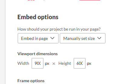
Also for expanding the window, if your project is set to embed in the page (it looks like it is) then you manually set the size to whatever you want. I have it set to 900 x 600 for my stuff because I like seeing the borders around my window, but you can set it to whatever you want really. These options are in the "Edit game" tab, right under the upload. That's how you change it for any embedded games :D

You've got nothing to apologize for! Just wanted to say it to make it clear that I didn't finish the whole thing and that's alright, not everyone will finish our games. I think you did a great job regardless and seeing as other people got through the game (just fine, I think?) it's possible I'm just an outlier.
Oh wow, that's a long one, thanks for checking out my game! Thanks for the compliments, and yeah the gameplay is really limited mainly because I'm not a programmer, Ink is all I can really understand! Unless I get outside help, the most I'll really do with these games is add images and sound (maybe).
As for the bug, can I have some more detail on what happened exactly? When you're selecting either of those choices, there's supposed to be a popup at the top of the screen where you type in your name, and I'm guessing the popup never showed up. Might be something with your browser, I'm not sure. I never implemented the feature before in an Ink game so I have no clue how it might break. Either way, I'm sorry that happened to you. If it helps, the story continues as normal after that point, it only decides whether or not you still get called Sergeant by the Paradisaea crew. As for the later block, I'm not sure what happened there either but I'll check it out later.
Lastly, there are around 18k words, but roughly half of it is recycled endings with few differences between them. I was running low on time so it was done really inefficiently. So the actual word count for unique sections (before I started copy-pasting) is roughly 8-10k words. A single playthrough will be anywhere between 3k-5k words based on how much you skip and which endings you pick. I've never written novels, but I've always enjoyed writing short stories. This was my first major attempt at making something like a game using my writing, so I'm pretty proud of it.
That was pretty dope! The grammar was a bit off in some places, but it was still more than understandable. I was lost on what had to be done during the cooking minigame though, as whatever was written on the left side was still in Italian. Either way, the bits I could understand were pretty hilarious, and I definitely found myself smiling at the variety of characters, their situations, and the absurdity of it all. Cool little surreal mess of a game, in a great way!
Speaking of the minigame, I think it's pretty cool, even though I was a bit lost as to what was going on. It's nice to see some gameplay beyond just text here. It looks just as goofy as the rest of the game!
Definitely not pressured, there were many things I wanted to do but couldn't due to time constraints. I can't say what it if I'll change everything I mention here, but there are definitely a lot of things I've gotten feedback for that I agree with, mainly to do with explaining things just a tiny bit more. I do plan to expand the story more, without making drastic changes to plot.
Aaahh yeah that was a bit of an unfinished thing. I wanted to bring it up again but I was running short on time.
Just to be clear, a single cycle is one thousand years! And without too many spoilers, I was hoping to expand that into the reason as to how the Paradisaea crew were on that planet for only a few years despite them having many thousands of years of travel time between them. Hence why the shock at hearing that they were only traveling for five cycles. No AI bugging out, it's more in the relativistic trickery I guess, but there really are all those years of space travel between them. Maybe a mystery for another time.
Also nobody's dead from hibernation sickness at the moment but I could definitely add a sad little secret ending or two just to add ANOTHER bad ending to the story lol
Thanks for checking it out, and thanks for the kind words!
Yeah, some of the endings are meant to be a bit open-ended, and I think that's one of them. We don't really know what the future holds, and I'm not sure if it would be a good or bad idea to think of an actual end to the journey like that. Maybe after the jam, I'll add more to that ending, I'll see. I do plan on going back. Thanks for the feedback!
Yo, thanks for checking out the game! You're right, the ending does seem abrupt, I've had more than one person complain that they aren't sure what happened and it's true, I didn't write it in. It's not a very happy ending, they're supposed to all be dead aside from you and the one other person who decided to stay. But time constraints led me to kind of forget to elaborate on that. I'll be doing so once the jam is over, though.
Regarding military stylings, there really isn't too much going on aside from Sergeant just going by that nickname, even though you can choose to use a different name later. I didn't want players picking a silly name at the very beginning of the game because I felt that might ruin things, which is why I give you the option to do it later. I came up with the backstory that made the nickname make sense- it's the character's rank before they got to participate in the program. But that's about as military as it gets- the rest of the crew isn't meant to be military.
Also, what do you mean by "time discrepancy"? I can certainly answer any questions you have if they aren't answered in the optional document you can download. It's just a text file that explains some of the reasoning behind the names and other details.
Thanks for checking it out. If I can be entirely honest, the colors mentioned were entirely randomly chosen. I was having some trouble figuring out what to write about, so much of it is just the first thing that popped into my head. I wish I could say there's some incredible meaning to them but I wanted the random colors to bring up the question of whether it's some odd cosmic-horror vase or if the person is genuinely insane.
DANG that was an experience and a half. I think the inspiration you got from the theme is pretty darn unique. The way you wrote the language and just about everything else really makes it feel like a genuine attempt at reproducing the 50 AD vibes (despite us not having much of a frame of reference of the times anyway). I also appreciate how you chose a tiny readable area so the text and choices to fit very neatly within its borders- it's a bit difficult to read sometimes but it just looks so NICE that I can't hate it.
I don't want to be offensive and say English clearly isn't the first language here when that might not be the case at all, but that's what it seems like, so I'm completely ignoring the grammatical issues. I think the story is still more than understandable and it's a fun ride. I saw in the comments that you got all this work done in just a day??? That's really impressive, you got a LOT done in a really short amount of time, even shorter than many of us had to work on our games. Your dialogue feels pretty natural, and the story seems to go along pretty smoothly. Also, I really love your thumbnail pic! I'm assuming it's yours, and if you end up illustrating your story with art like that then it'll only make it better, even though I still think this is a solid piece even without any illustrations.
My only request? Please make the window a little bigger! I have no idea how many people don't read stuff in full screen, but I'm one of those people, and you've got tons of room on the page to open up the readable area! You don't have to make it bigger of course, it's just a personal thing!
Overall, good job :D
Good job! It was a treat to go through, and I think your narration is pretty good. I feel like I understand the choices I'm making well before I make while the story still progresses naturally.
While I like your style, but I think it can be a bit difficult to follow who's talking in a few areas, especially when you have dialogue split apart from the tags. SPOILERS: One such place is around the line where Santana goes “Well, I mean… I’m a grown woman. And it’s kind of… you know…” which might be a mistake since I was under the assumption that Santana was a man and you use he/him pronouns for him even after this line, so then I thought it might have been Paula saying it, but the way the text is formatted doesn't make sense for Paula to be saying it. I hope that makes sense?
Pretty cool! I think your narration is pretty good and I get a clear idea of what's ahead and the inclusion of a soft retry button is quite nice! I certainly don't enjoy restarting entire stories whenever I mess up when I want to test things out. Also, the choices carry appropriate consequences without feeling like they don't make sense. That out of the way, I want to point a few things out in hopes of helping out in case you want to go back and fix them:
Some choices look out of place when they show up alongside the story text instead of disappearing like other choices, like "Lean back and enjoy the silence" but there were a few others. Also, I had several cases where the game would stop loading text for me and force me to restart. I haven't seen this happen with other exclusively-ink games so I wanted to point it out. It might be something on my end or not, I have no clue! Hopefully, it's just a small issue on my end.
Overall, good job!
Dang, the perspective of watching life flourish being condensed into a tiny number that you don't even get to witness in its entirety made me think of seeing your life flash before your eyes but you blink and you'll never see it again. At least here you can see another generation, I guess. I enjoyed it, but a part of me wishes there was a bit more choice beyond just skipping text. Looping around and getting a bit of new text was a nice touch, though ("the display comes to life" vs "your eyes itch").
I think you've done a great job here! I'd also like to say that it's pretty smart to mirror the graphics as it saves a LOT of time in creating art assets, plus they look pretty darn nice here. The simple color palette makes the consequences of your choices stand out a lot more and overall it all seems to fit together nicely. Sorry to say that's all I can really comment on, I was a bit too dumb to complete the whole thing!
If I can weigh in on this a bit, because I wanted to mention something similar, I think what they're trying to show is that they chose an option to order something, some choice in between, and then another option to order a drink, and the dialogue feels disjointed because the line corresponding to ordering a second time sounds as if they haven't ordered at all. They just paid for their first order in those first few lines, but then the bartender talks to them as if they didn't just get up to leave. I agree with Hyacinthos that it catches the reader off-guard and doesn't feel very smooth. I hope that makes sense?
As for me, overall, I enjoyed it. Everyone's got a different way of writing about being lost, and I like the way you did it. Having the text flow between what's expected for fiction writing into poetry and back and forth made for some nice variety. My only wish is that dialogue be formatted because I had trouble figuring out who's saying what and when dialogue is meant to end sometimes. While dialogue punctuation in the end is a stylistic choice, I think the lack of it here can mess with one's enjoyment of what I think is a pretty well-written story. The lack of dialogue punctuation might also be what Hyacinthos had in mind when they mentioned "grammar and punctuation errors" in their initial comment.
These types of games always freak me out so I'm sorry to say I couldn't finish it all, but I got halfway on the notes. That was pretty spooky, the Darkwood inspiration feels pretty clear here. Having the narrative split across the various notes forces you to get out of your comfort zone to find out what's going on. I was always worried about something coming up behind me. The only thing that messed me up while playing is that I didn't catch on to the fact that you drop the bait whenever you interact with things- I kept thinking "Wow, why the heck do these people have bait under all these notes?" But yeah overall, it's very spoopy and a pretty well-thought-out of spreading the narrative across the entire game. Good job!
Edit: I only remembered this after the fact, but if you want to freak people out a bit more, a blinking mechanic that makes your screen go black every so often would really mess with people. ;)
Yeah, the constant influx of new lines helps a ton! I think it'll depend on who's reading because some people might just be bored with a chill, low-conflict setting whereas others are like "OOH CAT" (me, and many others, it seems). If anyone does actually complain about it feeling too stale or repetitive though, it can easily be remedied by just rewriting things a bit to make the lines feel a little different, but I think you're alright, especially for a jam :D
I think this has quite a bit of potential despite being so short- it's tough thinking of multiple different paths in less than 24 hours. It's clear it's unfinished, but you can definitely go back to it later! As for the paths that seem too similar to others, why not merge them back together? Not every choice has to start infinitely branching out, sometimes they can converge back together, and you can think of something later to make them branch out again if you really want to. Having choices already makes us interested, and they don't always have to be game-changers. It's a good start :D


