Play game
Chroma Dungeon's itch.io pageResults
| Criteria | Rank | Score* | Raw Score |
| Gameplay | #60 | 3.907 | 3.907 |
| Overall | #66 | 4.085 | 4.085 |
| Presentation | #76 | 4.395 | 4.395 |
| Originality | #135 | 3.953 | 3.953 |
Ranked from 43 ratings. Score is adjusted from raw score by the median number of ratings per game in the jam.
What do you like about your game?
It's finished!! and i did all that i wanted with it
Leave a comment
Log in with itch.io to leave a comment.


Comments
holy fork dude great job
Woah. That was crazy. I really enjoyed this game. I read you had sent a message to #jam-general about designing puzzles, and as a guy who loves designing puzzles and playing puzzles I thought I should try it out. This game broke my brain.
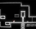
I read some people mentioning the steep learning curve and I agree. It's really steep, but I think more than it just being steep, what is happening is that some of these puzzles aren't as difficult as they are intimidating. Here's an example:

This puzzle introduces three new pieces of information to the player:
This is a lot of information to spring on the player in one level. In addition this puzzle is essentially two puzzles in one. The first half is the part I've drawn a red box around: The puzzle of moving the box up to the button (including its other half). The second half is the part I've drawn a blue box around: The puzzle of moving one half of the box down to the other button (which requires figuring out which half to keep and which half to move). Keep in mind that you need to do all of this while maneuvering the player character, which already requires some brainpower. So I was at maximum brainpower here.
When I first saw green added into the mix, I considered stopping. But then again, I realized that the level was just intimidating because of the amount of information I had to juggle in my brain. It was three separate puzzles, so I started isolating them in my brain and ignoring parts that didn't matter for each mini-puzzle. I think especially when there are more colors in the mix, having three or even four possible positions for each object becomes incredibly difficult to keep track of. Especially in the final two levels where you don't even know where one of the positions is. Those two levels where the screen would be tinted showing you only where two of the possible positions were were hellish. In the first one, I didn't even realize what was happening so when I saw the green character appear, disappear, and then appear near its target (on accident). I thought it was a bug. So when I got to the final level, I had to figure out through a lot of trial and error that there were hidden positions for each element in each color (which I should've learned in the previous level) and where those positions were. It really felt like the puzzle game equivalent of a dark souls boss.
I'm really happy I powered through and beat the game. The ending was really cute.
I hope this comment isn't overwhelming or too long. But I really liked this game and I think it could be improved significantly if the levels introduced new concepts one at a time, focused on solving one problem at a time, and maybe limited how much information you needed to keep in your head per level. You can make a full game with multiple sets of levels with what you have already. Thank you so much for making this game. I had a great time with it!
Oh my god, you're actually a menace to push through my entire rushed puzzles without any explanation, there's a lot of things i can improve i agree, i had way too much thinking time which left me with a lot of time to just think about puzzles, puzzles like the one you mentioned where supposed to be introductory to boxes but since that was a level that was made some time after some other later levels i didn't even realize it was teaching other things, i was thinking on something way simpler, but after hours of just "i mean i can add that" it devolved significantly into a lot.
Another thing i was actually thinking on at the time but ran out of time, was a flickering animation to the green light turning off which would show the player that the green is there for a short period of time, still not super explained but it would've helped the player figure out the new mechanic and added a layer of polish.
A lot of things i would try if i expanded upon this game in the future but i'm not sure if i will.
Anyways still thank you a lot for playing the entire thing!! and for the kind words and feedback, means a lot, especially that atleast somoene saw the ending
Very nice graphics! Had a good time playing it
Very nice and polished! Very cool way to interpret the theme.
I thought it was quite difficult so could not finish it.
That's amazing interpretation. For me it was a bit hard after some stages. It would help if I can see the other state of the objects or at least the some kind of indication of those positions.
Clever idea, Very pretty and snappy game !
Puzzles were a biiit hard for me, and it felt that not all the mechanics were introduced properly at once. But maybe i'm just dumb !
Interesting :D
My monkey brain got me to 5 level. Visuals are fantastic, idea is amazing, gameplay is solid. Pretty well done. I hope you already proud of yourself.
Visuals are top notch, I love the bloom effect alongside de CRT filter. Puzzles were also very pretty well balanced, if not a bit on the difficult side for me (I don't usually play a lot of puzzle games though, so I believe I'm not exactly a good frame of reference)
I didn't get very far and I think the game crashed when I entered level 3 or 4?
For your first game jam game, this is really solid! The puzzles are actually make you think, which is hard since puzzles are hard to design. Though, in my opinion, I feel like they're a little too hard. The difficulty curve was fast and the mechanics were a little confusing, even after playing them a while. But that's more just on me, I really couldn't understand exactly how things worked. And once I saw that there were MORE colors in the gameplay, I knew I just wouldn't get past this lmao.
Otherwise, the game looks really nice! I love how the CRT filter makes everything look and the concept of playing a fake arcade game. The music is groovy (albeit, maybe a bit too short and samey for the amount of time i spent on the game lmao) Really good job on this game!
Thank you!, and I agree, the main issue was not allowing the mechanics to simmer for a bit I spent more time thinking on the mechanics than developing the game due to my schedule, and with that every level was basically adding something new, a lot of times in levels with a lot of moving parts where the new mechanic isn't even a focus, this happens in level 4 i believe (my scenes are terribly labelled due level moving around 2.5 goes straight to 3.5 so not sure) , and for example the light mechanic which is one of the more confusing ones just appears in a simple level but without explanation, you smash the screen one time and it's suddenly purple, there are definitely ways i could've introduced it better, but yea if i ever make this again or just any other puzzle game in general I'll try to be more cautious with puzzle mechanics and allowing the player to get used to them first.
Cool unique puzzle game concept!
i love the juice
I like the idea of this game. Puzzle take me some time to solve it. I like arts style and music.
Great game and even greater execution! The music was catchy and the graphics were beautiful! The only problem I had was the arrow key controls because my keyboard had a faulty right arrow key. But overall great work!
Love the puzzles! Super well done!
Look good and play good at the same time?!?! biblical
Aberration overload
Aberration overload
The game is good. I like playing it. It looks gud. The sound is good. the puzzles are good and hard (that shows it is a good puzzle) game and the idea of two players of a player controlling two is used so originality is less. presentation is NGL GREAT. the gameplay is also good but you should also have wasd controls and jump for jumping. Cz i prefer that but after that the puzzles take much time to solve. and i only solved till 3 but 4th one looks gud as well. the puzzles should be easy and their must be hint system ( i am not complaining, you did this good. my sucks ) btw if you had a menu button or level change system that would be gud. Otherwise You are so beeTTER than me
A menu in general to have an easier time with levels and menus was something I thought of but I was already running low on time sadly, a hint system would've also been great, these are both things that would've been great to implement,
Controls aswell. There's so many things
I currently only have a linked video showing how to solve so people can check to see how some part of a puzzle plays out if they want to play the entire game, itch doesn't like embed apparently however.
Thanks for the kind words!
i am certainly not telling you that you made bad. but giving you improvement ideas. your game is well furnished. and great. but the thing is improvements can be made and level difficulty curve should be small in start so that we can understand more. as i was stuck in lv 4.
BTW please play my game though it sucks no one has reviewed so please.
I'm dumb and didn't get very far, but I really liked your idea to split the character into the color channels so to speak! Definitely an interesting way to take the chromatic aberration concept :)
I too, I completed till level 3. We both are an idiot.