love the gameplay (except for the goo) but now there is even more ui stuff im way overwhelmed
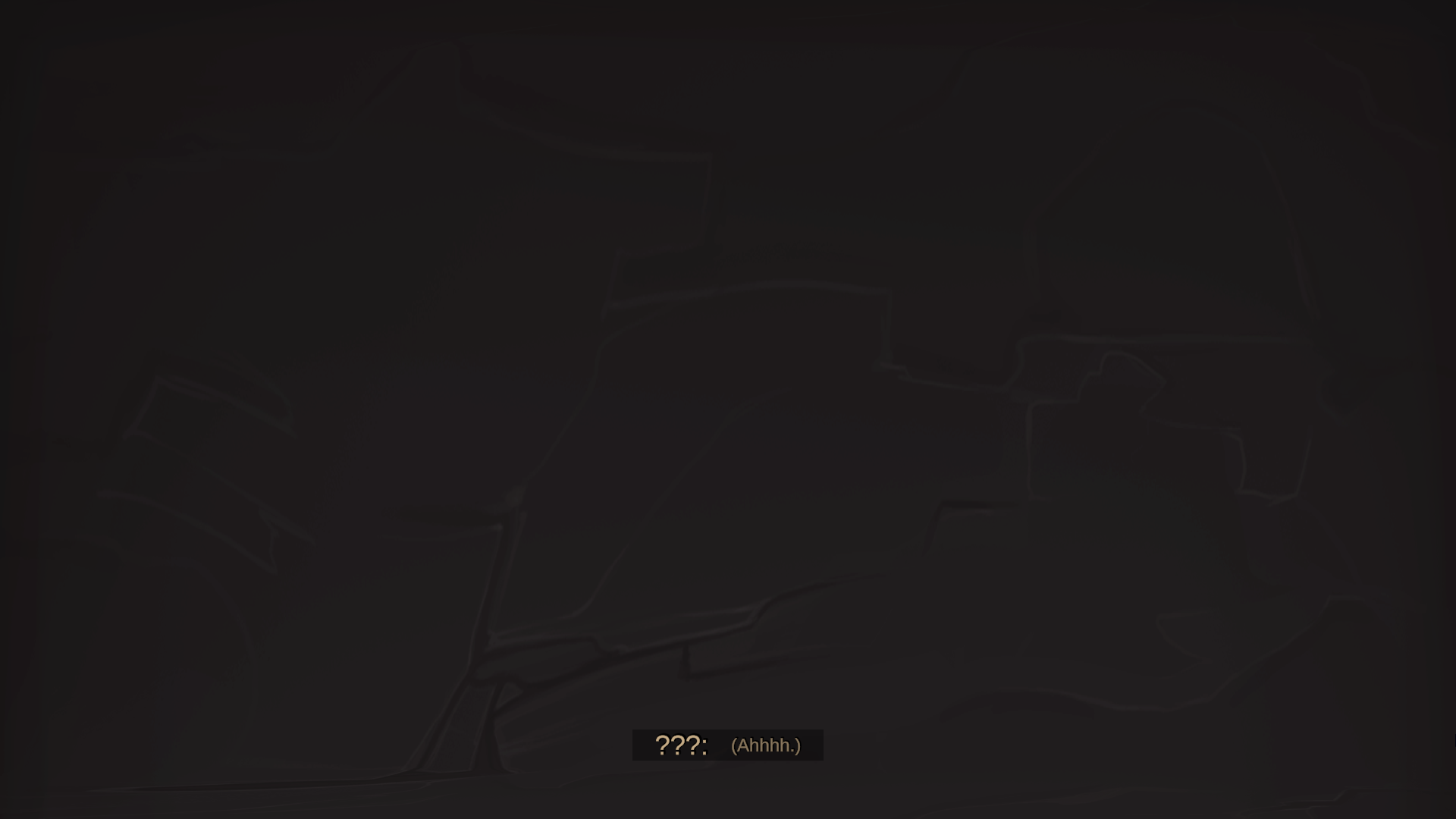
also all cutscenes looked like this for me
First off, I would like to say I really appreciate you recording gameplay with commentary. Seeing people play is important indirect feedback on it's own - very useful.
I was going to write a lot, addressing things you were mentioning, and what you wrote in the comment but I realized it would probably make a lot of sense to show how I play myself.
https://litter.catbox.moe/yc7g8f.mp4
I played from the start to pretty much the same point you did.
Let me clarify some things:
I get what you mean by the tutorial being very verbose. It's a lot of mechanics, and information to digest for players. I was told multiple times the tutorial takes a while to get through, so I don't really want to expand on it even more (I cut out rooms from the tutorial, and split it in two parts).
All dungeons are actually beatable with no mana/no jump abilities, but having them gives more options.
Given all cutscenes, tutorials and extra reading it takes a while for players to get to the core gameplay loop. I don't want to bore them with very easy dungeon rooms that still feel like train wheels (beginner templates already don't have bigger rooms, and vertical rooms).
One of the things I have planned for future it to have a practice mode, where already discovered rooms can be replayed on their own, so players can figure out how they want to proceed through them. I hope that and the option to play with unlimited time (but at the cost of far less gold) is going to help with the initial learning.
I'm interested what you think about those ideas, and if my video clears up some things on how to play.
It's been one week after DD47. Thank you for all feedback.
Here's what I changed during the week:
Added Screen Wipe after intro disclaimer.
Added option to show tooltips automatically, without needing to hold right mouse button.
All “...” names in cutscenes were replaces with “???”
Heart windows can now be closed with Esc key.
Added cutscene option to have dialogue text’s colour match speakers’ names’ colour.
Added option to crouch as toggle (default), or hold to crouch.
Cursor should not appear after dashing on windows builds any more.
Alt-Tabbing/changing application windows during dungeon generation should no longer hide cursor, and make pause window appear.
I can see massive UI improvements since last time, and it's slowly getting there.
I agree with comments below about the cutscenes. And it's not only the length, I have to skip it 4 times to get to the gameplay.
Just like I didn't leave a comment last DD, I'm still not up to leaving any meaningful feedback. I don't really feel the concept, and the higher difficulty make the possible flaws more obvious. Exploring a random dungeon with time limit to find a randomly placed object... It could work with proper setup, but I don't really get it as it is.
I am happy to hear the UI is getting better.
I hope cutscenes are gonna fly after I add some artwork. I was debating for a long time if I should have any story at all, because I knew if I start, then I am going to have a lot of it, especially at the start of the game.
I don't really feel the concept
That's ok, thank you for trying it out anyway.
It could work with proper setup
I hope the gameplay is going to have more depth/variety after I add side objectives.
higher difficulty make the possible flaws more obvious.
I am interested what those possible flaws are. Even if you think your feedback is not meaningful, I really appreciate it.
If you look how search algorithm work, the execution time will be wildly different depending on how early it will enter the correct path. Same could be said here. You either are able to explore the whole dungeon in the time limit or you might be shit out of luck. Last demo it was very easy to finish all dungeons, but this time (starting with the demo day seed) in 3 runs I only found a single bedroom, so you can see where I'm going with this - the balance might be shaky if it's dependant on an arbitrary time limit.
Assuming I understand anything about the game at all, improving it could be done the systems way or level design way.
Timer might not be an instant game over, but just applying penalties/making the dungeon harder (or the other way around, giving bonuses for fast finish).
Level design way would be removing the single point of failure of not being able to find the objectives. It could show you where the objectives are (like from behind bars), but player still has to be able to find and reach the entrance. You could also take a tighter experience approach of removing most exploration towards focusing on platforming.
I think I understand what you mean, but I think a lot of those things are already solved by Navigation Abilities (radars, x-ray vision, door sensing), as well as taking different exploration strategies.
in 3 runs I only found a single bedroom
Template "Baby Steps Day 1 - 3" only has one path, and 3 heart rooms connected to that path, example pic below:
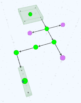
The fact you say you only found one heart room in those 3 runs is actually quite amazing given how unlikely it is.
If I misunderstood you, and by
(starting with the demo day seed)
you meant, you used the cheat code I gave, then yes the dungeons were harder than last time, because the cheat code advances ingame days, which also put you on harder dungeon templates, so sorry if I wasted your time explaining the beginner template above
.
Time limit can also be increased directly by using Time Limit seals, or indirectly by using Seals that make exploration faster, easier, or narrow down where you need to go.
As for the instant game over, if running out of time was not a game over, I think the game would become too easy, and push players towards slowly collecting all coins and chests inside dungeon even after the time is up.
I still have some systems planned, which are going to change balance in future. On one hand there is going to be a skill tree, with passive upgrades to make things easier the more you play, but on the other hand I am also going to introduce many side objectives, which are going to make things harder.
I see, that makes sense.
I still can't wrap my head around that while playing. I looked into seals, and it had already all the time limit increases. I also gave it another try. It didn't go well. Basically one whole side of the dungeon was empty, and despite trying to speedrun it the time run out some distance into the second wing before I managed to find anything. Is one of the wings always supposed to be optional? Is it possible to determine that before wasting time?
it had already all the time limit increases
You can unlock more Seals at The bathroom. As far as Positive Time Seals go, there are 11 (you start with 3).
As for your dungeon generation, it really depends on what templates you are playing on. Different Seals are more important on different templates.
Template descriptions are visible on loading screen, break room, and template tooltip in hub area.
You're talking about empty wings, so I guess you must be talking about either "Loop", or "Two Paths" templates.
Loop example:
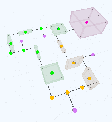
Heart Rooms in Loop template can connect to either green path, orange, or both, so in theory, you could reach the Magic Mirror without ever seeing heart rooms, but that means to get there was just one room after the other, with every room just having 2 doors. On the other hand if you found them before you got them, you can easly narrow down your search later, as in you can decide if you can ignore one half of the dungeon. It's actually one of the easier templates.
Two Paths example:
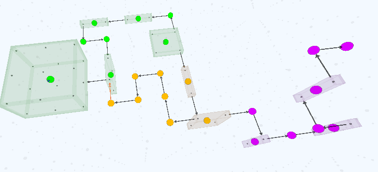
That one is harder, because all Hear Rooms appear in one branch. If you take the green path, you would need to backtrack through it, and eventually find a room with 3 doors on the other path (the only room besides the room before magic mirror room with 3 doors). If you went with the orange path, you would need to remember which was the room you passed with 3 doors, and go back there after finding the mirror.
Is it possible to determine that before wasting time?
Navigation Seals help with that a lot. Radars, compasses, and x-ray vision can help determine which path to take often from the start of the dungeon. Door Sense ability helps in figuring out those rooms with extra doors even if you cannot see the.
Then there is of course familiarizing yourself with templates (some room types appear on different templates, paths, and branches).
Of course if you would like to try to get better at the game, I would advise to play from the start, without using the cheat code, because harder templates appear on later days.
It's also better to exit dungeons before time runs out. You don't have to finish all objectives every run.
I am happy to answer your questions, even though I feel like I am spoiling a lot. What seals you unlock is random, but can be narrowed down by what seal types you need. Different playstyles come to play depending on your unlocks, and what templates you get e.g. navigation seals are very important on e.g. Maze template, but pretty useless on Snek template.
I think I figured it out. I might have not added any guests. After adding a goblin there was a mirror, but the one heart I found was fucked up (probably not enough guests?). I really think those should be set by default, because the same happened to me last DD. This time I just had a bigger brainfart.
oh, if you play from the start (day 0) unlocking goblins is actually explained in the story now. As for the other hearts with no guests, chances are there were not for goblins, but for e.g. kobolds.
If you interact with a heart, you can check its requirements.
The way heart rooms work is not checking what you unlocked and spawning that, but spawning what was meant to spawn, and then showing players what they need to unlock.
If you play from the start day 0 is going to have no guests at all (reception not unlocked). After that, you are going to be able to unlock female goblins, and you are going to have guaranteed 3 days with goblins. From day 4 other guest types might be required to have any guests show up.
I'm probably going to sound like some of the other play testers here. But here are a number of thoughts I have after going through a the game for ~10min.
I am interested in trying it again, the gameplay looks like it could be really fun. Also the goblina was very cute.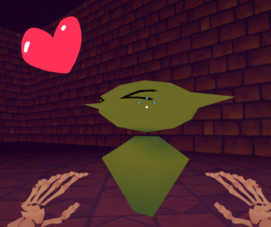
Thanks for playing.
Yes, UI and sound are game development parts I struggle the most with, so if you got any ideas how to make UI better, I am all ears.
It would be really nice to be given some in-game pointers on how to do more advanced movements.
Well, there is the tutorial, but people were already saying it is very long. If I were to go in-depth on how to do all the things, it would be even longer. I am not sure what you mean by "pointers".
I feel like your levels should be set up in such a way that players are able to test their abilities without already being under the clock.
I assume the tutorial is not enough. Dungeon Runs can be also played with unlimited time (but don't get much gold). I plan to add some options to "practice" rooms with no timer in future in-between dungeon runs.
I found the objectives to be confusing, it says to activate the mirror then collect the hearts.
It doesn't say to collect hearts, but to find the correct guest. The first time you go to the dungeon, that objective is actually invalid, which is explained in the story.
I was not able to get out of water once I fell in if there wasnt a ramp.
I assume you are talking about Sticky Slime Pools (green). Yes, you are not able to jump out , or climb out of them, and they slow you down. Every slime pool has an exit somewhere.
It's good to read you are interested in trying it again. I'm happy you find my goblin (placeholders) cute.
It's my first time playing this so you've probably heard these before but here's a little list of things I'm writing down as I play.
Starting cut scene is way too long. I was on board for about 2 minutes but after that I just kept mashing to skip everything. and I was astonished as to how much mashing I had to do. Sad part is, I Was enjoying the dialogue. I'm sure you're planning on having a proper animated intro at some point but right now staring at a wall it's very boring. If I were you, I'd try to space out your initial information dump in between gameplay. This would hold true even with a proper cutscene. Players are excited to play your game when they start. don't let them down.
UI is very overwhelming at first. it might be good to outright hide all the options that aren't available yet. Gradually introducing them in as you unlock them.
Little weird how you have to right click to get information tooltips. it feels more natural to me that they're just always there when hovering.
There's a bug (on linux) that if I minimize the game on a loading screen, my mouse will disapear and I can't click the button to start the dungeon. however there's a workaround where when the pause menu is open in the loading screen, you can click play from within the pause menu. unpausing the game still keeps you in that state of not being able to click play.
(This room is not fun)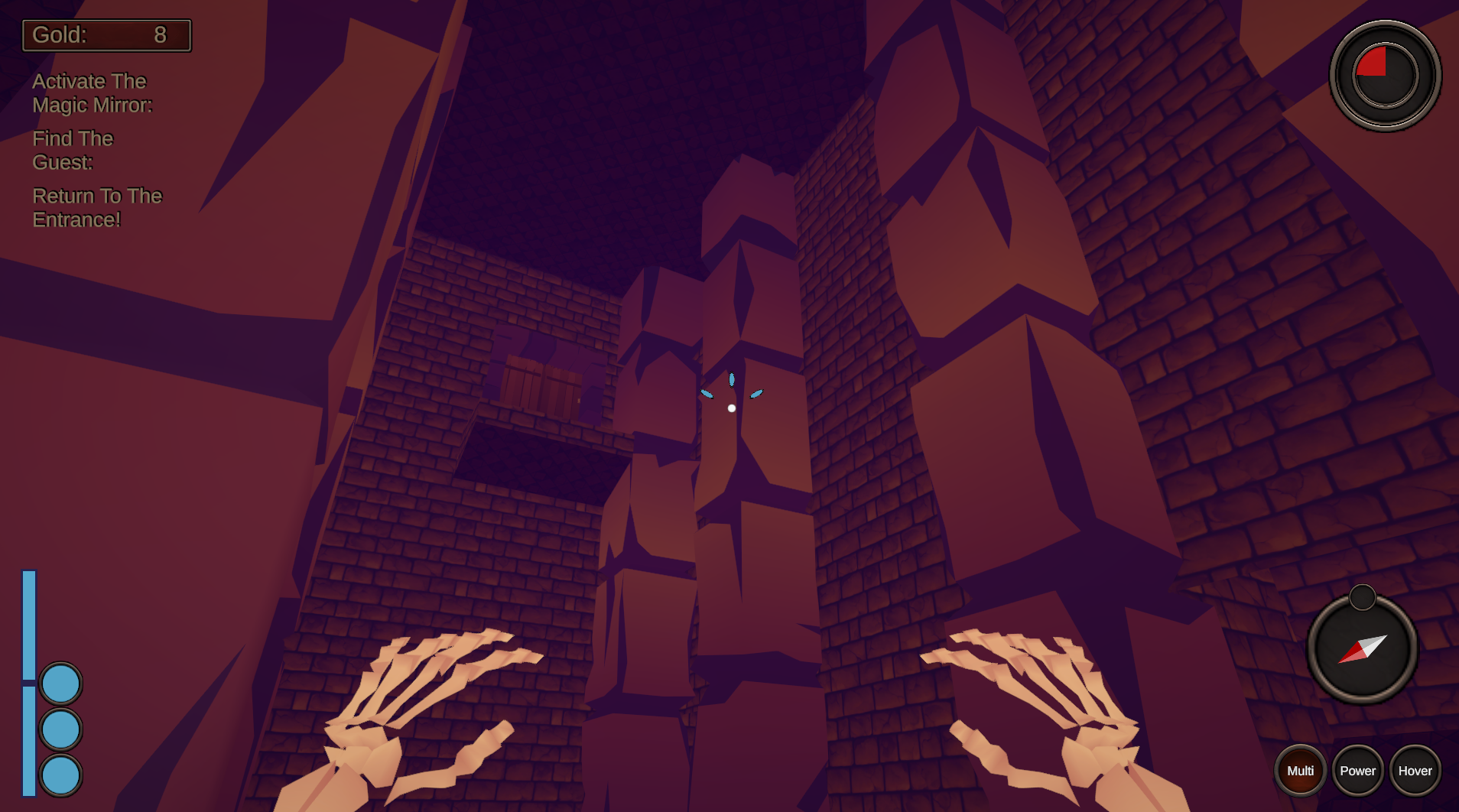
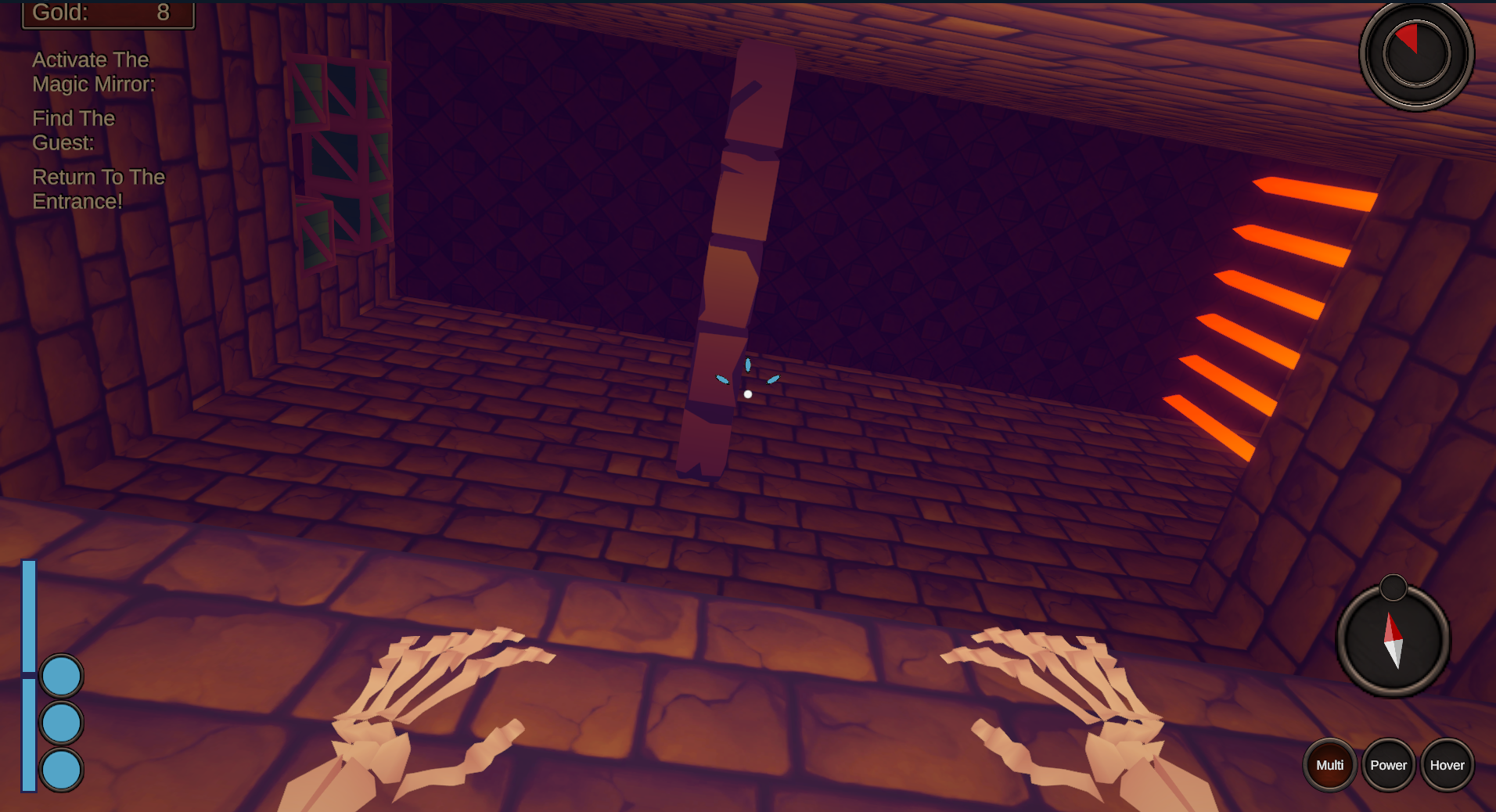
The game is fun, honestly. It's hard but it's a game you can see yourself becoming good at (which I'm sure you are). The thing I HATE, is the time limit. I feel like it's completely anti-fun. Or at least, the fact that it kicks you out of the dungeon. It's not very conductive to you getting good at the game. I feel like the game could be a lot more approachable if the time limit was reworked in some way. Either extending it by a lot or making it a requirement for greater rewards without ending your run altogether. Maybe even implement a rating system to see how fast you cleared a level and base rewards on your ranking. But ending the level when the timer hits 0. not fun.
Thank you for playing, I am always happy to read new player's experiences.
Starting cut scene is way too long.
I hope they are not going to feel that way after I add images. I don't know how else I could space them out, which would make sense in the story.
UI is very overwhelming at first. it might be good to outright hide all the options that aren't available yet. Gradually introducing them in as you unlock them.
Oh, it's actually much better now. Which info specifically do you think should be still hidden?
Little weird how you have to right click to get information tooltips. it feels more natural to me that they're just always there when hovering.
It used to be on hover, but I did not like it. I played games with hold right click for tooltips before, so it's a personal preference. Maybe I should make it an option.
if I minimize the game on a loading screen, my mouse will disapear and I can't click the button to start the dungeon.
Yes, that's a new bug that was also reported by Tomo. Thank you for reporting that, I think I got a pretty good idea what is causing that.
(This room is not fun)
Did you find it too hard, or did you not know what to do?
The thing I HATE, is the time limit.
Ha ha, yeah some people just really hate time trials in general. You can play with unlimited time, but earn much less gold. What I really don't want the game to become is some sort of grind where players spend 15 minutes on one dungeon so they can get all coins without worrying about anything.
I don't know how long you played, and if you unlocked Sealing Chamber, and Bathroom, but there are many seals (equipment, and modifiers) that make time last longer, or make it quicker for you to advance through dungeons. You can get them at start of Day 5, or use the cheat code I wrote about at the bottom of this page.
By the way, I was going to play your doodle town next week, but I might do it earlier now that I know you are online.
Oh, it's actually much better now. Which info specifically do you think should be still hidden?
I think every unlockable rooms in the offices section should be hidden when not unlocked.
>Did you find it too hard, or did you not know what to do?
Too hard.
>I don't know how long you played, and if you unlocked Sealing Chamber, and Bathroom,
played for 45-60min. I did unlock both of those. They are fun. but there seems to be a hard cap on time limit increases in you can get in dungeons. iirc it says "capped at 85 seconds" is that the upgraded cap? I think I've only managed to complete 1 run. most of the time, I fail without even reaching the mirror room. Do you know roughly how much time people still have on the clock when they complete a level? Maybe I just suck. but most levels I feel like I always failed without even standing a chance.
>By the way, I was going to play your doodle town next week, but I might do it earlier now that I know you are online.
Hey play whenever you feel like it. but I appreciate you planning on trying it out!
I think every unlockable rooms in the offices section should be hidden when not unlocked.
Oh, the reason why they are not hidden is because clicking them tells you what you need to do to unlock them. I don't think it should be a secret that e.g. unlocking Mimic employee gets you access to Treasury.
Too hard.
One easy way to skip the part with crates, and lever if you got mana is to just use power jump to reach the higher door platforms. There is also a hole under the lever, so you can use power jump, or hover jump to get to it. There are also other ways depending on your Seals. I think part of the fun is coming up with more efficient ways of progressing through rooms depending on different situations.
They are fun. but there seems to be a hard cap on time limit increases in you can get in dungeons. iirc it says "capped at 85 seconds" is that the upgraded cap? I think I've only managed to complete 1 run. most of the time, I fail without even reaching the mirror room. Do you know roughly how much time people still have on the clock when they complete a level? Maybe I just suck. but most levels I feel like I always failed without even standing a chance.
All numbers you see in Player Stats are numbers that are already modified by Seals, so if you got more Seals that increase time limit, you can still add them, and see that number increase. It's important to take advantage of the extra time (the green buffer time). It's often worth getting that extra time crate and coins to pause the timer. I would need to see you play to know what you could improve at.
The thing is, you don't have to complete every run. Just make sure you don't run out of time. With days passing, you are going to start getting harder templates, but even with just playing safely you would eventually get enough points to unlock even more seals that increase time limit, extra time, give new skills. At some point you are going to have enough seals to suit your play style, and change them depending on what template you are going to be playing next.
The dancing Hardhat Goblins are adorable.
Cutscenes being purely text and manual cycle through is not. The Cutscene options are unnecessary at best I think. Why would I need to scale the Textsize and adjust its position on an otherwise empty screen?
I don't know what to say about the 'Cutscenes' themselves. Its just text at the bottom of an empty Screen. It's alright I guess? Maybe? I'm no writer by any means, and its not like theres much there otherwise. Maybe they're a bit long as of now. But maybe they just feel like it because theres nothing there.
Main HUD screens are cluttered as always, but I like the option to add Stuff to the Location Quickbar, so I can better customize what I need. Would still like it to be more of an interactable 3D Scene per Room instead of just swapping to a different cluttered UI.
Finally, the Mouse locks to the Center of the Screen when starting a Dungeonrun, and I can't click on start to actually start it. Sorry.
Thank you Tomo.
I will add images to cutscenes in future, so maybe those options are going to make more sense then.
Finally, the Mouse locks to the Center of the Screen when starting a Dungeonrun, and I can't click on start to actually start it. Sorry.
That's never happened before, right? I also did not see it happening on streams. Were you alt-tabbing when the dungeon was being generated, or something? Were you playing windowed?
Would still like it to be more of an interactable 3D Scene per Room
I plan to have locations being "explorable" by switching to different came view angles, and seeing different npcs doing their things. So at e.g. Reception, there would be a receptionist, and some guests in a waiting area. I don't want to have reception ui be accessible by e.g. pressing on the receptionist, because she may not always be on the screen. That's why the visuals for the rooms, and UI are going to be separated.
Progression pace seems much better now with the really easy levels in the beginning. The game "clicked" for me this time around and I finished several dungeons. I don't have that much other to comment on; more rooms, especially the starting one, of course but I am certain you're working on it already.
Thanks for playing
Right clicking brings up the mouse cursor while in game for some reason. Goes away again when going into a menu.
So you mean after dashing? It doesn't happen for me on linux, so I am going to need to look more into it. Thank you for reporting that
Can't cancel popups with Esc key.
which ones would you like esc to work on? If it's a confirmation window, should it choose a yes, or no when you press esc? Or did you mean heart windows?
With the less throwing force seal it felt kind of inconsistent when crates broke, but maybe that was a me problem.
What do you mean? Crates were not breaking after you threw them?
I have 800-900 FPS ingame,
That's kinda amazing. I will look into adding v-sync options.
Rebindable keys
Yes, I never made any rebindable keys, but I understand how important they are.
Custom icon for the exe!
I still don't even know if it should be a goblin, skull, heart, or something completely different.
Thanks for playing and commenting
So you mean after dashing?
Yeah exactly.
which ones would you like esc to work on? If it's a confirmation window, should it choose a yes, or no when you press esc? Or did you mean heart windows?
Oh right, I think it was only the heart windows. I didn't notice anywhere else where I wanted to do it, but if so I think it should cancel.
So I started the game to show you better what I meant about the force seal and crates breaking. But first the dungeon gen. failed and then the game crashed right after.
Anyway I couldn't replicate it at all. They seemed to break when throwing normally against the floor but it didn't when I played earlier. I kept throwing them into the ceiling just to break em. I have no idea. I really wish I'd recorded now...
Ah yes, the generation uses a lot of RAM. I am glad the message at least works. When it crashed, did you close it right away, or gave it some time? (sometime giving it more time works, because the game still tries to generate the dungeon). I have some ideas how I can make generation better, because right now I cannot even do it asynchronously.
I am going to make heart windows close with esc.
They seemed to break when throwing normally against the floor but it didn't when I played earlier.
welp, since you couldn't replicate, I am just going to assume it was the reinforced crate, which take multiple throws to break.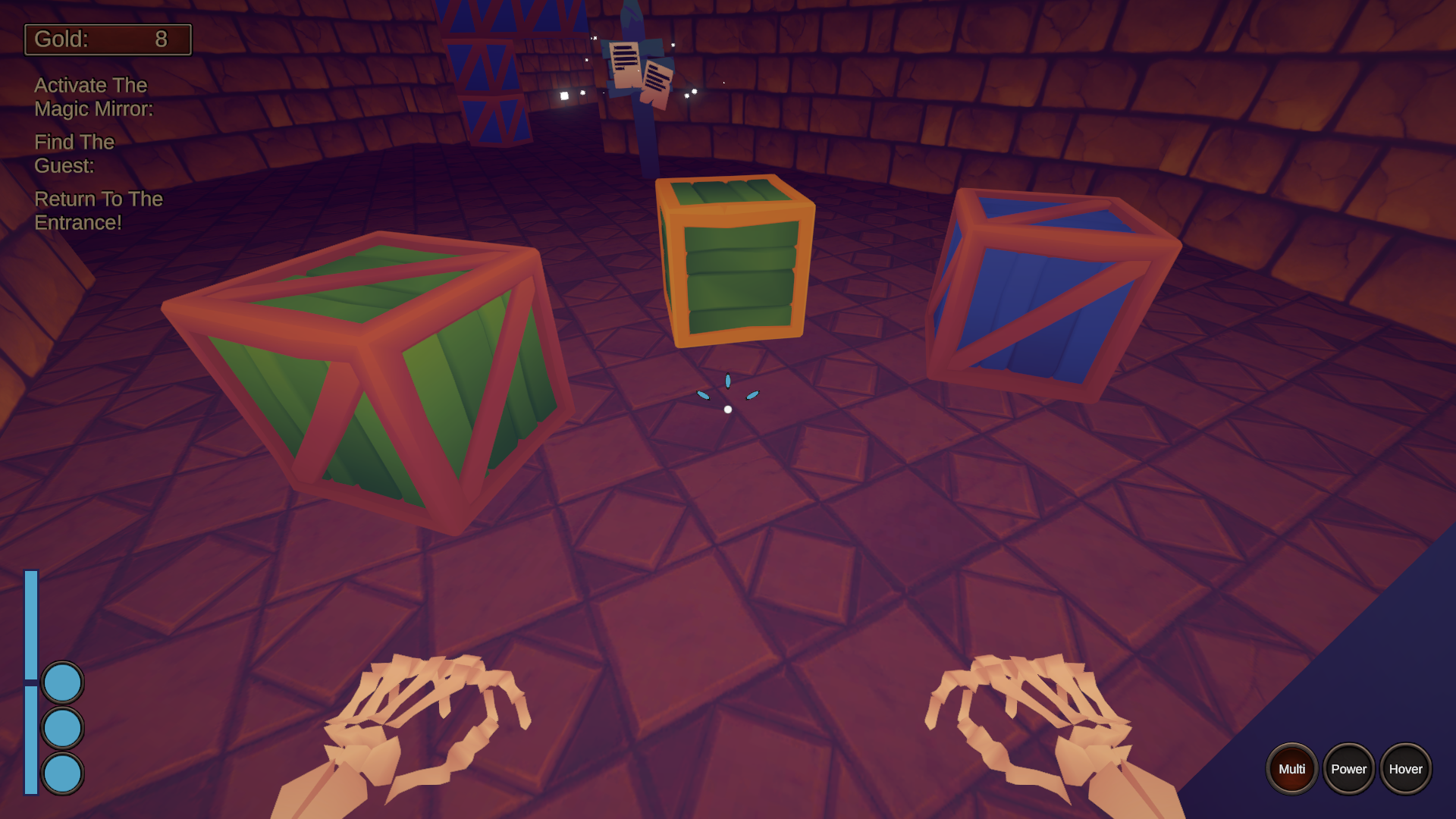
The gameplay in this is really good, especially once you get into timed runs in non-linear dungeons and are frantically breaking green crates. Good stuff.
Ledge grabbing when jumping out of water didn't quite work consistently for me. I hate how having power jump selected delays your jump even if you don't hold the button. I'd like an option to hold crouch instead of having it be a toggle, similar to sprinting. Other than that I have no complaints about the gameplay.
The whole management aspect seems to have been streamlined because I didn't get completely filtered by it this time. I feel like the whole explanations for the dungeon are a bit much still for what is essentially
>find magic mirror and get face
>find gobbo with that face
>get out
The UI is also quite overwhelming at times, specifically the screen when you start a dungeon run comes to mind. Does it really need all those buttons along the bottom with one leading to the options menu? Can't I just have that in the pause menu once I'm in the dungeon?
Also the UI when you select a heart. A simple checkbox asking if you're sure should suffice.
Thank you for playing.
Ledge grabbing when jumping out of water didn't quite work consistently for me.
You're not able to ledge grab while in water, so your "feet" must have been still in water when you tried to ledge grab.
I'd like an option to hold crouch instead of having it be a toggle, similar to sprinting.
I see. I got an option to make sprint as toggle like crouch, but not the other way around.
The whole management aspect seems to have been streamlined because I didn't get completely filtered by it this time.
That's good to hear. Did you play long enough to get to unlocking Seals with seal points? Alternatively using the cheat code I gave at the bottom of the submission comments. Having your "equipment" be unlockable was one of the biggest changes from the last DD.
>find magic mirror and get face >find gobbo with that face >get out
That's pretty much what you get on pause screen, and under gold indicator.
Does it really need all those buttons along the bottom with one leading to the options menu? Can't I just have that in the pause menu once I'm in the dungeon?
Still too many buttons. I am going to put them in a separate tab section. As for player stats, they are in pause menu as well.
Also the UI when you select a heart. A simple checkbox asking if you're sure should suffice.
Do you mean I should drop the whole confirmation text?
Thank you for all the feedback.
Played a bit of the campaign today.
It is nice to see you added a tutorial for the dungeon section. Now the game should funnel the player better into learning the game. Its also cool to see you started to work on the campaign and story. I also see you made the UI less overwhelming and the mana on the crosshair is a nice touch. They are first steps and are on the rough side, but is nice to see the game starting to take shape!
For detailed description of all changes between this version, and Demo Day 46, you can check out the following devlogs:
https://webcough.itch.io/goblin-resort/devlog/423159/version-01u-changes
https://webcough.itch.io/goblin-resort/devlog/423183/version-01v-changes
https://webcough.itch.io/goblin-resort/devlog/426090/version-01w-changes
https://webcough.itch.io/goblin-resort/devlog/428785/version-01x-changes
https://webcough.itch.io/goblin-resort/devlog/431299/version-01y-changes
https://webcough.itch.io/goblin-resort/devlog/434277/version-01z-changes
https://webcough.itch.io/goblin-resort/devlog/439821/version-021
https://webcough.itch.io/goblin-resort/devlog/444969/version-022
https://webcough.itch.io/goblin-resort/devlog/447684/version-023
For those who would like to skip the first in-game week, and receive some resources I prepared a following cheat command: AGDG Demo Day 47
You can input it in the text field in Hub -> Dungeon -> Seed Options, and pressing enter key.
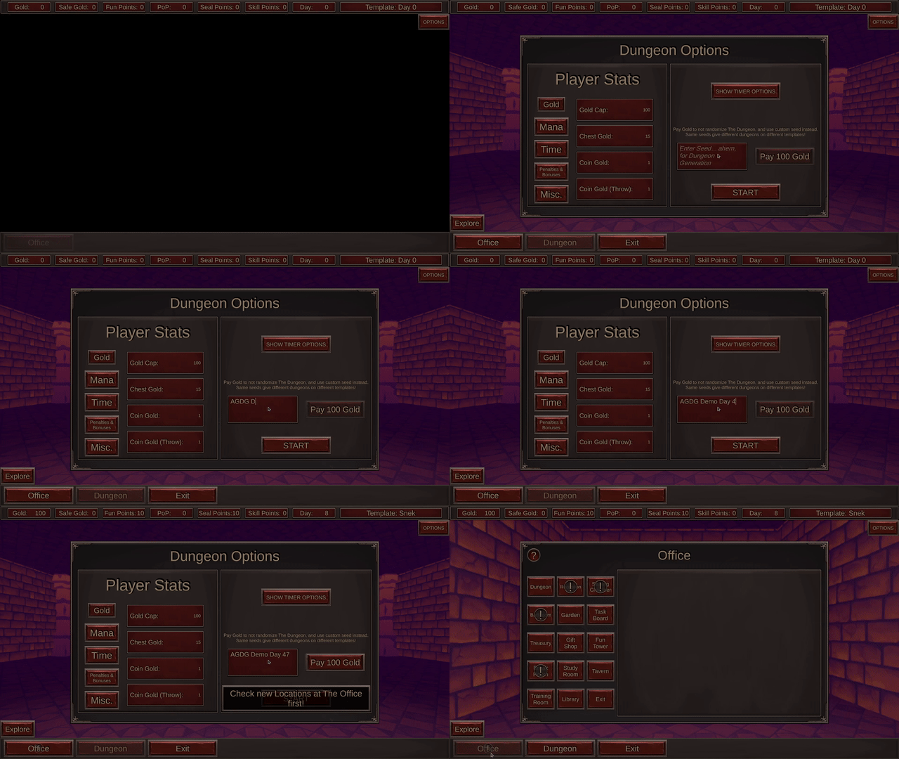
The cheat is going to give you 100 Gold, 10 Fun/Lust Points, 10 Seal Points, unlock some locations and skip to day 8. The cheat is not going to work after day 8.
Leave a comment
Log in with itch.io to leave a comment.