Play game
Diving Bell Mayhem's itch.io pageResults
| Criteria | Rank | Score* | Raw Score |
| Theme | #43 | 4.121 | 4.121 |
| Innovation | #50 | 3.636 | 3.636 |
| Fun | #92 | 3.530 | 3.530 |
| Game Design | #94 | 3.591 | 3.591 |
| Overall | #94 | 3.520 | 3.520 |
| Graphics | #282 | 3.318 | 3.318 |
| Audio | #317 | 2.924 | 2.924 |
Ranked from 66 ratings. Score is adjusted from raw score by the median number of ratings per game in the jam.
How does your game fit the theme?
You're using a diving bell to dive deeper into an ocean chasm.
Did you write all the code and made all the assets from scratch?
All code and visual assets were made from scratch. Some audio assets were imported, they're referenced in the game's description.
Leave a comment
Log in with itch.io to leave a comment.



Comments
Always great to see another Godot user in a jam. I like the momentum based movement, the visuals are simple but effective and the sound is nice, very arcadey. Good job!
Pretty sweet game, I enjoyed it ! :)
awesome game! really enjoyed it and very unique mechanics
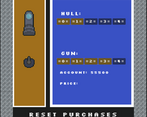
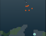
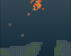
I really like the diving bell concept, first I've seen this jam! The procedural nature of the levels and enemy/pickup spawns was a very nice touch and keeps it fresh every time. I see in the pictures there's an upgrade shop, maybe I just missed it but that definitely sounds like a great thing to have in this game, especially if the upgrades carry over after you're destroyed. My only major criticism is that it's not uncommon for you to have to shoot downward so much that you go off-screen at the top and lose sight of the diving bell. I think maybe if there was significantly less force pushing back on the y axis it'd make for more enjoyable gameplay. You could even explain it in lore as the pressure under the sea keeping you moving down!
Anyway, here's my gameplay video playtest of it. Hope it helps provide you some valuable first reaction feedback!
I definitely see what you mean about going above the screen, and I'm very glad that I actually have a video of what that looks like for someone who's unfamiliar with the game. I've been told more or less the same thing before, so I added pushers (for lack of a better word) in an improved version that I'm working on that would guide the player out of the top of the screen, however after seeing this it seems it might be better to have them lower down (maybe where the HUD is) to prevent the player from reaching the top of the screen in the first place.
A few other things I'll just mention in rapid fire:
Thank you so much for your feedback!
Hey, really glad my gameplay was helpful to your development! I completely missed the shop at the main menu lol, it might be a good idea to add it to the menu after losing that way you don't have to go back to the main menu just to go to the shop.
Probably, though the shop's code is held together by hotglue and hope, and the idea of touching it again terrifies me. I'll likely have to redo the shop entirely before I can do that.
Fun concept, great implementation. One small remark - the cannon can go off screen (the top part) with enough momentum.
This is a really good game. The mechanics are simple, but super interesting. Using your guns knockback physics to move, while also watching out for enemies makes for a fun and tactical gameplay loop. Saving for upgrades only enhances the gamemplay loop even further.
Only thing that bothered me was that the hull was able to go offscreen (especially at the top or top-corners of the screen). This made it really hard to see where you should shoot to get out of the situation. It's also what made me die in most scenarios. Otherwise great game
Thanks!
I've (mostly) fixed the issue you mentioned in the post jam version. It'll be significantly harder to go off screen, and easier to come back if you still do.
Loved this. Controls are so intuitive, the physics feels genuine and satisfying. I only wish there were some more different types of upgrades.
As Borat would say, very nice! I think random generated level design is very cool, moving bell is little chalenging, but also so satisfying when you manage to make it as you wanted. There is so much things happening down there, i really like graphics style, sounds and overall, superb entry!
Awesome fun infinite game! Looking forward to the post-jam release!
Great game, movement that is also your atack is always a fun game machanic, graphics are good and I think its really cool that this can also be played on a phone. the bullet impact sound effect is not the best, especially when you shoot a lot at a time, but this is a very minute detail.
Great game. Keep it up
i like game play it was very smooth and easy to understand. graphics are simple an nice . No lie im not fan of the sound effects but its okay.
That's fair. Most of the sound was very last minute, improving it is on my to-do list. Glad you thought the gameplay was good though!
You did a great job on this game! I loved the momentum aspect where you shooting moves your character, you seriously did a great job! Because I could not put this game down! I kept playing it to try and beat my score! You should be proud of this title! Great job!
Cool game that evolves around a well thought mechanic! Rlly had fun playing this!
Really liked how the shooting serves two completely distinct (and important) roles.
Great work with this idea!
I like how shooting is both used as a way to correct your position and protect yourself from threats. Took me an embarrassingly long time to figure out.
Confused at first about the movement but when got hook of things game became fun! Nice foundation to build a proper polished mobile game. This game is the definition of easy to learn hard to master which is the one of most crucial things in game design. Amazing game!
Interesting idea ^^ The upgrade system was a nice touch, and so were the gun power ups.
Really enjoyable game! The settings UI was confusing tho.
Glad you enjoyed it!
If you don't mind, how exactly was the settings UI confusing? Currently my best guesses are button vs background colour and maybe it being stretched out a bit too much, so if you could narrow the issue down that would be great!
Yes, one thing is button vs background colour, but I was more concerned with the placement of the buttons. I mean that "Reset all data" button is almost at the middle of the screen and it looks like the most important button. On the other hand, the "Back" button feels like it's thrown between buttons (by that I mean "Back" button should be more seperrated). My first thought was that something didn't load properly.
I think moving down both "Reset all data" and "Back" buttons would help.
But maybe that's just me ¯\_(ツ)_/¯
Ok, that makes a lot of sense actually, thanks.
I really like games where the movement mechanic is so different, it's simple but entertaining, well done.
Wow, this is really exactly what you expect from a game-jam game. Exactly one, but very polished, unique and challenging game-mechanic. Simple, but good looking graphics. Same for sound. And all in all a perfect fit for the theme. And as a bonus it even has a shop, wtf :-D
There was actually just one little bug (or maybe i did not really get, how to get them). When shooting one of the power-ups, they appear, but i couldn't collect them. Neither by driving there nor shooting or so?
But nevertheless, all in all, this one is really a 5 stars masterpiece. One of my favorites of the jam so far :-)
If you shoot the power-ups the bubble surrounding them should pop. At that point it's considered collected and will act accordingly (either by giving you a tripleshot, points, or repairing your hull). Were the bubbles not being popped when you shot them, or were the power-ups not actually doing anything?
Also thanks for the feedback! I'm glad someone finally noticed the shop, its script is an unoptimized mess that's barely held together with hot glue and hope, it got so bad that I considered scrapping it for a while.
Ah ok, yes then i think it works. Just expected, that i maybe have to collect it also after shooting it outside of the bubble or so. Maybe you could add a little visual feedback or so. Just that players know what's their effect (or just write the effects next to the icons on your game page).
About the shop. Yes, i detected it more or less by accident as i wanted to leave^^
I mean, if you maybe plan to release it as a real game and put some IAP stuff in it or so, you should maybe show it the players a bit more prominent. But for the little game jam, i rather found it as an "easter-egg", which then just was a very nice surprise at the end :-D
I doubt I'm going to release this (or anything really) as a 'real' game, I just want to make another web game that's a better version of my jam submission. Also my original plan was for the player to have to catch the power-ups after popping the bubbles, but I realised that would be a bit too hard and just kinda forgot to add improved visual feedback. I'll add something into the improved version, probably a text display either on the power-up or the HUD.
Cool, yes i would bet you're in the Top 10 in the end. So a little "better version" could be maybe pretty useful for the first time after the jam. Definitely wish you all the best :-)
Sorry for taking a while to respond.
I highly doubt I'll be in the top 10, there's too many games that are just better (not that it's a bad thing), but I appreciate the confidence.
No problem. I've played a lot in the meantime. From fun and game-mechanic yours is still one of my absolute favorites ;-)
That's nice (and somewhat surprising) to hear. Also since it was your idea, I've updated the powerups in the new version, they now fade to green before becoming transparent once you collect them (and there's three more of them).
Oh nice, glad i could help a bit.