The polish and care really shine through. And such a well put together game well done
Play game
SCP-2317: The Countdown's itch.io pageResults
| Criteria | Rank | Score* | Raw Score |
| Audio | #25 | 3.944 | 3.944 |
| Overall | #43 | 3.750 | 3.750 |
| Theme | #43 | 4.083 | 4.083 |
| Graphics | #58 | 4.083 | 4.083 |
| Game Design | #62 | 3.722 | 3.722 |
| Innovation | #64 | 3.611 | 3.611 |
| Fun | #256 | 3.056 | 3.056 |
Ranked from 36 ratings. Score is adjusted from raw score by the median number of ratings per game in the jam.
How does your game fit the theme?
It's centered around SCP-2317, a mysterious entity in the form of a Door leading to Alternate Universes
Did you write all the code and made all the assets from scratch?
All art has been drawn by our artists, same for music and sfx!
Comments
Amazing game, the amount of polish shown here is impressive. Not to mention one of the best adaptations of the theme I have seen. The team should be proud of this game, well done!
The presentation and vibe of the game is great! Really well put together by the team. Nice work.
Really nice game! Love this kind of games, where the imagination of the actions can run wild. It took me by surprise in a really good way!
Nice Job
PS: I love SCP
YESS!! Day 4, no casualties! I played like five times, this was fun 😄 Proper art, great music (that piano theme in the menu is actually beautiful), sounds and game design, all well done! This was a pleasure to try out 👍
A super interesting take on the theme. I really loved the visuals the art style was neat. I feel like a few puzzles or something like that would've made the game feel more engaging. Still very solid!
I love the SCP concept! Definitely clicked a few random buttons and died a lot though.
I'd love some more in-depth clues on the research and some puzzles to solve, because the end felt abrupt. I think that's because it was tied to random chance? Basically, I would love some more elements of story! Like something that goes wrong on day 3 or something.
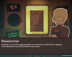
The dialogue could also use a little polish, just to be more concise and seem more lab-y.
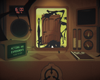
Absolutely love the graphics and music, especially how you never see the art changing—very FNAF. And the art style itself was like Little Inferno. Two of my favorite games in one!
Having the researchers go insane was creepy and cool, especially with the psychological test thing, too. I felt like I might have also been hallucinating when the monsters appeared around my desk.
Also love the layering of the character art against the background, with the highlighted outline. It just looked super clean.
The flickering of the changing dialogue was another small detail that really added to the atmosphere. Same with the copious SFX. And the music was the cherry on top.
Not sure if the loading screen was real but it definitely made the game feel more legit! The title screen and credits, too.
I'm a sucker for horror and SCP, so this game had me hooked from the concept alone. It might put some people off to have so much text, but I personally loved getting to click through it. Super amazing for only a week of work!!! And gotta love that everything was made from scratch :)
+ I saw a comment saying that there was never enough time to do everything you wanted, but I actually really liked how the calendar caught me off guard. Felt exciting and a little more challenging. But maybe it could be better balanced with longer missions etc.
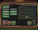
Really stunning art and sound, and wonderful, creepy vibes to the gameplay. Once I figured out how the various terminal actions worked, it was a lot of fun to solve the mystery. It felt a little easy to figure out which entity it was with just a little bit of observation and an expedition/offering, but I'm not sure if there's a good way to solve that without introducing more door types.
All in all, super innovative and very impressive. Great work!
Seems really cool but I genuinely don't know where to start, I feel like this is the type of game that you need to watch someone else play before you can even begin to wrap your head around it. The art and atmosphere are great though!
Great use of the theme - love the creepy atmosphere and the art! Clever gameplay as well!
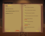
Great game with a promising concept! I wish there was some danger indicator when the monsters are at the critical level and I need to maintain the room immediately. Dialogs needs a bit of polishing: if you spam "Skip" trying to get to the gameplay part faster, you'll accidently hit the first dialog option.
Also, just an idea, it would be great if results of expedition or monitoring would be visible inside the room, not only in the journal (for example there would be a tools showing you pressure and temperature after expedition, image of the door would distort after finding visual anomalies, etc.)
Thanks for playing and glad you enjoyed it! We ran out of time to really polish it up and had to cut features and content in order to make sure it would be (mostly) stable, but after the jam we’ll have some updates to get in all or most of what we originally had intended. Thanks for the great suggestions :)
Very cool game! I love your take on the theme and the atmosphere is fantastic. Awesome work!!
graphics give me little reminding of little inferno. nice work!
Okay, it took a couple of tries, but I get what ya'll are going for and I like the idea. It's a 60 Seconds! meets Phasmaphobia. My thoughts (while keeping in mind that this is a game jam):
- Visuals and atmosphere and great. More would be nice (different researchers, etc) but you knew your scope and didn't over reach.
- Menu and day progression is good, though I think the bug where the "next day" overlays the "this is what happened during your chosen task" was pretty discombobulating, and while it's a GJ, would have helped the flow of the game tremendously.
- Task mechanics work fine, and I appreciate that when there's nothing left to do with a task, it gets greyed out.
- The journal and the entire goal of the game to figure out "what door is this" is neat, but wasn't obvious to me (probably because I skimmed some text tbf). That said, I think to help not-so-smart gamers like myself, forcing the player open the journal would be smart.
- My only hold up on the game is the fact that all the missions are just 100% luck/random and there's nothing you can do to prevent failure. Clearing out monsters was easy enough to figure out. But the fact that you can choose the researchers to send in, and that a researcher/guard can die right off the bat feels... bad? As a player I just feel I have little agency, and the best option is to clear out all the "safe" tasks, and then brute force the expedition until I have enough GREEN words to select a monster. This is pretty much the strat and while it was fun to figure out, it doesn't offer the player any agency or replay value mechanically (though there might be more story to it).
- Also, there's a bug that soft-locks the game. It's when it ask me to press space on some text, but space does nothing. At least it's happened to me a couple times now.
So, outside of the bugs, I think the biggest upgrade to the game is giving the player more agency in their choice (60 Seconds! has some simple but solid methods in how they achieve this). Obviously, it's a game jam, and there's never enough time to do everything you want. What you have is impressive, and you chose to keep things within scope and that's a talent not many of us have. Great job overall, and glad you submitted this great work!
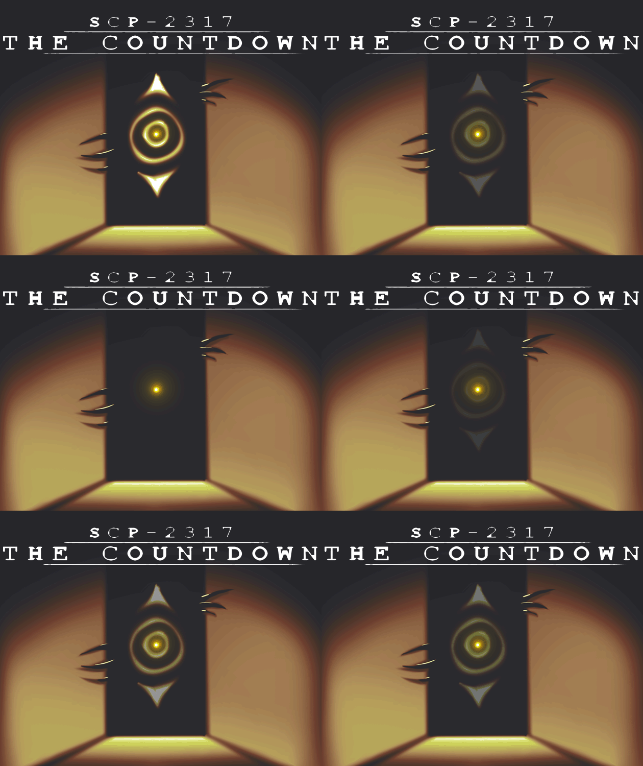
I totally agree with KittenPowerLord comments. The overall aesthetics, sound, and first introduction are great. They feel like a final game. However, the actual gameplay was too much "read small text". So I didn't go very far. I would love to see someones play through though. Also awesome thumbnail.



Leave a comment
Log in with itch.io to leave a comment.