this is all I could ask for in a review and so much more. thank you so much for the detailed analysis :))
Varii
Creator of
Recent community posts
hom, my guy, i finally gave this another go. and while i *really* wanted to love this because of the amazing ambiance, i just couldnt get behind it.
i think maybe thats because the game relies to much on memorising this one language. i can envision a version of this game with the timers made much more lenient, but where the fictional language is randomised on each play. that way, the game remains a test of translation, not of memorisation.
hmmm i think this was quite flawed honestly. it's essentially overcooked, but with only one recipe, no upgrades, and no possibility to multitask.
i assume there were two furnaces to encourage multitasking, but the fact that making a sword locks you into the process for the entire time means that by the time you finish your first sword, your second iron bar will be destroyed in the furnace.
art was very pretty, sound was great. im very open to discuss this game more with you if you'd like.
i do apreciate the ambition, but overall i think this was just alright. you definitely a lot right, but it was the jank that left its impression on me. mechanically and story-wise (in game story, not what you wrote on the page) i dont believe this fits the theme in the slightest.
- the objectives just required scouring the map, it gets very frustrating. some kind of in-game map of where objectives are would help a lot
- stealth was very much optional. the "calm" approach is no better than sprinting around and knocking everyone out. it enemies could do with being more threatening once aggro'd
- the timer is just salt in the wound. losing only means you have to re-do what you've already done, it doesnt add any interesting gameplay challenges. instead, if the timer actually brought a "storm", like aggroing every NPC in the town, it would both fit the theme better and be an interesting mechanic
- navigation was kind of buggy
- the game's 2D art looks overall a bit cheap.
i had some fun with this. there are quite a few things i would change.
storm/no-storm modes should be more impactful, and switching should be instant and/or on a button press. as is, i just stayed in storm the entire time, because changing took too long and calm felt bad.
movement was far too imprecise. jumping felt kind of off, like, i never really wanted to jump because it usually just got me hit. the character felt too slippery, and enemies took maybe one too many hits each.
the art was beautiful. i really do apreaciate the animation on the main character.
this was harsh i know, but i promise can see the bones of a genuinely fun experience here.
i think this game generally controls quite poorly. the slippery movement and jump mechanic seems at-odds with the focus on precision movement challenges. attacking costing HP feels at odds with enemies that spawn infinitely and spam projectile attacks . i also didnt know how to control where the attack went? it didnt go straight all the time. basic enemies taking two hits is too many. i also dont understand how it fit the theme at all.
graphics were pretty
for your next jam game, i recommend you take a totally different design approach. there's clearly some coding talent on display, but it didnt resolve into an enjoyable game because of your design decisions.
so, this has the appeal of incremental games to me.
people like the experience automating the gameplay out of incremental games. instead of intending to remove the left-right swiping strategy (which is essentially an automation of gameplay), why not add upgrades that automate that strategy.
either, more levels of quantum so that you can sit your circle still, an auto-seeking circle, or an auto-swiping upgrade. or maybe some combinations
i just love this concept. being forced to show empathy for people who are just about to die really gets me. its a concept i really want to see expanded in one form or another.
that being said though, the QoL was lacking. a map wouldve been nice, as well as an in-game journal, maybe? NPCs just standing around when unposessed also felt a bit weird, i ended up leaving the grandma in someone else's house lol
the main menu music goes so hard
https://gr0n.itch.io/divine-dining
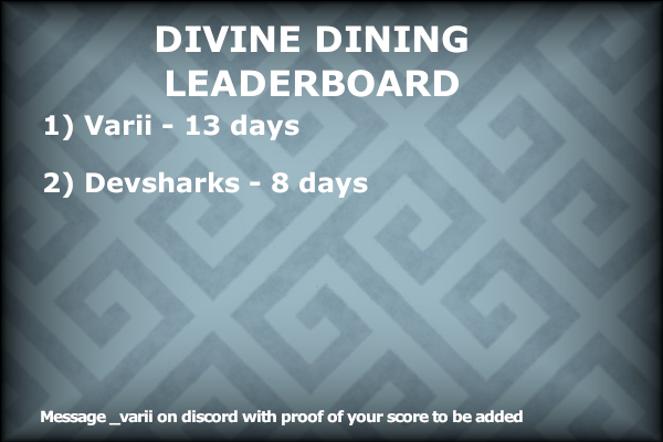
message _varii on discord with your failure screen and you'll be added to the leaderboard 


