So this is an interesting game.. nice mechanics. You concentrated more on the mechanics and balancing. And that actually pay off! its a fun game, i die a lot. hahahaha.. adding a pause option would be nice. overall nice game!! didnt find any bugs. also i wanted to tell you that i came here because armanlone recommended you. That you give awesome feedbacks! that is how i got here lol... I would appreciated if you could take some time to check out my game and give me your harsh honest feedback. the game can be finish quickly :)
Play game
Broken Times's itch.io pageResults
| Criteria | Rank | Score* | Raw Score |
| Innovation | #35 | 4.077 | 4.077 |
| Theme | #42 | 4.269 | 4.269 |
| Game Design | #51 | 4.038 | 4.038 |
| Overall | #106 | 3.782 | 3.782 |
| Fun | #183 | 3.654 | 3.654 |
| Audio | #468 | 3.192 | 3.192 |
| Graphics | #515 | 3.462 | 3.462 |
Ranked from 26 ratings. Score is adjusted from raw score by the median number of ratings per game in the jam.
In what way does your game fit the theme?
The game involves the concept of the levels rewinding time with several hazards, as well as being able to pause and fast-forward as well.
Did you write most of the code yourself and made all the assets from scratch?
98% of all assets were created by me. The only asset that was made by someone else was the dust particles used in the game. They were originally made by the user of this forum post: https://forum.unity.com/threads/new-simple-dust-particle-system.341921/ The dust asset has been heavily modified to fit the game's style.
Comments
This game rocks!
Things I liked-
- One of the few games in the Jam where the time is not controlled by the player
- It not hard but its not easy either
- Easy to grasp the mechanics
- Keeps player in suspense (especially the final level)
Congrats!
+ I love the idea. It is simple but the mechanic has a lot of potential.
+ Great art style (love the eye of the player and how it reacts when you jump!). Great and simple background.
+ Audio is simple but more than enough for the game.
+ The levels are well designed.
- I think the movements of the player are difficult to control is hard to make the player move the way you want.
- I prefer being able to replay a level more rapidly but I don't know how to do it in your game as you have to animate even the camera movements.
- I would have added some extra easy levels before the hard ones
Thank you for your feedback!
I have been considering designing levels that did not involve auto-scrolling, and instead focus on time affecting the objects around the player.
I'll also have to add levels that involve teaching the player how to utilize their controls, one mechanic at a time.
In what way is it hard to control the player exactly? There were a few people in the comments who mentioned the game didn't have coyote time, but I'm not sure if that's what you are referring to.
It is something very personal, I guess. But maybe it is the player moves too fast or jump/fall too fast. What I found is that it was harder than expected to avoid bullets. And I felt it was due to the control of the player.
I didn't want to bother you with this. It is just my personal feeling about movements. Maybe I'm totally wrong :)
I like the unique graphics but I find this game a little bit hard, specially when dealing with the red spikes.
The Gameplay was really nice, I enjoyed it a lot, but i think the one thing that would be better is bumping up the movement speed because I think the game felt to slow, but that's just my opinion. Otherwise a very nice game!
Oh my god, this is so much fun! The game is a bit short but I guess you have all the tools to design more levels and make it even better. Very nice work! Keep it up!
I really liked how you interpreted the theme.Intruduction part was great and i loved the character sprite(Eye of the Sauron lol).
My issues are there is no background music maybe adding a simple music can help?
Adding a pause menu can really help the game i was frustrated at the giant saw part and wanted to pause to calm down but got repetadly killed :D.
Other than these complaints i think you made an original fun game :D Great work
Really neat concept! I like how you utilized theme in such a way that it's not us who have control over the "rewind mechanics". Gameplay wise, the game was fun to play, though it felt a bit short and controls were a little bit unresponsive (there were moments in which it felt like I pressed the space just in time, but the player still didn't jump).
Sound and art style were nice :)
Pretty standard situation - while running towards the edge of the platform and pressing jump right before it's end. I would suggest adding a little timeframe right after you leave the ground during which you can still perform a jump. In such fast-paced game it could really give an illusion of much bigger responsiveness.
The feedback you gave to me is really good and here is my feedback to your game please don't take it too seriously, you can delete/skip this comment if you want.
FEEDBACK:
- At the start of the game, it is really catch and you don't know what to expect from your game.
- It keeps me pumped up at your menu hoping something like a hack n' slash gameplay.
- A little thing about changing the Forward / Backward / Pause is maybe a flicker (Alpha 0 to 1) to make the player know that it will soon change.
- Checked if you had Coyote Time, I might be wrong, but when I jumped I didn't experience the Coyote Time.
- I don't know why your game is in the outer space, maybe to signify the Space and Time. I think with your amazing pixel art skills you can make something like clocks everywhere or have an hourglass.
- And maybe you can make the ground not white it feels off with the game.
- Skulls that are rectangle kills me when I collided with them, can you please put the spike at the side of the rectangle too to know that it is dangerous to step on the side.
- PIXEL ART is really good though.
- Some background music will be good addition to your game.
I know this is a lot coming from me, but thank you for playing my game, and giving me a lot of feedback. Compared to your post on my game I know that this is too short but please don't take it to seriously. Good day man!
Wow, this is some lengthy feedback! I appreciate it so much!
Another user mentioned that the symbols could use a flickering effect as well, and I definitely agree with that since not having any warning could lead to some unfair deaths.
I also agree that the game does need some form of coyote time, this is on my list of things to add when I re-ramp the controls after the jam ends.
The reason for the particle effects you're seeing is to visually enhance that the player is moving around instead of having just a static background. I figured it would save much more time than to add a background texture while keeping the graphics minimal style... HOWEVER, there is nothing in the game that mentions as to why there is yellow dust floating around. So there does need to be a future explanation of what the dust particles are and why they are floating around. I do plan on having this game take place on a small planet floating in space in the developmental future, so I'll probably need more visual enhancements to show that's the location each level is on.
The ground does look a bit too white, and it really could have used any sort of texture. At the time of this game's creation I have not learned how to use the tileset generator yet, which is something I should really get into if I want to continue advancing with pixel art.
With the skull spikes, I was originally going to have it so that touching the side of them doesn't kill you. However, I also had to deal with making sure the player doesn't climb on top the very edges of the hitbox where they don't end up getting killed. Since I was running low on time, I just had the hitbox go around the skull spikes and figured that the skull symbol would be enough for players to know not to touch them at all. Perhaps I'll make a variety of skull spikes where the spikes surround all sides to deal with this problem until I can get it fixed.
This is a lot of helpful information I'll take into consideration. Thank you for taking your time to write this long critique.
This game is really good looking and unique. The art style is really nice, it has this cosmic-pixel kind of vibe, which matches the main theme perfectly. It's both challenging and replayable which are great and I think that means you could add a ton more levels if you wanted to.
A couple things I can suggest to bulk up the game would be some background music, something cosmic like I said before, maybe it changes every level or something.
Also, I saw another comment of yours talking about story, which I definitely want more of from this character and its temporally-messed up world. Nice job, keep it up!
Thanks for the feedback! I have been thinking about changing up the story a bit, and have been debating if I should continue with the clocks messing up time, or to overhaul it to the player fighting against someone messing with a VCR's buttons.
However, I never thought anyone would view this as space themed from the particles, but now that I think about it, the particles do seem to resemble stars and the player seems to look like a little alien. Perhaps I could have this game take place on a planet whose time works differently because they orbit a black hole, so they need to have clock devices put in place in order to keep time working normally. You might have just inspired me to come up with the right story of this game, thank you so much for that! I'll have to continue on with this theme since a story is the one thing this game desperately needs.
...I guess I need to include you in the credits now.
Almost every single game so far has used the "Rewind" theme as something to help the player, like a tool at their disposal. It's great to see that your game has the rewind theme being used against the player, like its own type of enemy. I would suggest making an Enemy AI that uses this mechanic rather than having the mechanic be a very scripted sequence of events, like an all-seeing entity that's directly against the player with a similar antagonist to the one in Jonas Tyroller's "Will You Snail". I like your idea and I seriously think this could be made into a really engaging and unique platformer
Thank you for your feedback! Funny enough with the "all-seeing entity" you suggested. I was originally going to make the story of the game involve a person on the outside of an old television constantly hitting the different buttons on a VCR player to mess with the player himself. You would see the fingers of the person about to hit the buttons to give a warning of when time is about to change, and to constantly remind the player of who the villain of this game is. The ending would have involved the player-character angrily walking towards the screen of the TV, he would then jump out of the slot of the VCR player and tackle the person who has been trying to get the player killed the whole time. The screen would then cut to black, and then to a picture of the person with his head shoved into the slot of the VCR player.
I also like the suggestion of having smaller enemies that would reverse time somehow, I'll have to think of a way to incorporate a design of an enemy to fit that purpose.
This is some very unique feedback, I appreciate it so much! I'll be sure to check out your game in a bit!
PRESENTATION/FIRST IMPRESSION
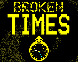
The game icon (with the title, stopwatch and cool time particle whirl effect) looked so awesome and professional that I downloaded the rar file onto my iMac, converted it to a zip folder using unrar.online, then I put the zip folder on a usb, took it to my windows 10 school pc, extracted the folder and played it. Even after all this effort, I only had time to play the first few levels.
INTRO: Was amazing, my heart was pounding so hard when I thought the missiles would hit me. The notion of fixing the clocks was a nice touch and made me feel like there was a reason to keep playing.
CHARACTER:
Good: I love the jump sound effect, good choice! (If you made it yourself, that's even better!)
I love how when the character jumps his eyes give the impression that he's so happy leaping into the air.
Improvements: Maybe you could have added some coyote time (when the player presses jump at the edge of the platform, there is a tiny little bit of extra leeway to let them jump. Eliminates the difficulty of pixel perfect jumps and makes the player feel great)
Overall the player character feels really tight to control, no slidy behaviour or anything, well crafted.
The platforming difficulty of what I played is nicely balanced and it made me feel good when I made a jump after 3 or 4 deaths at it. (I'm usually good at platformers/reflex stuff, so 3 or 4 deaths to me is like 50 deaths to someone else.)
THEME:
Perfect. Loved how the level can turn against you at any minute and it is a constant race against time (pun totally intended) to get to the end. And what stands out here is the level design, because it does not matter which direction time is going, the level design still holds up.
FINAL VERDICT:
A well made platformer which follows the theme to a T, with great sound effects, a heart pounding intro and great level design, whether time is progressing forward or backward.
SHAMELESS PLUG:
I also made a game! Less sophisticated than yours though :D. It's called Retrograde Brigade, a top down shooter where an old wartime veteran yearns to return to the battlefield. His wish is fulfilled but with one caveat: he ages backwards.
"...I downloaded the rar file onto my iMac, converted it to a zip folder using unrar.online, then I put the zip folder on a usb, took it to my windows 10 school pc, extracted the folder and played it"
I feel really bad you had to go through all that effort all because I didn't realize WinRar had the ability to make .zip files. Next time I participate in a jam I'll make sure my life depends on making the game into a .zip file that supports Windows, Mac, and Linux, or to do it in WebGL.
I do agree that the game does need some coyote time since there were a few people mentioning that some of the platforming jumps was a bit too precise. If I continue working on this game, then that will be one of the first features I will add in.
I also appreciate how you mention that the character doesn't slide. I personally find sliding in platformers to be a bit of an annoyance, especially if the level heavily relies on being precise. I wanted to make sure the controls felt as accurate as possible so the player feels like they have absolute full control instead of the character working against them by sliding at the wrong times.
I'm also happy you were willing to keep going even though you kept dying at the same spots. I wanted to keep the levels as short as possible so that when the player dies, they don't feel like they lost too much progress. Also having the death animation be super short makes it much less frustrating to die to a hazard.
I appreciate this lengthy review, and I'll be sure to check out your game as well!
Cool game! I loved the character and the small details in the animation of the jump (the eyes like he's smiling ahahah ) the game is very solid, I encountered no bugs. The number of levels is reasonable for a 1 week game jam as well as the level of challenge. Just one thing. I'd loved to have a background music :) Well done!
This is overall a great game! The graphics are really nice, the sounds are great too and the levels are fun! It was fun to learn the patterns to the levels and finally master them! I did notice that there were a few ways to cheese some parts of the game but to be fair, I only noticed these strategies after I learnt the movement patters, so I used them as strategies instead of 'cheating'. The only thing I would say to improve is that it would be nice to know when the speed is changing, like what happens whe it is unpausing. Really nice game!
also i like how the game is called PlatformingThing in the files lol
Thank you so much, this is really helpful feedback!
Since you mentioned that you were easily able to complete some levels after learning their movement patterns, it makes me wonder if the game needs some work towards the replayability aspect. It wouldn't be as fun to play the game again if you know where every surprise time change is.
The reason of why every symbol besides the pause doesn't flash is because I wanted to have some sort of "surprise" aspect of time changing. However, I could see that there could be some unfair moments if the player doesn't get some sort of warning that time is about to change, like if a player were to time their jump over a missile and the missile suddenly stops in place at the worst time. Perhaps in a future update I could have the symbols flash quickly for half a second to warn the player time is about to change.
...Also "PlatformingThing" is what happens when you let brain-dead tired Liam name your games at 4 AM
Yeah it really depends how you want your game to be played the second time, I personally like the fact that you can learn some strategies to make it easier, almost like its a speedrun, but I also see how you wouldn't want this to happen. And yeah I also completely understand what you mean with the "surprise"
This game is short and sweet! I'm quite bad at games requiring exact jumps, but I managed to complete it after quite some deaths in the second level. Here's my feedback:
Great!
- The sound effects the hazards make are awesome.
- The way the story is told in the beginning is awesome. I expected to be bombarded by all those missiles!
- The graphics are simple, but I love the contrast between the rich colors and the black background.
- You don't punish the player to badly for making mistakes. You immediately restart the level without any delay for another try. This is a good thing!
- The last level was great, it felt a bit like a boss level. Especially the part where it goes impossibly fast and then stops, giving you just enough time to pass and finish the level.
Could be improved
- This game could use some chiptune background music to go along with the look.
- I'm not a fan of pixel perfect jumps where you need to jump off at the edge of a platform to reach the edge of another. Might just be me though, I don't play many platformers these days.
- There aren't enough levels. Just 2 more extra levels would have been great.
- There isn't an ending sequence to tie it all together. A little tale like in the beginning to let the player know what happened next would be killer. I want the little blue alien guy to be safe!
Thank you so much for your feedback!
The rich colors were based on the palette of an old British computer called the ZX Spectrum. I wanted a retro look while making everything look clear and bright to the player, so I thought the ZX palette would fit both of those purposes.
I'm also happy you noticed that the deaths are less frustrating because of how quick they go. I usually like keeping levels short and sweet in games so that when the player dies, they don't lose much progress. Keeping the deaths short to convince the player to keep going and try again instead of stopping and interrupting their fun. I personally believe that dying does not mean you lose the game, but rather the only way to truly lose, is to quit the game and never return.
It's not just you with the pixel perfect jumps. I play a lot of platforming games and even I think the platform gaps in level 2 are a bit too far apart and require a bit too much precision after replaying it.
I also agree that the game lacks some chip-tune music. It was kind of a missed opportunity to have music be affected by time speeds which really would have added to the theme. I'll have to either look for some pre-made chiptune music, or learn to make my own compositions.
I have mentioned in a previous comment reply that the game does lack some levels due to the fact that I might have over-focused on graphics a bit too much. Lesson learned: game first, then graphics (unless if the graphics affect gameplay).
The game really does lack an ending, despite the attention grabbing intro it has. I would say this was because of a lack of time, but in game jams, that's not a good excuse. What I should have done was to come up with an intro AND ending right at the start of development instead of waiting for the very end where I had zero time left.
Fun game, the mechanic is fun and engaging and the art is really nice, the sfx work really well with the game, good job!
Nice! Interesting mechanic. Last level makes me nervous!, but managed to complete it. Lovely jump SFX! The game has potential for more level. Congratulations!
Thank you for your feedback! This was my first jam I've ever done.
I do agree that my game is a bit too short and it really could have used around 3 or 4 more levels. One reason for this may be that I might have focused a bit too much on the graphics rather than gameplay elements. Lesson learned from this jam: do not over-focus on game graphics unless it truly affects gameplay. Only work on graphics AFTER you have a working game.
But I guess that's the beauty of game jams, you get to learn about your limitations and how to improve your own skills based on the very limited time you have.
I'll be sure to check out your game soon!


Leave a comment
Log in with itch.io to leave a comment.