Play game
Lunar Rescuer's itch.io pageResults
| Criteria | Rank | Score* | Raw Score |
| Graphics | #86 | 3.621 | 3.621 |
| Audio | #97 | 3.276 | 3.276 |
| Overall | #188 | 2.862 | 2.862 |
| Theme interpretation | #204 | 2.828 | 2.828 |
| Innovation | #211 | 2.552 | 2.552 |
| Gameplay | #229 | 2.517 | 2.517 |
Ranked from 29 ratings. Score is adjusted from raw score by the median number of ratings per game in the jam.
GitHub repository URL
https://github.com/CrazyFizik/Lunar-Rescuer
Theme interpretation
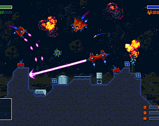
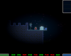
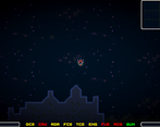
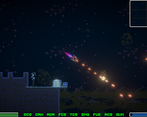
This game is inspired by the classic Lunar Lander game, where you have to fly in the field of gravity of the moon, fly around mountains, destroy meteorites, and rescue astronauts who will join your crew. However, your mission is complicated by the ship's fragile subsystems, which can fail when they collide with obstacles.
Leave a comment
Log in with itch.io to leave a comment.



Comments
Nice graphics and gameplay!
Congrats!
Cool game! Graphic and music are really nice and controls feels really good
Gameplay itself also enjoyable
The artwork is really nice and it's a fun to fly about. I wasn't able to fine any astronauts to rescue. The different subsystems which can fail is a really nice touch! Well done!
Nice game, cool art and music. Controls feel good too (although I crashed a lot hah).
Congrats!
This game has very quality movement and controls. The audio and art work very well for a game like this, so amazing job on those fronts as well. I do wish there was a tutorial at the beginning rather than in the description, but overall a great game!
Sorry, but I don't understand why you did not keep the classic Lunar Lander keyboard controls. Why use mouse controls?
Hi! Different classes of spacecraft use a different control scheme. Control scheme like classic lunar lander using fro large spaceships with the turret.
I played the game and also made a video! I really liked the controls and all, but I was not sure what my objective was! Find my video review below:
1:38:20 Lunar Rescuer
Hi! Unfortunately, the game's goals are one of those things that has fallen under the onslaught of time :-(
At the moment, you need to fly and search for astronauts to save them, as well as periodically return to the base for repairs and refueling. The relative location of targets is indicated using a green marker on the radar in the upper-right corner. However, in fact, your main goal is to survive :- ) I sometimes need to change several ships myself before I can save an astronaut.
Initially, the game was supposed to be more dynamic, where the player had to first fight with enemy spaceships, but this part was not completed before the deadline. So you're actually playing an early prototype with a few core mechanics
haha that explains! Well it can become great i am sure 👍
Thank you very much! In general, I'm thinking about it now, in fact, we managed to complete about 1/3 of the game, and most of the art is ready (and some of the art is not used, for example, only 2 ships are available out of 6 and only half of the weapons are available in the game). I plan to wait for the game jam to finish, get feedback, and then finish the game based on it (at least bring it to the demo stage). Basically, I am now thinking about the fact that I need to increase the dynamics of the game, rework the user interface and refine, make a smooth intro, and finish what was originally planned: enemies and dynamic missions.
We started later than the game jam started and in total the game spent about 1 week developing the art (you can find both packages on the artist's page, they are released under CC0 license) and about 1 week programming, so it probably takes about 2 more weeks to complete this. I think I can try to finish the game after the voting is over for the Christmas holidays.
that sounds awesome! But in one week well done so far!
Nice game, well executed!
Cool game ! The art is on point and it has nice music too !
I like the ship controls with the mouse - felt pretty good. But the goals weren't too clear. I flew around a bit, shot some falling meteorites. Crashed a few times (I like the dimmed lights and "time out" by the way). I'd like to see this with a bit more gameplay.
If you like platformers, please try our game - Lumi and the Dark Night.
So I felt really split here.
Good - The art and effects and theme are consistent and look fantastic. You guys made a great looking game with a very consistent and pleasing aesthetic. Maybe the best I've seen so far in everything I've looked at this jam. Additionally, the music from DOS-88 is great, I love it.
Could Use Work - The controls and just gameplay in general were not super clear. Once I did start to get and understand what I was doing, it turns out it was just really simple and not all that fun. I also managed to just fly out of the map both horizontally and vertically and when I did stay on the map, flying the ship and hitting stuff with my guns was kind of frustrating. Would also be good to add some sound effects (as long as it doesn't interfere with the sweet music).
I know time is limited in a jam so I super hope you keep iterating on this afterward because it seems like a great start that you put a lot of effort into.
Thank you very much for feedback! I will convey your words of gratitude to the artist (it took a long time to work on the visual part).
What exactly caused the frustration during flights and shooting? Could you explain in more detail?
The flight mechanics are quite typical for games of this kind (Lunar Lander, Asteroids, SpaceWar!) — you just need to fly in the field of gravity to the objective point and land like in Lunar Lander to take the astronaut on board. Flight control is quite smooth in my opinion and similarly to same type games, but it took a lot of time, because both angular and linear motion is provided by physics, in the absence of friction with the help of a simple regulator, and it was quite problematic to balance (given the fact that there are no speed limits) and suddenly it is very closely related to art (because it is pixel art), given that the game uses two different control schemes for large and small ships. So with movement, I need to map out specific growth points in advance. For larger ships, I plan to slightly expand the control system and make it 4DOF by thrusters, as I did earlier.
As for shooting, it was originally planned to add full-fledged enemies, but other aspects of the game took too long and the enemies were not completed (primarily AI and problems with and the mission system), so shooting is more of an auxiliary ability. Finally, shooting is primarily intended to shoot asteroids, because a collision with them can be fatal, especially if the propulsion system is disabled at high altitude.
So in fact, your entire mission is to fly and rescue an astronaut, periodically shooting asteroids and avoiding collisions with mountains, with breaks for refueling and repairs at the main base — for this you earn points. We didn't have enough time to implement more :-(
There are really no limitation, I thought about getting around this in the following ways: punish the player if he flies too far (it seems that this should be done first), wrap the world around myself (here I encountered jerks in the background, it seems that this issue should be studied better) and procedurally generate an infinite world in blocks (for some reason, this does not work in the WebGL version, so I had to abandon this, the demonstration of level regeneration is only in the PC version, but without an infinite world).
As for the sounds, we didn't have time to finish this part, although I have already started to pick up a collection of freely distributed sound effects, perhaps later if I do a rebild of this game (this will be next year after the voting is completed).
Now I'm trying to collect a detailed feedback. after that, I will decide what to do next: finish the game and add the missing features, or make a new project based on this with a total rework, or do nothing :-)
As far as frustration with flying/shooting - the ships felt sluggish. Additionally, the POV is pretty zoomed in so there isn't a lot of time to notice an asteroid coming and move the guns and fire and actually destroy them before they hit you or fly by. While I was playing I think i only used the initial small ship (the one you crash with the astronauts) and the bigger ship you get second. I wound up restarting a few times and repeating with these ships because I flew too far up or over and didn't feel like trying to navigate my way back to land.
Also I hope this doesn't feel negative. If anything, what you have feels like a great foundation and I can see a clear path something really great... I always wind up having more constructive feedback in that sort of case. You all did a great job and I'm impressed you did this much so quickly.
Ok. I understand. I also think that we should change the field of view. I'm thinking that if I increase field of view by about 1.5 times (camera is orthographic) , it should improve the game experience - the player will have more room to maneuver, more free time to reaction, and also allow for a higher dynamic speed range. The main problem is that initially the game was planned to control an astronaut, for these reasons, spaceships were drawn large enough (so that it would not turn out that the astronaut is larger than the spacecraft). Another feature is how I have implemented the render workflow: gameplay resolution is 640x360 pixel, than I'm scaling all sprites (with point filter) in 3 times to 1080p full hd resolution, because this approach allows me to freely use sprite rotation without fear of losing the aesthetics of pixel art. Thus, to increase field of view, I need to either reduce the size of all sprites 1.5 times, or set the gameplay resolution to 540p, then it will look like this:
I hope this will be enough.
As for the sluggishness of the ships, this is somewhat more difficult, because I need more experiments to understand which linear and angular accelerations are optimal. For slow ships with turrets, I think that I need relize movement with 4 degrees of freedom (in other words, the ship should have engines around its perimeter and move in any direction without having to turn). For fast small ship I need adjust thrust and angular speed. There is some difficulty in adjusting the parameters. The fact is that most arcade games use the friction, so that the ships slow down very quickly, but in my case, honest Newtonian physics without friction is used, so that the spaceships have high inertia. I plan to increase the thrust of all spaceships, but I'm thinking about how to discreetly limit the appetites of players so that they don't accelerate to superluminal speeds :-) Either I have to do fly-by-wire for spaceships (like, Wing Commander, Elite and Star Citizen), or I somehow have to create obstacles for players so that they only accelerate to reasonable speeds. Perhaps the game needs some helpers for navigation. At least that's what I'm thinking right now.
Thank you for your feedback.
The great pixel art, music and the smooth control create a really nice Space atmosphere. I think the damage system is very innovative for this type of game. I also like the screen dimming when getting hits.
Looking forward to see future iterations. Well done!
Thank you very much! Yes, the damage system of the ship's subsystems was one of the core-mechanics that we wanted to test and figure out how to better balance it. There were other ideas, but we didn't have time to implement everything on time.
I liked this a lot. The subsystem damage is very cool. The flying is very fun, although I couldn't seem to find any astronauts to rescue.
This seems to be a problem with my mission generator, which should place astronauts on the map in random places and show them the path on the minimap - I did it on the residual principle, and it seems that it sometimes places the astronauts too far away from the player. In general, this is normal, I myself sometimes lose several spaceships before I get to the astronaut :-)
I planned to make a dynamic mission system, where the mission controller will alternate between different missions: exploration, attack, rescue and defense depending on the situation in the game, but I did not have time to finish this part of the game as planned before deadline :-(
Great art and music. I hope you get a chance to implement all you wanted after the game jam is officially over.
Thank you very much! Of course, I'm just thinking about what I can try to continue developing the game further, maybe I can start this next year.
Great number of spaceship options here, subsystems make it quite "real" but also hard to manage, they tend to fail too much (although I think that's very real also) and this makes the navigation even harder. I'd like some paced introduction to the mechanics, maybe starting with a simple ship with the bare minimum and some progression after that. The overall game is quite polished, I really like it. Good job!
Loved the audio and graphics! The control is a little bit hard to use, but the idea of systems on the spaceship can break is very interesting.
I think the downside is this control scheme does not allow the ship to travel smoothly in any direction quickly with precision.
The field of view is a bit small too so when travelling I always hit something unexpectedly.
Lastly, I personally think that the subsystems break too often and it stops the gameplay very suddenly and frequently. I would prefer if the subsystems become malfunctioning rather than completely stalled most of the time.
Overall it is a very interesting concept with some cool graphics. Love how all the ships look too!
Thank you very much!
Yes, I agree with you. There is still a lot of polishing and balance of the gameplay and I need to add movement in all 4 directions (with 4 degrees of freedom, as here, for example) and it will even be more realistic it's just that I've been experimenting with different approaches to gameplay and software architecture.
As for the field of view, this is just the most difficult part, in which I need to correctly choose the size of the ship relative to the height of the screen and accordingly balance the range of available accelerations and gravity. I also think that the field of view is too small, and the relative size of the ship needs to be reduced, however, this is complicated by the fact that I'm using pixel-art that imposes certain restrictions to preserve the perception of art. In other words we need to redraw the spacecraft sprites and reduce their sprite sizes. Currently, spaceships range in size from 24 pixels to 48 pixels, with an average size of 32 pixels, but it seems that the optimal size should be between 16 and 32 pixels, but in most cases no more than 24.
Fast way - I can increase the gameplay resolution: now it is equal to 360 pixels in height of screen which is then scaled to the target resolution (1080p or 720p), potentially I can increase it to 540 pixels, but in this case, the minimum comfortable resolution for the game will be 1080p, not 720p, and everything below 1080p will have noticeable graphic artifacts (related to turns and movement, because I do not use interpolation and anti-aliasing due to the fact that they will lead to pixel blurring).
I think if I reduce the relative size of the spaceships to 1.5 it will be OK. I think like this:
Or it should be a different art approach: simple sprites (not pixel-art) which using bilinear filtering and anti-aliasing, or should it even be a 3D game. In this case, I can freely choose the zoom of the camera.
That YouTube link for navigation control is pretty neat! And it looks like all that has been achieved with holding down a mouse button. The animation does require some AI working out the direction it is going relative to its orientation. Really interesting stuff.
Our team also struggled a bit when trying to scale pixel art in our project and our approach was to adjust the Windows size… (the lazy way) however I would say, if you then created sprites of few sizes for the same spaceship, you would be able to do camera zooming and just change the sprites as you do so. That effect would be pretty cool to have I’d say. (Perhaps camera zoom can be triggered with a button by the player rather than automatically so that things are more flexible according to what the player is currently trying to do) and your screenshots do show that it can significantly affect the look of the game and the sense of surrounding.
I would love to see how you continue to develop on it and how your decisions will effect the final product.
Very nice audio/visuals, I like the idea of having to keep track of the various systems. Was confused at first, I think a small tutorial screen would go a long way.
Hm. I can probably try adding a simple tutorial screen before starting and do it quickly.
About subsystems — it seems that this was one of the main core mechanics. However, I'm not entirely sure I've chosen the right set of subsystems that the player should track. The current set of subsystems is as follows:
This emphasis on subsystems in this case is an experimental mechanic that is great for testing on a game jam, but I'm not sure that this is done correctly. It seems to me that the number of subsystems was too large, although this combination allows you to achieve unique combinations of damage effects (for example, a ship without a crew loses control and becomes a useless pile of scrap metal in space), but it seems to me that there should be fewer subsystems, because such a large number of subsystems is very difficult to tracking by player, and it also complicated the development. Now I'm thinking that it probably makes sense to combine some subsystems to reduce their number, for example,
In general, as you can see, I got into a classic design fork and experienced developer analysis paralysis. Personally, I think that the number of subsystems should be somehow reduced to 4-6, because first of all, a person can usually keep about 3-5 entities in his head, and secondly, this will simplify the development of code (now I have a very large number of disparate game objects and a voluminous property inspector). But on the other hand, a large number of subsystems can be perceived by the player as a special version life bar.
What do you think about it?
Personally I like when mechanics are introduced progressively, so you could start off with fewer subsystems, and as the player learns and accomplishes goals you can add more in with brief tutorials or explanations. That way you could keep a large number of systems without overwhelming the player. The combinations you mentioned would also work to simplify things
The graphics and controls were nice, but the gameplay needs more depth. For example you can have some fuel recharging stations on the ground and other intermediate goals.
Hi! In general, the main stumbling block was time :-) Initially, it was planned that there will be enemies present and this should already diversify the gameplay enough. Next, the goal generator creates random events depending on the situation: exploration, attack, rescue. For example, completing a scouting task should trigger a mission to destroy enemies (possibly with allies). Then, after completing the attack mission (depending on its results), the player receives a mission to rescue astronauts who were evacuated from the destroyed ships.
This all together proved difficult enough to complete in a reasonable time.
First of all, there were quite a lot of problems with AI — it was difficult to get other spaceships to fly around obstacles when chasing the player, and this also required code processing (my architectural mistake). In this regard, the game is somewhat more difficult than the classic shooter with a top view due to the presence of the surface and mountains, therefore, it already required the development of a full-fledged path finding.
In the second place — the system of dynamic missions, and I just did not have time to build it properly. Another element that I planned to add is ground armored vehicle with weapon.
I am currently thinking about how to really rework the source code of the game and add the missing elements, but it seems to me that this will not be soon and already a separate project (it is unlikely that I will have time to do this before the end of voting).
I had a lot of trouble playing this game because, at least at the beginning, the colors felt so low-contrast. It was also very jerky on my machine, which is a relatively powerful Mac running Chrome. That said, the idea is pretty neat, and the music was kickin', as previously mentioned.
With contrast, everything should be fine, on the contrary, the terrain tiles and spaceships are very bright, while the background is very dark. The only special feature is the low contrast between the background and asteroids. Initially, asteroids were made in several color options, but now the game only has the darkest version of asteroids, which are faintly distinguishable from the background. This was a deliberate choice to make make asteroids less visible, so that their appearance often comes as a surprise to the player :-) Bright asteroids are too easy to play with :-)
However, the game uses a linear color space rather than the outdated gamma color space, but I don't think that this can cause problems with contrast on the MacBook.
I don't really understand what mean "jerky" - is it input lag, freezing, image jitter or background jitter while ship moving? There should be no problems with lags, the game runs absolutely smoothly both for WebGL and Standalone versions, but there may be problems with the background image in the Web version. You should also keep in mind that the game was developed for a resolution of at least 720p (1080p is better), so there may be noticeable artifacts in a small browser window (there are none in full-screen mode), also game uses the 2nd version of the graphic API for WebGL version. in general, the images in WebGL and Windows versions are slightly different. I think if you look at the two images below, you will immediately see the differences between the PC and WebGL versions (at least in fonts and the position of UI elements, but not only)
However, I do not know exactly what configuration you have, if your Mac does not have a discrete video card or it is not used for playback, then there may really be problems. As far as I know, only the top 15" models of MacBooks are equipped with discrete video cards, and if this is really standard equipment with an integrated video card from Intel (for example, some Iris UHD), then there will be only 48 shader processors there - this is slightly more powerful than the GPU of a mobile phone, and somewhere in the level of video cards between 2005 and 2010, and this can cause problems because and heavy pixel shaders are very actively used in this game (postprocessing and some effects), although I specifically checked the standalone version on my very cheap laptop without discreate video card and there were no problems, but it was the windows standalone PC version. In general, I need to understand better what your problem is and what it is related to.
Mine does not look like that at all - not sure if I just missed something, but my ship is barely even visible, a small blue smudge on the screen. Not sure why, but literally none of the things you said are true for the web version I played, so maybe it's just a weird interaction on my Mac.
As for jerkiness, what I meant was that there's a lot of image jitter, in your terms. I have an extremely powerful Mac with a great graphics card, and almost no one else's games so far have had any problems with rendering (and if they did, they weren't simple 2D games like this).
Hm. This is very strange. It seems that this is exactly some kind of rendering problem related to the browser and platform (I sometimes have artifacts in Chrome for Windows related to the scrollable parallax background sometimes), and it is possible that this is due to on-screen postprocessing, however I can't figure out what the problem is yet. It will be necessary to study this issue in more detail.
In order to port the game from Windows to the WebGL version, I had to disable or replace some shaders, because they did not work in the browser. As I wrote above, WebGL has two versions of the graphics API, the first version is usually used, but I used the second one because I use linear colour space and HDR. But the second version of WebGL should be supported by everyone, because it is already 7 years old (but this does not mean that it works equally well), but in any case WebGL's capabilities are very limited. Also, the WebGL engine is different for Windows and for Mac, for example, in Chrome for Windows, it forcibly uses DirectX, which I was guided by (to be honest, I have never worked with OpenGL and Metal at all, I have always worked exclusively with DirectX and do not know what is beyond it), while in Chrome for Mac and Linux, OpenGL is used (at least it used to be early before Metal, I don't rule out that Apple might have changed something). Moreover, different browsers have slightly different WebGL engines, but I did not expect that there might be problems on MacBooks 0_0 I will need to see if possible how the game works from under the browser in Linux, it may be interesting :-)
However, I was able to run the game even in browser on my phone lol, it looks exactly the same as on Chrome in PC, only the game input has gone mad and something is wrong with viewport, but it was expected :-)
However, this is not Chrome, this is a different browser - Yandex-browser :-) Chrome on my phone, couldn't launch the game - it just freezes at start :-) In other words, the behavior differs from browser to browser even on the same platform...very interesting. I expected that WebGL's behavior would still be more predictable, it would be good to understand what exactly causes such things...
As for simple 2D games and powerful video cards, I once had a case about 4 years ago when running a regular calculator in Windows caused a BSOD due to video adapter failures, as it turned out, the problem was with the drivers (and it could not be solved for about six months and was observed in all the cards of one microarchitecture but in different ways). In general, it can be anything.
But in your case related to what combination of platform, browser, and shaders which I use in game, but that's just my guess, and I don't have a Mac to reproduce this error in the near future and understand what the reason is :-(
But I will remember this question.
Nice entry, the artistic direction is pretty neat!