Play game
Shattered Dimension's itch.io pageResults
| Criteria | Rank | Score* | Raw Score |
| Aesthetics | #161 | 3.746 | 3.746 |
| Story | #204 | 2.825 | 2.825 |
| Sound | #247 | 3.048 | 3.048 |
| Music | #251 | 3.254 | 3.254 |
| Theme | #393 | 3.048 | 3.048 |
| Fun | #462 | 2.762 | 2.762 |
| Mechanics | #483 | 2.698 | 2.698 |
Ranked from 63 ratings. Score is adjusted from raw score by the median number of ratings per game in the jam.
How many people worked on this game total?
1
Did you use any existing assets? If so, list them below.
Hero Knight (Unity Asset store), Bringer of Death (Unity Asset store), Fantasy Wooden GUI: Free (Unity Asset store), Classic footstep SFX (Unity Asset store), Bandits - Pixel Art (Unity Asset store), Oakwoods (brullov.itch.io), MedievalCastle (brullov.itch.io), music from Pixabay, Sound effects from FreeSound
Leave a comment
Log in with itch.io to leave a comment.


Comments
The game has a very nice look to it. For the most part it felt good. There were a couple of things that I think it would benefit from. I ran into a jump issue where I barely stepped off the ledge and the jump failed. That is something solved with Coyote time. Then I agree with Carlos E. Perez that the jump seemed a bit floaty. Here is a link to a video on how to make a jump feel great: Mario Jump. All in all, I liked your game, I think you have a great start to a game.
Thank you for playing and the feedback, I'll check out that video :)
Very mysterious and interesting vibe. The music and dialogue had me thinking of games like Hollow Knight and Dark Souls. Also, beautiful music selection, the animations flow well, although the controls could be a little bit less floaty.
Overall, I like the theme and vibe you were pulling off for this one.
Thank you for the compliment, Dark Souls is a huge inspiration for me so if you can get those vibes I'm happy :) The controls could use a good polish, but I'll wait till after the jam because I will spend days fine tuning it once I start
Very moody and interesting looking world. While the game was quite small, I could tell that you put a lot of thought into it. That fight was such a tease, I wanted to fight even more.
One small quibble I had was that there was some sort of blur on the character when you move him around. For some reason it bothered my eyes a little bit, not sure why. Either way that was a tiny thing on an otherwise great presentation and set up for a potentially grander game!
Thanks for playing. I did some changes to fix tearing, not sure if that's making the blur (I didn't see it, but will pay more attention). I do want to expand after the Jam, there's a lot I wanted to do, but I couldn't get it done in time.
I liked the art style a lot, this has potential to be a nice RPG :)
Thank you for playing
Also wanted to say that making an RPG type game is a dream of mine, but there is a lot of work to do before I get there. Maybe this is a start
looks like "Pirates of the Dark Waters", I love this type of game!
Thank you for playing!
Just a quick question before I rate this game - there is only 1 enemy and after you switch at the second crystal you are stuck there because up top there is the end of the map and the house you cant enter and the door to the left is closed and the crystal gone right? or did I miss a part of the game?
Yes, unfortunately very short. It's my first game Jam and the way I did things I really didn't give myself enough time to produce something more substantial. Planning on expanding after the jam. Edited my reply because I misread your comment
Dont worry about it there are a lot of short games - check out mine it has only three short levels.
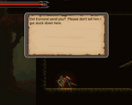
I like what you have done so far and the premise of the story is intriguing.
If you continue on it - for me the jump is a little too floaty and if you could add some feedback for the combat that would be really nice
Oh and the paralax is a bit much but others already told you
A good base to build from! I'd be interested in seeing what story you add.
Thanks for playing! I'll play your game after work :)
I really like the responsiveness of the controls and the art style used in this game they really stand out nice job D. Would you mind trying out my game and rating it according :).
Thanks for playing! After work I will be going through the comments and playing+rating all the games I haven't yet :)
Sure D, thank you too
What you've built is really great. What I so often find is that I spent 90% of my time on the game engine then the remainder building content. And it never feels like there's enough time. That said the atmosphere was spot-on. The mechanics are also great, loved the 3 hit combo you can perform.
The parallax is sweet, although a bit too fast moving (stuff in the background should move 'slower' than the foreground). How did you do it? I always struggle with parallax, although my games are usually top-down rather than side-on.
I did find myself wanting more so please continue with this one!
Thanks for playing! So the parallax will be toned down later today. The three part background was part of the one asset pack and I have a parallax script with a speed setting that I attach to each image with a different speed setting for each. The image, however, needs to be linked as a material because you adjust the offset to get the scrolling effect. The script isn't perfect because I still need to define a reference to the player object in the inspector, but I'll be looking to make that dependency smarter as I intend to be moving between scenes seemlessly eventually.
As for time spent on the engine, I completely identify with that. I have another project with so many systems designed and just no playable content. I've been taking drawing and modeling courses on the side so I can start creating original assets for it.
I really think you created a solid working game here. Short, but still enjoyable, clear. The only thing I definitely would change is the parallax effect of the background. But I love the way everything fits together otherwise.
Thanks for playing! I am going to do a few fixes later, I'll add toning down the parallax to that list ;)
It's a nice aesthetic - a lot of room to create a world and story.
Thanks for playing. I do plan on expanding after the jam :)
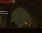
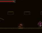
I was expecting more. The graphics is nice. It's funny to see the monster "break dance" when you stand right on top of him.
Thanks for playing. Yeah, I ran out of time, wanted to do more. More will come after the jam. Still not sure what to actually do about the monster collision, it's fine for now, but after the jam I'm going to rework it
Nice short game. There are some lines appearing in the tilemap, this is fixable but i forgot how i did in my games :D i think it is by setting the tilemap unit to 0.99.
Thanks for playing. Someone mentioned using a sprite atlas to fix the lines. It's my first time working with tilemaps, so I'll try out a few fixes after work and see which I like the most. Thank you for the feedback. I'll play your game after work
Nice work! Though it was short, it gave an impression of various game mechanics and set a tone and atmosphere that was interesting.
Thank you for playing. Yes, it was short. I had a lot to learn and time got away from me. There's still a lot more I want to do with it, but will have to wait till after the jam.
The first time through I jumped on top of the menacing looking figure and ran off behind them, they didn't seem to mind! I restarted and tried attacking them and naturally they attacked me back... so, actually, I think I might have been the villain.
There's some screen tearing between the background images if you move quickly and jump a lot. Assuming you used a tile map, you might be able to easily fix that with a sprite atlas.
Thank you for playing. Yes, used a tilemap for the first time actually, so I'll look into a sprite atlas. Thanks for the tip.
I mentioned this in another comment, but the enemy is optional. Once I can expand a bit, the consequence of not killing it is that the brother in the cave dies. So either way, you're the villain in someone's story
Ah, I see! Story consequences to player actions are great to have in a game. :)
Just so you know, I've uploaded a new update with a sprite atlas, hoping its fixed the tearing (I don't see it anymore)
It looks fixed to me, too!
I love the aesthetic and music of the game, although maybe not the enemy one, it felt a bit out of place. The background felt a bit disorientating moving a bit too much, other than that I like it. Overall good job! :)
Thank you for playing and the feedback. You're the second person to mention the background moving too much, so might have to adjust. Planning on expanding after the jam
That's a lot of work for 10 days! A solid start for a nice game! Loved the adaptive music with the battle. Maybe you can add feedback for hitting the enemy. Anyway, nice done!
Thanks for playing and the feedback, definitely need to make hits feel more impactful
Good Stuff and I wish it was longer. I did encounter a slight glitch when moving up an incline but great looking and good music!
Thanks for playing, I'll look into that glitch, but luckily it's not game breaking (I think). Definitely wanted to give more to play, but time got away from me, will be adding more content after the jam
game looks really cool! the one thing that bothers me though is that it shows the mouse cursor
Thanks for the feedback. Honestly, I completely forgot to hide the cursor. I'll put it on the list of things to do
Wow, that was cool, really. I liked the graphics and mood of the game. Just couldn't hit the mob underneath, but quickly passed it and reached the end! Gj!
I'll check it now just to make sure he is still killable after the conversion, but just a little side note: The mob is optional to kill. When I expand the game the plan is that if you don't kill him he kills the brother in the caves later. Get some Miyazaki vibes in there.
Thanks for taking the time :)
oh, nice! keep it up, i liked it!