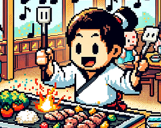
Play game
DJ Hibachi's itch.io pageResults
| Criteria | Rank | Score* | Raw Score |
| How well was the Theme implemented? | #22 | 3.789 | 3.789 |
| How cohesive is the game art (do all visual elements work well together)? | #31 | 3.895 | 3.895 |
| Is the art appealing (do you want to spend more time in this world)? | #31 | 3.474 | 3.474 |
| Overall | #33 | 3.474 | 3.474 |
| Do the animations/effects improve the player experience (game juice!)? | #36 | 3.421 | 3.421 |
| Did you enjoy this entry? | #43 | 2.789 | 2.789 |
Ranked from 19 ratings. Score is adjusted from raw score by the median number of ratings per game in the jam.
Which team were you in and what was the modifier for your team?
Team Endmark - 2 buttons
Which game engine did you use?
Unity
If you are chosen as the wildcard will you continue in the competition?
Ye
Leave a comment
Log in with itch.io to leave a comment.


Comments
Solid look and feel! Cute animations! If I had a suggestion for future work it might be to spend some more time designing the game start screen. The title of the game could be a more themed font (it looked like a button to me.) Tiny nit: would be easier to understand if the difficultly levels were "easy", "medium", "hard" instead of sizes, which took me a bit to figure out.
Very fun, nice work! Mechanically, I think it would be much more forgiving if you styled the “both at once” spatulas different to the other spatulas, because otherwise it’s very hard to tell looking back and forth the timing of which one of several close in a row is the double one(s). I went for the M on my first try, getting a 633, I’ll take the D haha. Other nitpick is the ending song fade out could be a lot faster, or you could show the results already as the song is fading out.
Great use of theme, and fun animations - which of course, is the main category for this round!
The perfect game for a “spectacle” with two buttons :D Super fun, and loved your art style.
Nice job!
I really liked this beat game. The art and everything fit really well together.
I really love your interpretation of the theme with the Hibachi. With two buttons, I was also considering making a rhythm game, but so hard to get them to feel right. I think some different colored spatulas to differentiate between would help to improve the gameplay. My daughter said the characters are cute, they remind me of the characters from Rimworld. Great job.
nice entry! my biggest feedback would be to maybe start with some points to avoid instant failing. once in got the beat down it was fine but it was hard to understand the timing when i wasnt even able to play long enough to understand the timing. That being said, once i got the timing down i really enjoyed playing along to the beat! and the art is super clean!
Love everything about this, maybe add some feed back for when you miss or late or are early, and maybe more animations or something maybe add food onto the grill as you get higher points? but other then that I enjoyed it
Good job and Good luck
The art and UI is great and very cohesive! Quite a difficult game, but it was still super fun!
Excellent art and concept. Great job!
As others have mentioned, it is a challenging game and I usually make it to the end but with a low score. I have managed to get a C once, but my best today was 204 which is a D rank . The gameplay and art are all good, but I think the speed is a little bit too fast for me to keep up with in the parts when I have to really focus on both sides at once
Good implementation of the theme.
I will say that it's way too hard though, not sure which of the difficulties denotes 'easy' but no matter which I choose I can't go for more than a few seconds.
I do like the pixel art style and you've obviously put some good effort into the UI.
Well done and I wish you well for the rest of the jam.
Fun concept for this one! I think the difficulty could use some tuning. Even on easy, there's not much of a grace period for hitting the spatula.
Art looks good, especially the cover art. Best of luck making it to the next round!