Play game
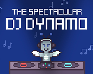
The Spectacular DJ Dynamo - GDKO Round 1 2024's itch.io pageResults
| Criteria | Rank | Score* | Raw Score |
| How cohesive is the game art (do all visual elements work well together)? | #20 | 4.257 | 4.257 |
| Do the animations/effects improve the player experience (game juice!)? | #20 | 3.886 | 3.886 |
| Is the art appealing (do you want to spend more time in this world)? | #22 | 3.771 | 3.771 |
| Overall | #22 | 3.794 | 3.794 |
| How well was the Theme implemented? | #23 | 3.686 | 3.686 |
| Did you enjoy this entry? | #30 | 3.371 | 3.371 |
Ranked from 35 ratings. Score is adjusted from raw score by the median number of ratings per game in the jam.
Which team were you in and what was the modifier for your team?
Team: SimonCB
Modifier: More is More
Which game engine did you use?
Godot
If you are chosen as the wildcard will you continue in the competition?
Yes!! :)
Leave a comment
Log in with itch.io to leave a comment.


Comments
This was a really nice game! The gameplay was super intuitive and I really enjoyed the art. It was so colorful and I really enjoyed the main DJ guy.
All visuals look really nice and polished, the atmosphere feels great. Gameplay is fun, but not very challenging. Well done!
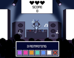
Fun memory game, also really love the visual style you've gone for! Mirroring Loten's concern, I thought some of the colors (mainly along the green/blue/purple part of the spectrum) were a bit too similar which ended up causing me some trouble, but that should be an easy fix. Despite the color confusion, I still really liked the color transition effects! If you end up adding to this, you could add another layer of trying to remember the timing of each color in the sequence, in addition to the actual color for each one.
I was not expecting a memory game... lol
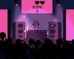
But that being said, I really enjoy it! I love the feeling of it and how it feels like you are the DJ and trying to keep the crowd happy!
Your pixel art looks great. You obviously put some time into make the atmosphere look good. A good idea executed very cleanly.
Nice job!
It’s great to see how far you have come since last year. I’m happy to finally see some artwork in your game and the pixel looks great. I wish the gameplay was a little faster pace, maybe instead of doing multiple rounds of the same number, just increase it by one each round. Also, the colors were a bit confusing, especially with the light, the purple/pink and green/blue were a little too similar, maybe some images go to along with the colors. Overall, great job on your round 1.
Thank you so much, I've been practicing my pixel art quite a lot, so glad that it has paid off! Thank you so much for the feedback as well, planning on making those changes in the future!
I think my favorite thing about this game is that it's a great example of scoping appropriately for a jam. You focused on one fun mechanic and did so much with it, and still had plenty of time to make great visuals and add appropriate audio to enhance the experience.
I'm not colorblind, but I do have very reduced vision, so differentiating blue, cyan, and purple was a bit difficult for me at times, but it was hugely helpful that all colors had different sound cues.
Great entry and best of luck in the round!
Thank you so much!! Glad the sounds did help, but I am planning on updating and swapping the blue for a yellow or something, because those light colours do look pretty similar, hopefully that could help!
A fun memory game, worked really well with the DJ theme. The colors were different enough to not get confused even with all the lighting effects.
The sound design is great, i like how every color has a different sound, that makes it easier to memorize. I rocked that leaderboard with a solid 13770. To be hones i was compleatly lost once it started to play 7 colors xD
Great game!
Thank you so much!! That score is incredible LMAO, I'm so amazed anyone even managed to make it that far, 7 is insane, and I was struggling at 5 lol
I feel like we play similar kinds of games because I always love what you produce. The sound design in this is so fun, I can't tell if it was my brain imagining it or not but the crowd seemed to get more hype the better I did. I love the synthy sounds as the lights change. And THE LIGHTS! Such good lighting effects. Im wondering how I can execute something similar in unity. If I could suggest one thing. Adding a royalty free synthwave music playing in the background I think it would add some valuable ambiance to the game. Something like this in the background would go so hard and fit nicely with the sounds you already have.
Thank you so much CJ, I really appreciate the kind words 😊!! I always love what you make as well so that sounds about right lol.
Love your idea about the background music, that one you linked sounds great! I think something like that would fit the vibe really well, it might be cool if I could involve some rhythm game/timing elements along with it as well
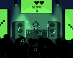
I have to say, the blacklights was the best. When I had no idea of the sequence, I just turned it all black.
Great work on the game! Loved the DJ vibes, and the lights were sick as a memory game! (Again. Black was thebest!)
EDIT: oh yeah! And I forgot to comment on the theme usage, I think it was great how more is more was going on with the lights and the score)
Thanks so much, really appreciate the kind words!! The blacklights are my favourite as well LMAO
Love all the effects and atmosphere of this game. Was a bit challenging at times to differentiate some of the colours, but overall really nicely executed with awesome visuals :)
Memorize em all da. Liked the concept and it looks pretty….
This looks great! Really cool animations and good use of sound.
My issue is that I'm colour blind so I wasn't really able to progress much. Maybe if you chose only colours that are very different from each other it would have been a bit more doable for me. I won't let this affect the rating though.
Really polished entry, good theme implementation. All in all well done!
Thank you so much! Sorry about that, I am planing on swapping the blue for a bright yellow, and adding corresponding symbols/shapes for each colour on the screen, hopefully that will improve it for the future!
Really like the lighting effects and the atmosphere you have created, especially with the jumping crowds. I also liked the leaderboard and got to third place but I imagine I'll get overtaken as more people have a go. I will say that I did get mixed up on some of the blue and purple colours as I'm a bit colour blind, perhaps having a yellow and a deeper purple could help make them stand out
Thank you so much! Definitely am planning to improve the visibility in the future, I think replacing the blue with yellow would definitely help, and also am thinking of maybe having shapes on the screen too, one corresponding to each colour, that might help as well. Thank you so much :)
It is very nicely polished, the game feels very cohesive :D
Great Job! I love the twist! a few times I would lose and i wasnt sure why so im not too sure what to say about that but overall it was really polished and the animations were great!
Thank you so much :) ! I think maybe that could be because some of the colours (eg blue and cyan) are quite similar, I am planning on differentiating them or changing the colours in the future!
that would be awesome just so it doesnt feel unfair. an idea would also to have symbols associated to the colors as well like circle is pink square is blue. and the symbols could be coming out of the speakers. that way it is colorblind friendly! Thanks for responding!
Dude this turned out really good! The crowd, sound effects, notes, light, etc... made such a good, cohesive style. FANTASTIC entry.
Thank you so much!! 😊
I like how the whole scene is animated. Everything seems alive. I also like the music notes floating around. Might be cool to have some additional animations/effects when you get the sequence right. Overall really great!
Thanks so much! And thanks as well that is a really good idea, I'll implement that in the future!
Nice twist on a memory game, and really enjoyed the spotlights going back and forth, they almost throw you off in a way. I mentioned it on stream, but making the colors more distinct, such as using the colors of the rainbow, and maybe a way to signify the start of a round, using the lights going black might be nice. Overall, nice job!
Thank you so much for the great feedback!