Play game
It's like snake but you're in a mall and its on fire's itch.io pageResults
| Criteria | Rank | Score* | Raw Score |
| Fun | #982 | 3.328 | 3.328 |
| Originality | #1116 | 3.522 | 3.522 |
| Overall | #1128 | 3.378 | 3.378 |
| Presentation | #1468 | 3.284 | 3.284 |
Ranked from 67 ratings. Score is adjusted from raw score by the median number of ratings per game in the jam.
How does your game fit the theme?
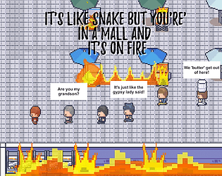
The game operates by acquiring followers via collision
Did your team create the vast majority of the art during the 48 hours?
No
We used pre-existing art
Did your team create the vast majority of the music during the 48 hours?
Yes
We created the vast majority of the music during the game jam
Leave a comment
Log in with itch.io to leave a comment.


Comments
I like this game! It's very challenging, and I love how everyone says different things. Just one thing, the player shouldn't die when it touches others. Other than that, this is a very well-made game. Good job!
Loved the humor! The pathfinding of the npcs behind you isn't precise so sometimes I felt like I died in an unfair way. I liked the art and style though a lot, it reminded me of earthbound with the wacky dialogue.
Looking at your comments, a lot of my thoughts have already been said. I like the idea of snake, but everyone you're trying to save is panicking, but everything moves slightly too fast, and when they follow you, they tend to cut corners and die. It's also not very clear what is background, and what is considered a hazard that can kill you. I'd suggest trying to add a border around the sprites of things you can collide with, and keeping the background without borders around the sprites to see if it helps with that. The good news here is that most of these are a few small tweaks, and you've got a pretty fun game!
I thought I would love this but I honestly found it to be frustrating. The movement is awkward and slippery feeling and for how chaotic the level design is with how precise movements need to be for a snake game, this didn't work for me. I would clip nothing and still die. I think the concept is there but it needs some more refinement. The music is alright but doesn't feed into the sense of urgency that comes with the building being on fire.
The funny name got me to get here to give it a look. It's an interesting concept, but I think that the collisions and movement are not really that well handled. Besides that, it's a really interesting game! I think that most of my frustration came to the collisions, and tile-based movement would have solved it completely. It would be greatly appreciated if it had a win screen when you save all of the fifteen people... Anyway, great job!
I like it! There’s enough variety in the map that makes it challenging to figure out who to pick up first and in what order you should do it in. Great job!
I was afraid that wouldn't be apparent enough, but I'm glad you could figure it out! Thanks for playing!
Really cool idea! it feels like it takes the core gameplay idea of the snake game and adds some backstory and bigger purpose to it. We also played around with the snake game for our entry (and even have some similar issue with wanky hitboxes XD ). I'd love to hear what you think!
I'm a work right now, but I'll check this out when I get back home! I'd love to see another snake entry!
This idea is really unique! I liked the game, but i have some critique points:
1. I would remove dieing when you run into yourself, or make it better / more obvious where you die.
2. The music was cool, but there was something off about. Can´t put my finger on it though.
3. Something that often happens when using pre- existing art, is that the UI looks much worse than the rest of the game. Also happened here. A tip to make it better: USE A DIFFERENT FONT THAN ARIAL! Please, if even would be fine with comic sans.
4. I like the name :D
Hope the feedback helped you, would be nice if you could check out my submission too. :)
Thanks for your feedback!
1. In the full game everything will be made in a grid system. Hazards (Including followers) will highlight the edges of the squares red (or something similar) This should help with a lot of confusion :)
2. I'm sorry you found the music off putting. Many others loved it. Maybe it was something with the fire sfx playing under the track.
3. I'm actually surprised this didn't come up sooner. During development we had to pick, and choose where to spend a lot of time, and where to cut corners to meet the deadline. The game over screen/pause menu only had time for 1 draft. With less time restraints the full version will be much more modern, and sleek.
4. Thanks we do too :)
I'll check yours out right away
This idea is really unique! I liked the game, but i have some critique points:
1. I would remove dieing when you run into yourself, or make it better / more obvious where you die.
2. The music was cool, but there was something off about. Can´t put my finger on it though.
3. Something that often happens when using pre- existing art, is that the UI looks much worse than the rest of the game. Also happened here. A tip to make it better: USE A DIFFERENT FONT THAN ARIAL! Please, if even would be fine with comic sans.
4. I like the name :D
Hope the feedback helped you, would be nice if you could check out my submission too. :)
It's a funny game but the hitboxes are a bit janky which is important in a game with small areas. It's got potential! Good job.
Fun idea I think my favorite part is the character dialogue. Only issue like stated by others is the hitboxes being a bit weird. But otherwise a concept that I really enjoyed and could definitely be expanded upon. Maybe adding more levels and such with each level having a gimmick.
I loved this! I felt like I was a Pokemon NPC from the older gameboy color games. I like the way you laid out the level, it became very clear really fast that people follow you like in Snake (I guess the title helped explain that as well haha).
One suggestion: Consider making the floor tiled and giving the characters a shadow so that it is more clear if they are going to crash into something. I think the 3d-ish effect makes it slightly hard to tell if something will be hit.
Overall great job!
Thanks for the feed back! Yeah a lot of people suggested the grid system. In the full version that'll definitely be implemented :) thanks for playing!
This is fun, love the theme/art/music and such. Hitboxes seem a little wack, don't really know why though.
yeah in the full version the hit boxes will make more sense. The movement isn't based on a grid so it's easy to be on half a tile and collide with something . Thanks for playing though!
This is what I call an original take on the theme! I absolutely loved the art and especially the humor in this game. Very original and quite challenging. The only "complain" I would make is that sometimes it was not really obvious what is the wall and what is not and hitboxes felt a little unprecise. Great submission!
Dang, this is a fun challenge! The concept is hilarious and well executed, I especially enjoy the little touches with the dialogue boxes. The music you made fits the art assets you utilized, and keeps a nice sense of pace without being overbearing, so well done on that. I think the only gameplay part I found frustrating at times is that I wish the movement were on a grid, as it is in traditional snake, because it was difficult with the art to always know where the hit-boxes were. In all though, well done!
Awesome game! I love tough games to complete and I am proud to have saved 15/15 people (after many tries).
The idea is fun, the artwork is awesome, gameplay is straightforward. I'd only be more careful about hitboxes because they are the core of the game and when my toe touches the outer edge of a fire's hitbox it makes for a sad ending! 😭😂
Good job! Really fun to play though
Congratulations on beating it! That is no easy feat. You sir are a master!
Dig this game, I like the inspiration taken from snake. I wasnt able to get all of the people out but I got close! Well done for 48 hours.
It was fun but I had some issues determining what I could run into. Also I enjoyd the title
Part of that is because I had to change how collision worked half way through development. Most colliders are pretty lenient (You have to hit the center of the object to actually be out) But some got left really tight. In the full version it'll be more consistent :)
Nice idea and I like the "but it's in a mall and on fire" XD. I think it's a bit confusing to know what I can't run into and it doesn't feel like the game should be over if you bump into one of the people you have already joined with
Thanks for the feed back! We wanted to keep the same feel as the game snake where you can't touch your tail or you lose. I do agree that it doesn't "feel" right, and in our full version I want to make it feel more intuitive to not touch your followers.