Play game
Made to Fit's itch.io pageResults
| Criteria | Rank | Score* | Raw Score |
| Style | #270 | 4.320 | 4.320 |
| Overall | #487 | 3.893 | 3.893 |
| Enjoyment | #866 | 3.600 | 3.600 |
| Creativity | #1055 | 3.760 | 3.760 |
Ranked from 75 ratings. Score is adjusted from raw score by the median number of ratings per game in the jam.
How does your game fit the theme?
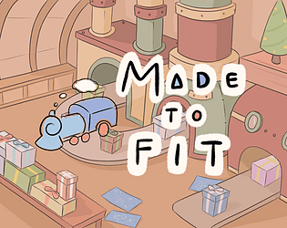
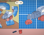
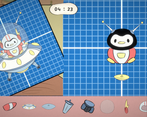
In Made to Fit, you need to reproduce a toy according to the dimensions given by blueprints.
Development Time
96 hours
(Optional) Please credit all assets you've used
Font Finger Paint - https://www.fontsquirrel.com/fonts/finger-paint
All other assets were made by us!
Leave a comment
Log in with itch.io to leave a comment.


Comments
Neat game, but it was a little frustrating that the scales did not always have the possibility to be perfect. For instance the bunny airplane one was missing an orange piece at the back for me so the brown section was showing even though it wasnt in the blueprint. And for the penguin flying saucer the head and helmet didn't ever have the right scale to match the body like the blueprint did. Un sure if this was a bug with scaling?
Would love it if the objects were dragged onto the scene scalled too instead of changing size when placing them.
Great art, great music, with the above fixed this would be a fun relaxing game. Could see a full release!
Thanks for the feedback! About the rabbit I think I understand what you are referring to, a friend played the game and made the same error, there's a trick for this, I think you didn't have the right scale for the back.
I don't know about the penguin though, it works on my side, maybe you ran into one of these rare bugs, I can't say.
And yeah, I realized too late that objects when dragged were resized, but it was too late for me to change this, I would need to change a whole section of the code because when you drag them they're UI and when you spawn the toy part it becomes a sprite and Unity handles the scale differently between the two.
Ok i think i figured it out. The thing that is throwing me off is the scale of the objects in relation to the blueprint. For instance the carrot plane needs to slightly go off the screen to fit at the right size.
This is a relaxing game. Could be nice to be able to control which objects are in front of the others.
Thanks! Yeah I think if we had to do a complete version ther should be like a layer menu where you can change the layers easily. A bit out of scop for the jam but that would be a nice thing to add.
A very cute and relaxing game. The visuals are precius, the music is fantastic and fits very nicely with the gameplay and overall is very fun to play and as someone who like scale modeling i enjoyed this even more, i would like play more of this. Also, i love the level transitions with that train animation. Great job!
Thanks!
It seemed to me that scales work very strangely and do not always increase as they should
Otherwise the game is great
Oh that's bad to hear.
All objects to not scale like the others, but I'm curious to know in what way they do not scale as they should.
Nice game, I believe it is very good for kids, I love it.
Thanks! I don't know how kids would approach this game, I'm curious now haha
so cute! great work everyone.
Thanks so much for playing!
Very nicely done! Looks and sounds great. Simple with a solid execution. Well done :)
Thanks! Really appreciate the feedback :D
Sooo satisfying it feels like building a lego or something. I could honestly play something like this for hours. However I do have some feedback too. I’d love if it had the ability to pan around and some kind of undo ability because sometimes you just do one single mistake and screw up the entire image because of the z ordering. The image in the last level rotating only made things annoying. It’s more of a chilling game and it is not meant to be hard or stressful so I would remove that. Those are the things I have to say but other than that very good game.
Thanks for the feedback! An undo button would be a great idea (though I don't know how to do that but it's still a great idea). The last image rotating was more to try something else so it's not too repetitive (it's probably rotating a bit too fast, I didnd't balance things much). The goal of the game isn't to stay too long on one puzzle to hit perfection, but more to have fun building something as best as we can. A rotating image surely isn't the best gimmick we could have added to the game, it was more like the easiest one but with a bit more time we would be able to create some more inventive levels eventually!
Really nice! I enjoyed it!
Thanks!
Well designed and super polished puzzle game. Visuals are great. Very cozy and fun to play. Congrats!
Thank you!
Really fun game! It's got a a great art direction and a cool aesthetic. I generally agree with commenters that there shouldn't be a time limit, that way players decide when they're ready on their own time, since I think players will keep playing so long as they're having fun, which I definitely was! It's really cool how we ended up going in similar direction with our games, except yours has way more polish added onto it! Absolutely lovely!
Thanks for the feedback!
Super fun puzzle game! I loved this interpretation of the theme, where you're building toys according to the blueprints. Sometimes it was frustrating to click on a piece accidentally and then have to readjust the layers of all the other pieces around it, but I guess that was mostly my fault XD. Very nice submission.
Haha yeah clicking on the wrong piece and all your dreams are destroyed.
I'm glad you like it!
Beautiful game! It's a fun idea that each level is two different kinds of puzzles. Very cozy/chill game. I'd say the countdown timer is unnecessary, I know it makes this more "game-like." This would be enjoyable to play for a really long time without the time limit. Overall, well done!
Thanks for the feedback!
The timer was added mostly for the jam format more than to make it "game-like". If we didn't have a timer some players wouldn't have tried all the puzzles because they would be staying longer on the first ones. It's just to make sure that it's not too long and players don't try to be too perfectionnist. Though I'll add to the game a "no timer" mode after the jam.
Wow, awesome art style! Love the color palette. As mentioned below, the game has a really nice vibe. Awesome job!
Thank you!
This is really lovely! The game combines simple but creative ideas to offer a really satisfying and relaxing experience. I enjoyed the cute art and music. I wish the layer of the pieces could be fixed (rather than having to click on every others to put one into the background), but it's only a small inconvenient. Overall the game plays smoothly, and offer just the right amount of fun. Nice work on the matching computing by the way, it seems to be not too strict, which makes the game pretty tolerant and never frustrating.
Thanks! The computing is probably a little too kind, you can get a 75% thanks to only one piece if you meet to conditions. It was made with the intent of not being to brutal but now it's too generous. I think I've found a better way to calculate the score that is more fair and close to what you got, but that will be updated only after jam.
It's very tricky to decide what should be the score, there's no good or bad answer, it's completely subjective, you choose what's "near" and what's "far". Definitely one of the hardest design decisions you can face as a game designer.
This was such a cute game! I had a blast playing, it was such a cute vibe all round! Nice work!
Thanks!
I'm in love with the art style! The gameplay mechanic is simple and effective. Well played mates!
Thank you! Wasn't expecting you to participate!
Yeah, sometimes I make games, it happens! XD
Ahahaha, a very surprising interpretation of the theme!
Haha thanks! I'm glad you like it!
This was unreasonably fun. Great music, great puzzles. A little improvement would be to make it easier to pick objects to resize, since I end up accidentally getting the wrong one quite often.
Other than that, loved it.
Thank you! That's a bit weird. I don't know how this happens, maybe when resizing your cursor ends up on another object? There's surely a way to avoid this, don't think we would've been able to fix this for the jam but I'll keep it in mind for my next games!
I think it happens with overlapping objects mostly, and I'm not sure about the best way to disambiguate. Maybe having a selection state and an outline around the selected object would help?
Either way it's quite a minor nitpick on an otherwise great game.
Oh yeah outline might be good. This is definitely something that I would not have been able to do for the jam but it fixes the problem mostly. Though we use a different layer for each object (actually sorting order) so they are each displayed according to the last time you placed them. This layer also corresponds to the position of the object as a child of his parent. We use the events system to drag and drop but I'm afraid Unity handles that in a very shadowy way that I would not be able to explain. Maybe using a raycast and comparing the int value of the sorting layers should be more efficient (but would hurt a bit bit the frame rate, not by much). )This is definitely something that I should look more into details for the future.
So freaking cute, I love how the time limit there though just gives it that little bit of tension as you're like "OH GOD WAIT I CAN'T KEEP MAKING SURE IT'S PERFECT I HAVE TO FINISH" after it caught me out the first time. Only slight nitpick is that sometimes I didn't want to pick a background element and so I'd then have to go and rearrange everything in a stack. Absolute delight to play through.
Thank you for the feedback! Managing layers clearly is the most difficult part of the game, I would've liked to make it a bit easier though it would need more specific features. Also sometimes there's this bug that makes you pick the wrong item that I never understood. I just hope it's not that bothering and doesn't breaks the enjoyment much.
It wasn't too frustrating I generally just kept clicking and it'd cycle through