Play game
The Journey to Orbos's itch.io pageResults
| Criteria | Rank | Score* | Raw Score |
| Style | #354 | 4.257 | 4.257 |
| Creativity | #471 | 4.029 | 4.029 |
| Overall | #598 | 3.829 | 3.829 |
| Enjoyment | #1912 | 3.200 | 3.200 |
Ranked from 35 ratings. Score is adjusted from raw score by the median number of ratings per game in the jam.
How does your game fit the theme?
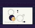
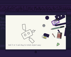
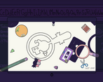
The size of the shadows that fill the shapes scales according to the distance to the light source. More of a jumping point for ideas than direct inspiration.
Development Time
96 hours
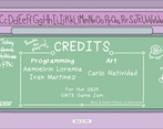
(Optional) Please credit all assets you've used
see description for full credits
Leave a comment
Log in with itch.io to leave a comment.


Comments
I had so, so much fun with this game! I played it way longer than I should have probably, haha! Please add more levels and consider turning it into aa mobile game. I truly think it could do so welll
I like the direction you took the theme, it feels very cohesive and the different pictures you could make with all the assorted items was really cool. My only major complaint is that filling in the shadows felt a little ungracious at times where I felt like I was really close that it could have just given it to me.
I really liked this game and enjoyed playing it! The idea is really creative and the gameplay was fun and relaxing. Well done!
Really enjoyed playing this game! The visuals and the concept are very fun.
I absolutely LOVE the use of childish chalk-like graphics for this one. Very creative with the size scaling usage of shadows. Puzzle is enjoyable with a kind of strict placing mechanic, making it more challenging. Would really love this as a full game packed with storyline. Good job on submitting this piece so closely before the deadline!
Cool game! The puzzle that introduced the Z and X buttons melted my brain (I couldn't figure out what shadows to use for the head of the satellite), but I really liked this concept! Would've loved to see where this cute little tale was going. Good stuff!
NOOO I ACCIDENTALLY RESTARTED THE GAME NOO
That's sad i would've loved to continue :C
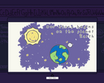
Really really nice take on the theme, the story is amazing, wow, and i also loved also the contrast between the big universe and distant aliens, and the small every-day and common items.
Amazing, only feedback, the controls were a bit clunky sometimes, maybe the c button to rotate could be removed, and be always a default option (for example if you touch the hitbox of the object you can move it, if you don't you can rotate from it's axis)
Same thing with the slide bar to shrink and expand things, maybe could be replaced with the scroll of the mouse, or maybe it could be better to keep them both, so that mouse players can use one, and laptop playes the other!
Defenetly (I hate english how do you spell this abomination) one of my favorite out there!
Cool looking game with great designed puzzles and all this 19 seconds before deadline nice
Fun little game, but imo way too strict. It seems like a chill game from the visual and vibes, the strictness of the clipping really is frustrating.
Thank you for playing the game! I'm glad you found it fun!
Super enjoyable and cute puzzle game!
I'm glad you enjoyed the game!
Very good looking game with a unique concept. : )

However, especially once the tilt mechanic becomes necessary it becomes very tedious to get the shape just right. One idea could be to give the player different/more objects that make it easier to align the shadows and give extra points for completing it the hard way.
Another thing: the tilt seems to be defined as the rotation around the global canvas x-axis, which feels a bit weird to me since tilting typically happens around a local axis of the object. I don't know if it's actually better for your case, but you could try implementing the tilt to rotate around a local axis (depending on where the mouse drags) instead (although this is also a lot trickier to implement ; ) ).
This must be the work of an enemy stand:
Yeah, eventually we decided the tilting mechanic was too finicky so you'll notice we stopped including it in the later puzzles. Perhaps a better idea would have been if the items only have two profiles (one for side and another for front/back) that made different silhouettes so the players don't have to mess around with the rotation too much.
Haha we ALMOST forgot to submit the game 😭 We we're too relieved with finishing it and uploading it on time to remember actually filling in the game jam submission form haha!
The objects are jam-packed with Jojo references, I'm glad somebody noticed them haha!
Anyway, yeah! Thanks for playing our game! We really appreciate it :)
This was awesome! What a cool concept! I think it could be a little less exact in the positions, but I really like this idea! Nice job!
The game is beautiful and the SFX and music are great. I found the gameplay tedious but it' a matter of taste ♥
Thanks for trying out our game! I'm glad you liked the aesthetics, we're really proud of it :)
I love the style and the shapes get tricky! I had a hard time with my laptop screen size though.
Thanks! I'm glad you liked the art style.
Yeah we realized a bit too late that we need some sort of zoom function to help with the tricky parts.
pretty cool and unique concept ꕤ
Thanks for playing our game! Our team is glad you enjoyed it :)
The concept is cool, love the art also. The shape verification should be a bit more lenient.
Awesome art style and take on the theme! Nice job!
Thank you! I'm glad you liked the game.
I agree with the other comments that the system requires excessive precision when placing the shapes, especially in advanced levels. Aside from this, the setting is very nice, and the main mechanic is reusable and functional (maybe even for a mobile version).
Fun fact: we used the same main music in our game, so that’s an extra point for me haha!
Thanksfor playing our game!
We appreciate your feedback and agree with your that the verifying is a bit too strict. We would have adjusted it if we didn't run out of time, so we're definitely gonna update it once the review period is finished.
And what can I say, great people have good taste in main music 😎
Creative and great, but the recognition system is extremely strict and would create player frustration as they continue to adjust and make tiny changes to make it 100% fit.
Really liked the interpretation of the theme here. Fun and creative puzzles! The only minor gripe I had was that the solutions felt a little rigid. I found myself making a lot of micro adjustments to fit the outline perfectly