Play game
Coloroid's itch.io pageResults
Criteria | Rank | Score* | Raw Score |
Presentation | #164 | 4.344 | 4.344 |
Enjoyment | #230 | 3.844 | 3.844 |
Overall | #284 | 3.875 | 3.875 |
Creativity | #1216 | 3.438 | 3.438 |
Ranked from 32 ratings. Score is adjusted from raw score by the median number of ratings per game in the jam.
How does your game fit the theme?
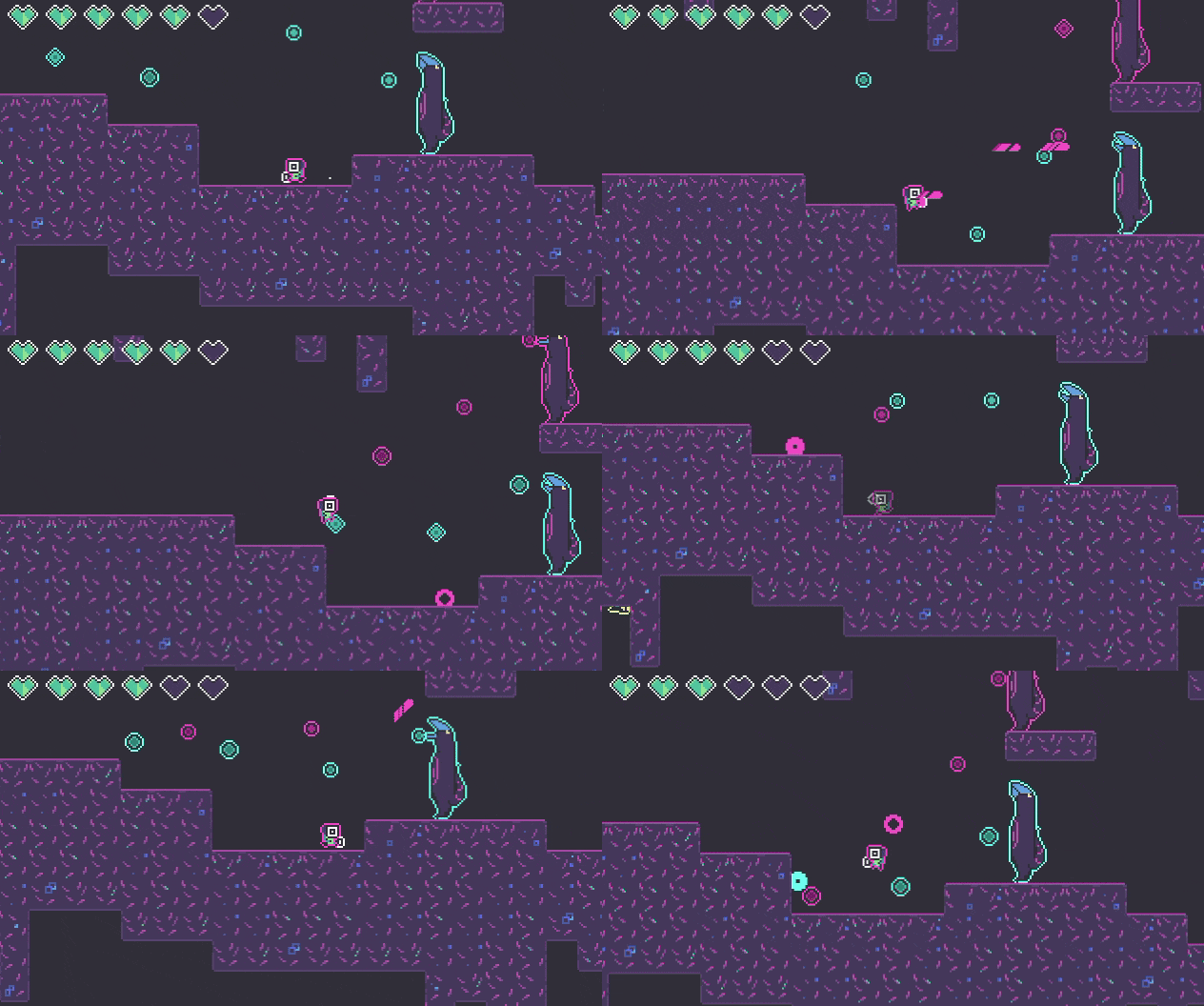
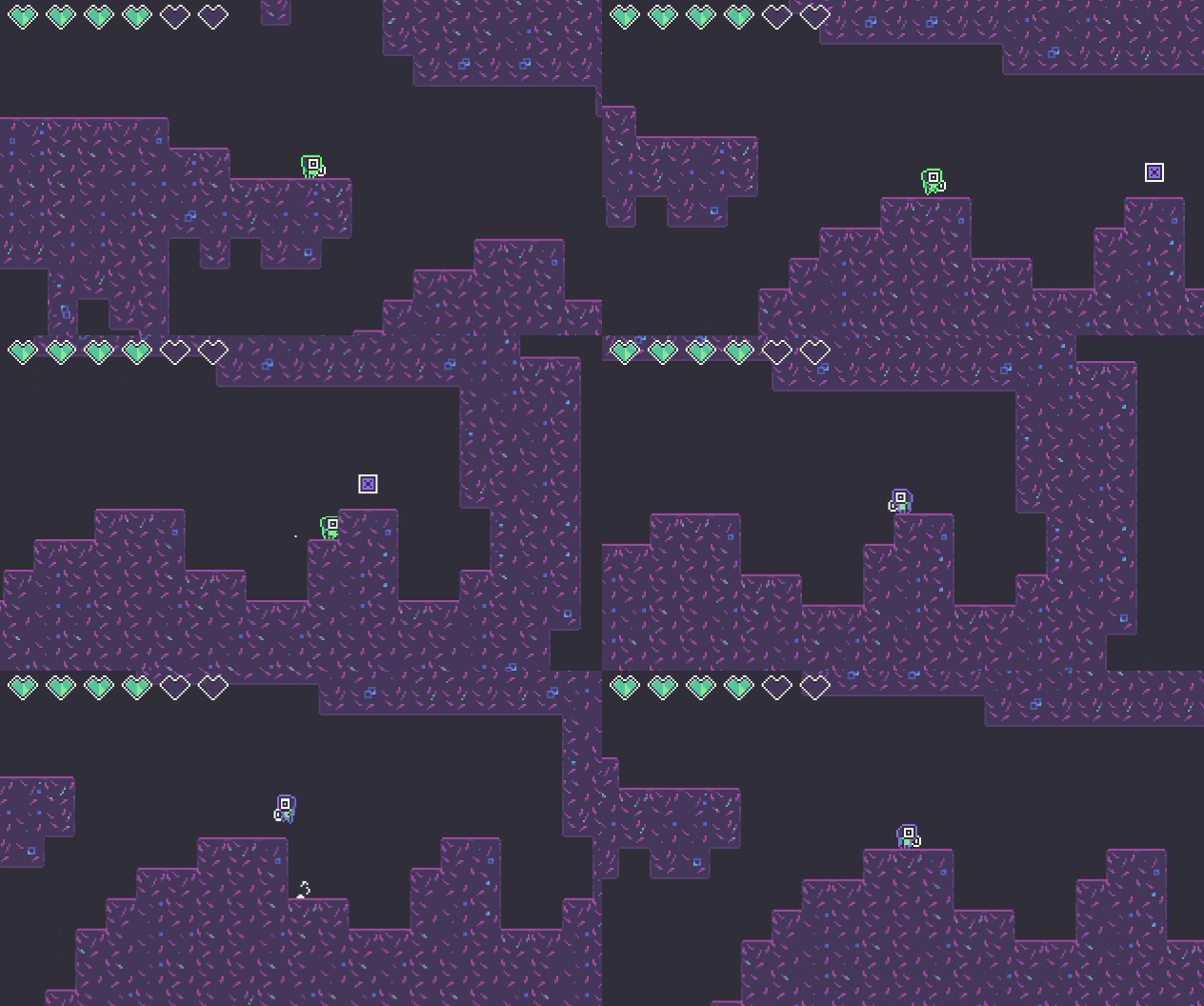
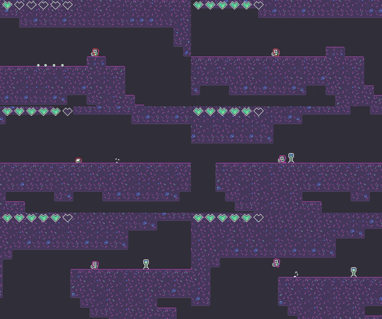
Coloroid is an action metroidvania in which your dodge roll also randomly re-selects one of your 6 potential weapons
Did your team create the vast majority of the art during the 48 hours?
Yes
We created the vast majority of the art during the game jam
Did your team create the vast majority of the music during the 48 hours?
No
We used pre-existing audio
Leave a comment
Log in with itch.io to leave a comment.
Comments
This is a pretty interesting game! The roll to change mechanic was not unique, but this one does it well, where I am often put into a situation where I'm forced to roll, and I assume enemies are weak to their color. There was a nice variety in weapons, however I feel that they are not all so different, but still impressive to have done all that in only 2 days. The character animation is so cute, especially the roll.
One major criticism I have is that I should've been able to hold to constantly shoot bullets, instead of having to spam the button. Make each weapon have different reload speeds, so that holding can be a thing. Also, the controls probably should've been stated, even just a block of text mentioning all the controls, I had to sit there trying out all the buttons for quite a long time before being able to play.
Overall a really great submission tho, the movements felt very fluid, and the jumping is very snappy, and the roll is also just very polished. Enemy movements also feels very nice, very predictable and anything I do wrong could've been avoided if I had played better. Very well done!
Love your game! Very well rounded entry for the jam: nice visuals and animations, fitting sfx and music, well balanced difficulty progression with nice level design! Amazing job! I'd certainly play a bigger version of that game. It has got a lot of potential!
Thanks for bringing it to my stream! Here's a recording in case you'd like to refer to it
I really enjoyed the presentation of this. I'm not sure about the different weapons however - what are their benefits?
Very well made game with interesting mechanics. The character feels good to move around.
Love the art style, great music too.
A really cool thing to get done in 48 hours. Some nice movement, decent fighting mechanics and some interesting enemy variety in terms of movement especially. Normally that doesn't happen so much with enemies. Also I am so happy there was a dodge, there have not been too many this jam.
Also a pretty nicely designed levels to get around which is always helpful. Though the flying enemies were really good at sneaking between the bullets all the time which was a little hard, buit makes sense ya know they are flying enemies. Just not the easiest to hit ever.
One thing that was a little interesting but also annoying at least in my opinion was the switching based off rolls. It's an interesting concept, especially with the theme, the problem is just there's not too much movement variety when you're trying to stick to a single weapon to deal a decent amount of damage to one enemy or another. I feel like having the changing based off something different could be interesting. For example a different key, or setting it to be on a timer. Just something to remove it from being tied to your main bit of movement.
Otherwise my only other real, not so much complaint, but note would definitely be on the color centric indicators. It's a little difficult if coloring is off, though they are definitely distinct, even when oranged out. Could be a little hard depending if someone is color blind though, so might be good to have a more symbol based visual indicator when possible.
Overall though I was not expecting a mini metroidvania to show up in this jam but a pretytr well done one for sure.
Thanks for your detailed thoughts! :)
Hey, it's a really nicely done game! The controls were good, also loved the cute pixel-art and sounds.
Thanks! :)
The art was stunning! Great job. The game felt smooth to play and nice to control! If you are to add screen shake, make sure you add the option to turn it off and/or turn it down.
Thanks for playing! :)
Wow. This is super polished and incredibly juicy, I am very impressed! Fun combat and interesting mechanic. I'd recommend cranking up the juice even another notch by adding screenshake. Nice work!
Thanks for playing, glad you liked it! :D It does have a bit of screenshake when you get damaged, but perhaps I should try out some mild screenshake when firing!
Really cool idea here - those animations are choice!
Some tightening up of the controls, and maybe have the colors control more than just what enemies you can hit (maybe link to movement options?) would be cool. Also, it was annoying sometimes trying to shoot enemies that were slightly above me as they would fly horizontally making me have to jump and shoot repeatedly, that may have been intended but it didn't feel great when it happened.
Would love to see this expanded on :D
Thanks for playing! :) Just curious, what do you mean by tightening up of the controls? Which part didn’t feel good?
Nothing major, just things to iron out from playtesting really.
The gun seems to be able to be spammed as fast as you can tap the button. The camera could be a bit jittery when moving fast. It may be intentionally absent, but I would love a dedicated button for firing diagonally.
This was a unique experience, and one that far exceeds what can be expected from a 48h jam game - and the fact that it was made by only one person is amazing. A really cool little adventure that could be fleshed out into a "real" metroidvania if you wanted to.
Thanks for playing! :D
I loved the art style and how well-made charecters and enemies made. I think that color palette was chosen very well!
Controls weren't quite on place in my opinion. I feel like attack should be ctrl, and roll - alt. But that's what I used to after playing some PC-platformers. Not really a big deal to get used to new controls.
Overall very nice platformer!
I tend to avoid Ctrl/Alt personally because of my keyboard setup (double-Ctrl is a hotkey for me), but yeah I agree that it might’ve been more natural. Though, I honestly feel like the game plays a lot better with a gamepad anyway. :)
Thanks for playing!
A real variety of moves, the characters and monsters were really nice but the background got a little repetitive.
Controls were slick, congratulations!
Thanks for playing! :) By background, do you mean the tileset, or the actual background layer? (Which is just a single color at the moment)
Yes, I meant the tileset 😊
The level of polish and juice for this game in 48 hours is staggering. You really nailed the feel for the movement, jumping into a dodge is very satisfying and I never felt like I was fighting the controls. I think post-jam a little work to make the weapons feel more different would be amazing if you did want to keep developing it. I really dig the art style too, and the End drawing! Great work.
Thanks for playing! Yep, I agree, I would’ve loved to have had more time to make the weapons more distinct.
I like it! I love the neon like glow on the character and the snappy control. Great job!
Thanks a lot! :D
Nice submission, really satisfying gameplay, overall a good concept for a bigger game.
Thanks for giving it a shot! :)
I really love it!
It's really surprising that you made this within 48 hours.
I love the concept and art, I really enjoyed it.
Glad you liked it! :D
you forgot to enable the http support on the page, the zip on it's own does nothing. You have to check the box on the zip that it works in the browser.
Unfortunately, I didn't forget, instead it seems like something is broken with Itch.io's loader, making the HTML5 upload not function. :( I'm fairly certain it's not my actual zip, because I can download and extract it locally, and it works fine in-browser. I've reached out to itch.io support regarding it, but haven't heard back, and I also can't upload a new version during the jam. Ah well.
Amazing game feel and look! I love the character design, and liked the portrait at the end. Only part that was unclear to me was the relationship between attack and enemy colors. From the visuals it felt like there should be, but any weapon worked fine enough on any enemy, and I never got a feeling of benefit or determent to color matching
Thanks for the kind words! :)
Your attacks do double damage when the enemy color matches, but I agree that this wasn't clear, and I also didn't really get a chance to balance things such that it actually makes an important difference (as you said, if you shoot enough, basically any weapon will work).
Woah this is really polished! Love the gameplay and the cute art style. Not the most original concept but I love the execution.
Thank you for playing! :D
Fantastic game feel! The character is a joy to control. I love the way the dash and shooting feels -- it's very responsive.
It did take me a staggeringly long time though to figure out that rolling also switched your color and attack, I was confused why it didn't seem like my attacks were working on an enemy that was blocking the way. I also wish the rolling dice theme was more incorporated than just really an RNG weapon switcher.
Thank you for playing! :)
Yes, I had an idea for a way to make the RNG weapon switch a bit more meaningful, like a timeout or some kind of "charge" mechanic to encourage players to use the weapon a bit before trying to switch to a different color. I also wanted to adjust the weapon types to make them have some more unique effects (besides just power / range). But alas, I ran out of time for all that, haha. Perhaps I'll try to play around with those ideas in a post-jam release!