Play game
Dream Defenders's itch.io pageResults
| Criteria | Rank | Score* | Raw Score |
| Fun | #2 | 4.100 | 4.100 |
| Accessibility | #6 | 3.650 | 3.650 |
| Controls | #7 | 3.900 | 3.900 |
| Overall | #11 | 3.686 | 3.686 |
| Audio | #14 | 3.750 | 3.750 |
| Graphics | #28 | 3.650 | 3.650 |
| Theme | #31 | 3.400 | 3.400 |
| Originality | #37 | 3.350 | 3.350 |
Ranked from 20 ratings. Score is adjusted from raw score by the median number of ratings per game in the jam.
Godot Version
v4.0.stable
Wildcards Used
A fork in the road
Game Description
Rally together the Dreamscape Defenders, and safeguard the Dreamscape from invaders!
How does your game tie into the theme?
The game takes place within a child's dreams
Source(s)
N/A
Discord Username(s)
Greenrose7#5512, Zuraniix #6190, AlexEvans#1542
Participation Level (GWJ Only)
6
My game has an export for Linux, Windows, & Mac and/or is playable through HTML5
Leave a comment
Log in with itch.io to leave a comment.


Comments
This is awesome! I've been playing a bunch of Super Auto Pets recently, and was actually thinking of doing some type of auto battler for the jam. Ultimately I thought it'd be too much work lol. But you guys pulled it off great!
Having the rock-paper-scissors elements to the units is a cool idea, it incentivizes you to have multiple different team loadouts for different situations, and makes where you place units more of a consideration. It's something I don't think I've seen before in this type of game, good job!
Thank you so much! I'm very happy you enjoyed it! I can safely say it was almost certainly too much work lol, but we got through it, albeit with some rough edges and unfinished ideas. 😅
Yeah, I wanted some reason for you to not just drop down the exact same units all run, so the elemental advantages felt like a good way to make you diversify your choices and effectively "triple" the amount of unit types in the game without a significant chunk of extra work. So glad that came through in the end!
Very refreshing subscription :)
The fight system such as the map look and feel very sophisticated. Good job!
Thank you so much!
The map was a learning challenge for sure! there are definitely some rough edges with it, but I was so pleased to have figured out a way to make it come together.
Impressive how many mechanics you got in this game! The grid setup reminded me a lot of Mega Man Battle Network. I really enjoyed how I got to choose my team :)
Mega Man Battle Network was one of our big inspirations for this project, so I'm happy it came through! Man, how many hours I played those growing up... 😅
So happy you like it! Thanks so much for giving it a go!
SAME! I loved that game. Hopefully you had a chance to play One Step From Eden?
Yeah, it was very fun and very nostalgic.
I did! But for some reason it never clicked with me. I even tried it again during the Jam as it came to mind, but I couldn't get in to it. I think the people you have to save mid-combat mixed with the frantic combat was too stressful for me lol
This was a pleasure to play. I liked the strategic element of it. The graphics and game design were spot on.
The AI could be slightly smarter (going to the higher level being or something like that).
Audio was great, I liked the dramatic music during battle.
Cheers, my friend!
Thank you for all the positive feedback! So happy you enjoyed it!
I would definitely agree about the AI. This was my first stab at pathfinding, so when I got the a-star mostly working I was happy to get it to a point where it at least held together. 😅
Happy you liked the music! I was very pleased with the fanfares and songs that Alex put together!
I really liked this game, had a ton of fun with it. This is exactly the type of game which will get me hooked, and indeed, I played it well past my bed time. Super great work!
Hahaha, what else could a game dev hope to hear! Thank you so much for giving it a go (or three! 😅).
i hate to admit this, but i just clicked through a lot of the text right up front and didn't grasp the game very well. That's on me and my attention span, 100%! But i prefer jumping right into games without needing to read multiple instructions before starting
that being said, the art was wonderful, and the design was solid. I can see a lot of time and effort went into building the framework for this. I didn't encounter any bugs. Nice work!
That's valuable feedback for sure! I do tend to go a little overboard with text-boxy tutorials, so I don't blame you for tuning it out up front 😅 I'll have to think about better ways to make that experience engaging! 🤔
So glad you enjoyed it though! Yeah, the framework underneath is probably overwrought for what it ended up needing to be, but I always get a little starry-eyed when starting out and dream of all the features it could support hahaha. But I'm happy to hear it all held together solid for you! I actually left myself some time to test the core game for this jam (what a wild idea!), so I was hopeful I had caught and ironed out most of the bugs.
I spent almost a full hour on the game because I liked it so much! I would say that the extended mode is buggy, it stops after 10, I would have liked to try it! very original game that deserves attention.
Thank you! I'm glad you had such a fun time! That makes me happy to hear!
Ah dang, such a shame about the extended mode! That's totally my bad. 😓
It was a final day addition as I wanted there to be a mode where you'd have a better shot at getting 3-start units and such, but I must've missed somewhere where I had hardcoded in a 10 stage limit, and didn't get to test it to that point to catch it. Sorry for the trouble!
That doesn't take away from the fact that I really enjoyed the game :D So no worry :)
Cool defender! Audio and visuals are perfect. I just need to place the defenders strategically and then press a button to win! Really cool!!!!!!
Thank you! I'm so happy you enjoyed it! 🎉
Even while creating it and testing it myself, I kept finding there was a surprising level of depth to choosing and placing units, so I was also pleasantly surprised with how it all came together 😊
One of my favorite entries so far! Very cute presentation, the game is super fun and easy to understand! I wish there were better UI elements, especially on fonts and bars! You can do a lot with pixel fonts, especially if you have a pixel art game. Great work overall!
Thank you for the very kind words!
That's a great point. Normally in pre-4.0 Godot, I was forced to figure out my font situation earlier in order to deal with the whole font->resource thing anytime I even wanted a different font size 😅 The flexibility with just the base font in Godot 4.0 proved to be a curse in disguise as I just kept putting off finding a suitable font to replace it with and it never got done lol.
Will definitely take that lesson away for the future!
Really fun game. Liked the dream feel and gameplay.
The extended version left me wanting more... three star characters?
Three star characters are technically implemented, but yeah, in the standard playthrough there is very little chance you would get one unfortunately. 😅
I'm pleased that the biggest complaint is that you wanted more! It is a great honor 😊
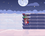
i agree a lot with the other comment, but the aesthetic was so calming and pleasant, and the UI was very traditional but matching the game's look and feel nicely. There is a little bit of visual confusion around depth when placing your troops, especially when side by side. The sound matches the audio well, and the idea itself was unique and enjoyable, with lots of replay value, which makes it very useful that you added an extended version.
Thanks for checking out our game! 😁 Yeah, definitely wished I had found a way to help with the depth. I thought about adjusting the tiles to be a bit more offset horizontally, but didn't end up with the time to reconfigure the way it was currently being done, built myself in to a bit of a corner 😅
- Theme: The aesthetic was there in everything. It felt like being a kid and dreaming about your toys coming to life.
- Fun: The main loop was solid. It needed a little bit more risk/reward to make battles feel consequential. There wasn't enough tension for some of the later battles that took longer.
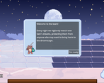
- Controls: Simple and intuitive. The tutorial had some issues where you couldn't select things behind it.
- Graphics: I liked the sprites and the VFX on the attacks. The recolors were cool as well
- Audio: Very effective in both SFX and music
- A11y: Adding some sort of pattern to the red and green health bars would help for color blind players. In addition, maybe an outline around player controlled units to keep track of the units, especially once they cross to the enemy side.
- Originality: This was a cool take on auto battlers, there's potential in this framework to add lots of replay value
Thank you for the very thorough review! Yes, I definitely had plenty more ideas I would have loved to implement, but had to keep reigning it in as always 😅