Play game
Secret of the Crystal Gate's itch.io pageResults
| Criteria | Rank | Score* | Raw Score |
| Writing: Is the adventure original and fun to read? | #37 | 3.960 | 3.960 |
| Overall | #61 | 3.547 | 3.547 |
| Usability: Is the adventure easy to use on the fly? | #72 | 3.240 | 3.240 |
| Fun: Is the adventure fun to play in an OSR playstyle? | #75 | 3.440 | 3.440 |
Ranked from 25 ratings. Score is adjusted from raw score by the median number of ratings per game in the jam.
Leave a comment
Log in with itch.io to leave a comment.


Comments
Love the art, love the adventure! Seems easy to plop down anywhere, and would make for a great session. Thanks for another fun place to fill out the world :)
You're very welcome! More of this nonsense to come (Zinequest 2025).
i really like how the module doesn't just pay lip service to player choice but actually has four paths. two are combat heavy, sure, but the others can lead to magic and treasure and maybe even god-patrons. i was a little confused about how to end those. i think i get that they're open ended, but i think a Indiana Jones boulder chasing you out the closing gate might have been nice to have as an option. still, it makes a pretty good filler episode. all in all, any module with a triangle golem is a module i want to play in.
It's dope when you can tell someone *gets* your work. I think Kismet and I would have built the adventures even further out if we had more page space. We ended up cutting a good bit to make it all fit. OSR modules are great for getting the creative juice flowing, but I find that a lot of them just give the GM a place and a little bit of context. I get the sense that the game devs of those modules thought a lot about the location and what the location is supposed to be, but don't really think about what players will actually try to do at the table. I want my games to feel alive and react to the players, sometimes in ways they wouldn't immediately expect. I really appreciate this review!
As thoughtful and funny as it is colorful and strong in theme! We think there is a whole array of mathmatical theories and opportunities you could present in this world let alone other games! Read this adventure!!
That's very sweet of you to say! I'm actually really bad at math IRL, but that's why we have fantasy lol
I love the artwork and the colourful design. Unfortunately I find it hard to read. I would suggest, that you increase the spacing. You can definitely be proud of yourself!
Thanks for the praise! Gotta jam as much content into those pages as I can lol.
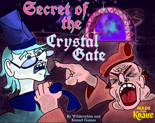
The cover is awesome, in fact all of the art is. I loved the use of colors both in images and in the text, it really suits the adventure's theme.
You might consider making the "Boss Fight" and "The Chase" section headings match the colors you used for them in the Table of Contents and the font/style of the other adventure headings. Clickable links in the Table of Contents would be a nice touch too.
I really like that you presented 4 branching "adventures" - you managed to fit a lot of useful content in just a few pages. It is a lot to keep track of but there's a lot of depth and you provided several interesting ideas.
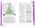
Reducing the page margins and increasing the margins between the columns of texts might improve legibility, there were a few places my eyes just wanted to keep reading from one side straight through to the other (like page 10).
Those are ace suggestions! Thanks for the high praise.
Good points. [Will upload w/fixes when allowed... ]
Panaetion and Locri at it again! This adventure even includes what to do when players go Murder Hobo lol!
Naughty player characters get the GATE GOLEM
Great foundation for an adventure theorem! Love the names!
Glad someone like the philosophic wankery! I love making NPCs for my players to hate.
Once upon a Time I taught math and puns on terms and names were a focus of the curriculum!
I enjoyed reading this, though it might be a little wordy for running on the fly. Though I don't think you should change that. I think this one is a better adventure for giving a GM fun details to remember. The Ink Wraith's special ability made me laugh out loud.
I'm just a wordy little imp I guess. Thanks for the kind wordys!
Love the depth crawl. Reminded me, mechanically, of The Stygian Library (though I've still yet to play it :(:(:( ).
Lots of really cool ideas and characters in here I'll be dropping into my games!
Recently, I've been made aware that I was trying to reinvent the wheel again. After I saw Cave-Girl's works I thought to myself, "ya know that is just a lot easier." Crystal Gate is a mini-vision of the bigger Depth Crawl I'm working on for Zine Quest. Appreciate your kind words, and being compared to such incredible peers!
I really dig the composition of your illustrations on pages 6 and 12. #12 especially—I love a long vertical piece holding a page together.
Cool stuff here—I recognized your name from the Troika! Bestiary Jam :)
Thank you!! The chase is probably my favorite piece from this one. I decided it wasn't long enough twice during development lmao!
Well thought out layout and art direction! I like how personality was injected into the NPCs and encounters with such a short page count.
Thanks!! (It's to distract from the pedestrian game design.) JK jk.
Nice Layout and a very fun premise. NPCs are characterful and have a good amount of humour that is likely to keep players invested! font size is nice and readable and I like the use of colour to distinguish the adventures. I like the mix of mini-adventures included and a depth crawl is a good way to use the space limitations. There is more direction than I'd usually prefer from adventures, but that's just a personal preference thing, overall I enjoy the vibe of this a lot and I'm sure my players will have a fun time with this one!
Appreciate the kind words, friend! When you use OSR materials for your personal groups, do you run them RAW or do you adapt them for your own story lines?
It varies, I would probably be able to slot this one in fairly easily, but If I see some factions or ideas that run parallel to something I already have in the setting I'll typically either adapt it by changing the names to match, or adding things mentioned in the adventure into other background elements. :)
There is a lot here. I really like that boss monster comic.
Thank you! I'm starting to see more comic art show up in TTRPGs which makes me stoked. Feels like such a no brainer to set the vibe.
You should read Lesser Gods from the Game Jam.
Will do BRB
Okay I'm back. You're right, Lesser Gods kicks
Looks great, y'all!
*does a flip*
Reading this adventure made me smile. So much fun to be had!
Appreciate the kind words! I've never been complimented by a lunch item before~