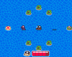
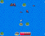
Amazing game! Super clean and polished, I loved all the little mechanics. Great use of the theme and limitation and very well done. The sound design is super nice and really adds welcome feedbacks when playing. My favorite element of the game was the little pirate head next to the life bar. Very good job, this is a very nice jam game!
Play game
Island Hop's itch.io pageResults
| Criteria | Rank | Score* | Raw Score |
| Enjoyment | #2 | 4.244 | 4.244 |
| Overall | #4 | 4.030 | 4.030 |
| Presentation | #10 | 4.073 | 4.073 |
| Concept | #11 | 4.024 | 4.024 |
| Use of the Limitation | #30 | 3.780 | 3.780 |
Ranked from 41 ratings. Score is adjusted from raw score by the median number of ratings per game in the jam.
Team members
SDf
Software used
Godot, Aseprite, Pico-8 (Music), Chiptone
Use of the limitation
The islands are placed on a grid and the ship slides between them and is aligned on the same grid.
Cookies eaten
5
Comments
Enjoyment: This was pretty fun. The best of this game was how amazing the mechanics were introduced, as someone who has made a lot of puzzle games ik its really hard to introduce puzzle mechanics without tutorial text and you did that really well. The only puzzle that seemed a bit scuffed was level 7 where it felt like that was just a random thing that hadn't really been introduced at all so there would be no way of me knowing that I could do that, but other than that is was a pretty smooth experience!
Concept: Its not super original as I've played quite a few ice slide game pretty similar to this game but there are some cool original additional mechanics.
Presentation: The pixel art looks good, I really liked the pirate face next to the health thing ui. I didn't love the water bg but I get that water can be tough to get look good. Finally the sound effects and music were good and fit well with the style.
Use of the Limitation: This one wasn't super clear but it works so…
A pretty solid sliding block type game!! The sprites are FANTASTIC and the variety of hazards + the meter make it pretty challenging and fun! Nice stuff!
You wished for Critic:
the Mechanik to move in one direction by pressing a Direction button is counterintuitiv to the wirlpool where you always go front. how about you turn the ship your self first and then press a button to unleashe the sails -> then the ship goes the direction you ve choosen.
the Wirlpool mechanik would make more sense I guess.
Make the islands bigger- let players imerse in the island feeling a bit more. I know more Work on the artside but would make the islands look more different.
the backgroundshader is WAY TO CONTRAST make the saturation a little lower between the blue tones so the wave effect does not make you dizzy. I was a little suprised at first but got the hang of it, but people could get thrown off by that.
the "refill houses" look like torned down, didn t know what they where doing. How about you make a Barrel of Rum or something to replenish a pirat ship - would be more logical to the theme.
Make the UI in the Top Center so it is Prominent. I wasn t seeing it at the beginning because it felt out of scope. but the readability is very great!
The X at the end was interesting. How about getting a Chest when reaching it? (did i miss it?)
Another Mechanik you could enter would be a Ship shooting at you if you pass by -> pushing you one gridlevel in shooting direction away from your current one.
The Game felt more like a micro Game you find inside another Game, thats because the Game moves very fast with no actual new goal after the first. Try writing some Story into the game. Each level 1 or 2 lines to make the player feel some progress.
I hope that was helpfull and you keep up your GameDevJourney - I liked the Game - felt like icedungeons in Pokemon or Zelda ! Nice Game so far!
Thank you so much! I like a lot of the feedback you gave and it inspired some new ideas in me! About the final level and the lack of the chest, you gave me an idea where when you find the red X in previous levels, it says "Your treasure is on another island," and then on the final level you find the actual treasure!
Really cool game, I would like to play more levels and see new mechanics!
Simple game but very charming and loads of fun! Had a great time with it, fun puzzels, and an amazing presentation! Amazing work here!
Simple concept, but a lot was done with it, and it has a good amount of content, as well as a smooth difficulty curve.
I loved everything about this game! It was super easy to understand, I love the water effect, it's hypnotic. Also nice puzzles. Good job!
I like it a lot. The mechanics are clear and elegant, and the game plays really well. I do not have much in the name of feedback. I just think this was a really good little puzzle game. Great work
Nice game! Reminded me a lot of those old ice-sliding puzzles in the 2D Pokemon games. Great job using the level design to teach the mechanics, I'm always impressed when people can knock out well designed puzzles in such a short amount of time.
Great entry!
Very unique use of the theme and limitation. The water messed with my head a little and could probably have been simplified, but other than that its a very well made game.
Very nice and classic game. I even found a bug, i dont know which level it was but i couldnt move anymore because i spammed the w key after i died and restared.
Very Nice. It was executed well, and I had a lot of fun twisting my head around thoes levels.
Fun puzzles! The sea monsters confused me at first, but over the levels I came to understand them. The sea monsters and I even go out for a grog every now and then lol


Leave a comment
Log in with itch.io to leave a comment.