Play game
Dark Wizard's Pantry's itch.io pageResults
| Criteria | Rank | Score* | Raw Score |
| Playability | #1 | 5.000 | 5.000 |
| Cleverness | #1 | 5.000 | 5.000 |
| Theme | #1 | 5.000 | 5.000 |
| Artistic Style | #1 | 5.000 | 5.000 |
Ranked from 1 rating. Score is adjusted from raw score by the median number of ratings per game in the jam.
Judge feedback
Judge feedback is anonymous.
- Great game, I had fun, love the art style, and I loved using the cat and kitchen sink card. I would love to see this expanded and released on steam, I love deck builders
Did you include your Game Design Document as a Google Drive link?
Yes
Seriously... did you include your Game Design Document?
Yes
Is your game set to Public so we can see it?
Yes
Tell us about your game!
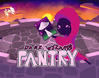
"Dark Wizard's Pantry - It's My First Day at Work and We're Being Invaded by Creatures of Light" is a game about a little shadow fellow who is defending their tower from an army of luminous enemies. Whether throwing some Salt in a Beaker, or Honing a Ferret and kindly firing it from a Blowgun, you'll use and fuse whatever you can as you scrounge through the tower to survive the army's onslaught.
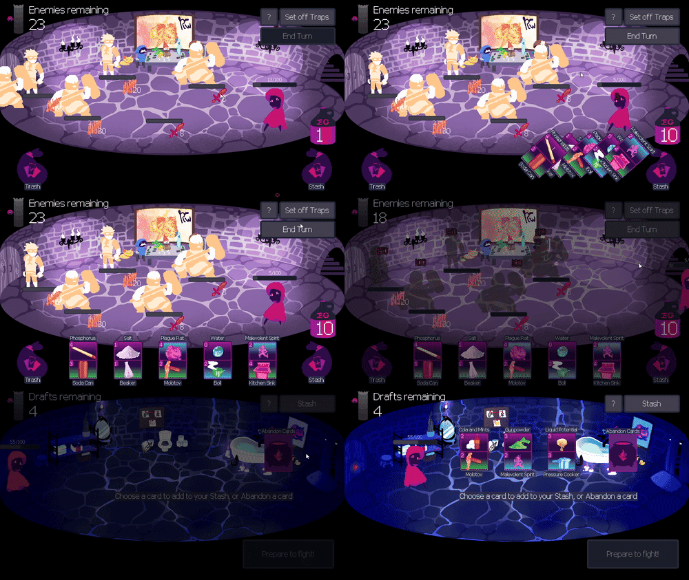
If you fall low on HP, don't panic! You can Set Off Traps that destroy all enemies in the room, giving you a chance to retreat, heal, and draft new component cards into your stash. Though if you retreat too often, you'll find yourself cornered with nowhere left to run.
Enhance Reagents and Deliveries with Methods and combine your components to extinguish opponents! Defeat all 101 enemies to find yourself the conqueror of light with your tower decidedly radiance-free.
- - -
CONTROLS: (Mouse)
• Mouse-over the names of components and icons on enemies to read their effects.
• Drag-and-drop components to swap them with components in the same row.
• Right-click to merge components into cards.
• Drag-and-drop cards up to play them, or onto enemies to target them.
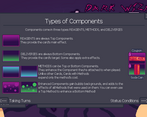
COMPONENT TYPES:
• Reagents (purple) provide a card's main effect.
• Deliveries (green w/ hollow spikes) provide a card's target and secondary effects.
• Methods (blue w/ filled spikes) enhance their paired component with new effects for one turn. Cards with Methods expend only the Method's cost.
GAMEPLAY:
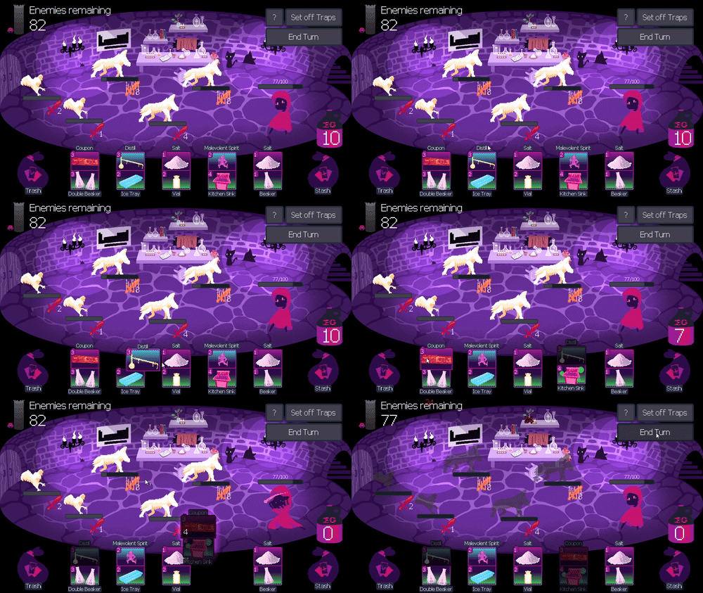
• Pair up Reagents with Deliveries to use cards on foes, or fuse either with Methods first to create crazy combos!
• Components cost Elbow Grease to play. Ration out your EG wisely!
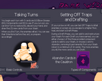
• End Turn to discard and refresh your cards and EG while your enemies take their turns.
• Set off Traps to deal massive damage, heal half your HP, and draft new cards as you retreat further up your tower.
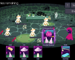
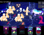
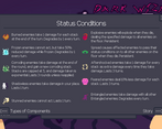
Check the in-game tutorial or the screenshots on the side here for more details on mechanics and effects!
- - -
We'd appreciate as much feedback as you'd like to give. We've collectively spent hundreds of hours working on our baby, and we're very proud of what we've made.
Thanks for playing!
https://drive.google.com/drive/u/0/folders/1pNixtOzRMlF5u6VjHnIVVde1Q1XkbpJx
Here's our GDD Folder!
Extra Notes
Best played in browsers other than Firefox due to font-scaling issues.
I'ma sleep for a week - Eliot Floor
This game was brought to you by homemade ice cream - The Magma Psychic
Plague Rat my beloved - Tremendo Dude
*Currently sleeping* - Rosewood
No one ever expects the crusaders of light - pikameiser
Leave a comment
Log in with itch.io to leave a comment.



Comments
Dynamic cards you can mix on the fly is such a cool idea! And there is so much content, so many cool cards with unique tooltips. Even ferret! Amazing how much you got done in a 2 week jam! Fantastic job!
Thanks for the feedback! I'm honesty quite surprised we managed to fit so much in. Though to be completely honest, at least 80% of the programming side of things happened in the second week. If we worked on it just as hard throughout the entire development period, we could have added even more and/or made it more satisfying to play. I'm very proud of our little game, regardless! The team did a fantastic job!
What a complex game!
Had to read through the tutorial few times to understand what I was doing but it was worth it! (Very smart to put a big '?' as a gameplay UI! Thank you!)
Excelent idea with mixing and matching ingredients, very unique mechanic, loved it!
Goal of the game was clear, enemy icons and intents readable. Very solid game!
Game defenietly needs some more polish:
- Card types - could use some more pronounced shape indicators/icons
- Font - that one was hard to read at times
- Left to right - I know you wanted to separate yourself from your inspiration but man people are used to play games from left to right 😁 (at least I felt weird having player on the right side as it was my enemy)
Good job creating that intricate game system in just 2 weeks!
Agreed on the font (especially when scaling up in Firefox; looks way better in the original size on browsers that actually play in the insert instead of opening new windows), and messing with the shape of components to make the types stand out more is not a bad idea!
The right-to-left was an intentional design choice, representing the player character being almost the “villain” against the light while also allowing the player to seem to “progress” left-to-right up the tower while retreating. Breaking the usual convention was a bit of a concern in development based on how unusual it might feel, but we hoped with the benefits the arrangement brings and with other even recent RPGs out there sharing a right-to-left arrangement (such as Octopath Traveler) that it would be something quick to get used to and enjoyed all the same.
Thanks for the feedback! I’m glad it felt rewarding enough to tough through that initial learning curve and enjoy the game!
I enjoyed this game a lot! Really awesome how many effects there are--it leads to a lot of different strategies. I also liked the trap mechanic a lot! It made me think a lot about whether it was worth tanking more damage or clearing the enemies, plus having to change your deck after can sometimes be pretty good and other times costly. The visuals are very cool and the music is fitting.
Here are some feedback notes if y'all decide to expand on this:
Overall, great job! Spent a lot of time playing this, it's very fun :)
All great points! I’m sad to hear the tooltips didn’t correct themselves when spawned by the edge sometimes, as that’s a problem we worked to solve and struggled to reproduce, but there will always be those “edge” cases, I suppose. :’) Everything else I’ve definitely noticed and fully agree with you. We definitely plan to expand on this game, and look forward to improving on these factors and more after the Jam.
Thanks for playing and for the feedback! I’m glad you enjoyed it!
From a more "technical" standpoint, the tooltip system is kinda wonky on the web exports for the version of Godot we're using. Will be fixed in 4.3! Just like an additional like 6 big things we had to find work-around for...
We definitely have been wanting to make an interactive tutorial, or at the very least a video tutorial. Give the game a look-up in a month or two to see what we come up with!
As for the final boss, and all the enemies for that matter, the balancing was very... Shall we say, instinctively done. And by that I mean thrown together willy-nilly. The boss "cleanses" a few status effects each round which is supposed to balance out the freeze/stun solution, and burn almost directly counters it! Balancing could definitely use some work.
I'm glad you enjoyed it! Do tell people, we're always looking for feedback. On that note, good feedback. Very helpful.
This is cool! I like the mechanic of building your cards together. I was a little confused at first, but that's a skill issue on my part (I always get lost in card games initially).
It's an interesting idea and I think it fits the theme very nicely!
Well done to your team, I'd like to see where this goes if you continue development on it after the Jam!
Appreciate the kind words! We’re definitely looking to continue developing it. The learning curve has been a consistent pain point, so we’re hoping we can make the game feel easier to pick up in future updates!
Thanks for playing!
This is a beautiful game. I like the idea of looking up what each element does and trying to combine it with a delivery method. It's like at the start of a round you don't even know what your cards are going to be, because you have to build them, that's really neat. However, I feel like it was a bit overwhelming to have so many different elements to work with on each hand, I didn't understand why some cards didn't do anything. I think easing the player into the gameplay with fewer options at the beginning would help player like me. Overall, this looks like a game with lots of potential!
I wonder if the cards that didn’t seem to do anything may have had Methods (blue components). The idea is when you use a card with a Method, the Method adds its listed effect to the other component it’s attached to, enabling powerful combos. We’re working on making it clearer that it’s basically merging one piece into the other in the next release.
Thanks for the feedback!
Very nice idea being able to combine different effects from cards and I love the artwork and music!
However, I did not have fun playing the game for two main reasons:
1. All the mechanics being thrown at you in a tutorial book with barely readable text is very overwhelming. Would have been nice to be introduced to one core concept and how to utilise it one level at a time.
2. No sound effects?! I know you've been inspired by slay the spire and I was addicted to that game for a while. The reason it's so satisfying is because of the sound effects which make you FEEL that you've done something , that auditory feedback makes we wanna play more and try crazy combos. When I played your game, I only got that feedback in the form of a small visual effect, there was no sound of the card being used either. Same thing with enemy attacks, I didn't feel any threat because there was no sound when they attacked.
You add those sound effects, add some progressive tutorial into the levels and this game has so much potential!
Thanks for the feedback! We sadly ran out of time before the submission deadline to add those elements, but we’re absolutely prioritizing adding SFX and an interactive tutorial to the game after the jam. For now, though, I went ahead and polished the game’s description to hopefully make the mechanics a little bit easier to grasp.
I hope you’ll consider giving the game another shot in the next release!
Ideally, as this is meant to be a roguelike, we'd implement a saving system so you can get a better tutorial only on your first playthrough. Unfortunately, the nature of the browser game coupled with the limited time made it impossible at the time. Our team has been talking about prettying this game up a bit, so check back in two or three months.
If we turn this game into something on Steam, you can bet your bottom we'll be dumping in all sorts of satisfying sounds, animations, and effects. As is, the team was already swamped with the sheer size of this project. None of us had tacked a game of this scale before, least of all for a jam. We might have been too focused on the mechanics rather than the presentation.
Thanks for your review! Again, check back in a bit to see an updated/bugfixed/polished version.
This is a really clever idea and works really well.
I like the idea and the clever combinations.
Also ferret instant +1