Play game
The Garden of Ora's itch.io pageResults
| Criteria | Rank | Score* | Raw Score |
| Overall | #1 | 3.450 | 3.450 |
| Graphics | #1 | 4.500 | 4.500 |
| Audio | #2 | 3.600 | 3.600 |
| Gameplay | #2 | 3.100 | 3.100 |
| Best use of the theme | #3 | 3.400 | 3.400 |
| Most likely to make an impact | #7 | 2.650 | 2.650 |
Ranked from 20 ratings. Score is adjusted from raw score by the median number of ratings per game in the jam.
Please let us know your team's name
Team 4
Leave a comment
Log in with itch.io to leave a comment.


Comments
It had the best graphics and really great story and aesthetic
Absolutely stunning art. The music is nice, though it didn't start playing for me until after a season or two had passed. Love the intro story and thematic framing of the game. The controls felt a bit clunky to use, but I think it would translate well to a controller or mobile game. Gameplay got a bit frustrating by the end since if I didn't plant properly and didn't notice soon enough I couldn't really do anything except watch my meters go down. I think with some further development this could be a really nice little game, maybe include story about different places that Ora goes to! Great work!
Notes I took during gameplay:
Love the name, instantly intrigued, makes me think of a cool 90s rpg
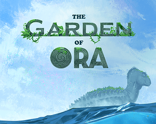
gorgeous splash screen. Amazing font. Sets the scene/theme immediately
nice wave sounds
love the starting story and the sketches framing it, well written and nice layout
lovely UI, fits theme well. Did you guys do this jam last year? the style feels a bit familiar, i'm vaguely remembering another game that felt similar
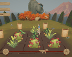
wood and woven textures read well. Stones (ora back plates?) ringing the play area are nice, like the moss. Ora itself looks awesome, nice use of villager cluster at the neck nape to put the assets together in a clean way. background of island in the mist is awesome. ambient details like birds are nice, though the falling leaves make me wonder where they are coming from. The sticks to indicate plots of earth are great.
love the meter at the bottom, the rope is a great touch. Unsure what it means, maybe time between seasons, or ora going somewhere else?
ok what do these different baskets mean? and the meteres in top left?
mouseover icon for interaction is great and reads well. Popup has great styling. I like the details about the plant use. Are these real plants or ones made up for the game? Font could be a bit nicer. Grow icons help explain the bottom meter, at this point I'm guessing it's a timeline for transition between seasons
mouseover showed plant interaction. Right click instead of left is odd, oh it removed them, maybe that's why it wasn't primary click...
can I rotate the camera?
ooh story, guesisng this was triggered by season change? Oh no, looks like it's a sad game over. Poor Ora :(
round 2
oh, the plants have bugs near them now. Or...sparkles? Can't quite tell.
there is an icon over my head, orange circle/brown circles on either side/leaves on top. Dunno what it maens. it's been following me ever since I clicked the basket with the shape that looks kinda like a turnip (top left basket). Oh, clicked a plot and planted something. Ok guess that means I am carrying a seed
ok, got it, planting now! now, does it matter what I plant? Guessing I have to fill the meters on the top left. All planted, do I just wait for the next season?
Oh nice, some plants grew. Oh, it looks like the meters are going down - the hollowed out design made me think they were already empty and needed to be filled. Making the meters raised instead of embedded, or showing them in a different color, may help this read more clearly to players
sun season. Music only kicked in now. I like the gong for season change, a popup might be nice for at the least the first season change to help explain what's happening
oh imma die, i can't grow any more turnips for another season lol. edit: looks like they are growing anyways in sun season. edit2: oh I see, there are two different types of tubers.
movement feels a bit too slow for all the picking I have to do
maple leaf season. Warning about stocking up on fibers and flowers!
can't appear to harvest mauflower. or...it has 3 stages of growth? it finally grew.
i seem to have planted pretty well, so gameplay at this point seems to be just picking plants. WASD feels a bit clunky here, would be nice to just use mouse for all of this (feels like it'd be a good mobile game for easy controls)
can I win? Does gameplay change?
nice, snowy art!
Snow season music feels absolutely perfect for the game. The season before didn't seem to match the theme, I think there was piano?
moving backdrop is gorgeous, but often covered by the popup UI. Missed that there was even much there for quite a few seasons.
didn't grow enough fiber before snow season, so kinda just had to sit and wait for the game to end.
round 3
gonna try more actively replanting this season. Slow movement makes it feel a bit frustrating with how short seasons are.
You can keep ripe plants unharvested and harvest them later during seasons they don't grow. Useful if meter is full to hold, but might trivialize later content. Plants give a lot more resources, so instead of picking when done, I'm standing around waiting until meter has dropped
a bit frustrating to see resources going down, but can't do anything but wait for growth
Such a beautiful game all around. This game has great potential if development were to continue!
Thanks so much! :)
Really really pretty art! Huge congrats on that! Music is calming as well
Some notes:
hey thanks so much for the feedback! Sorry to hear your struggles I didn't quite have time to make sure the game fit different resolutions. There's meant to be a full screen button just below the game? That probably explains why you were confused about the goal as well because there's actually resource meters in the top left you probably couldn't see haha. That's why some of the plants have the same icon, it shows you which resource they recover. :)
oooh I missed the full screen button because of the resolution! sorry I'll review it again cause it's not really your fault (I blame itch xD).
But resources are still confusing to me - I could see the meters but should I just keep everything full and that's the endgame? It could have some indication to a "safe amount" and "not enough left" or something so players can better understand what to do (besides just keep planting and planting)
Basically the challenge is just to keep them from running out for a full year. :)
Yeah, I think we wanted to keep the instructions quite vague and let players figure things out, but we might've put in some more hints if we had the time haha
Thank you for reconsidering your review haha! <3
Nice art and i liked the background audio. The gameplay was a bit clumsy, i think it would be better with a point and click interface so the player isnt trying to move to a basket, hit a button, move to a plot, hit a button, repeat. Itd be a lot smoother if you just clicked the basket, waited for your little dude, then clicked the place to plant (etc)
Thanks!! Yeah we might have tried that if we had some more time. :)
Awesome presentation across the board. Visuals, sound design, story flavour were top notch and the seasonal based gameplay loop while simple was well conceived. It was a little confusing at the beginning due to no tutorial, so quickly failed on my first go but clear labelling and UI meant my subsequent attempt was more successful. Made it through all the seasons and thought it was pretty well balanced. Excellent work team!
Thanks so much!!!
I really love the art, and especially the 2.5D enviroments! The story is also really good.
The graphics and sound are amazing!
really good work. I love the art.
Nice game, loved the story, i kinda wish the plants will still grow ver slowly in the wrong season because they dont grow at all right now, and that makes it easy to lose when youre not paying attention enough
Thanks for the feedback! Yeah I think we did consider going that route. Ended up with not that much time left for tweaking the difficulty but might consider patching this after the jam. Cheers :)
Beautiful art, concept and audio!
Gorgeous game. Love the art style and the music!
Fantastic concept. Is it inspired by the Paikea story?
The artwork is gorgeous and I love Ora. Great work!
Thanks so much! The first concept for Ora was a whale and she is inspired by Māori tradition, but I don't think Paikea was an explicit touchpoint :)