Play game
Loot Retrieval Squad's itch.io pageResults
| Criteria | Rank | Score* | Raw Score |
| Technical Implementation | #50 | 3.714 | 3.714 |
| Overall | #148 | 3.248 | 3.248 |
| Graphics/Animation | #163 | 3.190 | 3.190 |
| Fun/Design | #169 | 3.238 | 3.238 |
| Music/Sound | #180 | 2.857 | 2.857 |
| Theme/Limitation | #181 | 3.238 | 3.238 |
Ranked from 21 ratings. Score is adjusted from raw score by the median number of ratings per game in the jam.
How does your game utilize the limitation and theme?
One of the characters, Pyp, uses a boomerang as her weapon which fits in with the theme as you shoot the boomerang away, and then recall it back to the character. You start each quest at the quest board and go off into the map to do the quest, once you finish the quest you back to the quest board to select another quest, and you once again go back to the same map to complete that quest. Hence going there, to the map to collect loot, and back to the quest board for a new quest. For the collectibles, the main objective of the game is to collect loot scattered around the map in order to complete a quest. You can also collect coins that drop after killing an enemy. The player can choose to ignore the enemies and focus on collecting the loot to complete the quest.
What was your team size?
You and one other jammer
Which of the following content in your game is NOT 100% newly made for the jam?
Affirm you have followed ALL jam rules. (Select all below or your entry will be disqualified.)
If your game includes any of the optional challenges, select them below:
Feature secret items rooms or features in the game
If you did any of the optional challenges, explain how they were used:
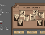
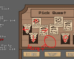
in the quest selection board screen, the quest have a similar layout to NES controler. D pad on the left, buttons A and B on the Bottom right. Put in the konami code and a purple quest will spawn, triggering a special boss fight.
Leave a comment
Log in with itch.io to leave a comment.


Comments
nice game, please check mine and any suggestion are welcome.
So my first thought was that the tutorial for this game was absolutely overwhelming. Every part of me wanted to turn back right then and there. My second thought once I started pressing buttons was that that whole tutorial section could have gone right out the window because I didn't read a word of it and figured out what I was supposed to do fairly quickly. I don't know if I started on one of the more difficult levels but it was a little bit challenging for a first level. It might be nice to have some really easy levels at the beginning while the player gets used to the screen and then unlocks harder quests as the game goes on.
My third thought was that you have a beautiful gem here. I would play the heck out of this game. I'm definitely going to be coming back to this one!
Thanks for playing our game! Just to clarify it was my friend who did all the code and I did most of the art assets (excluding the background/environment)
Yeah the instructions are way too overwhelming and causes more confusion that is solves, and it is very off putting. A tutorial level would've been a much better alternative to the mess that is the instructions, and could also ease the players into the game. The UI could use some tidying, and a minimap might also help as well.
Thank you for such the detailed feedback, we really appreciate the gameplay video, it really shows the rough edges of the game.
I know I sounded a bit critical, but honestly I could play your game for hundreds of hours. I think it’s fantastic. I hope you keep going with it!
It was fun to play, but somewhat confusing. Maybe the instructions could be made a bit easier to follow if there was an interactive tutorial rather than a set of static images with text on them. I imagine that would take some work to make though. At least I could check the help screen in mid-game, which I did a lot. It would also be nice if the menu options had tooltips. I mean, so when I point at the "ability" option I get to see what the currently selected character's ability is, that would have saved me some looking at the help screen (the drawback of tooltips is they would be harder to get working on mobile, but I haven't even checked if the game can run on mobile, but browser games that don't require a keyboard might, especially 2D games... I guess if there's enough space, you could add the attack descriptions and ability descriptions on the buttons themselves, I could see space being an issue on mobile though). And I initially didn't know I could walk between rooms. Maybe that could have been shown somewhere. And yet, I feel like the art was pretty good. A minimap would probably have been helpful with that.
The credits screen was a bit hard to read with the busy background. And the music, although it wasn't the same really short bit over and over, it did feel a bit sameish since there wasn't that much variation. Maybe having a part where the drum stopped and some slower-paced music took over for at least fifteen seconds would have made it more interesting.
Having tried 30ish action games from this jam, some even with time limits, it was nice to try something turn-based too.
Thanks for playing our game! The instructions were definitely way too overwhelming, and a tutorial would certainly help ease the player into the mechanics of the game. The tooltips feature does sound like a good idea and a better way of displaying the tutorial than just the pictures, and to remind the players on certain mechanics. For now the game doesn't work on mobile, so the amount of space wouldn't necessarily be a limitation at the moment. I can see the confusion with the doors as they do look like the walls, and a minimap would've certainly helped with navigation around the map. The credits was a bit messy and the music does get quite repetitive after a while. Thank you for the feedback and glad that you enjoyed our game!
Neat pretty engaging gameplay, regrettably held back a lot by the presentation (not exactly in the 'why doesn't it look 'pretty'' sense, but bad font choice, distorted interface elements, difficult to parse important information, etc).
-My favorite part was the general pacing of combat. Even though I'm not too much a fan of the wide range of values that can come out of basic D&D like combat, when not there for the purpose of drama/story among a group, the movement range/abilities/dash/combat etc actions were fun.
-As mentioned at the start, this really needs an overhaul of the interface and visual presentation. Personally it's not a matter of wanting it to 'look good', just be more presentable. The font is the first thing that needs to be changed. Then the general elements like health etc need to be more readable.
It could be a lot more enjoyable with the content that exists with some more tweaks.
-Also agree a lot with everything HelperWesley said, super nice work for the time you had, but as far as the current experience, it feels lacking polish and revisions that could really it be fun for more than the one quest I stopped after.
Thank you for playing our game!
Yeah I understand that the instructions and general presentation of everything is a bit messy and rough around the edges. I can certainly see how the health bar and a few other aspects being more visible/clear would improve the gameplay. The game really does lack playtesting and polishes, and might be something we'll work on in the future. Thanks for the feedback!
Just want to make a post to clarify how attacking works.
You'll need to select Action and Right click to where to aim the attack first before clicking Attack.
If you don't aim the attack first, the character will aim at his location and attack their feet :P.
Wow was I overflown by the text a bit. Once I got everything it was logical and easyer though. So the learning curve is okay. The music suprised me a bit because it's not the style I've expected. I got lost in the game, took me a while to understand that I can go up to continue. Since I've noticed that first enemies spawned up, than down, I assumed that The enemies will just keep spawning in that rectangular room, but as it turned out, it wasn't the case.
To fix confusion I'd: (B is the most efficent for a gamejam)
A) Make the player able to pan the camera, maybe it could be a an ability.
B) Make the level much smaller sothe player can see everything in the starting area (and the exit upfront).
C) Both.
At the end I didn't know where to progress, so I've just quit. Also at the spawn there was this glowing something, and I tought that after I killed the enemies I have to return there to go to the next level, but it didn't do anything. Players alwas go towards the light, and glowy stuff, so If that would dissapear after spawn that would help avoid confusion.
Also about combat: I didn't understand the boomerand for a long time. If I could change it, you would just be able to throw it instead of using it as a bear trap. The calling back ads more strategy, so that could still be the same.
In conclusion:
The game was super complex (in a good way) for a jam, it had strategy to it, looked nice, and sounded nice too. It had some confusing elements, the level could have guided the player better, and I didn't understand why are you supposed to use a boomerand as a bear trap, but it was a good game after-all. Good Job!
Thank you for trying our game! I agree that the text at the start are scary, but we were low on time and just needed to get some instructions in. We've thought about having smaller levels, but we had kept the single level that the player returns to in order to fit the theme. The goal of the game is to collect enough loot and items and return to the glowing portal, killing enemies are optional for extra gold.
As for the boomerang and attacks, you'll need to select Action and Right click to where to aim the attack first before clicking Attack, we should have made it a lot more clearing with it, sorry for the confusion.
OOOOHHH! Now I get the boomerang. I think selecting attack and after that right-clicking would make a bit more sence, but this is good as well. About the tutorial: I tought that you hadn't had the time, and the fact that you can re-open it later is really helpful.
About the smaller room: I think that only the starting rectangular room could be a bit smaller, or it should have had more enemies in it, because I didn't go to 80% of that room. The other rooms were okay.
The music is nice and I love turn based games! This was fun, the tutorial is very extensive and I found myself going back to it every once in a while to make sure I was doing things right. It would be a quality of life improvement I think if the game could have a leave quest button once the quest is finished because using the portal sometimes felt like I was quitting when Im not supposed to 😁
The overall experience was nice and the abilities and movement system and AI were all fun! good job! 😄
Thanks for playing our game and glad that you enjoyed it!
The tutorial page is quite overwhelming, and leaving the quest could definitely use some improvements, I can see how it feels like you're abandoning the quest when you're really not. Thank you for the feedback!
loved the graphics and mechanics.
Good job!
It would be nice if you check out our game too😄
Glad you liked our game! Will be sure to check out yours too! Thanks!
Very nice game! enjoyed all of the abilities of each character and their attacks. There were some stuff on the UI that even with scrolling I couldn't read it, but overall was pretty well made!
In the Fun and design category for me is 5 it was pretty fun. I definitely believe that if you continue with this project, could do very good! Hope to see more of it.
Glad you enjoyed our game! The UI is a bit wonky and will be something to fix if we do continue with the game. Thanks for the feedback!
A lot of content! very impressive. I love the cute art as well. Really great work overall!
It would mean a lot if you could check out my Jam submission if you get the chance. Thanks!
Thank you for playing our game! As the artist I'm glad you found the art to be cute :3 I'll check out your game for sure!
Oh my.
When you were told "be careful of scope creep", you must have rolled up your sleeves and handed someone your beer. lol.
I applaud you for creating and implementing a fully functional turned based strategy system. That must have been really hard. So I gave you full points for technical implementation.
However.....
-The game art is tiny and hard to see.
-The level art is sometimes obtrusive.(I spent a bunch of time in the first room wandering because I didn't know the door was open to walk through)
-The buttons you do interact with are tiny in comparison to the inventory, which you don't really interact with. You could shrink the inventory and increase the button size.
-You shouldn't have to press move to start moving at the beginning of your turn. That should just be started by default and only when you want to do something other than move should you have to click something, like attack. Making the player click move for each turn is just giving them busy work.
-Enemies within an attack radius should be highlighted, I missed a few attacks until I just started standing on top of enemies to hit them.(Which I'm assuming isn't how you wanted the game to play)
All in all,
Your core mechanic works well, the sound/music was good, and (despite the huge awkward tutorial screen) the game is easy to understand. Your game mostly lacks playtesting and polish. I personally think the scope might have been too big for a jam game.
__________________________________________________________________
P.S.
I do again want to say well done. You made a freaking fully functional turned base rpg in 7 days.
That is awesome.
Thanks for playing our game and even more thanks for the praise! It was my friend who did the programming, and it truly is very impressive!
The characters really do appear tiny on the screen, and the 'doors' do blend in quite a bit of the wall, I can see how it can cause quite a bit of confusion. More playtesting probably would've really been useful as we were both used to staring at the art and didn't notice the sizing issues with the HUD either.
The move aspect was heavily DnD inspired and thought it made sense at the time, however I can see how to can get quite tedious after a while, thanks for pointing it out! The attack automatically misses if you don't select an enemy, however when you do it will attack every enemy in your attack range (the blue circle), it is a bit iffy and would've benefitted with better clarifications.
The instruction page is very lengthy and overwhelming, and it will be something to note for next time. It was a pretty ambitious idea but glad that the gameplay actually worked out in the end.
Thank you for the feedback, glad you enjoyed our game!
This is my favourite so far, really the sort of game I would play, even pay for, if it's more polished, would love to see more, really awesome! :D
a few notes: it was a lot of info, overwhleming but I enjoyed it and took my time learning it and figured it out and glad I did, it's a huge fun game.
there were some problems with the damage not being dealt even tho they were in the damage circle or it wasn't displaying correctly or I missed something.
The dog always attack towards the left, even though the damage indicates it will attack in a circle.
No big problems, I was overwhelmed and enjoyed it very much :D you are the winner for me, atm, love it!
Glad that you enjoyed our game, and thanks for the praise!
Yeah looking back at the instructions there is a lot of info and pretty overwhelming. For the attack, it would automatically miss if you didn't select/aim at any enemies in the attack range. And when you do select an enemy, it would still be able to damage all the enemies that you didn't select but are still in the attack range, it is a bit iffy but should've been more clarified. I only animated the dog's attack facing left, so it does look a bit strange for when he attacks multiple enemies around him at once.
Thanks for the feedback, it means a lot! ^^
A lot of work must have went into this, the quest system, character with abilities, art, music and more is just amazing. In one week you have definitely impressed me, well done this is an awesome entry!
Thanks for playing our game, and we're glad that you enjoyed it! We put a lotta work into it, and its good to know that it has paid off!
Definitely worth it! Give yourselves a break, its is well deserved! :D
Very impressive you managed to implement all this in a week! An enjoyable experience. I would suggest adding an indicator as to the attack range of the characters, I often found my self being just out of range.
It was a busy week for the both of us, but glad that it has paid off! I believe that there was a blue circle to show the attack range of the characters but only when you clicked on the action button, but I can see how that could cause a bit of confusion. Thanks for the feedback!
The game play was engaging and the combat system is interesting. Perhaps the instructions could have less words on one page? For instance, focusing on one aspect by greying out the rest of the area. I don't really play turn based games so it surprised me when there was a good amount of action between the player and enemy.
Thanks for playing our game! Yeah, looking back at it now the instructions are way overloaded with text for each slide, the feedback is much appreciated! Glad you enjoyed the game though!
Right off the bat, I could already tell that this game was going to be fun. I love games that have this kind of management and progression! However, I think that one of the things that you can work on is the HUD and the text. There's a bit of an information overload at the beginning, and the text kind of seems to be stretched horizontally. Other than that, I DEFINITELY see the potential in this-- keep up the good work! If you have the time, I'd appreciate it if you played my game as well!
EDIT: I also forgot to add that I really dig how the gameplay rolls out. It kind of reminds me of JRPG turns!
Glad you liked it and thank you for the feedback! Will definitely checkout your game.
fun and enjoyable , HUD could use some simplification as there are too many things displayed at once ;)
Thanks for the comment! Yeah I see what you mean with the HUD, thanks for the feedback!