Play game
hyper_storm_zero's itch.io pageResults
| Criteria | Rank | Score* | Raw Score |
| Audio | #156 | 3.524 | 3.524 |
| Graphics | #196 | 3.857 | 3.857 |
| Game Design | #469 | 3.143 | 3.143 |
| Fun | #471 | 3.095 | 3.095 |
| Overall | #475 | 3.135 | 3.135 |
| Innovation | #633 | 2.762 | 2.762 |
| Theme | #898 | 2.429 | 2.429 |
Ranked from 21 ratings. Score is adjusted from raw score by the median number of ratings per game in the jam.
How does your game fit the theme?
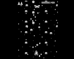
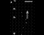
its a shmup with an upgrade segment and a battle segment, the upgrade segment is a calm puzzle thing, the battle being the storm
Did you write all the code and made all the assets from scratch?
i made everything from scratch using godot, fl studio, and aseprite, some assets/code i reused from old projects though
Leave a comment
Log in with itch.io to leave a comment.


Comments
A really nice shmup! The retro art and audio work well with the gameplay. The gameloop is good. Only thing that bothered me was how long it took for the battles to start and end, just too much waiting.
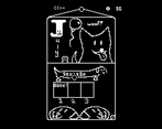
yeah i forgot to change the ending screen taking a good 3-4 seconds longer than it should... but the beginning of the levels needed some sort of "break" imo. i added in the fake load screen cause the immediate transition from the calendar screen to the level was sort of jarring. i need some kind of start level screen that has a cooler more appropriate transition. but i didnt want to take out the funny dog calendar... so its sort of an unnatural pause. thanks for the play/feedback!
Very Cool!
Very Thanks!
AAAH super cool game! Love the 1 bit pixel graphics. And love the upgrade system! Never seen anything like it before! Can't stop playing. Great job!
hey thanks! thats 20 ratings woooo! thanks homie
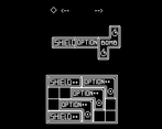
Nice shmup! I almost missed the tetris upgrade system, I thought that was a really good idea. The arcade aesthetic is awesome, but the 1-bit graphics combined with the fast gameplay made it difficult to understand what's going on sometimes. Really good submission, nice work!
yep, i didnt indicate what the tetris grid was at all... shouldve added a little more tutorial text. thanks for the feedback!
I love the aesthetics of the game! congratulations, I enjoyed playing it :)
hey thanks! wish id spend a little more time on the backgrounds/final boss, but i think it was enough to get the point across. thanks for playing!
nice little game! I think I got stuck at one point when one of the last enemies went away before I could kill it and I was stuck in empty space. the art and music are simple but effective, everything seems very cohesive!
oh yeah i forgot about that lol. the first enemy of that type i programmed was supposed to go away after a certain time, and i recycled it to use as the "final enemies" of the next stage but i forgot to remove that lol. im pretty lazy :I thanks for playing!
Hee-ho. Cool classic game. Downloaded .exe version, I have issue with browser version (black screen, Google Chrome)
The graphics and concept are engaging, but there seems to be a consistent issue with the game not running smoothly on the browser. A clearer tutorial for controls and mechanics, especially for first-time players, would enhance the experience.
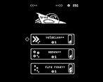
yup, i feel like many of the games in the jam need a tutorial honestly, but i dont think many people had time to make them. takes longer than youd think. thats why i tried to be as descriptive as possible on the itch page, but i thought it would be too wordy to try to explain the block placing mechanic. so i hoped people would figure out from the screenshots... i should've at least linked a video or something. thanks for the feedback!
I couldn't get the game to run, I'm not entirely sure why. The game cover caught my attention, but was a bit disappointed. Even with your debugging below the game I coudn't get it to run on the browser :(
sorry to hear, feel free to try the downloadable versions if you have the time, windows mac and linux are available. thanks for the interest!
After spamming many keys, I found out that 'z' starts the game and finally got to work in some way 🤷♂️, but yeah, it's a bit buggy but I think for other aspects of the game it's quite cool! I might check out the Windows build too.
Edit: gold dog 🐕 ?
sorry bout that, i forgot to add other keys when i exported and i never changed it cause its not technically "gamebreaking" so idk if i can reupload. i did write that z is start below the game but its easy to miss. and yep, lots o' bugs. i was up till the deadline/am not super efficient lol so i didn't have time to throughly playtest. anyways thanks for sticking with it/getting it to work! gold dog bark. its just an excess coin dump lol, makes ship bark
I played the game in my web browser, here are a few things I noticed:
Things I liked:
- The consistent monochrome graphics and (seemingly) consistent pixel size & sprites
- The module system was cool, having to fit modules in your ship
- Music and sound effects were perfect for this kind of game
- gold_dog
Things I didn't understand:
- I didn't see the upgrade pages at first
- gold_dog
Things to improve:
- Readability in menus
- Endless mode (because it was so fun)
This was fun, I liked the art especially the art in the menus. The game was difficult before I realized that there were more than one upgrade page, then It got alot better and more fun. I really think that a modern shmup with the inventory / upgrade tetris is super cool. I hope you expand on this concept in the future and make a game with high scores and an endless mode!
If you have time to review my game, I would appreciate it!
thanks for the feedback! i was worried about the ui design of those menus too, but i didnt want them to be to handholdy, and im not too experienced with ui and "puzzley" stuff, so i wasnt sure how to make it super intuitive without being overly descriptive. glad i got to try something new though, think i learned a bit from it. also i almost considered doing an endless thing, but since i placed all of the enemies manually through export variables i didnt have a good random generation thing made, and i felt like id rather just have another decent level/make new enemies/polish abilities before adding endless. and i didnt wanna throw together something sloppy so i was like nah
the gold dog was just a money dump for if you had too many coins/maxxed out upgrades. didnt really mean anything lol. meant to add a little extra thing at the end it it was on your save file but i forgot :P if it was in the game, it probably would have looked something like this:
A very fun game, I really liked the art. The only downside is that it lacks a bit of game juice.
erm. game juice? not sure what you mean by that but ill drink as much gamer juice as i can next time i can get some lol. thanks for the play/comment!
Took me a while to find the 'start' button, but fun game!
yup, i wrote "start" as a placeholder when i was first putting the game together, but i forgot to actually map all of the main buttons to it so you could just press whatever lol. press start just looks cooler than "press any key", you know? thanks for the feedback/play!
Wow! Amazing job!
I loved the vibe this game had, the sounds and visuals where so nicely done, and there were even some humoristic visuals which I appreciated. The gameplay was very entertaining and I could see myself playing this game on my freetime!
Very well done using what you had to the full potential and creating a polished game! :D
hey thanks! yours was pretty awesome too!
You successfully improved Space Invaders:)) I absolutely loved the game! Maybe if you could rotate the Tetris pieces, it would add more depth to upgrading skills, as you'd have to figure out the most effective way to place them. Also, slightly increasing the speed at the start of the game and reducing the speed boost from upgrades might work better. I really enjoyed it! The last level took me a few tries, but I had a blast finishing it.
yep, the grid wasnt as well done as i wanted it to be... i havent done much "puzzley" stuff so i had trouble setting it up. by the time it was working i didnt want to mess with it and wanted to move on to other stuff. definitely would want to make it more substantial in a full scale project. i kind of hated the movement speed too in a way, but there are only so many speeds the player can go at a fixed framerate and "real" pixel graphics without the thing jittering and stuttering. as a bonus i felt like it forced the player to focus more on strategizing and shooting accurately providing a bit of variance in play. and if they didnt like it the upgrade was cheap so i was like meh whatever. gradius 3 does the same thing where it starts you out unbearable slow but the first easiest thing to upgrade is speed, so its sort of like a blatantly correct choice mechanic. also the final speed upgrade was over the top lol. i forgot that you couldnt undo that and just choose to not upgrade it. maybe i should take a hint from your game and add a "sell" mechanic lol. thanks for the feedback/play!
Quick and fun. I had a hard time navigating the ui at first. The upgrade tetris is neat. I upgraded from 0 to max speed in 1 go and ended up crashing immediately.
lol that was inspired by my gradius 3 playthrough, old awesome snes shmup but the max speed upgrade is way too fast. its nearly unplayable lol. also where the options came from, although im sure plenty of shmups have a similar thing. thanks for playing!
the game only showed when I entered full screen
A fun game
The ship without the speed upgrade is extreme slow, the second upgrade I got 😂, first one has the money
yeah, the way i did movement only allowed for a couple different movement speeds since certain speeds will cause the ship/enemies to appear "jittery" since its "true" pixel graphics. i also wanted to lean into it since the slow movement sort of forces the player to strategize with upgrades, or play more strategically in game. its also sort of a gimme, part of the reason i started the player with 10 coins was for them to come to the realization that the ship was too slow and that they should buy the speed upgrade on the next run. sorry about the graphical issues, i dont know how to fix html, i just used godot default settings lol. thanks for the play/feedback!
Fun game to play! A classic game with an interesting UI. I have nothing to say about gameplay, It works perfectly fine but pre game menu was hard to understand.
yep i was worried about that lol. i wasnt sure how to explain the menus, i shouldve had more tutorial text in the beginning, also i dont think i ever explained the grid/store menu super well lol. thanks for playing!
I just remembered. In my browser(Chrome, full-size, my monitor is 1920x1080) I also couldn't see the game, there was only a black screen. However, when I resized the chrome with the CTRL+mouse wheel, the game was visible. Also, full screen works fine but I had to read the description to find the fullscreen button.
thanks, maybe ill put up a splash screen before the title with controls or something next time. it was in the how to play menu, but itd probably be good to throw the basic stuff up by default. seems like html always has little problems like this lol, literally no idea how to fix them though. thanks for the feedback!
This is very fun game! I really like the audio and how good the sprites look despite being two-colored. Also, was my golden dog statue just a bark (i feel scammed now XD)?
Despite all good, there is some not so good. First thing that happend to me: I have purchased bomb with hard-earned coins. I have mastermindfully installed this one block and ventured into space, and then ... I immiedatly pressed Z and my bomb went off. It's because in station I use Z move around but in space I use X to shoot, so I wanted to shoot, but I was used to press Z. And this even happend multiple times to me! I would suggest some button swapping.
Also, when I first played the game, for some reason I thought that the top left arrow leads to menu, but maybe I am just dumb and unable to find the shop.
Lastly some (maybe) bugs:
Except for this minor things, this game is really good and I enjoyed playing it. Thanks for making it!
oh dang i didnt think about the x/z swap thing lol. hm i guess i would switch the ui confirm to x in that case? i wanted to use as few buttons as possible.
thanks for letting me know about those bugs/the detailed feedback! also the dog statue was pretty pointless i just wanted a way to spend the extra coins lol. i shouldve at least added a little dog statue like sprite on the vending machine or something lol. thanks for playing!
Web export must be broken. It looks cool and I want to play :(
thanks for letting me know, theres also a windows version if youd like, ill export the linux/mac too. although im not sure that theyll work since i dont have anything to test them on lol. thanks for the view!
Not sure if its just on my end, but when i can't get past the first screen :( when i press buttons on the press start screen nothing happens
hm, im not sure, it works for me. Z should be the key for that screen. i probably should have written press z to start lol mb. also make sure you click in, not to be captain obvious but just in case lol. thanks for letting me know by the way, theres also a windows version if that doesn't work