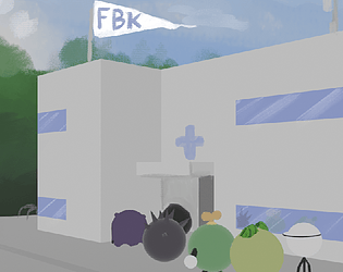
I really liked the style, nice game!
What threw me off in my first attempt is no explanation of what or how to play the game.
With the explanation in your description I understood and could cleanse some corruption.
A simple text field above the corruption, like "click to assign Takos" would have really helped the game.
Otherwise, as a fellow Tako, nice work and cute Takos
WAH!
ZeraDoesStuff
Creator of
Recent community posts
Don't worry about it.
Like I said I had planned the project much smaller to begin with, so I'm quite happy with how it turned out in the end.
Also I worked on the project for a few month now and I wanna try other things, other genres.
Start with cleaner code and a better plan, not constantly change and redo stuff.
So no worries I had already planned to start a new project after being done polishing the visuals.
And also best of luck to you and your future projects.
Hello, thanks for playing my little game and sorry my reply is so late.
I'm aware of those shortcomings, though to my defense the game was originally planed much smaller in scope since it is the first game I ever published.
But while making it I added one feature after another and now it's kind of a mess with a few problems as you pointed out.
So to answer your last point, I myself don't know where to go with it so I will make it look a little nicer and then move on to a new project.
Thanks for your comment!
I'm quite ashamed I forgot to normalize the movement vector and then didn't even notice it...
In the Level select screen it is written for each level how many points you need to win. But yeah I could also add that somewhere in level as well as to the end screen.
Some form of tutorial is planned as in a few pictures at the start screen.
As for serving the wrong product I want the player to be able to serve the wrong one and loose a point. Though I'm also currently developing more visual feedback and gamefeel, including the customers making an angry face and sound or something when served the wrong product.


