Play game
Super Neon Platformer - Ultrastorm's itch.io pageResults
| Criteria | Rank | Score* | Raw Score |
| Theme | #26 | 3.967 | 3.967 |
| Fun | #33 | 3.700 | 3.700 |
| Visuals | #42 | 3.933 | 3.933 |
Ranked from 30 ratings. Score is adjusted from raw score by the median number of ratings per game in the jam.
Leave a comment
Log in with itch.io to leave a comment.



Comments
Great platformer! Really creative use of platformer mechanics.
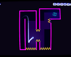
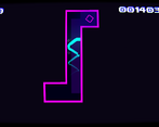
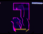
I also like the visuals a lot, epecially the title screen is quite unique. And neat background music, too.
Definitely a great entry!
This is a really cool platformer. The feedback effects are very cool and feel great. I really enjoy all the polish you added to the game. Nice job!
I’ve always loved platformers, and this one was really well made! The visual effects for movement and death were fantastic, and the movement felt really satisfying - the fall speed might have been a tad too fast, and getting stuck to walls when I didn’t mean to was a little annoying, but those are minor complaints overall. I also did just play the jam version and got that error when I beat the last level (at least I assume it’s the last level).
This is a REALLY good example of a simple concept that was executed really well - if you wouldn’t mind, I’d love to know how you made the visuals and effects look so appealing, since I just started using Gamemaker a couple of months ago and that’s something I’m really struggling with. I tried to use shaders for my own submission, but I had to get rid of them because they weren’t working properly and I couldn’t figure out how to make my own nice effects.
Anyways, really good submission! Downloading the extended version now, would love to play a full-size project built off of this
It's all shaders and I'd like to say a somewhat decent art direction. I'm no pixel artist so I won't try to do that but I know basic color theory so I trust in my ability to judge what's looking appealing at least in that regard. But mostly just shaders. Oh, and maybe you didn't realize but my shaders are also not working properly - I just worked on them until the mistakes are less noticeable XD. Seriously shaders are tricky at first don't let that keep you from learning them. Xor has some of the best game maker shader introduction tutorials out there https://xorshaders.weebly.com/ . He's just great! And I also liked this video series a lot
Oh and just look at other people's code. If I recall correctly there should be some free shaders on the gm marketplace to download! Hope that helps!I love the neon aesthetics, they look great! Just some minor feedback: the screen tilting as you move, while subtle, is quite annoying. I also wish you used Space as an alternative jump because it took me a while to get used to using Up. Other than that, it's a well polished game. Good job! :)
Yeah, I was in a state of total horror when I realized that I forgot to return the controls to their usual state XD In the extended version that should already have been fixed :D
Well, in its genre it must be first class -aside from my attitude that I don't play games solely relying on finger-eye coordination. About 5 levels even I could conquer, so perhaps a difficulty setting could be handy. The trail left behind, the screenshake cool and overall very appealing. :)
(this wall jumping-mechanic & its love belongs to the new generation - I guess)
Very nice ! First impression was really great with the cool vfx and sfx and getting the hang of the possible moves I can make for the first few "tutorial" levels was easy to grasps (like how far/high I can jump, the wall stick/slide) I was determined to complete as many levels as possible! But the level with the many yellow spikes on a walls, floors and ceilings were too hard :( I died like 20 times and still can't get past that level cuz i could never get the perfect jump arc and timing of the double jump together and just die instantly.
Apart from that, I like it, great job! :)
Thanks for your feedback! You already got to the last level! : D I made it like a test of all the abilities of the levels before combined but I wanted the player to succeed! So this feedback is super valuable to me!
Very nice! The movement felt solid, like a floatier Super Meat Boy, which fit since you're controlling a point of light instead of a hunk of meat. I dug the music!
I don't usually play platformers but this one is an exception. That lil cube can hang on a wall, giving me some time to think about what to do next. Movements are smooth and nice to play. Great work :3
Nice game! Great visuals, and great sound. The game fit the theme very well, and was challenging. I did have a fatal crash right as I beat a level.![]()
yeah, I realized it but didn't have any time left for another build XD
the extended versions are already fixed!
Neat game, the visuals were cool, especially with the filters and effects. I found the double jump to be a little inconsistent to use, and I wasn't really sure when I could use it. The music was good, and enhanced the experience, and the level design was pretty good.
Thanks, that feedback is super useful to me! The rule is that you always get back the double jump as soon as you touch a solid surface, but the truth is I completely overlooked that fact; it never does gets "explained" in any level!
Ah, that makes sense. Thanks for explaining
Good job, great level design and great visuals despite having an error in one of the levels
Thanks so much! The level design was super important to me!
Incredible juice! I just wish there was more to it! It was a very solid platformer and I had a TON of fun playing it! Amazing!!
Sidenote, I did get this error:
Thank you so much! Yeah, that's what happens when you submit 30 seconds before the deadline: it's, unfortunately, the official end of my jam entry XD
luckily its fix basically took 13 seconds and is already patched in the other versions ; )
I got this exact error. Tried to paste an image, but it didn't work. This crash happened right as I exited a level.
This is great!!! I love the movement. It's simplistic, but really fun to play. I got stuck in the room with the narrow spike passage to jump through. I almost made it a few time, I was so close!! The effects are really cool too, like the death effect and the screen shake. Fantastic game!!!
I'm scared by this game. It shows just how far a simple but well executed concept can go.
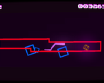
In terms of visuals, the menu screen and effects were honestly breathtaking, but I feel like you could've done something more with the gameplay art. Maybe more particles or decorations in the background? Maybe a light, stereotypical synthwave background?
In terms of theme, I mean it's in the name and I guess it could be considered neon but for me at least, if it doesn't have a bloom shader, it's not really neon. But I gave it 4 stars anyway.
Not much else to say. Wish there were more levels, mechanics, main menu, saving and loading, and a death sound effect. It feels SO out of place without one.
Yeah, I pushed myself pretty hard. I've done a lot of platformers in the past just for fun for myself and thought that I should be pretty fast with it and had the idea to make a "simple" one but then add this whole layer of interconnected levels, different exits in the levels and routes on the overworld map; pretty much inspired by speedrunners glitching through level barriers and ending up somewhere else entirely but about 2/3rds into the jam I had to realize that this was waaaaay too ambitious and I had to scrap everything in that regard to at least have something actually playable at the end of it. That's why the level select screen is so overdone and the levels are so sparse and there are only so few of them XD Hindsight something something XD
pretty nice visual style, nice mechanics it feel like supermeat boy and thats a really good thing, great job!
Thanks! Yeah, I also think Super Meatboy feels pretty great! Even though it didn't already have all the conveniences of life I tried to implement like celeste and other games later introduced as far as I know. Like coyote time, input buffering, and all that jazz. Which makes it even more impressive I think XD
Played the extended version. Nice, fun platformer!
The only thing that seemed superfluous to me was the camera turns when the character was moving, for some reason I did not like it, although not very noticeable.
The new versions show that you can't wait to continue the project. Good luck in development =)
Yeah, it seems like that feature is very devisive! I didn't expect that at all and how wrong I have been XD
but to be totally honest someone else already mentioned it and after actually looking at it I realized that it's even bugged and should have moved differently. That's how much attention I had paid to it XD In hindsight I should have simply left it out.
But in the future I will try to experiment with a 3D camera lagging a little bit behind the character. I could imagine that working much better in the games favor. This was just my cheap attempt to replicate the feedback without the work of implemnting it all but clearly it didn't work out ^^'
I had a fun time playing and thought the effects were great (especially the tilt and the death effect) but it was unfortunate to have the error in there with obj_level_exit. Great job otherwise :)
Fun to play, the style and presentation where fantastic, whish there was more to the game, maybe less screen shake during the platforming over all very nice, hope to see more. https://www.twitch.tv/videos/1064516191 @04:41:36
Thank you so much!
Do you mean the screenshake upon death or the tilt during movement? I wonder if I had more time at my hands I would have liked to work with a 3D camera that was always lagging behind a bit and maybe that would have worked better... I dont know.
Thanks so much for your feedback!
the tilt during movement. :)
Love the cool retro monitor look and the NEON theme is brilliant.
If my monitor had shaked this much I had brought him to a repair shop ;-)
Don't like monitor shaking at all, makes me dizzy.
That's unfortunate! Was it the screenshake upon death or the slight tilting of the screen in whichever way you move in any given level?
I remembered how as a kid I would lean into whatever direction I'd move in a virtual space with my full body and wanted to replicate that feeling somehow but I'm not sure whever that implementation here was successful...
Thanks so much for your feedback!
This "slight tilting" makes me feel uncomfortable like, "The monitor is defect, beter stop playing."
Btw. why is it bending, nailed from the top left ? I don't see a retro - technical or game related meaning for the bending !?
Hard screenshakes, like in the death event, makes me dizzy.
Would be nice if all these could be optional. ;-)
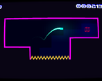
Oh and i think the glowing trail is a bit to massive, for me it could be a bit more "alpha".
On tight jumps I lost view of the position caused by the trail glow.
Had some chrashes on hitting the exit cube. But I don't now under wihich conditions.. It is the SuperPlatformer not the Post-Jam Version.
Need to test this one also :-)
On the "SuperNeonPlatformer_PostJam" is the bug fixed and i played to the end :-)
Have you done the music also by yourself ?
It's really great retro sound. Perfect fit for the theme 8-)
Hi, this great feedback is super valuable to me! Thanks so much! The monitor tilting seems to be bugged; it should be from the center and the idea was to give a bit more feedback when you're running and coming to a sudden stop like jumping into walls. I'm not sure whether it was successful; some people liked it, some people didn't.
Of course, making it optional would have been ideal but I didn't have the time. It's definitely a feature that needs a lot of reworking
And hell no, the music is not by me. I can program and do a little bit of art - even though very slowly, but I'm as far removed from being a talented musician as can be. The songs are by the patron saint of all people on the internet who need royalty-free music: Kevin McLeod https://incompetech.com/music/royalty-free/music.html His website is a treasure trove of soundtracks of all kinds. Super useful for game jams and stuff. Would highly recommend to bookmark it : D
The tilting from the middle would made maybe sense ;-)
Thank you for the link to the free music assets. Is now in my litle bookmark list.
Btw. you need to look for the "free" kind of license !
There are some with "By Attribution 4.0", so when you use the music, you need to notice somewhere who made it or a link or so...
The older CC 2.0 license is more strict. Some laywer made a living by suing everyone who did the notice incorrect... it is a so bad world 😉
thanks for the heads up! The post jam versions include a small rolling credits screen so that should cover me - I hope ^^'
Really cool! It was a little jarring to have the last level end with the fated, last room error screen, but it was really cool. Some room decoration would have been cool to see as well.
Thank you! I just took literally 30 minutes this morning and fixed all issues in a post jam version! Now its a short but complete and well rounded package :D
In a few days I'll probably also add the missing levels so maybe come back in a week and check it out? ; )