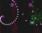
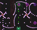
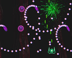
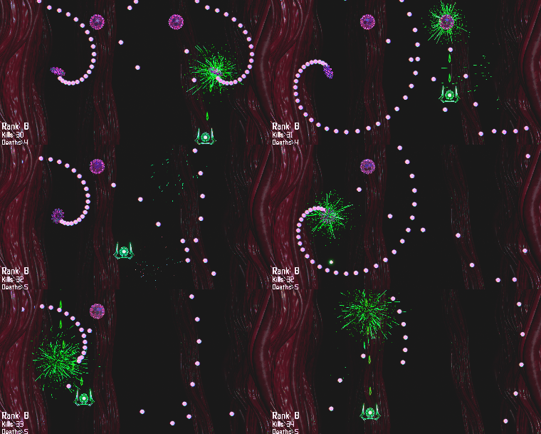
Cool game, I found the side walls hard to tell apart from the BG, also felt the ship could be a little bit smaller. Overall pretty fun! Hard patterns to navigate!
Play game
CellShocked's itch.io pageResults
| Criteria | Rank | Score* | Raw Score |
| Fun | #122 | 3.415 | 3.415 |
| Presentation (graphics, audio) | #150 | 3.634 | 3.634 |
| Theme | #195 | 3.268 | 3.268 |
| Originality | #318 | 2.732 | 2.732 |
Ranked from 41 ratings. Score is adjusted from raw score by the median number of ratings per game in the jam.
How does your game represent Mode?
You switch between a big mode and a small mode in the game. In small mode, you are able to move slower to dodge projectiles, but you lose the ability to shoot. In big mode you are harder to hit but can kill enemies with your bullets.
Comments
This was amazing to play , vfx are really cool and colors too. You can add some movement to the ship maybe it can lean right and left a little. Overall its a great game!
The end screen with its "CONGRATULATIONS, YOU GOT D" cracked me up a little for some reason, I think the pacing of it turned out unintentionally perfect haha
Speaking as a player who played a lot of bullet hell shmups (and bullet hell not-shmups) and a dev who worked/is working on 4 bullet hell games - unfortunately, as far as the gameplay of CellShocked goes, there are many things that could be done better.
Starting with the huge hitboxes for the ship and bullets - for a bullet hell, this is definitely not the right way. It takes away player's options, making micrododging and risky plays impossible, and also heavily restricts the game designer by forcing them to use simpler (read: boring-er) bullet patterns with fewer bullets and more spacing. Bullet hell fans won't hesitate to burn you at the stake for using big and weird hitboxes - a lesson I learned the hard way with my own first game.
Player movement - overall, controlling the ship didn't feel very responsive, especially due to the lower framerate, and there seemed to be some inertia to its movement. Bullet hells with ship inertia exist but it's really not received all that well either. I'm not sure if CellShocked ship inertia is by design or if there is a bug/issue that causes it, either way I don't think it adds any value and only makes controls harder for no reason. Ship slowdown with spacebar (focus) - felt too slow for me, but it could also be due to having to mind the inertia and the huge hitboxes. Maybe try setting focus speed to 1/2 or 1/3 of the ship speed and see if it feels better?
Enemies - player firepower was fairly low, especially for having a narrow, focused attack, and most enemies felt too tanky. As a result, +due to not so much pattern variation, dealing with waves felt repetitive. Enemy bullets felt on the slow side but it's a matter of personal taste, and kinda necessary with the hitboxes. Again, if the hitboxes weren't so huge there'd be a lot more room for more bullets, bullet pattern variety, and also variable bullet speeds (I really want to emphasize the overgrown hitboxes as much as possible).
Lastly, there was no fps counter so not sure what the framerate was, but on a 1920x1080, 144hz monitor playing a bullet hell with less than 60 fps feels pretty jarring. The 600+ mb size download also didn't feel quite right, perhaps some assets could be optimized and compressed to reach a smaller size (improving performance in the process).
Excuse the wall of text, I only hope the feedback will be of use. Bullet hells are my favorite genre so I'm always happy to see players and devs try their hand at it. Congrats on finishing the jam!
Thanks for the feedback, I definitely tweaked the timing on the final screen to be a little comedic :D
There is a lot to improve in the bullets for sure, I have not figured out yet how to do compensation for the velocity so the movement adds velocity to the bullets that are spawned (You could also take advantage of this to increase the firing rate of your ship by moving upwards strategically). I may need to re-write the bullet spawner entirely to be more flexible and more optimized. For the jam I threw it together within a week and had to move on to the other aspects of the game. I noticed in Rotschwert the enemies will start shooting after they sit still, and that was something I explored but the way I coded the spawner didn’t enable it to work in its current form.
The hitbox is definitely huge in the large mode, and could have been telegraphed a little better perhaps with a different colour on the central flower which is the true hitbox. And when in small mode, it is just the sphere.
I think the inertia you are feeling might stem from the framerate or lag issues, as I did not code in any inertia to the movement (unless you are extremely highly attuned from your schmup playing experience!). Did you try out the graphics settings in the options and see if the lowest setting might help out? Graphical fidelity and improving performance in all types of hardware is still an ongoing learning for me in using Unreal Engine 5. For sure this type of game is not something I want people to need a beast of a PC to run. The file size is also something I have to work on, I think I can get it down to half the size by re-packaging it without the additional unused assets.
I’m glad for the feedback. I find it hard to get to know people who are open to giving very detailed feedback and to teach others, such as yourself. Would love to connect with you on Discord to talk more!
I just tried playing with "Bad" graphics and it definitely felt a lot better, with a framerate which I'm still not sure about but which definitely reached 60 fps or higher! The inertia was also gone.
I didn't play to completion but noticed a couple things I didn't notice before:
- The left and right screen borders are not sized the same, the left one takes more space while the right one takes less
- When trying to move diagonally into the bottom screen border, the ship slides. Maybe it's part of the reason I thought there's inertia
- When going into focus/small mode, you can no longer move diagonally
As for the last bit - there is still a lot left to learn so I don't think I'd make a good teacher, but I'm open to share thoughts and stuff ^^ Handle is @wingedfoxdev, I'm on the bigmode server but didn't message much yet, maybe we can chat there!
A really cool presentation with good use of green, purple, and red to make a complementary triangle of colors. The mechanic of becoming small to make a bullet hell both easier and raising the hypothetical skill ceiling is a novel idea that I'm sure could make some really devious challenges for any future stages you'd want to make with the concept, and I'm also surprised that I've never seen a biology-themed bullet hell before. Not that I've played many lmao. But this was a very competent one and it felt doable as an arcade challenge that isn't too grindy. :]
Wow I was very impressed with this game. I've never played a bullet hell with a small-mode before and it made it so much more playable for me. I did way more runs in a row of this than I expected to (around 7 in a row), it was very addicting. The progression of difficulty is very well crafted and I like all the enemy designs and the player designs. The color palette is also very smart and appealing (nailed the purple vs green color contrast).
It was crazy how much of a wrench those first enemies can throw in your plans during later levels if you don't take them out, so that was another fun contrast. On my first playthrough I was thinking "hmm I wonder if there be powerups" but by my second playthrough I realized it's a perfectly balanced, tightly crafted test of skill exactly as-is.
I always felt like I could do much better on my next playthrough but I usually ended up with a D or E anyway, but it was always my own fault. Since we have the tiny-dodge mode every death feels earned, due to me being too greedy/impatient. Extremely impressive balance and game design!
And the way that it looks like fireworks when you're shooting enemies never gets old, great eye candy!
Thank you so much! I really appreciated reading that! Our concept artist nailed it with the color scheme, so glad you liked it. I tried to keep it simple and just showcase the bullet patterns, which is something I enjoy staring at. No need to fuss about running to collect power-ups and just focus on getting better at dodging and playing with the lean mechanics :D
It's cool how you decided to slow player down so player can better control their dodges rather than just give a dodge/shield ability! Difficulty def shot up with the entire screen littered with bullets. Good bullet hell game overall!
I thought I was good at the game until the cross shape bullet flowers showed up lol. Fun bullet hell, I thought the way you used sound to communicate enemy hp to the player was really interesting and unique. Music and SFX were good, as were the visuals. The gameplay felt good and smooth. Good job!
Visually very pleasing bullet hell game. The hit particles and explosions were especially nice to look at. I also like that the enemies had certain rhythm with each other so the dodging was not too chaotic. Well done!
I was worried about losing as it got harder, but was happy to see it was very jam friendly and let me keep playing. I fell from an A to an E rank, and had a blast along the way!
I managed to get a B! The infinite lives/quick respawn with temporary invincibility makes for a very pleasant experience. I’ve never played any of the OG bullet hell games, the most experience I have is Isaac and Gungeon. The swapping between shooting and being small is very satisfying, and it reminds me of the airplane segments in Cuphead. Others have already mentioned the issue with enemies being in the bottom half of the screen, and it looks like you mentioned having moving enemies which would be awesome to see. You’ve got very clean, easy to read visuals (I feel like I’ve played too many games with heavy filters!). Great work.
i’m definitely not a bullet hell expert by any means. this game was still super fun as a beginner, though! it was pretty forgiving of any mistakes i made, and the rank system is a great way to make it so anyone is able to play, while still keeping a high skill ceiling. (not biased ^^”) i did only get D rank, but i can see a lot of room for improvement on my end. i also really liked the stylistic choices in the game, the glow effects on the models were super cool, and the music slapped! great job!
I'm actually surprised the settings gave me graphic adjustment! This game is actually pretty nice!
Oh boi can't believe I found a game where I am thrown into Touhou here. But much more forgiving, thank GOD for no life system.
I'd personally probably love the movement in small mode to be slightly faster, since it's still quite hard to dodge in that speed haha. But it's still a very solid finished game! The enemies pattern are nice and I'm enjoying the sound effects!
A shmup in the Jam! Awesome, I've been developing a rogue-like shmup for one year now and really loved the bullet patterns you used here, presentation and the different modes are very crisp, great idea and great job!
I'm terrible at bullet hells but thanks to small mode and unlimited lives, i managed to beat the game. Great visuals and music/SFX. Felt like something like this would be a very good trainer/tutorial for the bullet hell genre in general. Nicely done!
i must've died a million times lol. the presentation is amazing, it looks and sounds gorgeous. i love the different types of bullet patterns and how they work with each other making for interesting ways to balance dodging and shooting. loved it!
Always liked shmups but I've always been bad at them. Small mode is a great addition to make it a bit easier for people like me to get through, combined with the slower pacing. Still got a D rank.
Great execution, I'm glad you made it ranked instead of limited lives so people who suck (like me) can still see everything
Nice work! Fun take on a bullet hell. I think some of the later enemies having large health pools didn't really add much to the gameplay other than drawing out a bit, however. All in all though it plays well and is a well-executed experience. Well done!
Fun shmup style game with some cool visuals. Controls feel tight and intuitive as well. Good work!


Leave a comment
Log in with itch.io to leave a comment.