Play game
Conventional Rush's itch.io pageResults
| Criteria | Rank | Score* | Raw Score |
| Audio | #169 | 3.500 | 3.500 |
| Innovation | #178 | 3.455 | 3.455 |
| Overall | #452 | 3.167 | 3.167 |
| Theme | #520 | 3.045 | 3.045 |
| Graphics | #570 | 3.182 | 3.182 |
| Game Design | #573 | 3.000 | 3.000 |
| Fun | #669 | 2.818 | 2.818 |
Ranked from 22 ratings. Score is adjusted from raw score by the median number of ratings per game in the jam.
How does your game fit the theme?
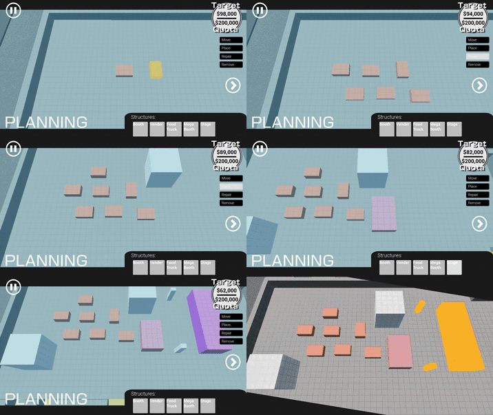
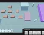
The goal of Conventional Rush is to set up a convention center with booths before hundreds of attendees show up.
Did you write all the code and made all the assets from scratch?
All code and music was written by us from scratch. We used paid assets for sound effects.
Leave a comment
Log in with itch.io to leave a comment.



Comments
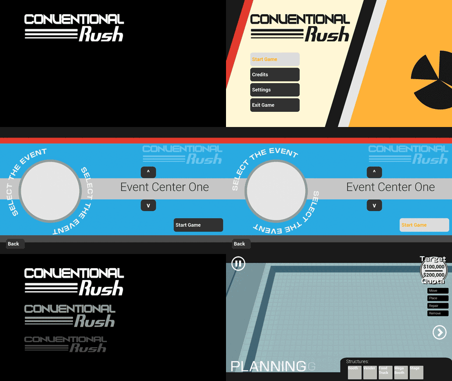
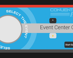
It's a very cool take on the theme. It is a shame that it feels so unfinished, and that the UI is the most polished part of the game. With that said, the UI was very, very good, and the in-game sort of worked even with just boxes and capsules. Impressive in its own way
This was insanely impressive. The UI alone is killer, but im also impressed with how polished it all feels for the time frame. If this became a full thing I'd totally play it a bunch, well done!
This is a fun game. The UI and sounds are really satisfying and polished. I just feel like some mechanics weren't finished like I couldn't select any of the cards and the game never told me when I got enough money.
Really interesting take! The gameplay was also pretty simple and stright forward. Would suggest some indicator as to how much each booths cost tnough
Enjoyed my time playing this! Looking forward to your next game!
This game has some phenomenal UI! I loved the music and the minimalistic graphics look pretty nice too.
Very cool and unique concept! I had a lot of fun building up my convention center. I got to a point pretty quickly where I could just keep rolling days without changing anything and rack up money, however and I wasn't quite sure what the cards were for, it seemed like I couldn't click them. The UI style is one point. I would recommend not putting text that the player needs to read, like the text on the cards, on a slant because they were a little awkward to read but apart from that its clear a lot of work was put into it. Great work!
Very cool interpretation of the theme. Loved the UI and the minimalist art/asset style. Really enjoyed the management gameplay but couldn't really tell if the cards were doing anything. Great work overall. Congrats and good luck!!
Mind-Blowing UI!
Great music, cool and smart usage of simple materials!!
Constructive criticism:
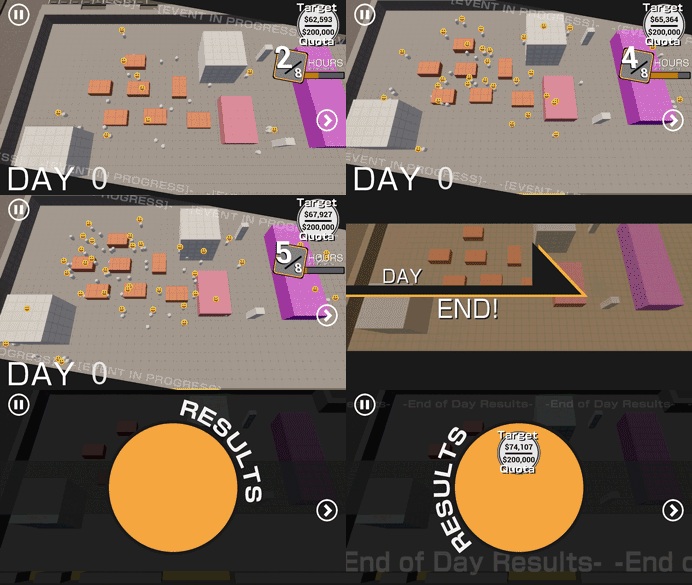
- I didn't quite understand the mechanics, I just set up a bunch of stands and then Run the Event. Then People would show up and money would increase. But I couldn't understand what's the measurement for winning or loosing.
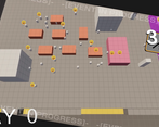
- Although the squares and colors has a nice vibe to it, and taking in account the limited time of the jam it was a good idea to use them. Still, I would have liked to see actual food trucks etc.
- The Menu where we need to select a Card (between levels) didn't seem to work.
- After starting an event, pressing the (>) "Play" button would skip the event to the next day but without calculating any incomes. So I guess it functions more like a "Cancel event" button, but it would make much more sense to make it a skip to the end button instead of watching all the smiley faces pile up every time.
Overall really cool use of Unreal Engine, a very unique Game and theme interpretation.
Good job!!
omg the music. it had me playing for a while there. Awesome game loop and cool mechanics as well
Music and sound design are spectacular. They set up the vibe perfectly! With the UI design and the simple buildings and people, the style feels candid! It could be developed further with shaders and some light texture (enough so it's not flat, not so much to lose the simple style).
I immediately felt the lack of in-game instructions. It took me a bit to figure out what was happening in-game and what was the goal, but once I did, I fell in love with the idea. Would love to see it developed with some sort of small story! It was immediately clear it was a building/tycoon game, though.
I jumped in blind, and the lack of instructions also made me not figure out you could move the camera or rotate objects ^^'
I didn't feel like the cards/events did anything. Also didn't see any friction to keep the money up; I could just keep placing stuff and watch as people came and smiled. That's not to mean this wasn't fun, though. It was really pacifying.
Last thing I felt lacking was no grid system to snap and attach objects to maximize space. However, it could also be taken in the opposite direction and let any orientation of objects, allowing full customization of your convention.
Game was pretty chill. I didn't know the arrow on the right started the convention. I thought I had to keep placing more booths down... lol. Was ok after the first run through.
Super relaxing experience with the kinda lofi music, and the UI looks great, very smooth animations and great colors! Great work :)
I liked the game, and how chill it is when you are planning out your convention! I also really liked the polish you guys added to the game :)!
I would have loved to have some sort of indicator on what each building did, because I cant quite tell if I gained the money I did because of the amount of buildings I placed, or which types they were. I would also have liked to see some explanation on what being happy and sad does for a costumer.
But I really liked this, and I'd love to see it more fleshed out in the future :D!
Despite simple graphics it does feel polished with a good UI, nice music and a satisfying gameplay loop. I like the premise, fits well into the theme. Although could have some more things for the player to do whilst the event is taking place. Also I got to $43M and nothing happened, is the game supposed to end at some point? Anyway, good job!
Thank you for your feedback! We had less time than we anticipated to work on the game this week, so it is very unfinished and we didn't get to things we wanted to. I tried to make sure thing a feature had a base level of polish before moving on to the next one, so I'm glad that shined through!
Loved the music!