Play game
The Grayscale Defender's itch.io pageResults
| Criteria | Rank | Score* | Raw Score |
| Story | #84 | 3.483 | 3.483 |
| Music | #107 | 3.655 | 3.655 |
| Aesthetics | #141 | 3.966 | 3.966 |
| Sound | #195 | 3.276 | 3.276 |
| Theme | #225 | 3.690 | 3.690 |
| Overall | #371 | 3.207 | 3.207 |
| Mechanics | #457 | 2.793 | 2.793 |
| Fun | #458 | 2.931 | 2.931 |
Ranked from 29 ratings. Score is adjusted from raw score by the median number of ratings per game in the jam.
How many people worked on this game in total?
3
Did you use any existing assets? If so, list them below.
No
Leave a comment
Log in with itch.io to leave a comment.


Comments
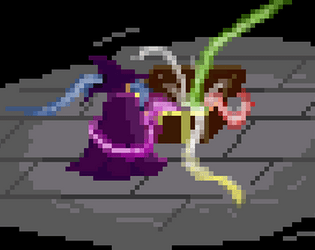
My colors!
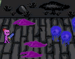
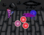
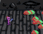
i loved the art for this! the concept of a grayscale background but color blob enemies is super cool! like other people in the comments said, i had some issues hitting enemies without getting hit myself. either way, good job on the game!
I also struggled quite a bit to hit anything without also getting hit simultaneously, so I kept dying pretty quickly, but aside from that this is a really great and fun game, good job! I love the art.
The animation of the introduction was so nice in fact that i didn't even notice that the game had already started xD
May i suggest adding a phrase or something at the end of the introduction's animation that the player has to click in order to start?
As for the combat system, i like it, but if you can make it i have a suggestion that would make it feel way more smooth: have the mouse position vs the player be detected when you click, and use that for the attack's direction. This would allow you to move back, but still attack to the right without having to move forward a bit while doing to. There is a bit of personal preference in this last suggestion, but I've found games that do this to be easier to aim and control the character.
Nice game! Cool concept and very nice storytelling, smooth design overall :D
I really loved the design of the different enemies I thought they were really creative. Actually just overall the art was really awesome. Also really great how you included a cut scene I thought that was a really nice touch!
I really liked the art style and the enemy variety. The cutscene at the beginning is a nice touch for the immersion. Good job!
Fun game! The opening cut scene was incredible I loved the art style and the way you positioned the camera. It reminded me of cutscenes in some of the PC games I used to play as a young 'un and it's amazing how well-done pixel art can immerse you just as much as photorealistic graphics (if not more so for me) when executed and you have succeeded in my opinion.
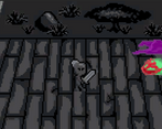
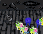
I also liked the visual and thematic idea of the grayscale character that absorbs the enemies chroma as you are hit that was a neat idea!
Excellent work!
Really great game! Loved your pixelated witch -- weather you picked it or made it, it was a great choice for this game. Your cut scene was amazing too for a first timer game -- i have no idea yet how to make a great one so I applaud that highly! Thanks for also playing my game again. <3
Nice! Really tough to hit without getting hit yourself, but fun and great aesthetics.
Nice game, the cutscene at the start really sets the scene and story for the game. The mechanics are simple but fun. I do agree with what someone said about maybe increasing the attack range a tad but apart from that it's enjoyable. I like the fact you slowly gain colour as you get attacked too. Nice touch!
Nice game and congrats on completing, I played your game on my youtube if you want to check it out here you can
Thank you for including my game in your video!
No problem, I think its a solid start if you continue with it. The game loop works great.
I played your game, it has a fun idea, I liked it!
I liked the cutscene at first the most!
Cool idea with the visuals indeed, its a bit hard for me, maybe adding some knockback when you hit enemies or increase the attack range could help. I really liked the sfx, especially the blobs death.
Seconded on a knockback. That would greatly improve gameplay.
Great job on this one!! I loved the opening cutscene, and the game was very fun! Keep making games :)
Thanks! That's my plan.
Good stuff
The hitboxes took a little to get used to but I liked everything else, especially the visuals and concept!
Great job on the cutscene! I also liked the mechanic of changing color to indicate damage. I lasted up until the rolling rainbow balls together with medusas, and then it seemed to difficult for me.
I really like the art style, and the opening is super epic! I wasn't able to live very long, hahaha. Tried a couple times but I'm not good at it. Really pretty though!
I liked the cutscene, also interesting art style, as far as gameplay, I'm not good at the game so i couldn't get far into it, nice work!
Very cool visual design choice making Greyscale vs Color!