Play game
Control: Override (Jam + Postjam version)'s itch.io pageResults
| Criteria | Rank | Score* | Raw Score |
| Fun | #134 | 3.936 | 3.936 |
| Originality | #209 | 4.064 | 4.064 |
| Overall | #239 | 3.851 | 3.851 |
| Presentation | #1331 | 3.362 | 3.362 |
Ranked from 47 ratings. Score is adjusted from raw score by the median number of ratings per game in the jam.
How does your game fit the theme?
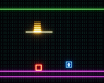
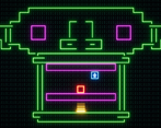
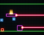
You are a computer virus out of control. You can only "hold" one "Control". Thus you are constantly out of control(s). And the effects of the controls... can be out of control.
Did your team create the art for this game during the 48 hour time slot?
Yes
We created all art during the game jam
Did your team create the audio for this game during the 48 hour time slot?
No
We used pre-existing audio
Leave a comment
Log in with itch.io to leave a comment.


Comments
great submission, the concept is very innovative, really nice and fun game
Haha, This was pretty fun! :)
Really nice puzzle mechanics
I found the mechanics pretty interesting, and the game was fun to play. I like how you can bring the goal to you instead of going yourself to it.
I think I found a bug though, as on the last level I managed to squish myself againt the ceiling while having the "right" control, go right, collect "left" control and boom. So, I think you could tweak platform behavior to avoid such things when they are not desired.
Also, moving background messed with my perception, I'd prefer a static one.
Nonetheless, nicely done!
Yeah, that's an unintended bug. I found it myself after the submission period was over. But thanks for reporting it anyways.
I toned down the brightness of the scrolling background image to make it less distracting. But if you say so, I'll consider reworking/removing it in a post jam version.
Thanks for playing.
Really fun puzzle game with a very unique mechanic and really cleverly designed levels! I think that the visuals could do with a bit more polish but the gameplay was amazing. You taught the player new mechanics through your level design and the puzzles were always really satisfying to complete. Overall I thoroughly enjoyed playing the game, great job!
Thank you. I'll be working on a post jam version once I calm down from the excitement of the jam.
It was pretty fun! Well executed game :) The puzzles mechanic was engaging. I thoroughly enjoyed myself, and I wish the game was longer!
This is a really enjoyable puzzle mechanic. I also like the theme and way you implemented it. Nice job
Thanks. Your game was neat too.
Very fun game! I wasn't expecting this and I really enjoyed it!
Really neat puzzle mechanics.
The idea of injecting inputs into other elements of the game is quite interesting and original.
Thanks for sharing.
Music was very loud. Otherwise, very cool game! Love the concept and would love to see it expanded even further!
Thanks. I really should have had a settings menu for the volume but I just didn't behave the time. I'll see if I can do a postjam version.
Saw your post on r/gamedev - fun mechanic and interesting puzzles, really well done! Was pretty addicting :)
Really interesting. I definitely thought the mechanic where you can 'inject' controls into a platform led to some smart puzzle designs.
Sweet puzzle and the beat kept me pushing .... even sometimes in the literal sense ;-)
Level design was a bit rough, but great concept and well executed overall
Great idea, and the puzzles are well thought out.
Awesome game! Really clever puzzles with easy to undestand main mechanic. Good aesthetic, I love that you went for CMYK pallete, simple yet great. My favourite level is the one with out of bounds arrow, great idea to "taunt" the player and make him think outside of the box (while writing this, I thought to myself it is literally outside of the box :D maybe the level should be named that way if you decide to name the levels). The last level on the other hand, while still great had pretty simple solution but felt like you have to use first try to see what's going on and fail to know what to do next, or maybe that's just how I played.
Really there is nothing bad I could say about the game in it's state considering it's a jam game.
I personally really like your design, although this game is the only sample. Looking forward to play more from you, maybe in the next jam :)
And like I said in comments of my game, I really love to see different takes on simmilar ideas!
Very interesting simple mechanic with some fun little brainteasers! Personally, I think with a bit more aesthetic polish, and some minor tweaks to the puzzles this could easily be a fully fledged game. Great work! :)
Thanks. I'll see if I can get some level ideas for a post jam version.
Really fun game, love the whole aesthetic, great work!
Very nice concept :D
Really solid concept! It's simple but leads to very interesting puzzles. Only thing I'd say is a lot of words get fired at you at once. Maybe instead of writing an explanation on what clicking does you could just say "click and hold" on this (with an arrow or something) Then the player can see what happens
Yeah. In game text is really obnoxious. Loads of jam games have tutorial popups that are annoying. I tried to limit the amount of text I throw at the player and let the level design do the teaching. Levels last the 3rd one are devoid of text. l I do agree that that the starting level has a bit too much text and it could be fixed.