Play game
How to Upcycle your Monster's itch.io pageResults
| Criteria | Rank | Score* | Raw Score |
| Presentation | #64 | 4.478 | 4.478 |
| Overall | #432 | 3.754 | 3.754 |
| Originality | #656 | 3.739 | 3.739 |
| Fun | #1566 | 3.043 | 3.043 |
Ranked from 23 ratings. Score is adjusted from raw score by the median number of ratings per game in the jam.
How does your game fit the theme?
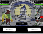
You play as both a scientist and their monster to fight other monsters. After defeating monsters you can take their parts and join it to your monster.
Did your team create the vast majority of the art during the 48 hours?
Yes
We created the vast majority of the art during the game jam
Did your team create the vast majority of the music during the 48 hours?
Yes
We created the vast majority of the music during the game jam
Leave a comment
Log in with itch.io to leave a comment.


Comments
The art and presentation is fantastic, and I really love every design! However, the gameplay needs some polish since there's basically no strategy, the enemy buff indicators seem to be a little glitchy, and there needs to be a better hit indicator, since I was never really sure what was happening.
Other than those issues, however, the game is great, and it'd make a great starting point to build up to a full RPG game!
Wow I love the art! Really great work! Unique interpretation of the theme and I love how you built from the concept! Really wonderful!
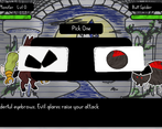
The art is really good! The main concept is cool as well, and I liked how the pickups you get affect how you look. The strategy felt lacking though, as I just attacked and won, and also wasn't clear on what the enemies were doing or what the icons meant above their heads. And some of the pickups you get didn't seem to have meaningful differences, like a couple times both would say "increase defense" but worded differently. Overall, I think the idea and style is great, would definitely visit the game's page on Steam or something looking at screenshots! But definitely needs some variety and challenge (which of course is hard to do in 48 hours :/). Also, super minor, but would maybe be cool if the background had some depth/layers to it, the art looks great regardless though :).
The art style is really sweet, as is the general concept. I felt a little bit underwhelmed by the gameplay, though that might've been because it felt a little bit too easy. It could do with some beefier sound effects or additional visual feedback during combat to help sell that the player or enemy has been hit. I do think the concept has a lot of potential, maybe a roguelite game where you gather these parts to create different monsters with different abilities throughout a run.
When playing this on stream I had a hard time expressing what I thought about this game. It does have a very pleasing aesthetic and the turn based combat was a unique choice for a jam. What felt off was the pacing and the balance of the game. I was able to buff attack and then just attack every turn with little worry of losing. And for pacing the text boxes and animations felt a little too fast. I think the monster designs and concept was fantastic but there was just some elements that made the experience fall short compared to the beautiful visuals you provided. There was also issues with the body parts that were offered at the end of the battles didn't match up with what the monster being fought had.
I still feel like this is a very solid experience, I just felt a little empty by the gameplay experience versus what my eyes were seeing. I hope that makes sense. I think this game has a lot of potential to be polished up and become a mash up of Frankenstein and pokemon. lol If you want to see me try to express my thoughts in video format, you can find it here:
One of the programmers here! I do see where you are coming from with the disconnect between visuals and gameplay and I totally agree. We were trying some new programming ideas and they did not turn out quite right, which sucked up a lot of time. Thank you for your feedback, we will make sure to keep it in mind should the project continue!
either way the game was still fun. And a turn based combat game in 48 hours is really impressive.
Very nicely done! Feels well made. I love that you get to keep something from the enemies you defeat.
I love the art style! It feels very polished. Great job!
I really like the art style of the game, and the gameplay feels very polished, my only criticism is that it isn't very balanced, I spammed buff attack and attacked the entire time, and didn't get attacked once
One of the programmers here! Yea, balancing was pushed until the very end due to many, many, many bugs. Lesson learned though, next time balancing will happen sooner! Thank you for your feedback!
I *love* this aesthetic! Had some minor issues with the monster parts displaying the wrong tooltip text and so I didn't really know what I was picking? but I loved this. More! Please!
I love it when games have some sort of permanent buff, especially when you can choose it. The art is fantastic, I think it is perfect for this game. Really enjoyed it :)
I like this one and hope it gets some attention
Good art, soungs and idea i really liked! Good work!
Unreal art style
The art style is amazing! I really like this one. The only thing I discovered is that clicking the exit button in the browser version is not necessary, because it will freeze the game :)
Really nice, loved the idea! Cute style!
i really enjoyed the art and concept!!
Loved the sound design