Play game
Built to Whale's itch.io pageResults
| Criteria | Rank | Score* | Raw Score |
| Style | #1411 | 3.689 | 3.689 |
| Overall | #2003 | 3.326 | 3.326 |
| Creativity | #2395 | 3.311 | 3.311 |
| Enjoyment | #2628 | 2.978 | 2.978 |
Ranked from 45 ratings. Score is adjusted from raw score by the median number of ratings per game in the jam.
How does your game fit the theme?
In the game you play as a giant whale
Development Time
96 hours
Leave a comment
Log in with itch.io to leave a comment.


Comments
I love how absurd this is! Great job!
a truly unique concept <3
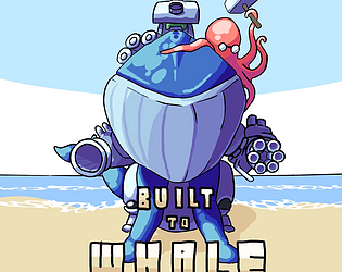
This whale mech is probably my favorite piece of art from jam so far. Truly beautiful / Awesome. Fun gameplay and well executed game. Great work!
I really enjoyed this! As soon as I saw the cover I knew that I needed to play it.
I've been craving a game like this ever since Shellrazer came out a decade ago on mobile. The mechanic of attaching absurd amounts of weaponry to a massive animal has been an itch in the back of my head for years, so I'm glad someone finally took another shot at it. The game feels very good, even in its unfinished state. The alternate right click gatling gun did feel a bit weird to use, possibly because I wasn't used to the way it charged. Maybe a more detailed bar / tutorial on charging times for weapons would be nice in a future build.
I'll keep my eye out for this game if it releases one day. I'd love to see a final product with tons of polish and weaponry!
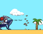
Love the pixel art and the design of the whale!
I love the art of the game, although I can't see how we can relate the game to the theme "built to scale" I had a lot of fun shooting the humans in the game though hahaa
Short and simple, with a very nice bit of art. I had in my hubris lost my fear of whales, but in this game it has once again been reignited in the form of a whale mecha-thing. Good job.
I am here for the battle whale! That art is sick.
Great little game, wish there was a bit more too it or some sound/music. But fun little game, keep it up!
Art budget must have been crazy
Seriously love the style. It would have been cool for the "Build" section to have been unlockable, or use the coins gained to get new weapons and such instead of having everything accessible at start
Great submission!
yess i was planning on doing that but ran out of time
The art is awesome! I love the whale and the art alone kept me hooked! I would love to have encountered a challenging enemy, or used my resources to overcome a challenge. But for 4 days, I'd say this is a solid start!
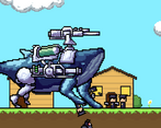
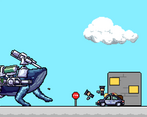
The giant whale with arms(!?) and cyber legs shooting people and buildings is such a cool and wild design! It really sold me on this game. I think you already know the places to work on when/if you update it but getting more weapons and an upgrade system would be nice. Some music to fit the tone is a must, and good sound effects for shooting the guns and hitting the enemies.
Honestly you don't need to add much to this game, the whale design is just that compelling and a real selling point for this game.
Bwhahaha, yes! This was funny, I liked the idea, and the art was really cool. The game left some to be desired regarding functionality, features, juice, and polish, but it's understandable in four days. Overall, good job, I enjoyed it!
Nice silly idea. :D Some sound-effects and music would have made it even better.
the whale with the guns is so cool! was fun to play
cool landwhale invasion game!
Nice and simple, but well done! The art looks great and while short, its fun to watch the whale rampage throughout!
The whale sprite is wonderfully illustrated. A shame that its detail and style does not match the rest of the world, however, this is hardly a drawback of the game.
I find issue with the use of symbols in the "build" menu. Consider that signifiers should either: immitate what they are meant to signify, have a relationship with the subject being signified that is determined through sociocultural consensus, or have a sort of causal connection to the subject being signified.
Applying this knowledge, one might see how the "Octopus" symbol is easy to understand for most readers. However, they might notice that the second row of two symbols is difficult to decipher without additional information (for example, language/text). Consider making sure that readers and players can access the game and it's newly created information equally and easily. Of course, a player can use trial and error to observe changes to the game from selecting different symbols, though I wouldn't consider that more efficient and accessible than naming original symbols first and foremost.
I really dig this cyborg whale thing. Super rad sprite. I'd love to see more done with that!
aha love the theming for this, and pretty fun to play!! Slowly introducing the controls felt really nice. Great job :D
thank you!! :D