Play game
Oliver the Dice Master's itch.io pageResults
| Criteria | Rank | Score* | Raw Score |
| Presentation | #882 | 3.729 | 3.729 |
| Overall | #1226 | 3.344 | 3.344 |
| Creativity | #1554 | 3.301 | 3.301 |
| Enjoyment | #1642 | 3.000 | 3.000 |
Ranked from 229 ratings. Score is adjusted from raw score by the median number of ratings per game in the jam.
How does your game fit the theme?
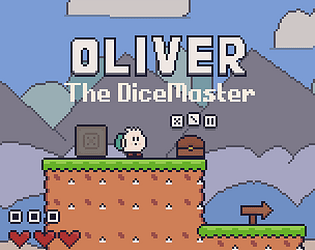
You roll dice to decide damage done to enemies.
Did your team create the vast majority of the art during the 48 hours?
Yes
We created the vast majority of the art during the game jam
Did your team create the vast majority of the music during the 48 hours?
No
We used pre-existing audio
Leave a comment
Log in with itch.io to leave a comment.


Comments
Wow, this is incredible that you could make this game in scratch. I realy enjoyed it.
Thanks so much for playing!
An absolute gem :) . The graphics are great, nice and simple. The gameplay isn't confusing or convoluted. I do have a small problem with having to manually equip different die in the middle of a fight, but I won't let that minor inconvenience overshadow the rest of this wonderful game!
Thanks for playing and giving feedback! I am planning to add an auto-equip dice feature after the voting period, though.
That was a cool little game! I'm also impressed that you made this with Scratch 😮 The art is cute and the music was very fitting, so very well done!
My feedback would be to watch out for the small collision issues with the pushable blocks, I got stuck for a little while trying to push one from a bridge to a grass tile... And I don't really get why we have to roll a dice before using it!
Still, really cool entry, well done again!
Haha... The collision issues only came up in the last ~2 hrs of the jam, so I didn't have time to fix them. The menu system (rolling, equipping, etc.) is going to be updated (hopefully improved) after the voting period, though. Thanks again for playing!
Oh no Z/X controls, my only weakness! In Hungary the standard is the QWERTZ keyboard where the Z and Y keys are flipped, which makes it very uncomfortable to use them. :D
Other than this very cute little game, the graphics are lovely and the sounds accompanying them as well. First I had a bit of trouble figuring out how to play exactly, but after I did, it became quite enjoyable. Good job! :)
Thanks so much! In the final build of the game, I'm planning to add Input Remapping, so that might help!
What a cute little game! I really like the art and the music is a good fit. There were some collision bugs and I think the controls are a bit awkward. But it's great for a jam gam.
Thanks for playing!
A cute platformer with very nice presentation. There were some problems with the collision and the menus were a bit clunky but otherwise enjoyable platformer. It would have been nice to see some more interaction with the dice rolls other than hoping for the best. Still impressive work putting all this together in such a short time. Nice job!
Thanks for playing. After the voting period ends, I'm planning on adding auto-equip dice and auto-close inventory/chest options that will be preselected by default. Again, thanks for the feedback!
Thanks so much!
There's a lot more to this game than what was expected, very interesting mechanics. Really enjoyed the visuals as well!
Thanks for playing!
Games with integrated tutorial are very much appreciated! I like the base mechanics, I think with more polish (better platforming collisions and a little less character speed) you could build a great game with what you have. Very well done!
Thank you so much for playing!
Great job making a fun, polished game in Scratch! All of the art was nice, and the platforming was fun and felt fair. The only part that I feel can be improved is the dice rolling and equipping. If you could make that a little faster, it would make this game even better.
Good job!
Thanks for playing. After the voting period ends, I'm planning on adding auto-equip dice and auto-close inventory/chest options that will be preselected by default. Again, thanks for the feedback!
Credit to you for a really complete feeling game, tutorial, enemy types and ui all there! The attack mechanic is fun and rolling the dice to beat a certain enemy is a good idea. Great use of the theme
Others have mentioned it could be more fast paced by menu, but I think it could be really cool to have enemies that home in on you so that you have to run and re-roll to try and be able to beat them. Might not work with your dice points mechanic
Great job!
Thanks for playing! That's an interesting concept, I think I'll consider adding that to the final game build.
honestly the most impressive part for me about this game is that (i think) it was created in Scratch! i've been an active user of it before and have been able to create short little platformers, though none that had scrolling or full-size bitmap sprites (i used this one technique where a color palette was iterated over and tiles were painted)... considering the engine limitations, i'd say the game is done well, despite its minor issues with collisions and such.
i haven't understood the point of the "throw out" mechanic, as it never seems to do anything for me. i've just been rolling a die, equipping it, and then walking up to an enemy and shooting. from the other comments, "throw out" seems to be the same as shooting, which seems pretty cumbersome compared to just pressing "X". that, and having to sort through a menu just to roll die also felt a bit tiring.
despite that, i do think that the game has its own charms, and it could even be improved further (still using Scratch or any other program) to become a neat little platformer!
Thanks for playing! Throw out just deletes an item from your inventory. The "throw out" mechanic is completely useless in this version. The original concept would have used it, however. The Scratch Project for this game has 4000 blocks, by the way...
Very pretty game!
Unfortunately, I felt that the UX and level design was left a bit behind the gorgeous graphics...
There were too many menus to navigate just to get a dice and equip it. The levels were easy and not much inventive, the biggest difficulty being the menus navigation..
I felt that, when I was finally getting the grasp on how to play the game more fluidly, the game ended :( maybe one or two more levels would be enough to the player feel that they master the controls and can put them to action ;)
Congrats on the submission, specially for your art :)
Thanks so much for playing! I am planning on adding many more levels in the final game, I just ran out of time.
I really wanted to like this game, but it felt like a lot of button pressing just to get something to work. The only difficulty was figuring out what buttons did what. But I love, LOVE the art. I wish a could draw pixel art like you. And I loved the platforming a lot. Good luck on your game!
Thanks for playing!
Very glitchy but fine.
Thanks so much for playing!
Great pixel art and music fits very well! But it's hard to say this for controls, gameplay and UX.
1) The character has a movement curve and I don't think this approach fits side-scroller games which has platformer elements. It has an acceleration when you press any move key and a release time when you release it. This makes movement harder to control.
2) The block we use to climb higher can move without intention. Assigning an extra key to be able to move it can ease this problem if not completely solve it. Also, slowing down the push can help to put the block to the place player has intended.
3) Rerolling a dice in inventory uses a "right to reroll" but that right is actually unlimited as I've experienced. Let's assume that was made intentionally: if there were only 3 rights, it could've made the last level (or any other level depending on high-digit dices) unbeatable since it's totally by chance to roll a dice higher than any value.
4) I didn't understand why there is a "throw out" and "leave it" buttons in chests and why should I use them.
5) Using the same key for opening a chest and opening the inventory pushes the player to change position unwillingly.
6) It could be a better approach to close the chest automatically if there is no dice left in it.
Thanks for playing and giving valuable feedback! I already have plans to implement many of the solutions to items on your list. Here's my response to a few of them:
2) I'll definitely consider improving this. I will probably by slowing down the push speed.
4) You're righy. In this version of the game, the "throw out" button is completely useless. My original concept involved 3 extra levels, some of which required managing dice in inventory using these buttons.
5) That's a good point. I'll try to find some way of getting around that.
6) That's definitely a problem. I'll add that to my task list for things to fix in the final game.
Again, thanks so much for playing. Your feedback will help to improve the game! :)
Nice! I'm glad if I helped.
I tried to study these controls and finally, I found the itch page maybe has some bugs. Downloading the website could play this game smoothly.
I don't know your other enemies' designs, but I think it is great to add box numbers and design a big monster! We can hit the monster and find new boxes and hit and find again! (It makes me feel excited!)
Thanks for playing! I'm planning to add more levels and take some of your ideas into consideration :)
♥
Controls were a bit hard to control for me, but I really loved Oliver and the pixel art! Keep it up!
Thanks so much for playing!
(Josh)
I like that you roll the dice and then need to throw them to beat the enemies. I also enjoyed the pixel art and music, both were well done.
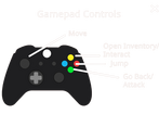
I don't like that the camera restricts your forward field of view when you move forward; it makes it harder for me to see what's up ahead. I kept getting tripped up over Z doing everything in the inventory, while X was Cancel _and_ attack; I think I would have kept Z strictly for opening and closing inventory, and have X be the button which performs inventory actions, but that's maybe personal preference.
Overall, though, I had fun. Good job!
Thanks so much for the feedback!
Great game! I like the design of interacting with dice.
Thanks for playing!