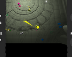
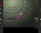
Play game
CMYKill's itch.io pageResults
Criteria | Rank | Score* | Raw Score |
Presentation | #140 | 4.382 | 4.382 |
Overall | #1086 | 3.402 | 3.402 |
Creativity | #2233 | 3.059 | 3.059 |
Enjoyment | #2237 | 2.765 | 2.765 |
Ranked from 34 ratings. Score is adjusted from raw score by the median number of ratings per game in the jam.
How does your game fit the theme?
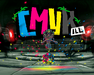
All revolves around the magic dice.
Did your team create the vast majority of the art during the 48 hours?
Yes
We created the vast majority of the art during the game jam
Did your team create the vast majority of the music during the 48 hours?
Yes
We created the vast majority of the music during the game jam
Leave a comment
Log in with itch.io to leave a comment.
Comments
i think this game can have lots of potential!
the presentation is especially well-done, and i appreciate the intro cutscene and the UI design. the dice mechanic took a bit to get used to (not sure if it's just me but it doesn't seem consistent? or ), especially with the blank sides, though i do still like the idea. shooting at enemies, especially up-close, felt a bit difficult than i thought, and the enemies do easily accumulate, especially if you're locked to a side and you have to use it up on enemies that aren't the right color.
all in all though, if expanded further, i think it would be a really neat little timewaster!
First of all, that opening gave me Spelunky vibes, which is definitely a good thing. The whole game was just so well polished, like you'd had months on it. So, incredible work to your artists. The gameplay was also great, with a lovely dice mechanic that burns out, forcing you to use new weapons. It would be great to see a bit more variety in these, if you're planning an expanded version, but what you had was great!
Wonderful work!
Really neat that there's a little cinematic intro to this game, it's a nice touch. The art is nice and I like that you used colour to differentiate between the enemies. It would be helpful for colourblind folks if you used symbols as well!
These are things that can't be done because of the time to make the game. Maybe in a future version we will add something like that in the game. Thanks for the feedback! I'm glad you liked it!
Very cool! The art was good, I liked how all of the enemies acted differently, but were still challenging, I liked the different abilities, I liked the start menu, and I liked the beginning cutscene.
The character did go faster diagonally, which means that you need to normalize the inputs in the movement code. Also, when I pressed the button to go back to the menu after I died, the music played, but the menu didn't load.
Overall a fun game. Good job!
Glad you enjoyed it!! We became aware of the issue after publishing the game which is a shame but we plan on releasing a fixed version once the jam ends.
Great work on the presentation, the intro and the tutorial UI in particular are great. I really like the idea of having to use every side of the die before the faces are refreshed, it's a great way to force the player into improvising with different attacks instead of just rerolling to get the best one.
I think if you took away the ability to roll blanks and let the player 'stack' the dice by purposely leaving a specific colour to last it would allow for some interesting strategies - maybe you could give a small damage boost to the last colour you use and then it would become a risk/reward proposition of trying to save a particular colour for last to use against a strong enemy or something.
I also would've appreciated some feedback for when I've completely used up a die, so I could keep track of what abilities I've already used and which ones are left. The delay between input and firing also made aiming a bit difficult.
Thanks for the feedback, I'm really glad you show so much interest in our game!
I think you've said some pretty interesting ideas and some will probably be included in a Post Jam version.
We put a lot of effort into the development of this game and I think it would be a shame to leave it as it is right now. We listen to each of you with the goal of changing the game for the better.
Thank you very much again for the feedback and for rating our game! <3
Fun game with fun colors. I didn't completely understand the difference between the push attack and shots, it seemed to choose between them at random, but fun nonetheless. The rerolling made certain moments frantic.
Thanks for the feedback!
The idea was that while the melee attack serves to sweep many enemies that are together, the ranged attack makes you prioritize some enemies or others. And the point of the dice rotating randomly the attack is making the combat more dynamic and the player has to adapt to the situation.
Thank you very much for playing and rating our game!
Stellar graphics and audio, the game's aesthetic gave me strong Spelunky vibes, which is a good thing! It'd be nice to have a directional indicator (like a line) pointing in the direction I'm about to shoot, to make hitting further away enemies a bit easier. Other than that though, I think the gameplay is pretty fun : )
funny thing, I composed the music using Spelunky as a main source of inspiration (and the visual designers did too afaik)! great to see someone noticing :D not my credit though, I got the idea from one of my fellow teammates! thank you <3
I love the theme and art style! and it is amazing that how much you can push to polish all the details in short amount of time. Amazing work!
We are very excited that you are liking it! We try to get the best result in 48h :D
Very polished! I love the idea!
Thank you very much for your comment! We hope to polish it even more after the Jam :D
Such an extreme polished UI and intro! I really like the tutorial. I wish there was that polish even in-game... try to optimize it after the jam ends! It's really cool!
Thank you very much! We're really, really glad you liked it. We finished the game very late, almost at closing time and had very little time to test and polish the game, but we intend to do it as soon as we can! Thanks for your comments!
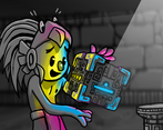
The cinematic is fabulous, wow! (Any insights on that, what have you used?)
The attack types are quite cool. I like the different enemy AIs, maybe they could vary in other aspects as well (shoot projectiles, dash at you, avoid each other…). I think the timer of how long you have survived doesn't reset, but not a big deal :). Overall, nicely done!
Thanks for the comment! We wanted to make each enemy behave differently to force you to make different strategies according to the moment, we're glad you like that!
As for the time on record we're aware of the bug, we'll upload a version with that and other bugs fixed as soon as we can! <3
And regarding the cinematics, a few illustrations were made separated by layers and we animated them in After Effects(specifically it's all work of our concept artist Rubrrig).
I apreciate that :3 It was a hard work
I liked it! Especially the art, I absolutely love the vibe. A lot of games in this gamejam used the literal numbers on dice and usually the dice are all black and white. So vibrant colors like this is very welcome. I also did not find the instructions too confusing.
I'm not sure how I feel about being able to re-roll a side of the die that you already used up. On one hand, I personally find it fun to try managing my resources while trying to focus on combat. On the other hand, since its randomized it did give me a twinge of frustration when I re-rolled into a grey side of the die.
All in all, very well done!
I'm glad you liked it, the truth is that the experience was insane and we finished the game on the last minute, so we are very proud of the level of finish we have achieved.
Beautiful cut scenes, interesting fun game gameplay and really polished UI! Impressive depth on the mechanics, a little confusing at first but after a while playing and re-reading the instructions it became clearer!
Thank you for the feedback! we are very happy to hear that you liked our game <3
Amazing polish on the art and UI, and a fun mechanic. A little difficult to understand which attack I had active which made strategizing difficult, but nice work!
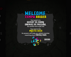
Thank you! We also like your game very much! We recommend reading the tutorial well, it says that there are two symbols, one for the melee attack and one for the 5 projectile attack.
Nice game !
The visuals looks really good & well polished ! kudos on that !
The controls felt a bit rigid & the concept of rolling the dice until you got the right color made the gameplay feel a bit unfair in the sense that you're not really in control of wether you're gonna be able to win or not.
But the game runs well & looks good & it was nice to try it. :)
Good job
It's great to read that you liked it! It is true that the controls have been a little weird but unfortunately with the 48h we have not been able to spend more time on them, we hope to be able to do it postjam
The game looks very good and the presentation is amazing. I love the opening cutscene.
It feels like you just roll until you get the color you want and then attack, but it can feel a bit unfair that you just have to keep rolling over and over. Maybe instead of requiring the same color, it could have done more damage to enemies of the same color.
Amazing artstyle and again, that opening cutscene was fantastic.
Thanks for the feedback! In theory, if you shoot an enemy with the wrong color you can push it, and it can be very useful to save time. It's true that with the time limitations we had, the push is not as polished as it should be, but from time to time it can save you from a rush. We're really glad you like the art and cinematics, we put a lot of care into them! Thanks for playing <3
Great visuals and setting! Music is also a great fit, and it's cool that you made your own tracks for the project.
Nice of you to put some time into easily overlooked elements, such as settings, pause menu etc.
I feel like melee atack is very satisfying to use, especially if you manage to clear a large group of enemies in one strike. On the other hand ranged attacks felt underpowered due to delay before shot, so it feels like getting a melee strike is always better, hopefully, there is a way to make ranged attacks feel just as impactfull and fun to use.
Obviously, many things can be improved, but it's a great foundation for an interesting arena shooter.
That's a great feedback! Thank you very much. The delay in the attack is because the shot responds to the animation and not the input. It is true that we didn't have much time to test anything, we were running very tight on time. It could be easily fixed by making the trigger cancel the current animation so we don't have to wait so long. We will fix it for the post jam version. Thank you so much for the comment and the nice words, they really help us grow! <3
The game design could be improved, we can't correctly aim enemies and having to use every attack before being able to reroll the die is frustrating when no enemy has the same color as our attack. The graphics and music are great!
It is true that the mechanics of the game were a bit complicated, unfortunately with the time limit we at least managed to make it work and give a good game time.
The works on the visuals really made your game stands out of the crowds. However the game design does not feel at the height. But overall it's fun to discover.
In this game we tried to go further than the previous jams and finally we were left with a result that, although not perfect, we are proud of and we believe that it can still give a good time of play.
Gorgeous artworks and presentation. Well done!
Thank You!! :)