Play game
Big Black Book of Magic's itch.io pageResults
| Criteria | Rank | Score* | Raw Score |
| Originality | #10 | 4.048 | 4.048 |
| Graphics | #12 | 3.667 | 3.667 |
| Overall | #17 | 3.313 | 3.313 |
| Controls | #18 | 3.238 | 3.238 |
| Theme | #19 | 3.286 | 3.286 |
| Accessibility | #19 | 2.714 | 2.714 |
| Audio | #20 | 3.048 | 3.048 |
| Fun | #20 | 3.190 | 3.190 |
Ranked from 21 ratings. Score is adjusted from raw score by the median number of ratings per game in the jam.
Godot Version
4.0.2 stable
Wildcards Used
Under Pressure
Game Description
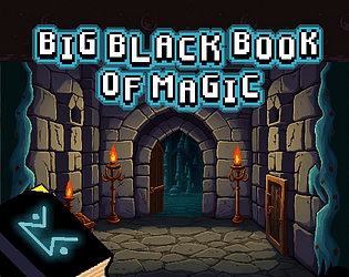
Learn to conjure spells from a Big Black Book.
How does your game tie into the theme?
A Young Wizard learns spellcasting an ancient black book of magic in hopes of resurrecting his wife. Thus, he turns into forgotten knowledge in desperation.
Source(s)
https://github.com/guladam/BigBlackBookOfMagic
Discord Username(s)
Guladam#2090, Luan Conzett#5629
Participation Level (GWJ Only)
3
My game has an export for Linux, Windows, & Mac and/or is playable through HTML5
Leave a comment
Log in with itch.io to leave a comment.


Comments
The spellcasting mechanic was awesome! A few times I felt like I made the symbol and it didn’t take, but in general it worked pretty well. Mind sharing how you did it?
Hey Ryan!
Thanks for the feedback, glad you liked the mechanic. The solution is based on this algorithm:
https://depts.washington.edu/acelab/proj/dollar/index.html
I've found a really old, Godot 2 implementation of it here: https://github.com/blurymind/1dollar_gesture_recogniser
This is what I updated and tweaked for a Godot 4 version which is available on my GitHub:
https://github.com/guladam/BigBlackBookOfMagic/tree/main/spellcasting
Hope that makes sense! :))
Kinda fun, really pretty, and solid menus and intro. I was impressed with the drawing mechanic. The sprites were well drawn and the background was nice. One thing I noticed is that drawing with a mouse is awkward and uncomfortable, so the main mechanic, while cool, got repetitive. I want to see zombies blow up and the art work, not my hideous squigglings! I think it would have been a better experience on a touch screen.
If the mechanic was used more sparingly (like, to select spells, or maybe the spells had 50X more shots), I think it would have added a lot to the game play.
Thanks for the feedback!
That's super helpful feedback because you're the first one to say that the mechanic was repetitive and boring.
I think 50X casts might be the other side of the spectrum, but for sure it would be a good idea to provide more spellcasts per drawing.
Thanks again for the remarks! :)
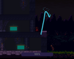
It was a nice experience to draw the spells to defend the castle from the advancing enemies, it was interesting and mostly reliable, one thing that I noticed was that if you draw any line twice the game won’t recognize the symbol. For example, in the heat of action I’ve started to draw the lightning bolt symbol from the middle, drawing the line up, then without releasing the right mouse button I drew the whole symbol from top to bottom, retracing the initial line, the resulting symbol looked visually correct, but the game didn’t recognize it.
I like the choice you are given at the end of each wave, you really feel like you are planning for the future survival, and the sad music adds to the atmosphere.
Thanks for the feedback!
Yeah, that's true. The algorithm only works if you draw it from either end of the symbol. It has to do with the implementation but that's a nice catch :)
Bot-to-top and top-to-bot works but if you start from the middle you're screwed, sorry 😔
I enjoyed the cast spell mechanic, well done! The level layout made it more difficult than I think needed, and the bottom floor seemed to be useless, I couldn't shoot out of it. Overall the graphics and gameplay were fun, I just wish I could have been faster during the later waves, it got tough!
Thanks for the feedback, glad you enjoyed it! :)
Absolutely agree with the level layout remarks.
The drawing to cast magic mechanic is fun. And balanced by making stronger spells harder to draw and remember. The fireball spell's hitbox made it not very useful against ground enemies though. The music adds to the mood without being repetitive or annoying. The options had the music and sounds off by default despite being marked as turned on in the menu (or did the X mean "off"?)
I think that the level layout is unnecesarily complex and some floors are unneeded. Like the bottom floor has nothing useful there, and I didn't seem to be able to attack enemies from the 3rd floor, but still had to go through it to reach the top of the castle.
The graphics are very nice, but the tile placement in the level with the floor blocking the background hurt the look a bit. Its a pretty good game overall.
Thanks for the detailed feedback! :)
Yeah the fireball hitbox turned out to be a bit weird for some reason. Other people mentioned issues with audio as well but I'm not quite sure about the cause. X would mean enabled by default.
I also agree with the level layout remarks, aim to do better next time in that regard.
Really cool mechanic with the drawing of spells. Really enjoyed that! It was a bit challenging having to run back and forth and go up and down the different stages. I feel like the amount of enemies ramped up quite quickly. The mechanic was a lot of fun though. Would be really cool as a co-op game.
Thanks for the feedback, much appreciated!
Never thought about making it a co-op experience but that's a great idea! :)
I love this Spell Casting Mechanic!
I had also the Audio Problems and sometimes the game crashed. (It was “Back to Menu” and “Upgrade Tower”.
Beside that. The Juiciness was really cool! The effects on the spell cast and also the camera shake were on point. That made the feeling very good!
As others mentioned, it was a bit hard to grasp what to do. I had esp. problems to understand that I can actually go “up”. After that I knew what to do and it was a fun game!
Also wanted to say that I appreciate your transparency regarding the assets! Putting them together for a good game is a big task itself and you did very well. The Audio was a good fit!
Really good job!
Thanks for the feedback, always appreciated!
Maybe I shouldn't have switched to Godot 4 this early :|
Yeah I agree with the other stuff. I definitely should spend more time on clarity, level design and a clear tutorial in my future jams! :)
Very pretty game with some nice audio. Like others, I had an issue with sound not working on every load, but that's presumably a Godot bug of some sort.
Gameplay wise, I wasn't really clear on what to do until I read through some other comments, but once I figured it out I enjoyed it. it's an interesting idea with the drawing mechanic for casting spells and think there's a lot of ways you could expand on this idea, though I did find holding RMB to draw so often a little uncomfortable, though I also use a funky mouse so that may be on me :D
Thanks for the feedback, much appreciated! :)
What do you think a good alternative control scheme might be?
I was thinking of maybe holding down a button and just moving the mouse instead? Or alternatively, pressing a button twice to start and to finish drawing? I don't know but it's a fair point, holding RMB is not the most accessible / comfortable choice here.
Yeah it's tricky. I thinking holding down a button to draw could be worth trying. Could also try pressing a button to toggke the drawing mode?
Somehow the name just feels like an innuendo and I can't stop myself from giggling every time it talks about a big black book. XD
There was no sound at all when I started the game, but after the intro played I didn't wait long enough and clicked "Skip intro" before it turned into "Start". Thinking I had missed something I refreshed the page and for some reason the second time I had sound. I'm glad I didn't miss out on that whole aspect!
I feel like I recognized the character sprite from the winner of the last jam, was that also you?
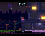
This game felt really polished and solid. The menus and little effects everywhere... so good! Once I started the game I was very confused about what was happening or what I was supposed to do. The intro explains the controls but I didn't realize it was a tower defense sort of thing. Initially I just thought "wow I'm glad those skeletons can reach me" and "what is that progress bar that's counting down?"
After that I kept thinking the side walls were pass through because they were dark so I tried to shoot the skeletons through them. Once I finally figured out the teleporters things got a bit easier, though it was still hard to shoot over the castle walls.
I was amazed by how well the magic missile spell worked at first. Then I got an upgrade and tried the lightning spell and couldn't get it to activate a single time. I died because of that and on the secodn try I double checked the sample drawing for lightning -- as a side not it would have been nice to have those on screen always -- and once I verified I had the right shape I tried a bunch more times and only got it to work once. I drew a few random lines out of frustration and got it to activate a second time somehow, but then the castle crumbled and that was the end of my dabbling in magic! :D
Hey, thanks for the feedback. :)
|
| ___ ___
|
|
Notice that the vertical lines are straight maybe you tried to draw a zigzag pattern? I'm just curious why it didn't work.
Thanks for the feedback anyways, super helpful, I appreciate it :)
Very nice work on the spellcasting system! I think you pulled off a pretty intuitive and fun control scheme for casting spells, which is tricky to do (as I learned in my own game this jam, haha).
I agree with some of the other commenters that the level feels a bit static and the enemies kind of just bunch up in one place - maybe a top-down viewpoint (instead of side-scrolling) could make it feel a little more varied / interesting.
I didn’t understand at first that casting a spell gives you multiple charges, and the teleportation system confused me slightly as well, but once I figured those bits out it was a lot of fun! I did find that I rarely teleported anywhere and just ran back and forth on the top level to defeat all the enemies.
Overall nice work!
Thanks for the feedback, absolutely great ideas there, much appreciated.
Yeah in hindsight definitely would make much more sense to go top-down instead of sidescrolling. :)
The spell casting system really intrigued me but sorry that I couldn't go pass round 2 😣
At some point I cast one spell too many times that I have forgotten (pun intended) the other spell.
Thanks for the feedback. I always love a good pun :D
If can just press Esc to pause and it shows all your available spell symbols in the pause menu but I it turned out a bit hard.
Glad you enjoyed the system ^^
Very cool game! I see it very much at home in a touch screen system like a nintendo DS or a switch. Certain patterns are difficult to pull off in the heat of the moment with a mouse, and the map is a bit janky, but the concept itself is simple and elegant and can make something very fun if fully realized.
Hi,
Thanks for the feedback. I agree that the map isn't the best though. Never thought about the touch screen possibilities, but it's a great idea actually, thank you so much! :)
A great game! It's similar to mine where you have to remember the spells but your spell drawing system is more interesting. It's just a bit difficult after 2-3 rounds. I could draw fast enough to defend against the waves. It might be cool if you could still cast the spells if you know the shape.
Hi,
Glad you enjoyed it and thanks for the feedback, really appreciate it.
I agree that it didn't turn out quite easy! :'D
This was a very interesting spellcasting system! Definitely tests your skills at memorization and drawing the shapes you learn under pressure (probably one of the best spellcasting systems I've found in a game). Probably this spellcasting system would have been great for some kind of PvP game (considering how nicely it incorporates reflexes, memorization and precision. Perhaps having some summoning spells as well to make AoE effects more useful in that pvp context. I wonder if it might be possible to incorporate ratio geometries and similar traits to allow "inventing" new spells by mixing up old ones - sorry for the enthusiastic runt about the idea).
What I didn't like was the level design and how most of the time I ended up just shooting the block I was standing on instead of the enemies. Perhaps being able to hit enemies from the first floor would have been nice? And if the teleport could work on demand and without needing to go to the portals.
Surprised this game didn't have any ratings yet. I think more people should play it.
Thanks for the very detailed feedback, always appreciate it!
I agree that the mechanic itself is very fun, but this castle-defending setup is not the best for it to shine.
Also, 100% agree on the poor level design part... unfortunately, this is the area I tend to neglect the most in game jams. Maybe next time it will be better! :)
Hey everyone!
I want to clarify that I relied solely on public-domain assets for the visuals.
You can see that in the credits as well, I just wanted to be fully transparent.